

This page is a quick tour of what separates a polished, persuasive chart from a default one. The tools are almost all {ggplot2}, but the point here is the design thinking, not the syntax. You don’t need to memorize the code. The goal is to know the principles and the names of the pieces that enact them, so you can point an AI assistant at the right one and judge whether what it hands back is any good.
Most default charts are readable. Very few are effective. The difference is a handful of deliberate choices: cutting what doesn’t earn its place, using color to direct the eye, and letting the words on the chart carry the message. Everything below is one of those choices.
Start with the message
Before you touch {ggplot2}, decide what one thing the chart is supposed to say. The message drives every later decision, including which chart to make. A bar chart, a line chart, and a scatter plot are not interchangeable styles. Each answers a different question: bars compare amounts across categories, lines show change over time, scatter plots show the relationship between two variables.
In the grammar of graphics that {ggplot2} is built on, a chart is just
data mapped to visual properties (position, color, size) and drawn
with a geom_*(). Switching geom_col() for geom_line() for
geom_point() is switching the question you’re answering, so pick the
geom that fits the message rather than defaulting to whatever is
familiar. When you’re not sure what will work for a given shape of data,
data-to-viz.com is a good starting
point: it maps data types to appropriate chart types and gives example R
code for each.
Strip away the clutter
The single highest-leverage move in data viz is removing things. Every gridline, tick, border, and stray label competes with your data for attention. The default gray {ggplot2} theme is fine for exploring your own data, but for a chart someone else will read, start subtracting.
Here is a plain scatter plot of the penguins data from
{palmerpenguins}, straight out of the box:
library(ggplot2)
library(dplyr)
library(palmerpenguins)

penguins_clean <- penguins |>
  filter(!is.na(body_mass_g))

ggplot(penguins_clean, aes(x = flipper_length_mm, y = body_mass_g)) +
  geom_point()
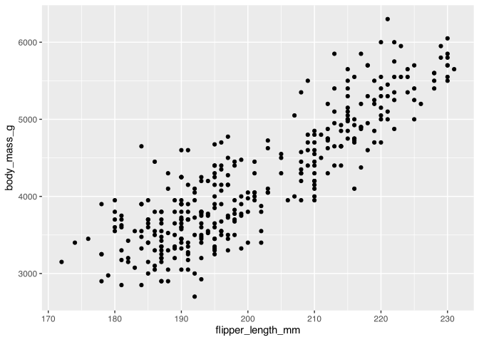
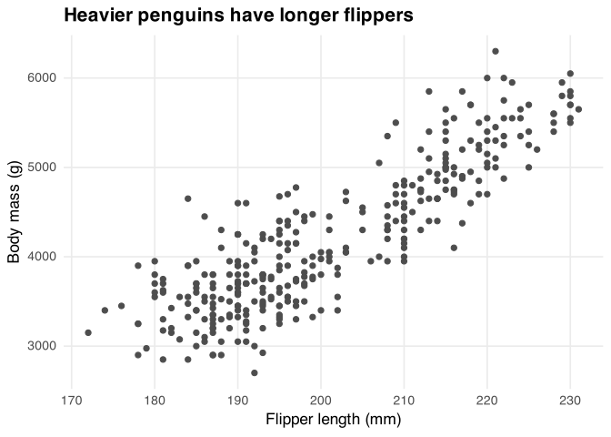
Now the same data, decluttered. The moves are all subtractive or
clarifying: theme_minimal() drops the gray background,
panel.grid.minor = element_blank() removes the faint half-gridlines,
and real axis titles plus a title that states the takeaway replace the
raw column names:
penguins_plot <- ggplot(
  penguins_clean,
  aes(x = flipper_length_mm, y = body_mass_g)
) +
  geom_point(color = "gray30") +
  labs(
    title = "Heavier penguins have longer flippers",
    x = "Flipper length (mm)",
    y = "Body mass (g)"
  ) +
  theme_minimal(base_size = 13) +
  theme(
    panel.grid.minor = element_blank(),
    plot.title = element_text(face = "bold")
  )

penguins_plot
The theme_*() family is where most decluttering happens.
theme_minimal() and theme_light() give you a clean starting point;
theme_void() removes essentially everything (axes, gridlines,
background), which is what you want for maps and some annotated charts.
From there, theme() with element_blank() lets you switch off
individual pieces: gridlines (panel.grid), axis ticks (axis.ticks),
or a legend (legend.position = "none"). Reach for element_blank()
any time you find yourself asking whether a chart element is doing real
work.
Use color with intention
Color is the most abused channel in data viz. The instinct is to give every category its own hue, but a rainbow of equally bright colors tells the reader nothing about what matters. Color should carry meaning, and usually the meaning is “look here.”
The most useful pattern is highlighting: pick one series to say
something about, color it, and push everything else to a neutral gray.
You do this by mapping a TRUE/FALSE column to color and then
setting the two colors by hand with scale_color_manual(). Here is life
expectancy over time from {gapminder}, with Rwanda pulled out from the
pack:
library(gapminder)

countries <- c("Japan", "China", "India", "Rwanda")

gap <- gapminder |>
  filter(country %in% countries) |>
  mutate(highlight = country == "Rwanda")

rwanda_plot <- ggplot(gap, aes(x = year, y = lifeExp, group = country)) +
  geom_line(aes(color = highlight, linewidth = highlight)) +
  scale_color_manual(values = c(`TRUE` = "#c1121f", `FALSE` = "gray75")) +
  scale_linewidth_manual(values = c(`TRUE` = 1.2, `FALSE` = 0.6)) +
  labs(
    title = "Rwanda's life expectancy collapsed, then recovered",
    x = NULL,
    y = "Life expectancy"
  ) +
  theme_minimal() +
  theme(legend.position = "none", panel.grid.minor = element_blank())

rwanda_plot
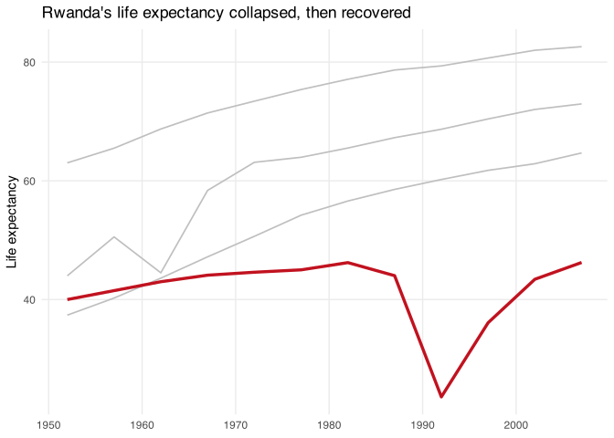
One red line against gray does more than four competing colors ever
could, and mapping linewidth to the same flag reinforces it.
When you genuinely do need a color scale (a sequence or a set of
distinct categories), pick a palette that is colorblind-safe and
survives being printed in grayscale. The viridis scales, built into
{ggplot2}, are the safe default: scale_color_viridis_c() and
scale_fill_viridis_c() for continuous data, and the _d() versions
for discrete categories. They stay distinguishable for the most common
forms of color blindness and read correctly in black and white. To
sanity-check any palette you build yourself, scales::show_col() prints
the swatches, and packages like {colorspace} and {paletteer} (a
meta-package collecting hundreds of palettes) give you far more to
choose from.
Label directly instead of leaning on legends
A legend forces the reader to bounce between the chart and a key,
matching colors to names. Whenever you can, cut the legend and put the
labels on the data. In the Rwanda chart above the legend is already
off. To finish the job, drop a text label at the end of each line with
geom_text(), filtered to the final year so you get one label per
series:
ggplot(gap, aes(x = year, y = lifeExp, group = country)) +
  geom_line(aes(color = highlight, linewidth = highlight)) +
  geom_text(
    data = filter(gap, year == max(year)),
    aes(label = country, color = highlight),
    hjust = 0,
    nudge_x = 1,
    size = 3.5
  ) +
  scale_color_manual(values = c(`TRUE` = "#c1121f", `FALSE` = "gray75")) +
  scale_linewidth_manual(values = c(`TRUE` = 1.2, `FALSE` = 0.6)) +
  scale_x_continuous(expand = expansion(mult = c(0.02, 0.15))) +
  labs(
    title = "Rwanda's life expectancy collapsed, then recovered",
    x = NULL,
    y = "Life expectancy"
  ) +
  coord_cartesian(clip = "off") +
  theme_minimal() +
  theme(legend.position = "none", panel.grid.minor = element_blank())
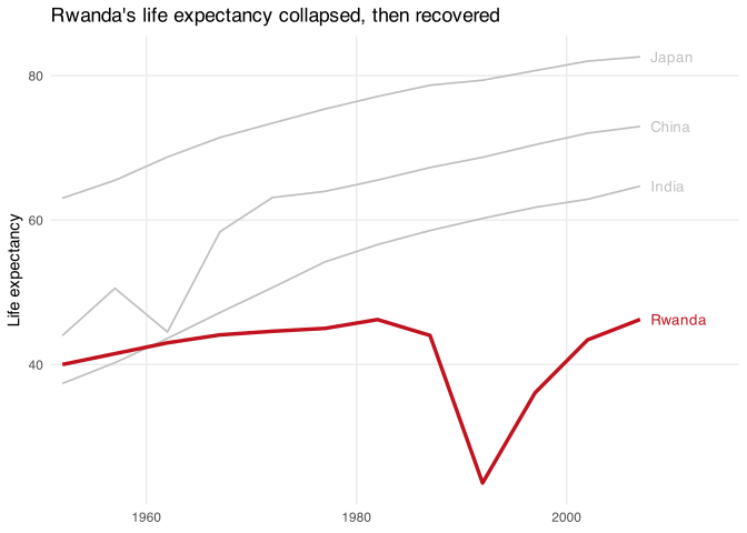
Two small details make direct labeling work: expand on the x scale
opens up room on the right for the text, and
coord_cartesian(clip = "off") lets labels sit outside the plotting
area instead of being cut off. When labels would collide (many points
close together), the {ggrepel} package
nudges them apart with geom_text_repel(), and
{geomtextpath} can run a
label right along a curve.
Make the title do the talking
On a default chart the title names the variables. On an effective chart the title states the conclusion. “Rwanda’s life expectancy collapsed, then recovered” tells the reader what to see before they’ve parsed a single line; “Life expectancy by year” makes them work it out for themselves. Write titles as sentences, and use the subtitle for the supporting detail (the time range, the source, the caveat).
You can go further and let the title reference the chart’s colors
directly, so the words and the marks reinforce each other. The
{ggtext} package renders Markdown and
basic HTML inside {ggplot2} text, so you can color and bold individual
words. Turn it on for a text element with element_markdown():
library(ggtext)

ggplot(gap, aes(x = year, y = lifeExp, group = country)) +
  geom_line(aes(color = highlight, linewidth = highlight)) +
  scale_color_manual(values = c(`TRUE` = "#c1121f", `FALSE` = "gray75")) +
  scale_linewidth_manual(values = c(`TRUE` = 1.2, `FALSE` = 0.6)) +
  labs(
    title = "Life expectancy in <span style='color:#c1121f'>**Rwanda**</span> vs. other countries",
    x = NULL,
    y = "Life expectancy"
  ) +
  theme_minimal() +
  theme(
    legend.position = "none",
    panel.grid.minor = element_blank(),
    plot.title = element_markdown()
  )
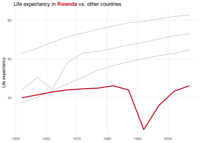
Now the word “Rwanda” in the title is the same red as the line, and
you’ve replaced a legend entry with a phrase the reader was going to
read anyway. {ggtext} also gives you element_textbox() for wrapping
longer titles and geom_richtext() for styled text inside the plot.
Annotate to tell the story
Titles set up the message; annotations point at the evidence. A short
note with an arrow (“The 1994 genocide cut life expectancy in half”)
turns a line the reader might skim into the moment the chart is about.
In {ggplot2} the workhorse is annotate(), which draws text, arrows, or
shapes at coordinates you choose without needing a data frame:
ggplot(gap, aes(x = year, y = lifeExp, group = country)) +
  geom_line(aes(color = highlight, linewidth = highlight)) +
  annotate(
    "text",
    x = 1978,
    y = 31,
    lineheight = 1,
    hjust = 1,
    label = "The 1994 genocide\ncut life expectancy in half",
    size = 3,
    color = "gray10"
  ) +
  annotate(
    "curve",
    x = 1979,
    y = 30,
    xend = 1991,
    yend = 24,
    curvature = -0.25,
    arrow = arrow(length = unit(2, "mm")),
    color = "gray30"
  ) +
  scale_color_manual(values = c(`TRUE` = "#c1121f", `FALSE` = "gray75")) +
  scale_linewidth_manual(values = c(`TRUE` = 1.2, `FALSE` = 0.6)) +
  labs(
    title = "Rwanda's life expectancy collapsed, then recovered",
    x = NULL,
    y = "Life expectancy"
  ) +
  theme_minimal() +
  theme(legend.position = "none", panel.grid.minor = element_blank())
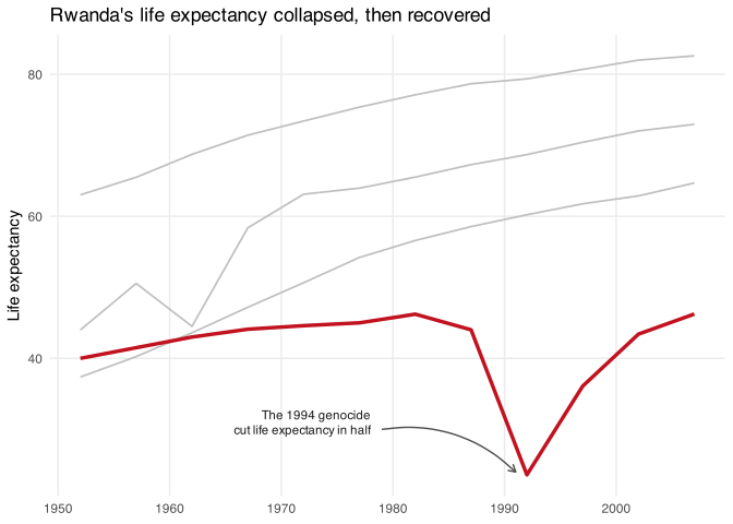
annotate("curve", ...) with an arrow() draws the swooping pointer;
annotate("text", ...) places the note. A few habits keep annotations
from looking sloppy: keep arrows consistently curved rather than mixing
straight and swooshy ones, keep the spacing between a note and the thing
it points at even across the chart, and set annotation text in a muted
gray so it supports the data instead of competing with it. For richer,
Markdown-formatted notes, {ggtext}’s geom_richtext() and
geom_textbox() step in where plain annotate() runs out.
Typography and fonts
Type is doing more work in a chart than most people notice. The default font is functional and generic; choosing a typeface on purpose is one of the cheapest ways to make a chart look designed rather than dumped out of a script. A couple of durable rules from the course: pair a distinctive headline font with a clean, highly readable body/label font (a serif title over a sans-serif body is a reliable combination), and use fewer fonts rather than more, since two well-chosen faces are far easier to harmonize than four.
Getting a custom font into a {ggplot2} chart used to be fiddly; it is
now mostly automatic. Modern R uses
{systemfonts} to find fonts installed
on your machine, and the ragg graphics device
renders them correctly, so once a font is installed you can name it in
base_family and in individual element_text() calls. (The
{showtext} package is the older
route, useful for pulling fonts straight from Google Fonts.)
# Requires the "Roboto" and "Roboto Slab" fonts installed on your system.
ggplot(penguins_clean, aes(x = flipper_length_mm, y = body_mass_g)) +
  geom_point(color = "gray30") +
  labs(
    title = "Heavier penguins have longer flippers",
    x = "Flipper length (mm)",
    y = "Body mass (g)"
  ) +
  theme_minimal(base_family = "Roboto") +
  theme(
    plot.title = element_text(family = "Roboto Slab", face = "bold")
  )
This chunk is not run here because the fonts may not be installed, but
the pattern is the whole idea: set a base_family for everything, then
override the title with a heavier, more characterful face through
element_text(family = ...).
Alignment, whitespace, and hierarchy
The last layer is layout, and it is mostly about restraint and
consistency. Our eyes group things that are aligned, close together, or
share a color, whether or not we mean them to (these are the Gestalt
principles). Good charts use that on purpose: line elements up on a
shared grid, give the content room to breathe with generous margins
(plot.margin = margin(...)) and panel spacing, and build a clear
hierarchy so the title reads first, then the data, then the supporting
labels, then the source note.
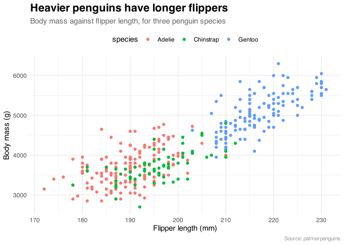
Size, weight, and color are your hierarchy controls: make the takeaway
title large and bold, the subtitle lighter, and the source note small
and gray, so the reader moves through the chart in the order you intend.
You set these in theme() with element_text():
ggplot(
  penguins_clean,
  aes(x = flipper_length_mm, y = body_mass_g, color = species)
) +
  geom_point() +
  labs(
    title = "Heavier penguins have longer flippers",
    subtitle = "Body mass against flipper length, for three penguin species",
    caption = "Source: palmerpenguins",
    x = "Flipper length (mm)",
    y = "Body mass (g)"
  ) +
  theme_minimal() +
  theme(
    plot.title = element_text(size = 16, face = "bold"),
    plot.subtitle = element_text(size = 11, color = "gray40"),
    plot.caption = element_text(size = 8, color = "gray60"),
    legend.position = "top"
  )
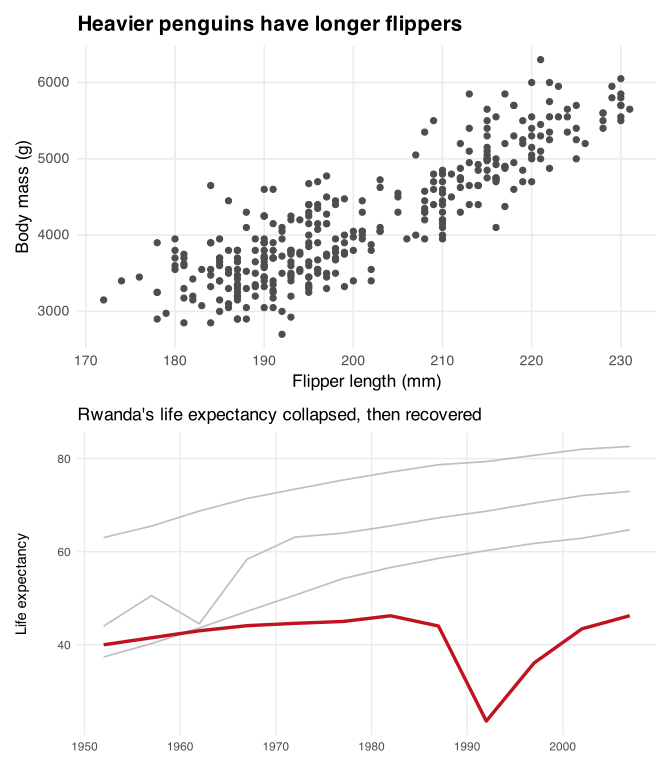
When you’re placing several charts together, don’t eyeball it. The
{patchwork} package composes
multiple {ggplot2} plots into one figure with aligned axes, using a
simple plot1 + plot2 (side by side) or plot1 / plot2 (stacked)
syntax that keeps a multi-panel graphic on a consistent grid. Here it
stacks two charts we built earlier on this page, the decluttered
penguins plot and the Rwanda highlight, one above the other (stacking
rather than placing them side by side gives each takeaway title the full
width it needs):
library(patchwork)

penguins_plot / rwanda_plot
None of these principles is exotic, and none requires much code. Effective data viz is mostly the discipline to decide on one message, cut everything that doesn’t serve it, and spend your color, text, and space on the thing you actually want the reader to see.