Learn to use the most powerful tool for working with data.
Even if you've never coded before.
Blog

How to Get Started Using AI with R
May 27, 2026
There are so many ways to use AI with R now that it's genuinely hard to know where to start. Should you just use ChatGPT in a browser tab? Install something into your code editor? And if so, which one? I made a video walking through the main options, with the pros and cons of each. The simplest approach is the one most people start with. Pop open ChatGPT in a browser and ask it R questions the same way you'd ask anything else. It works, but you end up bouncing back and forth between the...
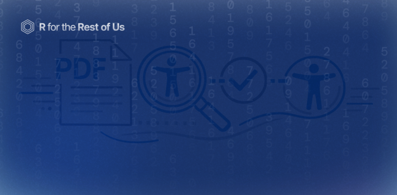
Introducing the {pdfcheck} R package for checking the accessibility of PDFs
February 5, 2026
Are the PDFs you're creating accessible? Can someone using a screen reader navigate them? Is the color contrast sufficient for people who are colorblind? These are questions we've been getting a lot from our consulting clients at Clarity Data Studio. And honestly? When we reviewed our own PDFs, we found there wasn't a really great tool to check accessibility and give us actionable steps to improve. So we decided to build our own. It's called {pdfcheck}, and it's an R package that helps you...

[Livestream Recording] How to Make High-Quality PDFs with Quarto and Typst
November 20, 2025
Last week, we released our massive blog post on making report templates using Quarto and Typst. R for the Rest of Us consultant Joseph Barbier and I did a livestream yesterday where we went over several questions submitted to us on this topic. In the livestream we covered several topics, including: Making complex elements that we used in the state-level immunization reports we recently created for the Johns Hopkins University International Vaccine Access Center. Taking a Typst template and...
How to Make High-Quality PDFs with Quarto and Typst
November 12, 2025
In our consulting work at Clarity Data Studio, many clients come to us for support making highly-branded PDF reports. I spoke about how we make these reports in my 2024 posit::conf talk Report Design in R: Small Tweaks that Make a Big Difference. In the last couple years, we’ve moved to Typst almost exclusively for making PDFs. Of the two promises that Typst makes (powerful and easy to learn), we agree with the first. The second, however, a bit less so. The Typst website has great...
What's New in R
A weekly roundup of new resources in the world of R.
What’s New in R: July 6, 2026
July 6, 2026
Welcome to this week's edition of What's New in R! This week, we're featuring a look at generating personalized exams at scale by going straight to Typst, a Quarto extension for shifting heading levels, and a package for building 3D plots with familiar {ggplot2} syntax. Let's dive in!Personalised Exams at Scale: From Quarto to tynding Nithin M walks through how to generate student-specific exam papers, each with randomized questions and unique datasets, and compares two approaches for...
What’s New in R: June 29, 2026
June 29, 2026
Welcome to this week's edition of What's New in R! This week, we're featuring a big update to a package for building advanced ggplot2 legends and guides, the highlights from Positron's latest release, and a fun statistical look at how long wars actually last. Let's dive in!Symbolic update Teun van den Brand has released version 0.3.0 of {legendry}, his package for building advanced guides and legends in {ggplot2}. The update adds a whole batch of new guides, including guide_legend_manual()...
What’s New in R: June 22, 2026
June 22, 2026
Welcome to this week's edition of What's New in R! This week, we're featuring an argument for why Quarto pairs so well with LLMs, a Quarto extension that saves you from repeating headings across slides, and a package for wrangling nested lists into tibbles. Let's dive in!The Unreasonable Effectiveness of Quarto John Paul Helveston makes the case that Quarto is the ideal format to reach for when you're working with an LLM. Rather than asking a tool like Claude to produce a Word doc or PDF...
What’s New in R: June 15, 2026
June 15, 2026
Welcome to this week's edition of What's New in R! This week, we're featuring a talk on keeping your R package environments from breaking over time, a community session packed with productivity tips and real-world lessons, and a guide to migrating your PDF reports from pagedown to Typst. Let's dive in!Great Scott! A chronicle of the dangers of time traveling in R In this talk, Malcolm Barrett (who created our package development course) digs into one of R's quietly frustrating problems: you...
R in 2 Minutes
Short videos highlighting useful R packages and functions.
A new way to make error messages in R actually make sense
December 10, 2025
We've all been there: you run your code and get an error message that makes absolutely no sense. I recently discovered a new tool in Positron that can actually explain your errors in plain language AND even fix your code for you automatically! I demonstrate this functionality using real-time coding examples, showcasing how Positron's built-in features can make inscrutable error messages actually make sense.
How to add speaker notes to Quarto slides
June 26, 2025
Have you ever been presenting slides and wished you had some hidden notes to help guide you through your presentation? There is a super helpful feature in Quarto that lets you add speaker notes to your slides - and your audience will never see them! In this quick video, I show you how to: Add speaker notes to your Quarto slides Access your notes during presentations Keep your notes on a second screen This has been a game-changer for me when teaching R in 3 Months sessions. I can keep track of...
How to conditionally execute code chunks in Quarto
June 5, 2025
Ever had a Quarto document where some code works perfectly in HTML but looks awful in Word (or vice versa)? I just ran into this problem with tables -{gt} tables look great in HTML but not so hot in Word, while {flextable} works beautifully in Word format. In this quick video, I show you a neat trick for conditionally executing code in Quarto. This is super handy when you're creating documents that need to be exported to multiple formats. No more manually commenting out code or creating...
How to add patterns to your plots with {ggpattern}
May 15, 2025
Ever wanted to add patterns to your plots made with ggplot? You can with the {ggpattern} package! Check out this short intro to the package. If you want to go deeper on {ggpattern}, check out its documentation website for all of the details about how it works. Code used:
Podcast
Conversations with users around the world about interesting things they are doing with R.

R for the Rest of Us Podcast Episode 30: Sara Altman and Simon Couch
June 11, 2026
Most coding assistants treat data quality as a speed bump. You hand them a messy CSV, they squint at it, and a moment later they've shipped some plausible-looking analysis built on a quietly broken foundation. Posit's new AI agent takes a different stance: it pauses, asks you the awkward questions, and treats the messy bits as the point of the work, not an obstacle to it. That agent is called Posit Assistant, and I sat down with two of the people building it: Sara Altman and Simon Couch. Sara...
R for the Rest of Us Podcast Episode 29: Mike Stackhouse
March 13, 2026
In this episode, Mike Stackhouse, Chief Innovation Officer at Atorus Research, shares valuable insights on effectively using AI with R programming, especially in regulated environments like pharmaceuticals and healthcare. Think of AI as a "Very Confident Junior Programmer" Mike's most memorable analogy frames LLMs perfectly: they're like junior developers who are extremely confident but occasionally wrong. Since LLMs fundamentally work with text in and text out, with limited context windows,...
R for the Rest of Us Podcast Episode 28: Nick Tierney
July 10, 2025
Our latest R for the Rest of Us podcast episode features Nick Tierney—a statistician, R developer, and consultant whose career journey spans academic research, software engineering, and more. In this episode, we talk about Nick’s journey with R, his influential blog Credibly Curious, and how he built {naniar}—an R package designed to make working with missing data easier. Nick also discusses: Why writing tests for R packages is essential (and easier than you might think) His philosophy on...
R for the Rest of Us Podcast Episode 27: Garrick Aden-Buie
June 12, 2025
In Episode 27 of R for the Rest of Us, we sit down with Garrick Aden-Buie, a senior software engineer at Posit (formerly RStudio), to explore his latest project: brand.yml. This innovative tool aims to simplify and unify branding across various data science outputs, including Quarto documents, Shiny apps, and more. Garrick shares the inspiration behind brand.yml, stemming from his experiences in creating custom theming solutions at different organizations. Recognizing the repetitive nature of...
