Tips and Tricks

How to Get Started Using AI with R
May 27, 2026
There are so many ways to use AI with R now that it's genuinely hard to know where to start. Should you just use ChatGPT in a browser tab? Install something into your code editor? And if so, which one? I made a video walking through the main options, with the pros and cons of each. The simplest approach is the one most people start with. Pop open ChatGPT in a browser and ask it R questions the same way you'd ask anything else. It works, but you end up bouncing back and forth between the...
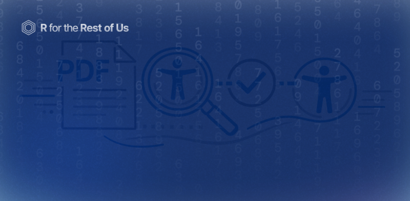
Introducing the {pdfcheck} R package for checking the accessibility of PDFs
February 5, 2026
Are the PDFs you're creating accessible? Can someone using a screen reader navigate them? Is the color contrast sufficient for people who are colorblind? These are questions we've been getting a lot from our consulting clients at Clarity Data Studio. And honestly? When we reviewed our own PDFs, we found there wasn't a really great tool to check accessibility and give us actionable steps to improve. So we decided to build our own. It's called {pdfcheck}, and it's an R package that helps you...

[Livestream Recording] How to Make High-Quality PDFs with Quarto and Typst
November 20, 2025
Last week, we released our massive blog post on making report templates using Quarto and Typst. R for the Rest of Us consultant Joseph Barbier and I did a livestream yesterday where we went over several questions submitted to us on this topic. In the livestream we covered several topics, including: Making complex elements that we used in the state-level immunization reports we recently created for the Johns Hopkins University International Vaccine Access Center. Taking a Typst template and...
How to Make High-Quality PDFs with Quarto and Typst
November 12, 2025
In our consulting work at Clarity Data Studio, many clients come to us for support making highly-branded PDF reports. I spoke about how we make these reports in my 2024 posit::conf talk Report Design in R: Small Tweaks that Make a Big Difference. In the last couple years, we’ve moved to Typst almost exclusively for making PDFs. Of the two promises that Typst makes (powerful and easy to learn), we agree with the first. The second, however, a bit less so. The Typst website has great...

Pros and Cons of Positron
November 6, 2025
Posit recently announced that their code editor Positron is now available as a stable release. With Positron out of beta, I thought it might be useful to go over what it is as well as some of the pros and cons for users considering moving to Positron from RStudio. Much of the rationale that Posit has given for Positron is to develop a code editor that works equally well for R and Python. Although this multilingual support isn't relevant to me (and, I suspect, many of you reading this), there...

How to make heatmaps in ggplot
May 1, 2025
Heatmaps are a common way of representing data. In this blog post, I'll show you how to make your own heatmaps using ggplot. In the process, you'll learn a bit about working with the {sf} package, specifically the st_make_grid() function to make a grid, the st_intersection() function to clip the boundaries of your geography to the grid you create, and st_join() to do spatial joins. This blog post is adapted from a lesson in the Mapping with R course. If you want to learn to make heatmaps (and...

Use shadows in ggplot to highlight findings
April 24, 2025
In our consulting work, we make a lot of the data visualization for parameterized reporting. It’s something I spoke about in my 2024 Cascadia R Conf talk, How to Make a Thousand Plots Look Good: Data Viz Tips for Parameterized Reporting. One example I gave in this talk came from our work with the Johns Hopkins International Vaccine Access Center and the World Health Organization. In this project, we made reports for the Immunization Agenda 2030 project, which tracks the progress countries...

Create your own custom {ggplot2} theme
April 3, 2025
Creating custom themes in {ggplot2} lets you elevate your data visualizations from standard to standout. Whether you’re aiming for a polished, brand-consistent look for your organization or a unique aesthetic that reflects your personal style, a custom theme function makes it easy to apply your design to all figures with a single line of code. In this tutorial, we’ll cover: the essentials of the powerful ggplot2::theme() function, including how to adjust fonts, colors, sizing, and spacing;...

Hide text labels with small values to make charts made in ggplot easier to read
March 13, 2025
One issue that we often face when making data visualization in reports is text not fitting into graphs. This happened to us when working on reports for the Connecticut Data Collaborative and the Partnership for Strong Communities in Connecticut. The reports we made, which show key demographic and housing indicators for towns and counties across the state, have bar charts that show the housing cost burden for renters and home owners in the state. In addition to the categories severe burden...