
High-quality data visualization, workflow improvements, and custom packages to enable your organization to communicate more effectively and more efficiently.
Success Stories
Reports
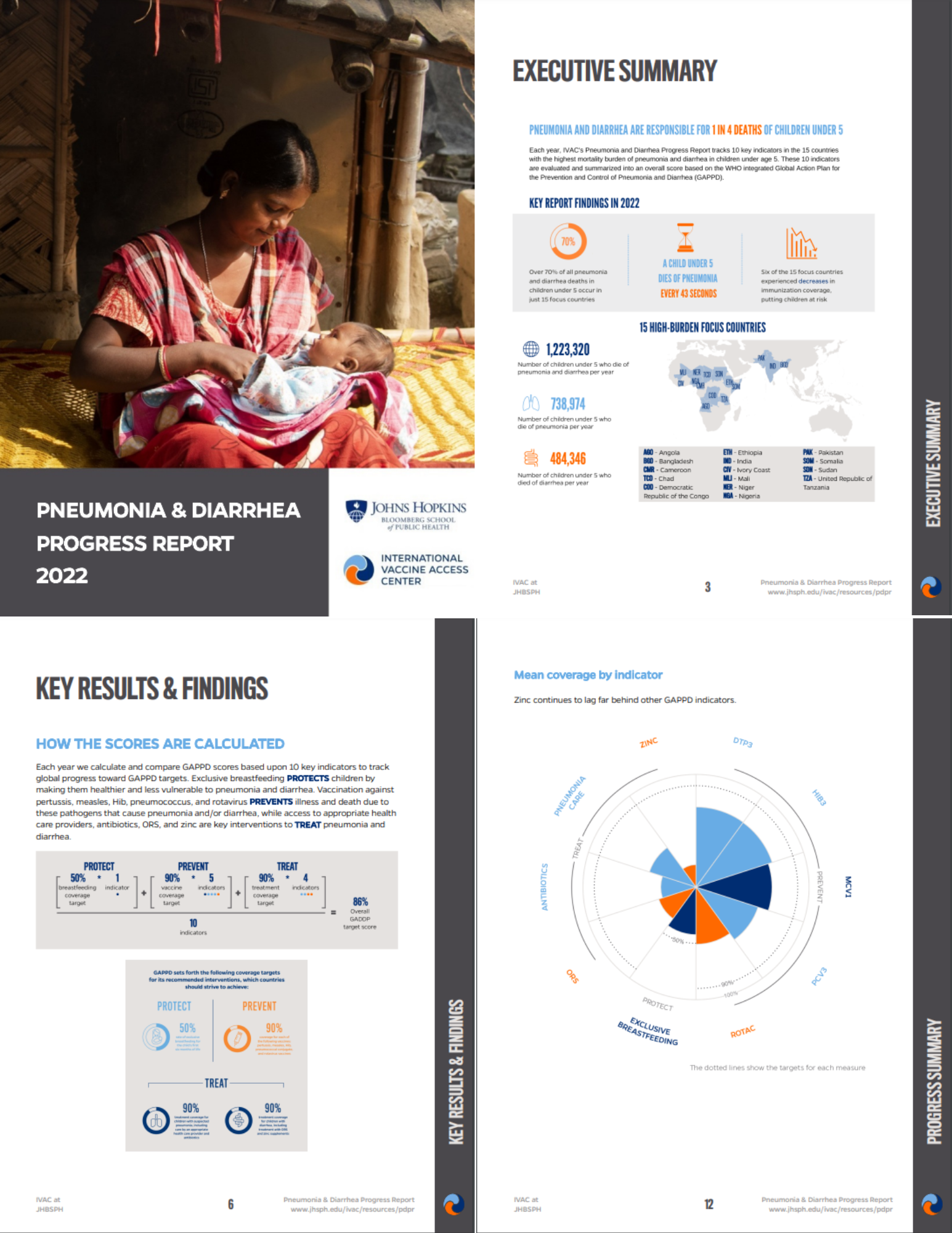
Producing Reports on the Global Impact of Pneumonia and Diarrhea
For the last 15 years, the International Vaccine Access Center (IVAC) at Johns Hopkins University has produced an annual report on the impact of pneumonia and diarrhea around the world. In the past, the major challenge in putting this report together was time. Data would come in close to the deadline to release the report and it was a scramble to get everything ready.
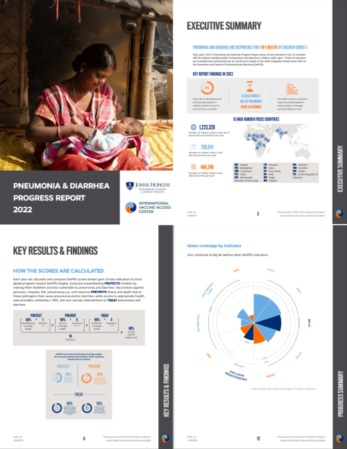

Making 170+ Reports Automatically
In 2020, the Partnership for Strong Communities (PSC) collaborated with Connecticut Data Collaborative (CTData) to update Housing Data Profiles for Connecticut's 169 towns and 7 counties. These reports, crucial for policymakers and developers, needed automation to replace the cumbersome manual process. PSC and CTData enlisted R for the Rest of Us to automate report generation using R. We created a customized report template and implemented parameterized reporting, resulting in visually appealing, easily updated reports that provide essential housing data insights efficiently.
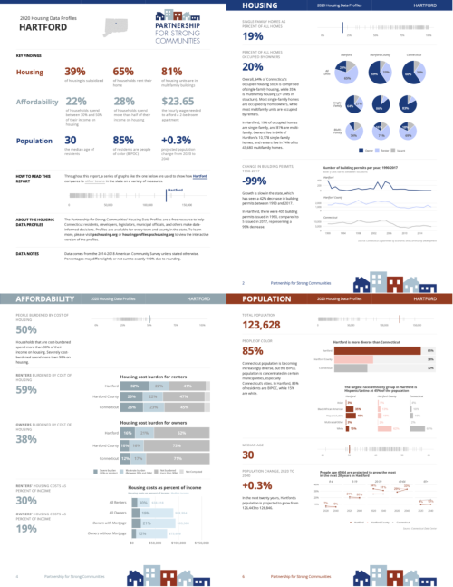
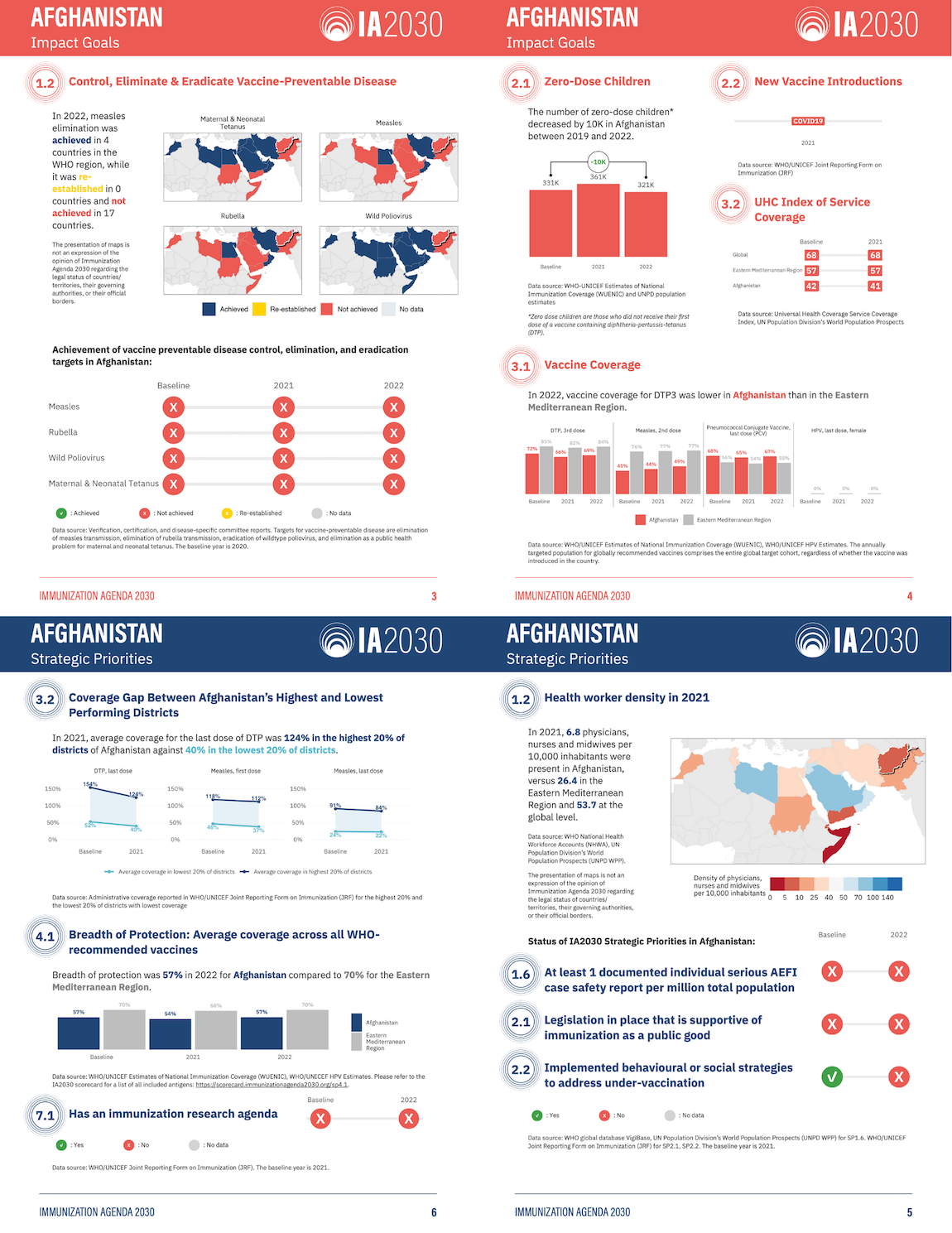
Immunization Agenda 2030 Reports
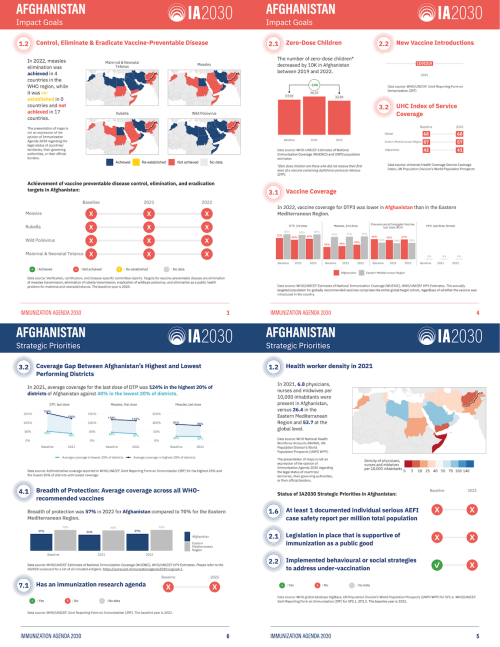
The World Health Organization's Immunization Agenda 2030 (IA2030) aims to improve global vaccine access. To better report progress, the International Vaccine Access Center at Johns Hopkins University partnered with R for the Rest of Us in 2023. They produced 72 user-friendly country-level reports in English and French, using parameterized reporting. These reports highlight individual country progress, use less technical language than previous online scorecards, and are in a printable PDF format for review.
Oregon Farmworker Needs Assessment
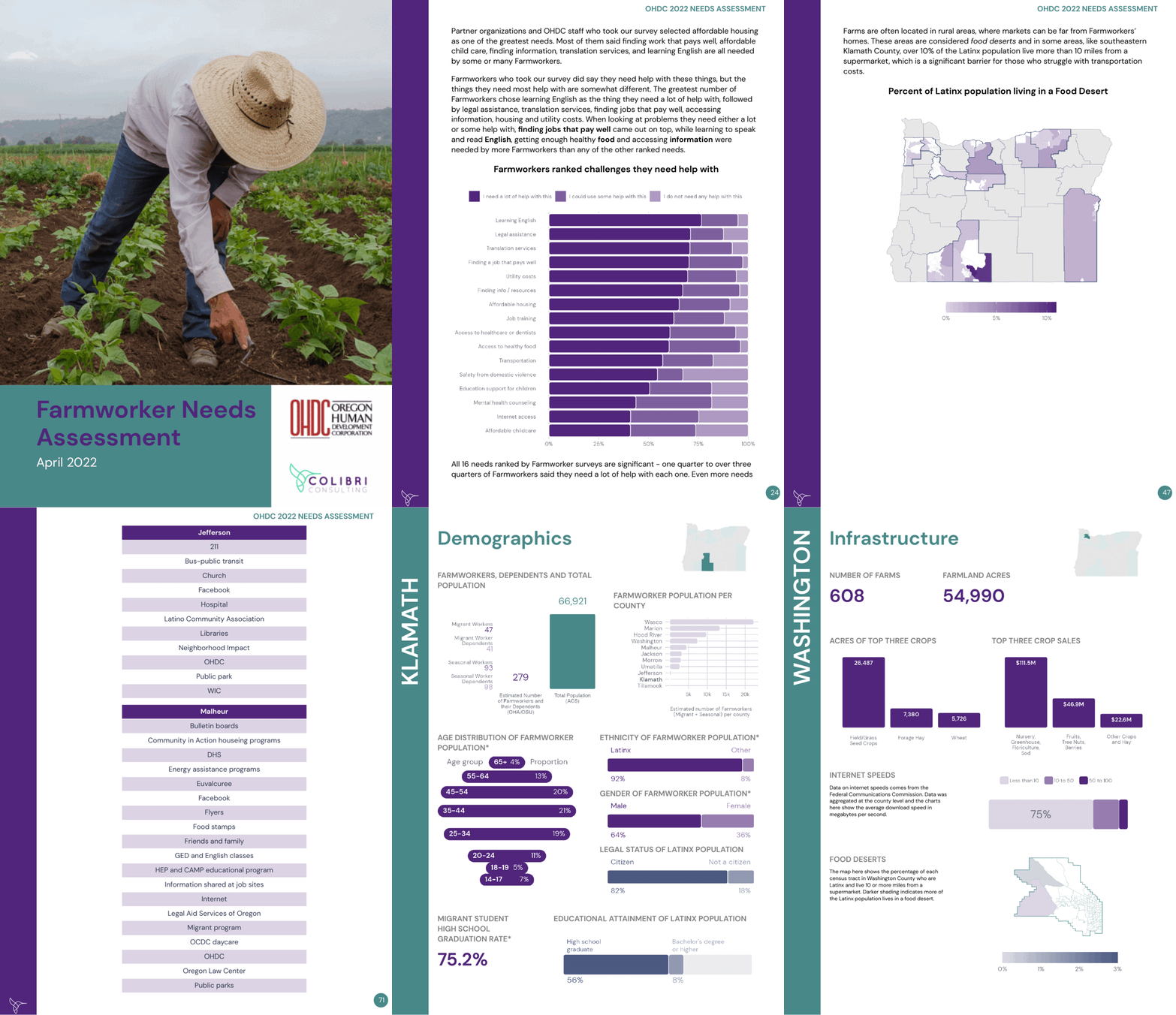
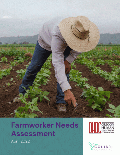
In 2022, the Oregon Human Development Corporation (OHDC) set out to conduct research on the needs of farmworkers across the state. The resulting report would help shed light on issues facing this long-neglected population. R for the Rest of Us partnered with Colibri Consulting and OHDC to put together the 2022 Farmworker Needs Assessment.
Success Stories
Interactive Websites
Interactive Map Development for the San Francisco Asian Pacific Islander Council
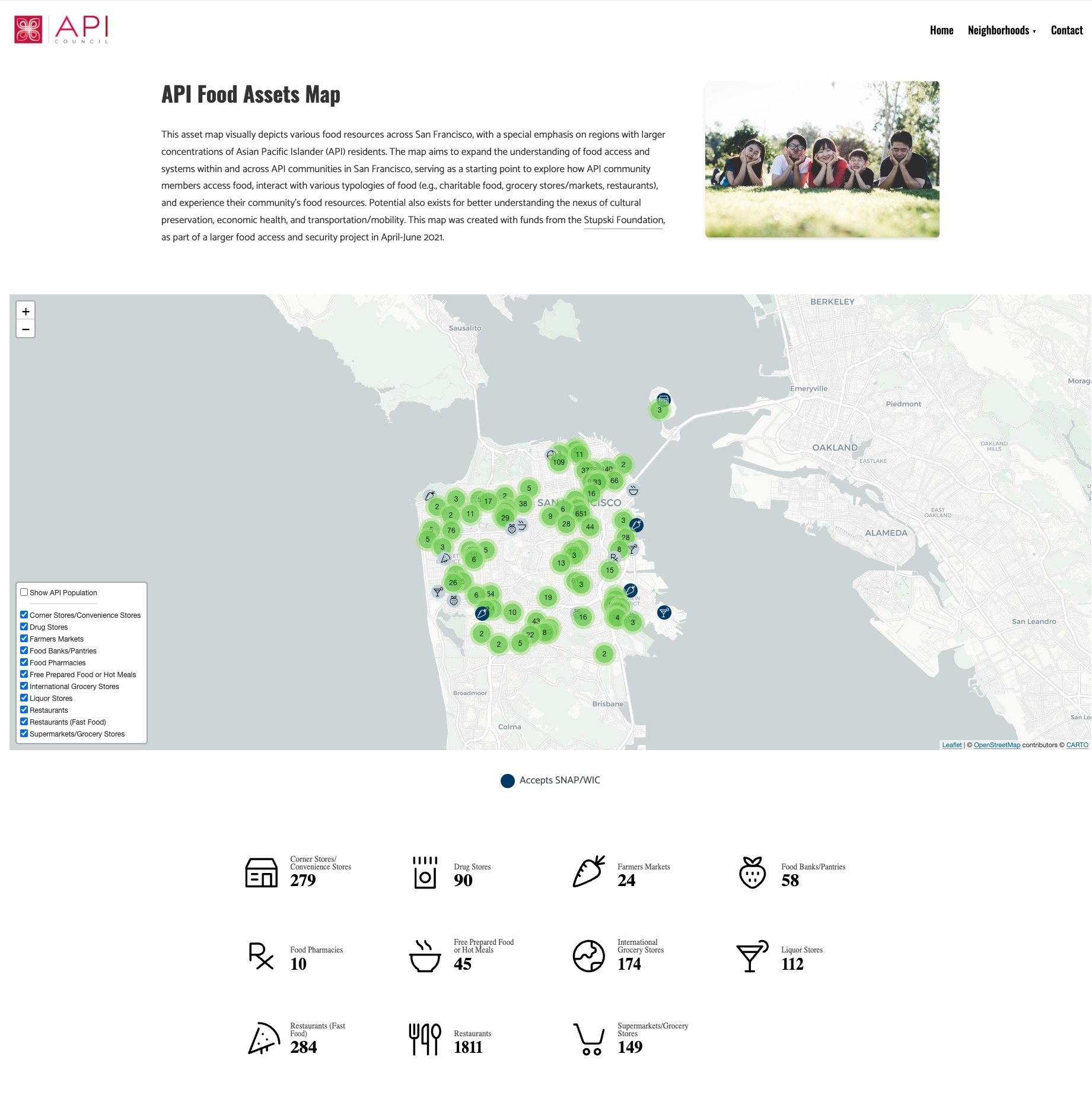
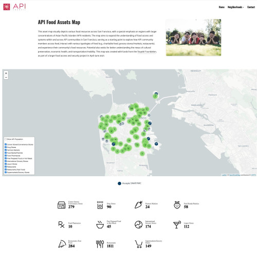
In March 2021, Kathleen Doll from Intention2Impact collaborated with R for the Rest of Us and the Asian Pacific Islander (API) Council to map food resources for San Francisco's API community. Automating data collection with R, we used tidycensus, osmdata, and web scraping tools. We created an interactive website map for the entire city and specific neighborhoods. These maps, matching the API Council’s branding, can be easily updated with new data by re-running the R code.
Success Stories
Custom Packages
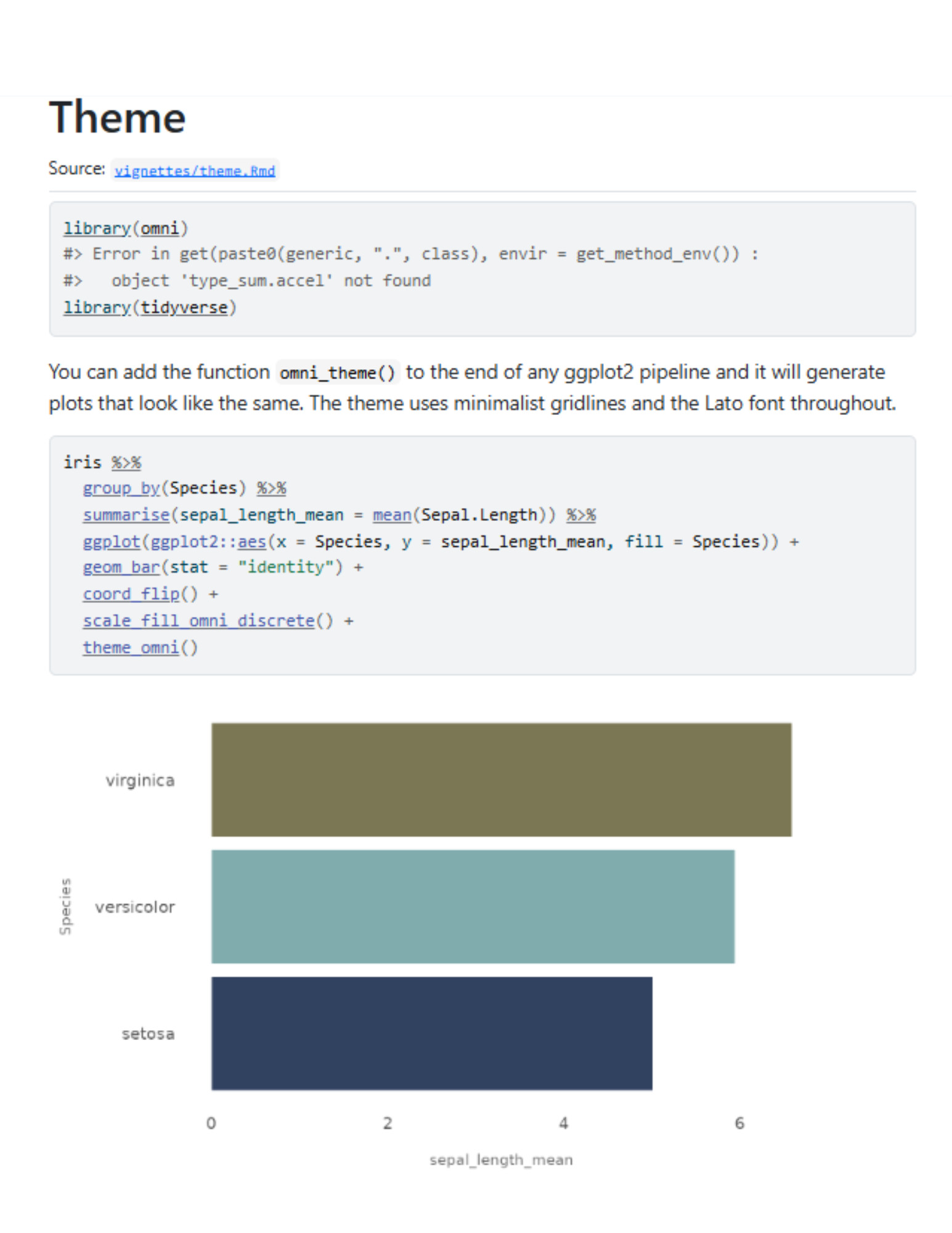
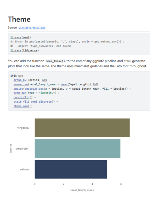
How R Has Streamlined OMNI Institute’s Workflow
Moving to R has helped the OMNI Institute dramatically improve the efficiency of their workflow, including automated data tracking and generating dozens of reports automatically.
Sustain East Africa Custom Package
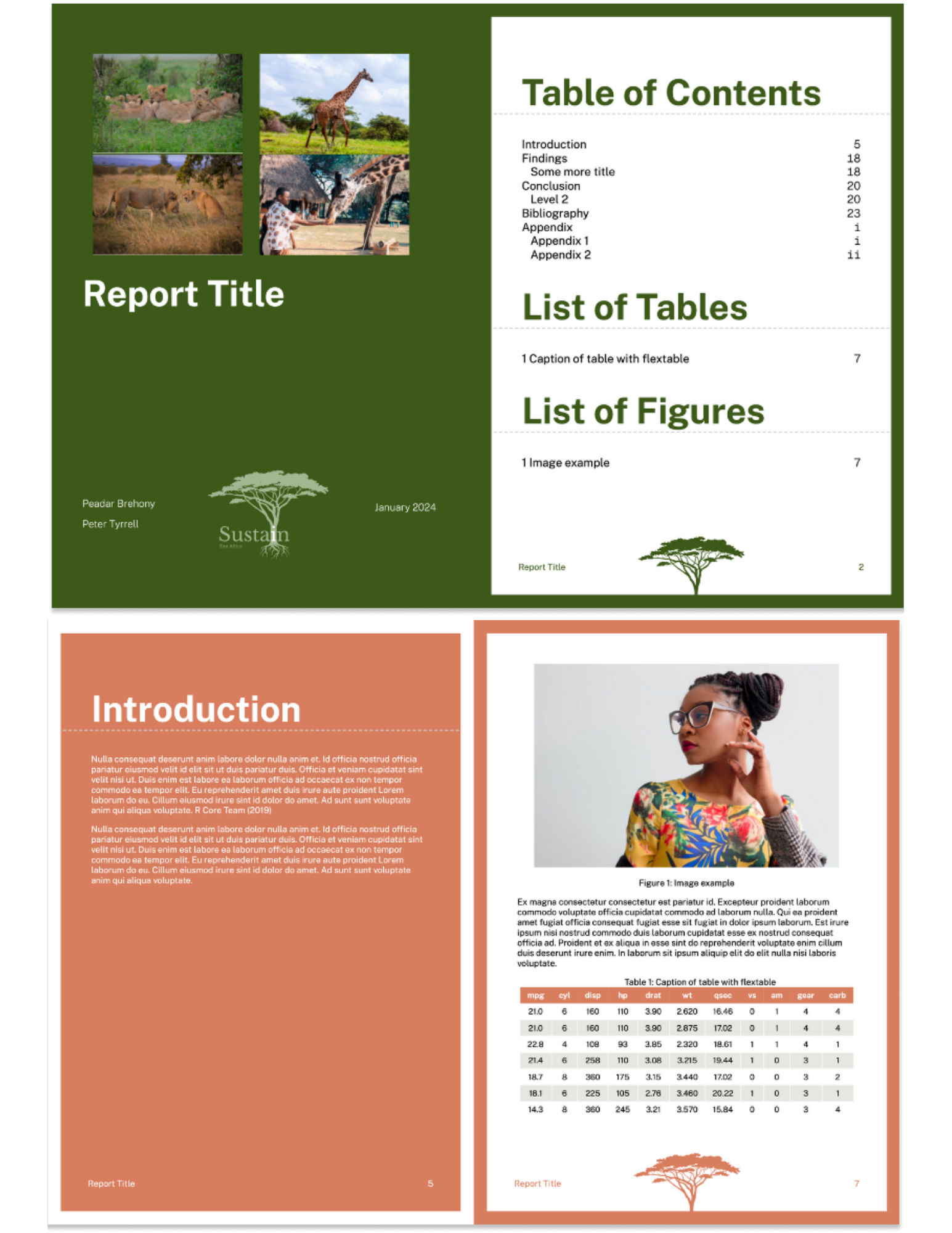
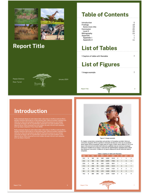
Sustain East Africa (SEA) reached to R for the Rest of Us about developing a custom package to assist in their reporting work. The package we developed has functions to create custom tables, ggplot themes, and a custom R Markdown template, all done with SEA branding. The resulting package enables SEA to more easily and beautifully report on their results.

Our consulting work has a new name: Clarity Data Studio.
Our mission, however, remains the same: helping organizations communicate more effectively and efficiently.