Use shadows in ggplot to highlight findings
In our consulting work, we make a lot of the data visualization for parameterized reporting. It’s something I spoke about in my 2024 Cascadia R Conf talk, How to Make a Thousand Plots Look Good: Data Viz Tips for Parameterized Reporting.
One example I gave in this talk came from our work with the Johns Hopkins International Vaccine Access Center and the World Health Organization. In this project, we made reports for the Immunization Agenda 2030 project, which tracks the progress countries around the world are making toward vaccination goals.
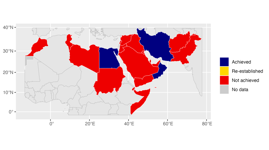
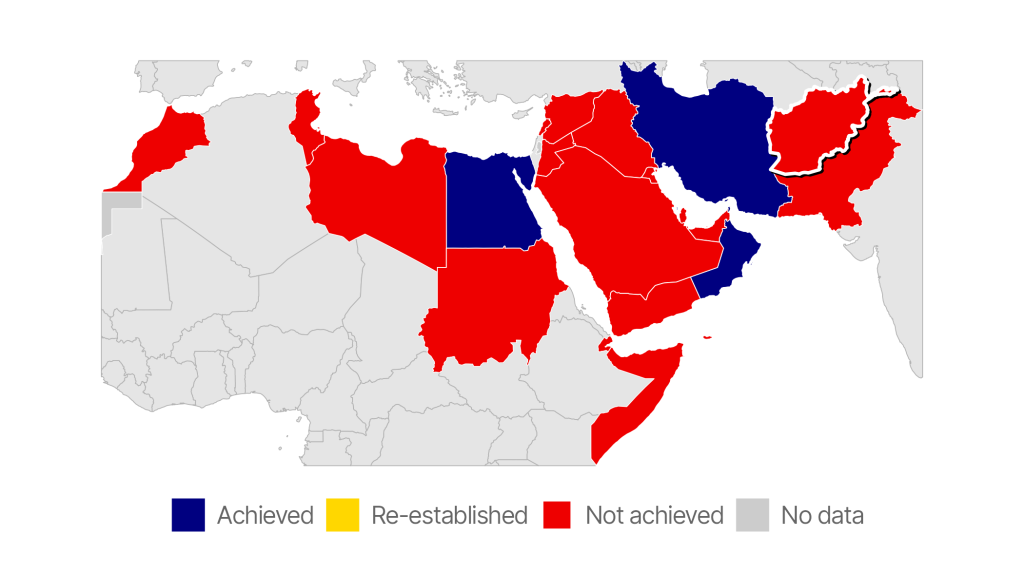
One challenge we face when making parameterized reports like the ones we made for IA2030 is how to ensure that the focus of each report is highlighted. For example, we made this map, which shows the progress Afghanistan has made toward the eradication of rubella.
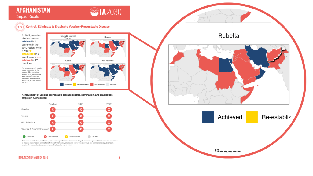
As you can see, we highlight Afghanistan in the map so that it is obvious to reader. We do this highlighting using a less conventional technique that you may not have considered: adding shadows. Using shadows to highlight findings can make a big impact on the quality of your maps and graphs, especially when doing parameterized reporting. Let’s talk about how we do it.
Import Our Data
The first step is to import our data. Let’s begin by loading two packages: {tidyverse} for data wrangling and plotting with ggplot and {sf} for importing our geospatial data.
library(tidyverse)
library(sf)I’ve posted a simplified version of the data we used to make these maps in GeoJSON format. The read_sf() function can import this file, which I save as rubella.
rubella <-
read_sf("https://github.com/rfortherestofus/blog/raw/refs/heads/main/highlight-shadow/rubella.geojson")We can take a look at the data:
rubella
#> Simple feature collection with 69 features and 3 fields
#> Geometry type: MULTIPOLYGON
#> Dimension:     XY
#> Bounding box:  xmin: -1466635 ymin: -185219 xmax: 8649202 ymax: 4806756
#> Projected CRS: WGS 84 / World Mercator
#> # A tibble: 69 × 4
#>    country                  region status                               geometry
#>    <chr>                     <dbl> <chr>                      <MULTIPOLYGON [m]>
#>  1 Afghanistan                   1 Not achieved (((8328599 4443845, 8322613 445…
#>  2 United Arab Emirates          1 Not achieved (((6004988 2752921, 5987241 275…
#>  3 Benin                         0 Not achieved (((392437.9 1287537, 386846.1 1…
#>  4 Burkina Faso                  0 Not achieved (((21538.26 1659358, 26885.45 1…
#>  5 Bahrain                       1 Achieved     (((5634224 2996093, 5633599 296…
#>  6 Central African Republic      0 Not achieved (((2701448 953673.8, 2689646 93…
#>  7 China                         0 Not achieved (((8649200 4202120, 8628076 420…
#>  8 Cameroon                      0 Not achieved (((1719405 819975.1, 1695115 80…
#>  9 Djibouti                      1 Not achieved (((4780514 1224241, 4766042 122…
#> 10 Algeria                       0 Not achieved (((961591.4 4389977, 943599.8 4…
#> # ℹ 59 more rowsAs you can see, it is geospatial , which is why it has the metadata at the top. In addition to the country variable, region indicates whether the country is part of the region we’re focusing on (1 if yes, 0 if no), and status shows each country’s progress toward rubella eradication.
Make the Basic Map
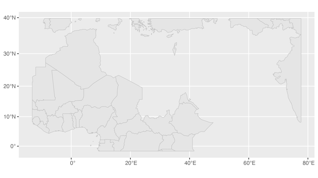
Let’s begin by making a simple map. To do this, I’ll separate the rubella objects into two pieces. First, I’ll make a new object called rubella_region_0 by filtering countries with region 0.
rubella_region_0 <-
  rubella |>
filter(region == 0)If we plot this, we can see that countries with region 0 are those in the surrounding area, but not in the Eastern Mediterranean region, which we are focusing on.
ggplot() +
  geom_sf(
    data = rubella_region_0,
    fill = "grey90",
    color = "grey70",
    linewidth = 0.2
  )
We’ll also create a rubella_region_1 object. However, before doing this, let’s take a look at the data, focusing on the status variable. Droping the geometry data with st_drop_geometry() before filtering our data and then counting status , we see that there are three unique observations in our data: Achieved, No data, and Not achieved.
rubella |>
  st_drop_geometry() |>
  filter(region == 1) |>
  count(status)
#> # A tibble: 3 × 2
#>   status           n
#>   <chr>        <int>
#> 1 Achieved         4
#> 2 No data          2
#> 3 Not achieved 17While countries in the Eastern Mediterranean region only have these statuses, we want to also show the status Re-established on our map legend. To do this, we use the add_row() function to manually add a row with status as Re-established. We then convert status into a factor so that the statuses will show up in the correct order in the legend.
rubella_region_1 <-
  rubella |>
  filter(region == 1) |>
  add_row(status = "Re-established") |>
  mutate(status = fct(
    status,
    levels = c(
      "Achieved",
      "Re-established",
      "Not achieved",
      "No data"
    )
))We can run count() again on the status variable. Now we see that there is a single Re-established observation, sufficient to ensure it will show up in our legend.
rubella_region_1 |>
  st_drop_geometry() |>
  count(status)
#> # A tibble: 4 × 2
#>   status             n
#>   <fct>          <int>
#> 1 Achieved           4
#> 2 Re-established     1
#> 3 Not achieved      17
#> 4 No data 2Let’s make a simple map using rubella_region_1 :
ggplot() +
  geom_sf(
    data = rubella_region_1,
    aes(fill = status),
    linewidth = 0.2,
    color = "white",
    alpha = 1
  )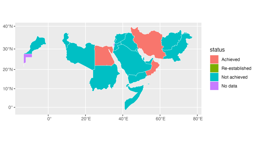
We can see the countries in the Eastern Mediterranean region, with each status in a different color.
Next, let’s combine the two maps we made. Doing this will give us a map that shows both the Eastern Mediterranean countries as well as surrounding countries.
ggplot() +
  geom_sf(
    data = rubella_region_0,
    fill = "grey90",
    color = "grey70",
    linewidth = 0.2
  ) +
  geom_sf(
    data = rubella_region_1,
    aes(fill = status),
    linewidth = 0.2,
    color = "white"
  )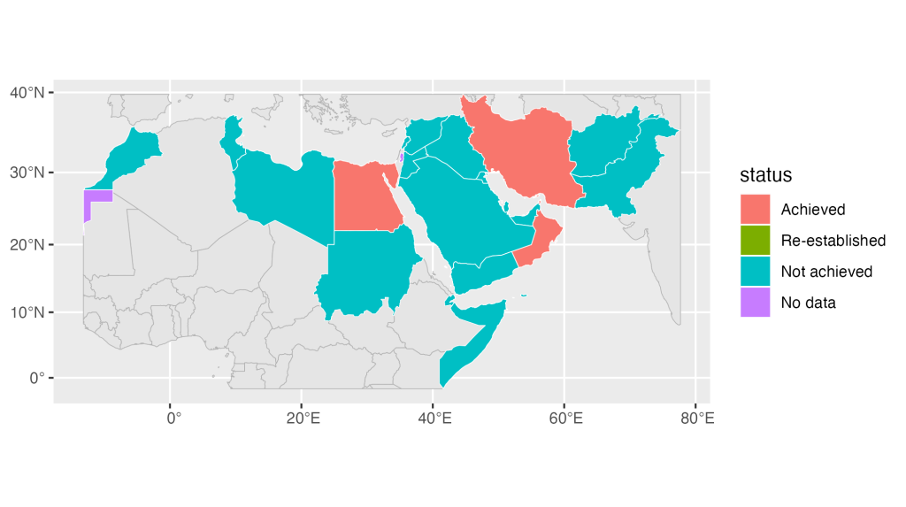
Let’s adjust our colors now. Using scale_fill_manual() we specify the colors we want for each status.
ggplot() +
  geom_sf(
    data = rubella_region_0,
    fill = "grey90",
    color = "grey70",
    linewidth = 0.2
  ) +
  geom_sf(
    data = rubella_region_1,
    aes(fill = status),
    linewidth = 0.2,
    color = "white"
  ) +
  scale_fill_manual(
    name = "",
    values = c(
      "Achieved" = "navy",
      "Re-established" = "gold1",
      "Not achieved" = "red2",
      "No data" = "grey80"
    )
  )
The last step in making our basic map is to adjust the theme. I use theme_void() to remove everything from our map, use the Inter Tight , and make some additional tweaks using the theme() function.
ggplot() +
  geom_sf(
    data = rubella_region_0,
    fill = "grey90",
    color = "grey70",
    linewidth = 0.2
  ) +
  geom_sf(
    data = rubella_region_1,
    aes(fill = status),
    linewidth = 0.2,
    color = "white"
  ) +
  scale_fill_manual(
    name = "",
    values = c(
      "Achieved" = "navy",
      "Re-established" = "gold1",
      "Not achieved" = "red2",
      "No data" = "grey80"
    )
  ) +
  theme_void(base_family = "Inter Tight") +
  theme(
    legend.text = element_text(
      size = 12,
      color = "grey40"
    ),
    plot.margin = margin(rep(20, 4)),
    legend.position = "bottom"
  )
Our plot is looking pretty decent at this point!
Turn Our Basic Map into a Function
Before adding shadows for highlighting, I’m going to turn the code I’ve created to make a basic map into a function. It’s as simple as wrapping the code above in a function called region_map() :
region_map <- function() {
  ggplot() +
    geom_sf(
      data = rubella_region_0,
      fill = "grey90",
      color = "grey70",
      linewidth = 0.2
    ) +
    geom_sf(
      data = rubella_region_1,
      aes(fill = status),
      linewidth = 0.2,
      color = "white"
    ) +
    scale_fill_manual(
      name = "",
      values = c(
        "Achieved" = "navy",
        "Re-established" = "gold1",
        "Not achieved" = "red2",
        "No data" = "grey80"
      )
    ) +
    theme_void(base_family = "Inter Tight") +
    theme(
      legend.text = element_text(
        size = 12,
        color = "grey40"
      ),
      plot.margin = margin(rep(20, 4)),
      legend.position = "bottom"
    )
}Now, I simply run region_map() and I get my basic map.
region_map()
Add Shadow to Highlight
Now that we’ve got a function to make a basic map, we can add a shadow behind any country in order to highlight it. To do this, we first load the {ggfx} package .
library(ggfx)This package has a number of functions to tweak your plots. I’m going to use the with_shadow() function. This function, which you wrap around any geom, will add a shadow. Here you can see that I’m wrapping it around geom_sf() , which I’m using to plot Afghanistan on the map. The arguments in with_shadow() adjust the appearance of the shadow: x_offset and y_offset determine how far the shadow will be from the geom while sigma determines the level of blurring. With options set for each argument, we can now see a shadow added to Afghanistan.
region_map() +
  with_shadow(
    geom_sf(
      data = rubella |> filter(country == "Afghanistan"),
      aes(fill = status),
    ),
    sigma = 0,
    x_offset = 4,
    y_offset = 4
  )
When we use shadows to highlight, we don’t typically just add shadows. One additional thing we often do is add an outline. Using the lines linewidth = 0.8 and color = "white we create a white outline around Afghanistan, which makes it even easier to pick out.
region_map() +
  with_shadow(
    geom_sf(
      data = rubella |> filter(country == "Afghanistan"),
      aes(fill = status),
      linewidth = 0.8,
      color = "white"
    ),
    sigma = 0,
    x_offset = 4,
    y_offset = 4
  )
Afghanistan is more and more obvious, but there’s one more thing we can do: adjust the opacity of the background map to make the highlight country pop even more. We do this by adding an argument to our region_map() function. The opacity_level argument applies to the geom made with rubella_region_1 .
region_map <- function(opacity_level = 1) {
  ggplot() +
    geom_sf(
      data = rubella_region_0,
      fill = "grey90",
      color = "grey70",
      linewidth = 0.2
    ) +
    geom_sf(
      data = rubella_region_1,
      aes(fill = status),
      linewidth = 0.2,
      color = "white",
      alpha = opacity_level
    ) +
    scale_fill_manual(
      name = "",
      values = c(
        "Achieved" = "navy",
        "Re-established" = "gold1",
        "Not achieved" = "red2",
        "No data" = "grey80"
      )
    ) +
    theme_void(base_family = "Inter Tight") +
    theme(
      legend.text = element_text(
        size = 12,
        color = "grey40"
      ),
      plot.margin = margin(rep(20, 4)),
      legend.position = "bottom"
    )
}To show you what this looks like, let’s run this code:
region_map(opacity_level = 0.25)
As you can see, the countries in the Eastern Mediterranean region are faded. Now, 25% opacity, as I did above, is probably a bit too much. Instead, let’s set our opacity to 75% (0.75) and see how it looks with Afghanistan added.
region_map(opacity_level = 0.75) +
  with_shadow(
    geom_sf(
      data = rubella |> filter(country == "Afghanistan"),
      aes(fill = status),
      linewidth = 0.8,
      color = "white"
    ),
    sigma = 0,
    x_offset = 4,
    y_offset = 4
  )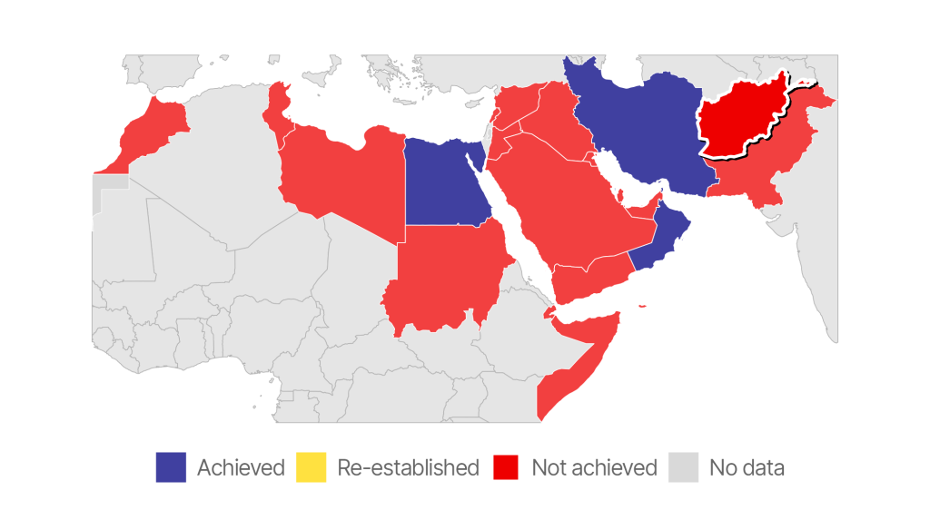
Looks great! For someone just flipping through the Afghanistan report, they’ll be able to easily pick out Afghanistan, which is exactly what we want.
In this blog post, I’ve given an example of using the with_shadow() function to highlight a country on a map, but it can work with any geom. Try it next time you want to highlight a bar, line, or anything else you might create with ggplot!
Sign up for the newsletter
Get blog posts like this delivered straight to your inbox.

You need to be signed-in to comment on this post. Login.