Create your own custom {ggplot2} theme
Creating custom themes in {ggplot2} lets you elevate your data visualizations from standard to standout.
Whether you’re aiming for a polished, brand-consistent look for your organization or a unique aesthetic that reflects your personal style, a custom theme function makes it easy to apply your design to all figures with a single line of code.
In this tutorial, we’ll cover:
the essentials of the powerful
ggplot2::theme()function, including how to adjust fonts, colors, sizing, and spacing;how to wrap your custom theme into a reusable function for any figure;
and how to add arguments to your function for further customization on specific plots.
Today’s inspiration: New York Times
To demonstrate the creation of a custom theme function, let’s create a custom function based on how the New York Times styles their plots.
Taking a look at this sample New York Times (NYT) plot on ocean water temperatures in the Atlantic's hurricane alley, we can figure out the font, color, and sizing elements to include in our custom theme:
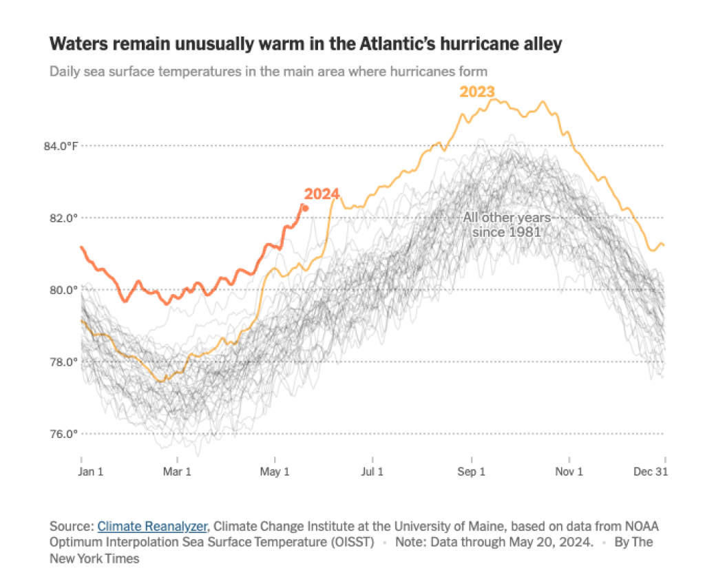
First, we can see that the New York Times uses the Franklin Gothic for their plots. This is a paid font so instead I will use Libre Franklin, which can be downloaded for free from Google. Make sure to install the font on your system before proceeding. For more information on using custom fonts in R, see this free lesson from Going Deeper with R.
From there, we can see that NYT plots use the following elements:
Title: bold, largest, left-aligned to plot, darkest text
Subtitle: regular face, medium sized, left-aligned to plot, light gray text
Caption: regular face, smallest sized, left-aligned to plot, dark gray text
Axis text: regular face, medium sized, dark gray text
Axis lines: major grid lines only for y-axis that are dashed, light gray
Spacing: plenty of breathing room with margins around each element
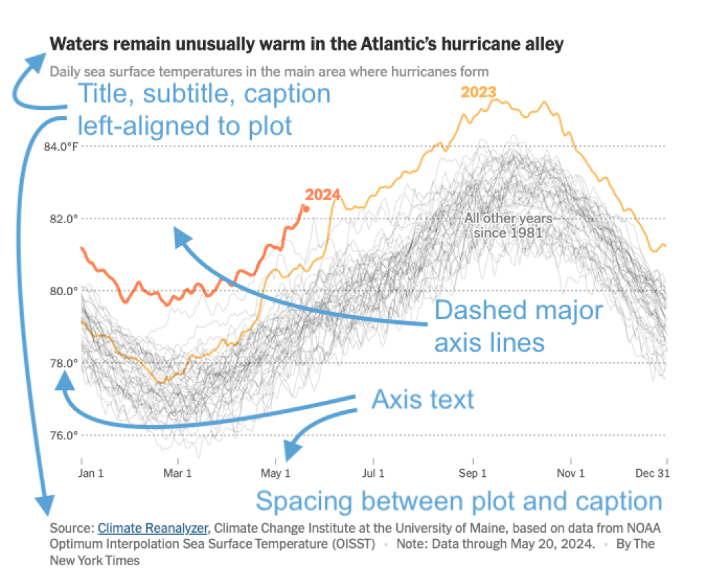
NYT figures generally rely on annotations instead of legends. Though this is beyond the scope of this blog post, you can find a couple other R for the Rest of Us posts to help you:
If you’re creating a custom theme for your organization’s branding, ask your design or marketing team if they have a style guide you can follow, rather than inspecting existing figures!
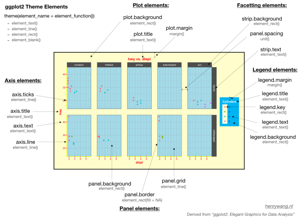
Match the style elements with theme() arguments
Now that we’ve identified some font, color, and sizing elements to include in our custom theme, we now need to figure out which theme() arguments they correspond with.
To see all the available arguments (there are almost 100 of them!), you can look at the theme() documentation by running ?theme or by skimming the {ggplot2} reference webpage.
```{r}
#| include: false
library(ggplot2)
?theme
```These arguments offer fine-tuned customization of the look and feel of your plots and can be grouped in these main categories:
Text elements:
plot.title,axis.title,axis.text,legend.title, etc., control font size, style, color, and alignment withelement_text().Line elements:
axis.lineandpanel.gridadjust line color, size, and type withelement_line().Rectangular elements:
panel.background,plot.background,legend.backgroundaffect color and border of background areas withelement_rect().
You definitely don’t need to memorize all of these arguments, but it is worth it to learn where to find the descriptions so you can reference them as needed. Henry Wang’s blog post also has a great figure to help you remember what is what!
Create an example plot
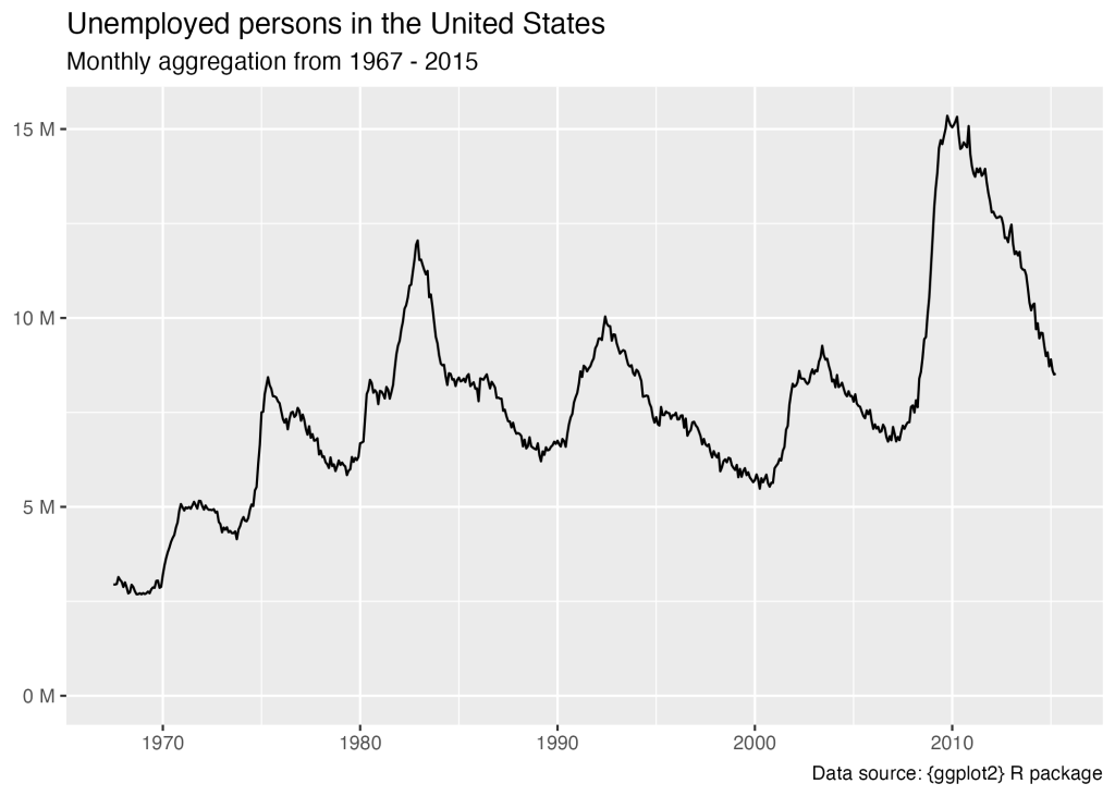
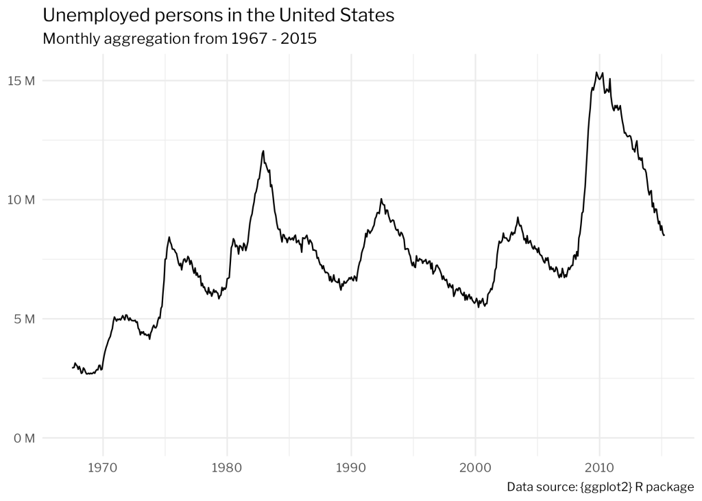
First, let’s create a basic plot with the default { ggplot2 } theme and the built-in economics dataset.
default_plot <- ggplot(economics, aes(date, unemploy)) +
  geom_line() +
  labs(
    title = "Unemployed persons in the United States",
    subtitle = "Monthly aggregation from 1967 - 2015",
    caption = "Data source: {ggplot2} R package",
    x = NULL,
    y = NULL
  ) +
  # Unemployment level is number of unemployed in thousands.
  # This declutters the figure by presenting the number of
  # unemployed in millions
  scale_y_continuous(
    labels = scales::label_number(
      scale = 0.001,
      suffix = " M"
    ),
    limits = c(0, max(economics$unemploy))
)Here is our plot.
Pick a built-in theme as a base
The easiest way to start customizing a theme is to pick one of the built-in complete {ggplot2}
themes that most closely matches the style you’re going for.
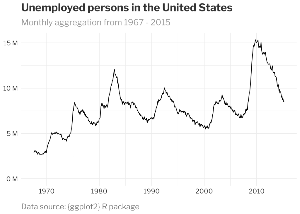
We’ll use theme_minimal() and modify its base_family to change the font family throughout all text elements in the plot.
nyt_plot <- default_plot +
  theme_minimal(
    base_family = "Libre Franklin"
)Taking a look at nyt_plot , we can see these changes.
Note, we could have set the base font family in the theme() function. But that would require a lot more copying and pasting of the family through multiple arguments, as we’ll see in the next section.
Customize text elements
Next, let’s set the size, face, color, and spacing options of the text elements in the theme() function that is called after we set the the theme_minimal() . Remember, this { ggplot2} follows the Grammar of Graphics, so each customization is layered on top of the last.
We recommend having the theme() and element_text() reference documentation on hand to help remember which arguments to use.
plot.title, plot.subtitle , plot.caption , and axis.text are all text elements, which can be customized using dozen or so arguments within the element_text() function:
size: text size in ptsface: font face (“plain”, “italic”, “bold”, “bold.italic”)color: color of the text, usually named (“red”) or hex color codesmargin: uses themargin()function with argumentst,r,b,lfor specifying top, right, bottom, or lefthjust: horizontal justification between 0 and 1. Left-justified is 0, center is 0.5, and right-justified is 1.
Below, you can see how we use these arguments to customize various elements of our theme.
nyt_plot <- nyt_plot +
  theme(
    plot.title = element_text(
      size = 18,
      face = "bold",
      color = "#333333", # dark gray
      margin = margin(b = 10)
    ),
    plot.subtitle = element_text(
      size = 14,
      color = "#999999", # medium gray
      margin = margin(b = 10)
    ),
    plot.caption = element_text(
      size = 13,
      color = "#777777", # light gray
      margin = margin(t = 15),
      hjust = 0
    ),
    axis.text = element_text(
      size = 11,
      color = "#333333" # dark gray
    )
)We can now view our plot with the updated in-progress theme.
Currently, the title, subtitle, and caption are aligned to the plot panel (default of plot.title.position = "panel" ). But we want them aligned to the entire plot so we’ll change the position to "plot" .
nyt_plot <- nyt_plot +
  theme(
    plot.title.position = "plot",
    plot.caption.position = "plot"
)Again, we can see our in-progress plot.
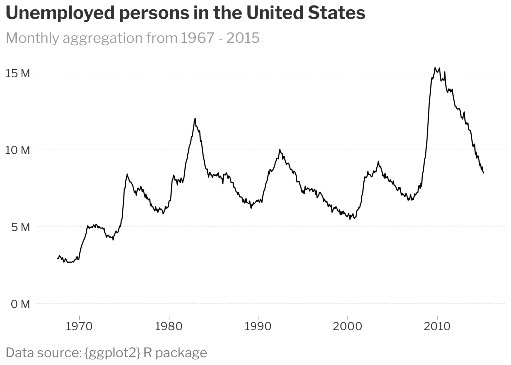
Customize line elements
Grid lines and axes are controlled with element_line() .
Notice there is a hierarchy within the theme elements:
panel.grid.majorpanel.grid.major.x, which inherits attributes frompanel.grid.major
By setting panel.grid.major.x equal to element_blank() , we overwrite the attributes of panel.grid.major and instead make the major x grid lines blank.
Within element_blank() , we control the line type, line width, and color. Running ?element_line will show you several other arguments you can use to further customize lines.
Sometimes there are arguments within theme() that cannot be controlled by a higher element. For example, there is no argument within element_line() to control the length of the x-axis ticks. Therefore, we need the axis.ticks.length.x argument.
nyt_plot <- nyt_plot +
  theme(
    panel.grid.minor = element_blank(),
    panel.grid.major = element_line(
      linetype = "dashed",
      linewidth = 0.15,
      color = "#999999"
    ),
    panel.grid.major.x = element_blank(),
    axis.ticks.x = element_line(
      linetype = "solid",
      linewidth = 0.25,
      color = "#999999"
    ),
    axis.ticks.length.x = unit(4, units = "pt")
)The plot with tweaks to the gridlines and ticks can be seen below.

We went from the boring {ggplot2} default theme to this much more polished, professional figure that looks like it could be from the New York Times! While it took many lines of code, we can now create a custom function so we can easily apply it to other plots with only one line of code!
Wrap it in a function
To make our custom theme function, we simply paste our previous theme code within the curly braces of our new function called theme_nyt() .
As you can see, there are so many lines of code, it may help your future self to separate text elements from line elements as you add more and more arguments to the theme() function inside your custom function.
theme_nyt <- function() {
  # Set base theme and font family =============================================
  theme_minimal(
    base_family = "Libre Franklin"
  ) +
    # Overwrite base theme defaults ============================================
    theme(
      # Text elements ==========================================================
      plot.title = element_text(
        size = 18,
        face = "bold",
        color = "#333333",
        margin = margin(b = 10)
      ),
      plot.subtitle = element_text(
        size = 14,
        color = "#999999",
        margin = margin(b = 10)
      ),
      plot.caption = element_text(
        size = 13,
        color = "#777777",
        margin = margin(t = 15),
        hjust = 0
      ),
      axis.text = element_text(
        size = 11,
        color = "#333333"
      ),
      plot.title.position = "plot",
      plot.caption.position = "plot",
      # Line elements ==========================================================
      panel.grid.minor = element_blank(),
      panel.grid.major = element_line(
        linetype = "dashed",
        linewidth = 0.15,
        color = "#999999"
      ),
      panel.grid.major.x = element_blank(),
      axis.ticks.x = element_line(
        linetype = "solid",
        linewidth = 0.25,
        color = "#999999"
      ),
      axis.ticks.length.x = unit(4, units = "pt")
    )
}Let’s test if we get the same figure using our new custom function instead of calling the theme() function with many arguments.
default_plot +
theme_nyt()The resulting plot matches exactly!
While we created theme_nyt() specifically for a time-series plot that only needs y-axis grid lines, we likely would need both x-axis and y-axis grid lines for a different plot type such as a scatter plot.
Add arguments to your custom theme function
We’ll add two new arguments to our theme_nyt() function: gridline_x and gridline_y which we will set default to TRUE to make it clear to the user that it should be logical.
theme_nyt <- function(gridline_x = TRUE, gridline_y = TRUE) {

}Set gridline_x and gridline_y to if else statements that if evaluated to TRUE , will evaluate to a variable defined within our function that is set to the element_line() function with our desired attributes for grid lines. If gridline_x or gridline_y evaluate to FALSE , they will be set to element_blank() and will not appear in the plot.
theme_nyt <- function(gridline_x = TRUE, gridline_y = TRUE) {
  gridline <- element_line(
    linetype = "dashed",
    linewidth = 0.15,
    color = "#999999"
  )

  gridline_x <- if (isTRUE(gridline_x)) {
    gridline
  } else {
    element_blank()
  }

  gridline_y <- if (isTRUE(gridline_y)) {
    gridline
  } else {
    element_blank()
  }
  ...
}The last step is to set panel.grid.major.x and panel.grid.major.y to our new variables gridline_x and gridline_y , respectively, within the theme() function of our custom theme_nyt() function.
theme_nyt <- function(gridline_x = TRUE, gridline_y = TRUE) {
  ...
  # Overwrite base theme defaults ==============================================
  theme(
    panel.grid.major.x = gridline_x,
    panel.grid.major.y = gridline_y,
    ...
  )
}Now let’s see it all together in the updated function with the grid line arguments.
theme_nyt <- function(gridline_x = TRUE, gridline_y = TRUE) {
  gridline <- element_line(
    linetype = "dashed",
    linewidth = 0.15,
    color = "#999999"
  )

  gridline_x <- if (isTRUE(gridline_x)) {
    gridline
  } else {
    element_blank()
  }

  gridline_y <- if (isTRUE(gridline_y)) {
    gridline
  } else {
    element_blank()
  }

  # Set base theme and font family =============================================
  theme_minimal(
    base_family = "Libre Franklin"
  ) +
    # Overwrite base theme defaults ============================================
    theme(
      # Text elements ==========================================================
      plot.title = element_text(
        size = 18,
        face = "bold",
        color = "#333333",
        margin = margin(b = 10)
      ),
      plot.subtitle = element_text(
        size = 14,
        color = "#999999",
        margin = margin(b = 10)
      ),
      plot.caption = element_text(
        size = 13,
        color = "#777777",
        margin = margin(t = 15),
        hjust = 0
      ),
      axis.text = element_text(
        size = 11,
        color = "#333333"
      ),
      plot.title.position = "plot",
      plot.caption.position = "plot",
      # Line elements ==========================================================
      panel.grid.minor = element_blank(),
      panel.grid.major.x = gridline_x,
      panel.grid.major.y = gridline_y,
      axis.ticks.x = element_line(
        linetype = "solid",
        linewidth = 0.25,
        color = "#999999"
      ),
      axis.ticks.length.x = unit(4, units = "pt")
    )
}We’ll test it out on the same unemployment plot we’ve been working with to make sure it looks as expected.
default_plot +
theme_nyt(gridline_x = FALSE, gridline_y = TRUE)And it does! Yay!

Our last test will be applying it to a different type of plot that should show grid lines for the x-axis and y-axis. First, we’ll create a scatterplot.
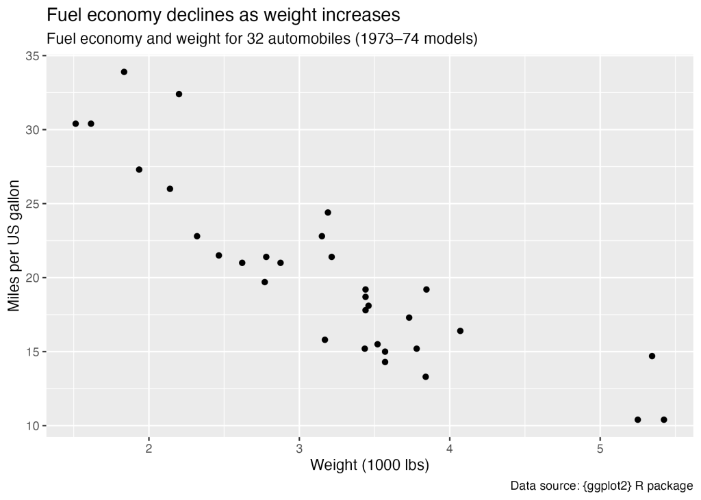
mtcars_plot <- ggplot(mtcars, aes(wt, mpg)) +
  geom_point() +
  labs(
    title = "Fuel economy declines as weight increases",
    subtitle = "Fuel economy and weight for 32 automobiles (1973–74 models)",
    caption = "Data source: {ggplot2} R package",
    x = "Weight (1000 lbs)",
    y = "Miles per US gallon"
)Here’s what the plot looks like:
Next, we can apply the them to our plot, setting gridline_x and gridline_y to TRUE .
mtcars_plot <- mtcars_plot +
theme_nyt(gridline_x = TRUE, gridline_y = TRUE)And here is the resulting plot:
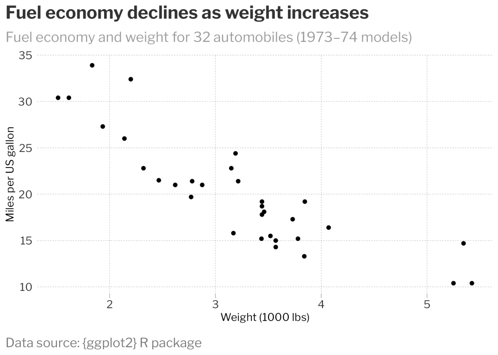
Awesome! We now have a scatter plot that looks like it could have come from the New York Times with both x-axis and y-axis grid lines!
You can follow this process to add more flexibility to your custom theme function, whether you want to allow your users to pick the base font family, grid line colors, legend placement, or any number of the other dozens of customizable elements.
Conclusion
Hooray! We’ve walked through where to find all the documentation for the very powerful theme() , element_text() , and element_line() functions that give {ggplot2} its flexibility in creating the visuals that match your style. Hopefully, you can follow this guide to design your own custom theme and apply it to many types of plots.
For other examples and inspiration, check out this article by BBC Visual and Data Journalism (there is also a chapter in R for the Rest of Us: A Statistics-Free Introduction about the creation of the BBC's custom ggplot theme). There are also packages with custom themes in them, such as the {ggthemes} package that compiles other pre-built themes to replicate the styles of other media outlets, including FiveThirtyEight, The Economist, and others.
Sign up for the newsletter
Get blog posts like this delivered straight to your inbox.

You need to be signed-in to comment on this post. Login.