Getting Started with {geomtextpath}
Have you ever created a great line graph only to feel frustrated that it requires a messy, hard to read legend? What if you could label the lines directly? Even the curvy ones? And have the text follow the curvature of the lines!

With the {geomtextpath} package, you can annotate your ggplot2 visualizations with clean labels and customized text annotations that can follow the shapes in your data, and it’s so much easier to get started than you’d imagine.
The Basics
First, let’s load our packages and pull our data. We’ll be using a subset of the vehicles data from the {fueleconomy} package.
library(tidyverse)
library(geomtextpath)

vehicles <- fueleconomy::vehicles

avg_hwy <- vehicles |>
  filter(year %in% c(1985:1990),
         drive %in% c("Rear-Wheel Drive", "4-Wheel or All-Wheel Drive")) |>
  group_by(year, drive) |>
summarise(mean_hwy = mean(hwy))We’ll start by recreating the graph above using {ggplot2} , but without the labels.
avg_hwy |>
  ggplot(aes(x = year,
           y = mean_hwy,
           color = drive)) +
  geom_line(linewidth = 0.75) +
  labs(title = "Average Highway Gas Mileage",
       x = NULL,
       y = NULL,
       color = "Year") +
  lims( y = c(18, 22)) +
  theme_minimal(base_size = 16)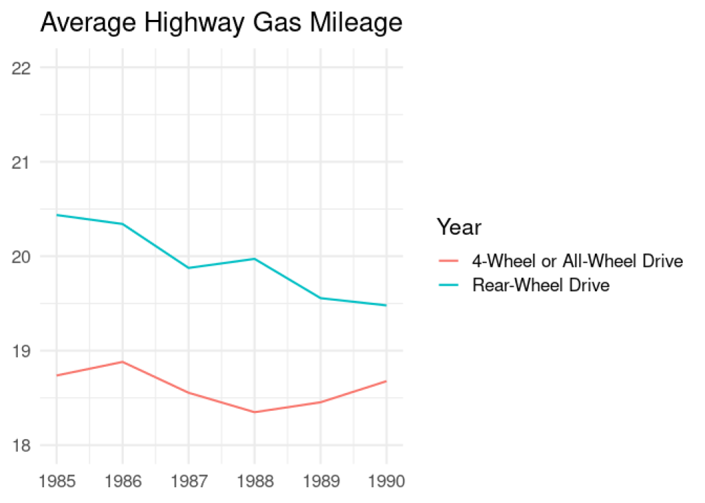
The legend on this plot takes up nearly half the space! Sure, we could move the legend inside the plot, but that would still look cluttered. Instead, by replacing geom_line() with geom_textline() from the {geomtextpath} package, we will get the same line, but with a label floating inside it. And with that handy label added, we can remove the legend.
avg_hwy |>
  ggplot(aes(x = year,
             y = mean_hwy,
             color = drive,
             label = drive)) +
  geom_textline(linewidth = 0.75) +
  labs(title = "Average Highway Gas Mileage",
       x = NULL,
       y = NULL) +
  lims( y = c(18, 22)) +
  theme_minimal(base_size = 16) +
  theme(legend.position = "none")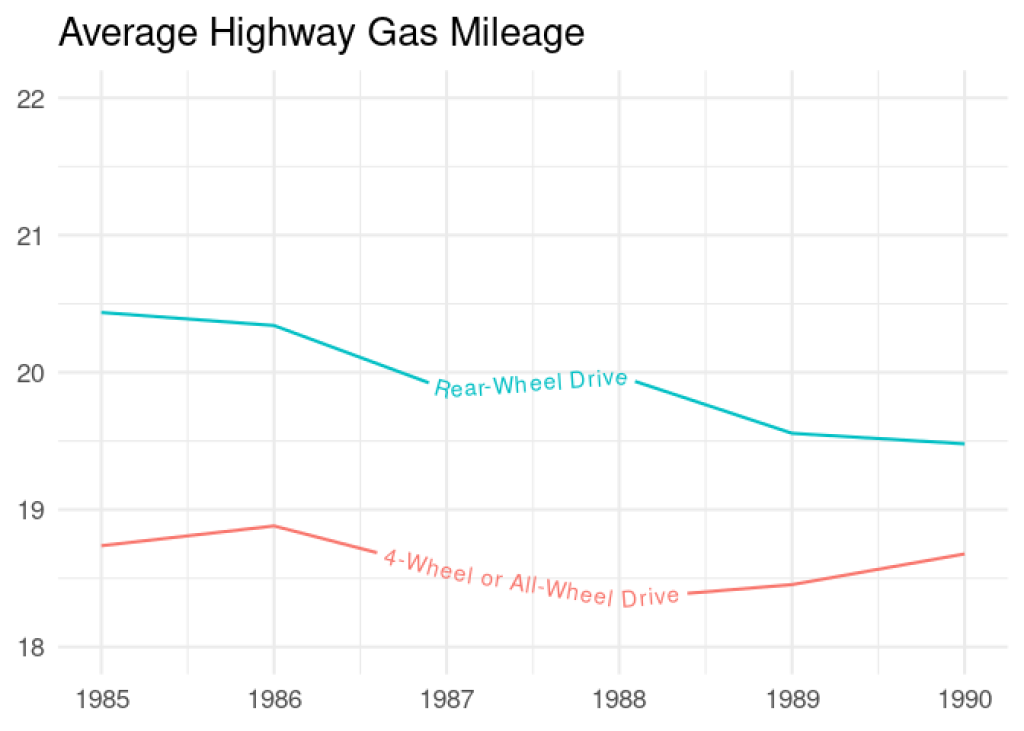
That’s cleaner already! Here’s what we did:
added the
labelargument in our plot’saes()call sogeom_textline()knows what to use as a label valuechanged
geom_line()togeom_textline()removed the legend
You’ll notice that the same linewidth = 0.75 argument we used inside geom_line() works inside geom_textline() as well. That’s because geom_textline() shares some aesthetics with both geom_line() and geom_text() from {ggplot2} .
Now, let’s make a few more adjustments in order to:
move our text up to float just above our lines by adding an argument for
vjustincrease the font size to 5 using
size, which has a default value of 3.88
increase the font size to 5 using size , which has a default value of 3.88
avg_hwy |>
  ggplot(aes(x = year,
             y = mean_hwy,
             color = drive,
             label = drive)) +
  geom_textline(linewidth = 0.75,
                vjust = -0.25,
                size = 5) +
  labs(title = "Average Highway Gas Mileage",
       x = NULL,
       y = NULL) +
  lims( y = c(18, 22)) +
  theme_minimal(base_size = 16) +
  theme(legend.position = "none")
This is looking pretty good, but the text could look better if we smoothed it out a bit. We can use the text_smoothing argument, which accepts values between 0 and 100. Let’s see what a couple of different values look like.
avg_hwy |>
  ggplot(aes(x = year,
             y = mean_hwy,
             color = drive,
             label = drive)) +
  geom_textline(linewidth = 0.75,
                vjust = -0.25,
                size = 5,
                text_smoothing = 75) +
  labs(title = "Average Highway Gas Mileage",
       x = NULL,
       y = NULL) +
  lims( y = c(18, 22)) +
  theme_minimal(base_size = 16) +
  theme(legend.position = "none")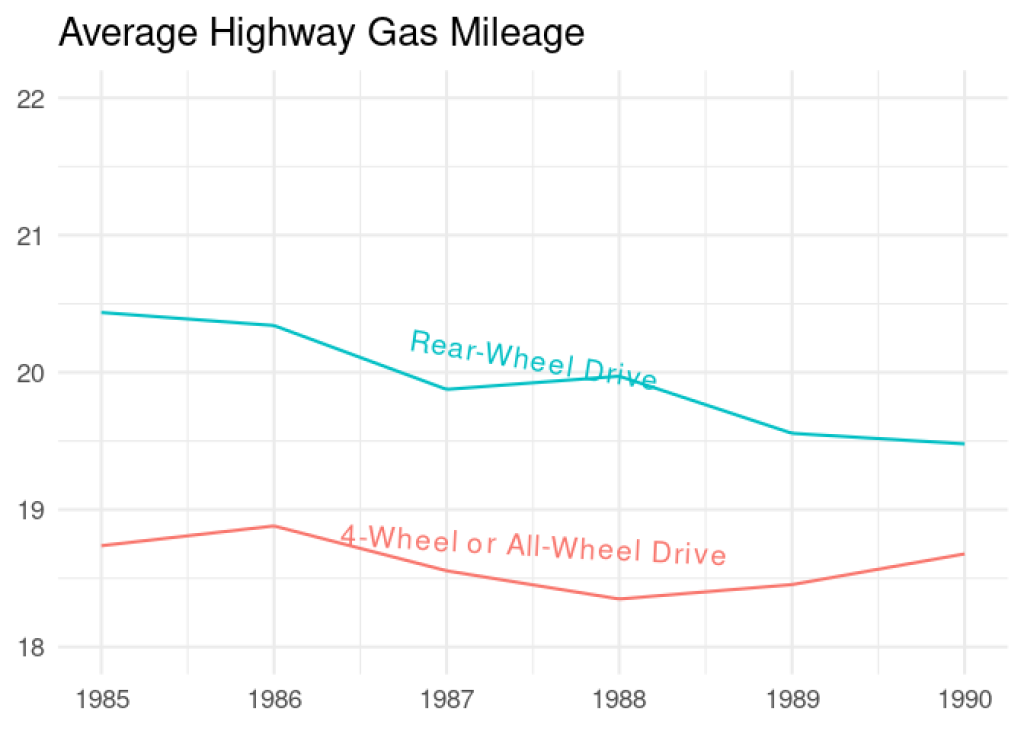
Above, we tried text_smoothing = 75 and that’s smoothed it out to almost be a flat line! Let’s try a little bit less.
avg_hwy |>
  ggplot(aes(x = year,
             y = mean_hwy,
             color = drive,
             label = drive)) +
  geom_textline(linewidth = 0.75,
                vjust = -0.25,
                size = 5,
                text_smoothing = 25) +
  labs(title = "Average Highway Gas Mileage",
       x = NULL,
       y = NULL) +
  lims( y = c(18, 22)) +
  theme_minimal(base_size = 16) +
  theme(legend.position = "none")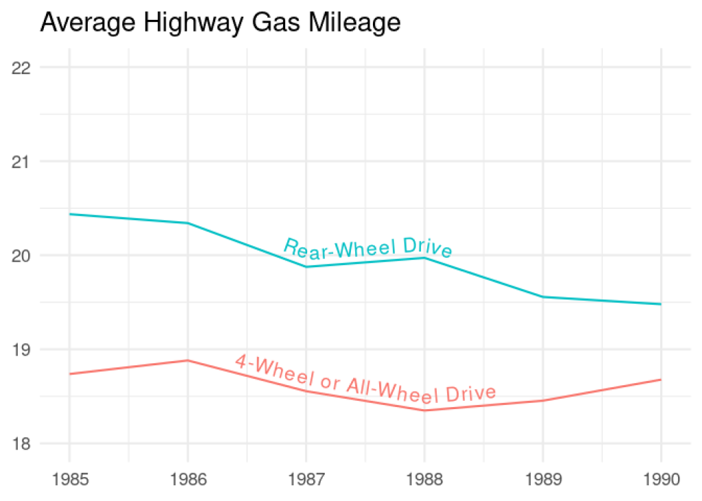
Using text_smoothing = 25 is better, but I think somewhere in between will work best. Let’s try text_smoothing = 40 next.
avg_hwy |>
  ggplot(aes(x = year,
             y = mean_hwy,
             color = drive,
             label = drive)) +
  geom_textline(linewidth = 0.75,
                vjust = -0.25,
                size = 5,
                text_smoothing = 40) +
  labs(title = "Average Highway Gas Mileage",
       x = NULL,
       y = NULL) +
  lims( y = c(18, 22)) +
  theme_minimal(base_size = 16) +
  theme(legend.position = "none")
That looks perfect! And it wasn’t too complicated.
If you’re wondering what all the default aesthetic values are for geom_textline , you can find them by typing in the geom name in camel case into the console (so, starting with a capital G). For instance, if I have the {geomtextpath} package loaded already and I type in GeomTextLine , I can then access the default aesthetic values by adding $default_aes . This also works for any ggplot geom functions you might be interested in. RStudio’s auto-complete will help you out once you start typing.
GeomTextline$default_aes
## Aesthetic mapping:
## * `colour`     -> "black"
## * `size`       -> 3.88
## * `hjust`      -> 0.5
## * `vjust`      -> 0.5
## * `family`     -> ""
## * `fontface`   -> 1
## * `lineheight` -> 1.2
## * `alpha`      -> 1
## * `linewidth`  -> 0.5
## * `linetype`   -> 1
## * `spacing`    -> 0
## * `linecolour` -> NULL
## * `textcolour` -> NULL
## * `angle` -> 0What about
Glad you asked. So far, we’ve replaced geom_text type functions, but there are label versions of all the {geomtextpath} functions, too! Like this code that uses geom_labelline() instead.
avg_hwy |>
  ggplot(aes(x = year,
             y = mean_hwy,
             color = drive,
             label = drive)) +
  geom_labelline(linewidth = 0.75,
                text_smoothing = 40,
                size = 5) +
  labs(title = "Average Highway Gas Mileage",
       x = NULL,
       y = NULL) +
  lims( y = c(18, 22)) +
  theme_minimal(base_size = 16) +
  theme(legend.position = "none")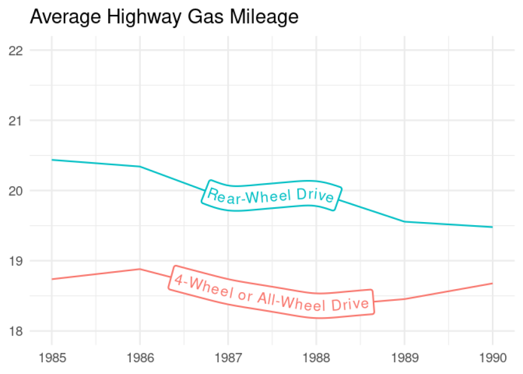
Basic Plot Annotation
Replacing a legend is fantastic, but you can also use {geomtextpath} to easily add annotation lines and text, too. Let’s look at an example of a plot that could really use some annotation.
First, we’ll create some fake cost and revenue data to play with.
break_even <-
  tibble(
  units = seq(0, 100, 1),
  price = 50,
  fixed_cost = 750,
  variable_cost = 25,
  total_cost = fixed_cost + (variable_cost * units),
  total_revenue = price * units,
  break_even_units = fixed_cost / (price - variable_cost)
)Using geom_textline() , we’ll plot the total cost in red and the total revenue in green .
break_even |>
  ggplot() +
  geom_textline(aes(x = units,
                y = total_cost,
                label = "Cost"),
            linewidth = 1,
            color = "red4",
            hjust = 0.7,
            size = 5) +
  geom_textline(aes(x = units,
                y = total_revenue,
                label = "Revenue"),
            linewidth = 1,
            color = "green3",
            hjust = 0.7,
            size = 5) +
  labs(title = "Break Even Analysis",
       x = "Units",
       y = "Total Cost and Revenue ($)") +
  theme_minimal(base_size = 16)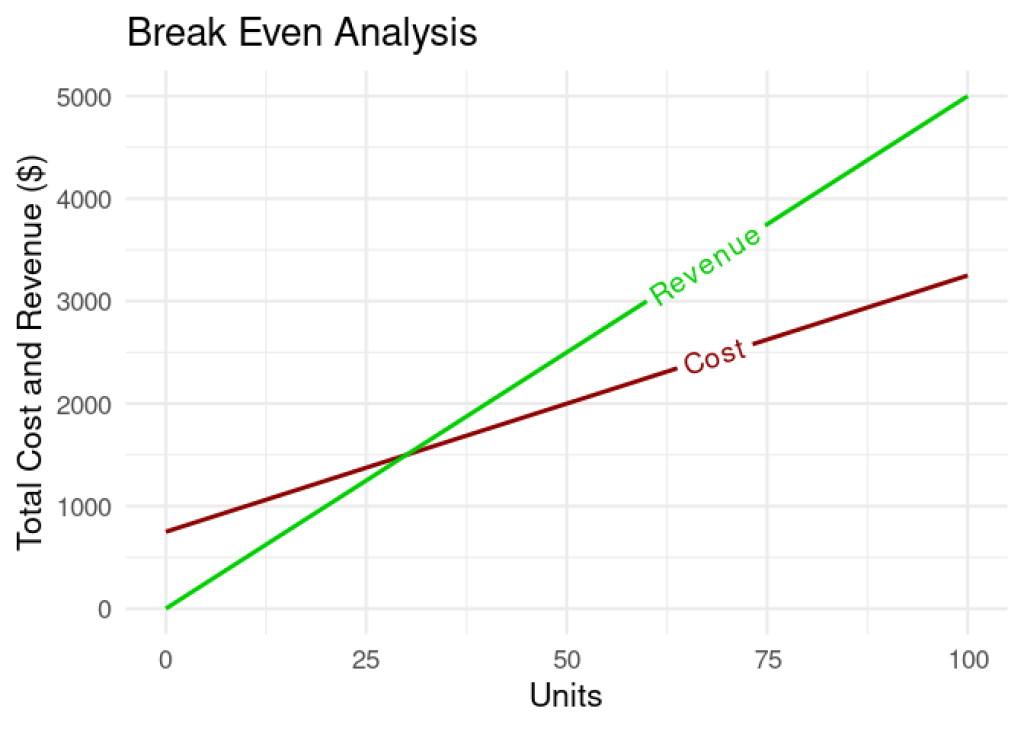
Notice we did not need to remove a legend using the theme() function. That’s because the lines are not two different groups from within the same variable. They’re two separate lines constructed from two different y-variables, so ggplot2 will not create a legend for us. Good thing we have geomtextpath to help us tell them apart!
This plot is clean and readable, but we’re going to make it easier to interpret.
Here’s what we’ve done so far:
plotted two separate lines by calling two different sets of
x,y, andlabelarguments in eachgeom_textline()aes()functioncustomized the
linewidth,color,hjust, andsize(text size) for each line
It would also be useful to annotate the point where our lines cross by adding lines showing what our fixed costs are and how many units we need to sell to break even.
We can add horizontal and vertical annotation lines using {geomtextpath} by calling:
geom_texthline(), which needs theyinterceptandlabelarguments in theaes()to create a horizontal linegeom_textvline(), which needs thexinterceptandlabelarguments in theaes()to create a vertical line
These functions replace geom_hline() and geom_vline() in {ggplot2} , and if you’re familiar with geom_abline() , you can replace it with geom_textabline() .
We don’t want our annotations to dominate the plot, so we can use "dotted" line types for them. Just like in geom_line() , we can specify this with the linetype argument. We can also get a little fancy by parameterizing our labels using paste0() so that they will always be correct, even if the data changes.
break_even |>
  ggplot() +
  geom_textline(aes(x = units,
                y = total_cost,
                label = "Cost"),
            linewidth = 1,
            color = "red4",
            hjust = 0.7,
            size = 5) +
  geom_textline(aes(x = units,
                y = total_revenue,
                label = "Revenue"),
            linewidth = 1,
            color = "green3",
            hjust = 0.7,
            size = 5) +
  geom_texthline(aes(yintercept = fixed_cost,
                     label = paste0("Fixed Cost = $", fixed_cost)),
                 color = "steelblue4",
                 linetype = "dotted",
                 linewidth = .75,
                 hjust = 0.6,
                 size = 4.5) +
  geom_textvline(aes(xintercept = break_even_units,
                     label = paste0(break_even_units, " units")),
                 color = "steelblue4",
                 linetype = "dotted",
                 linewidth = .75,
                 hjust = 0.6,
                 size = 4.5) +
  labs(title = "Break Even Analysis",
       x = "Units",
       y = "Total Cost and Revenue ($)") +
  theme_minimal(base_size = 16)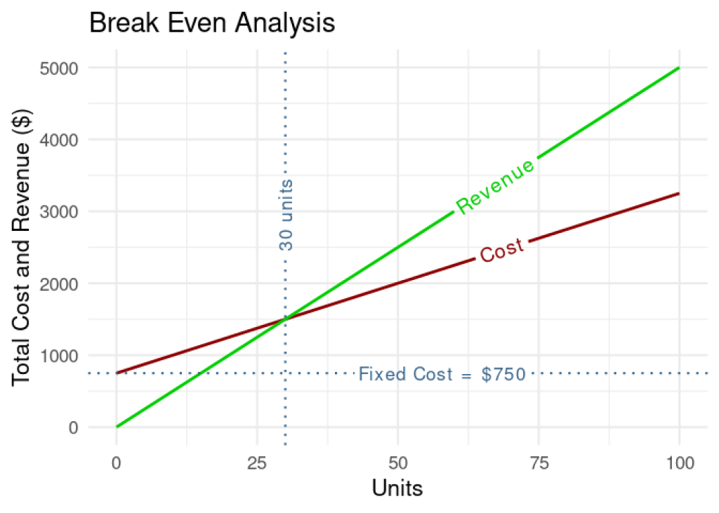
There we go. Our plot shows all the important information and we avoided using a cluttered legend.
For these new dotted lines, here are the arguments we used:
color = "steelblue"to keep the annotations more subduedlinetype = "dotted"to keep them unobtrusivelinewidth = .75to make them thinner than our main plot lineshjust = 0.6to move the text labels down the lines so they don’t overlapsize = 4.5to increase the text size, but keep it smaller than text on the main lines
It’s worth noting that hjust moves the text label along the line whether it’s a horizontal line (moving it left or right), or a vertical line (moving it down or up). In the same manner, vjust moves the label above and below the line, whether the line is vertical or horizontal.
What if I just want the text?
You can do that, too! Let’s create a beautiful overlapping density plot to demonstrate. We will, of course, use everyone’s favorite penguins for our data set!
penguins <- palmerpenguins::penguins |>
drop_na()We could create a plain density plot using the geom_textdensity() function from {geomtextpath} .
penguins |>
  filter(species == "Adelie") |>
  ggplot(aes(x = bill_length_mm,
             color = island,
             label = island)) +
  geom_textdensity(linewidth = 1,
                   size = 4,
                   hjust = .49,
                   spacing = 40) +
  labs(title = "Adelie Penguins from Different Islands",
       subtitle = "Do they have different bill lengths?",
       x = "Bill Length (mm)",
       y = "Density") +
  theme_minimal(base_size = 16) +
  theme(legend.position = "none",
        plot.subtitle = element_text(size = 14))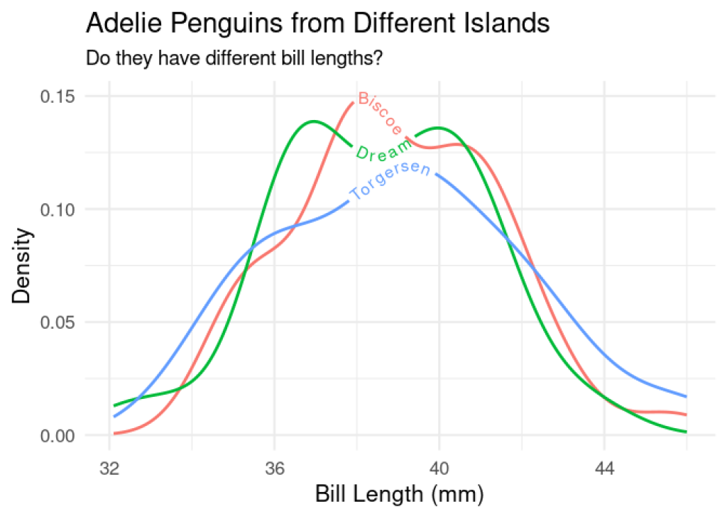
But, what if we want to create a beautifully transparent filled density plot with custom colors, like this?
penguins |>
  filter(species == "Adelie") |>
  ggplot(aes(x = bill_length_mm,
             fill = island,
             color = island,
             label = island)) +
  geom_density(alpha = .5) +
  scale_color_manual(values = c("#CEA804", "#EA5F94", "#0000FF")) +
  scale_fill_manual(values = c("#FFD700", "#EA5F94", "#0000FF")) +
  labs(title = "Adelie Penguins from Different Islands",
       subtitle = "Do they have different bill lengths?",
       x = "Bill Length (mm)",
       y = "Density",
       fill = "Island",
       color = "Island") +
  theme_minimal(base_size = 16) +
  theme(plot.subtitle = element_text(size = 14))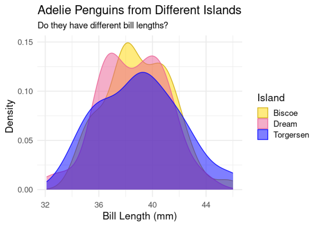
Can we still use {geomtextpath} to label this plot and get rid of the legend? We sure can.
We can use the text_only = TRUE argument inside geom_textdensity() to use just the text and not the line. Let’s add it to our plot, but take note: we have to add it Plots are like onions. They have layers 🧅
We’ll use all the adjustment arguments we’ve learned so far, plus a few new ones:
hjust = "ymax"to move the text to the highest points on the density plots (where the y-values are highest)spacing = 50to space out our letters so they’re not too squished together over those curves
We’ll also add ylim(c(0, .16)) to our plot this time to add just the tiniest bit of height to our y-axis limit so that our floating text won’t get cut off by our subtitle. Try removing it to see what I mean!
penguins |>
  filter(species == "Adelie") |>
  ggplot(aes(x = bill_length_mm,
             fill = island,
             color = island,
             label = island)) +
  geom_density(alpha = .5) +
  geom_textdensity(text_only = TRUE,
                   text_smoothing = 25,
                   hjust = "ymax",
                   vjust = -0.35,
                   spacing = 50,
                   size = 5) +
  scale_color_manual(values = c("#CEA804", "#EA5F94", "#0000FF")) +
  scale_fill_manual(values = c("#FFD700", "#EA5F94", "#0000FF")) +
  labs(title = "Adelie Penguins from Different Islands",
       subtitle = "Do they have different bill lengths?",
       x = "Bill Length (mm)",
       y = "Density") +
  ylim(c(0, .16)) +
  theme_minimal(base_size = 16) +
  theme(legend.position = "none",
        plot.subtitle = element_text(size = 14))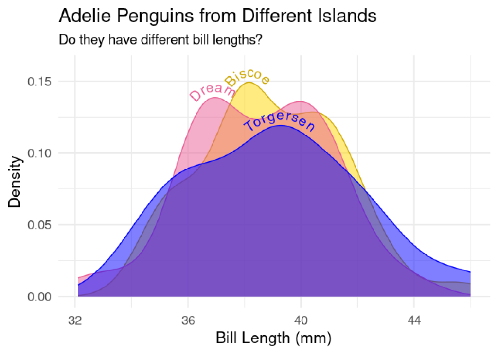
Now we have a gorgeous filled density plot with no legend and clearly labeled lines.
Learn more about {geomtextpath}
I hope you’re excited to try using {geomtextpath} on your next plot. I really recommend reading through the package documentation to learn even more, especially all of the pages in the Articles section and the table of geom equivalents on the main page, because this tutorial is just the tip of the iceberg. Happy plotting!
Sign up for the newsletter
Get blog posts like this delivered straight to your inbox.

You need to be signed-in to comment on this post. Login.