How to add annotations in ggplot: should you use geoms or annotations?
Annotations are a neat way to draw your readers attention to specific parts of your data visualization. For example, you could use, say,
an arrow to point to a specific data point,
a rectangle to draw a border around specific points in a scatter plot that you want to highlight or
a text label to clarify something.
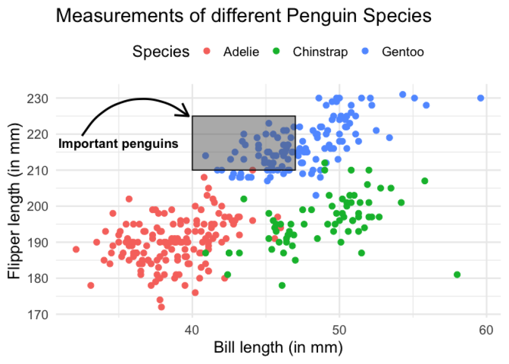
The possibilities for annotations are endless. Here’s a plot that combines these ideas into a ggplot.
You can create such annotations with the annotate() layer. Who would have thought that, right? Annotations are done with annotate() . Shocking news, I know.
But regardless of this obvious function name, you might wonder why we even need an extra function for that. Can’t we just create labels with geom_text() or arrows with geom_curve() or rectangles with geom_rect() ?
Today I want to show you why annotate() is actually necessary. And to answer this question, let us build the visualization from above with both annotate() and the corresponding geom_*() layers. We will see that annotate() leads to better results.
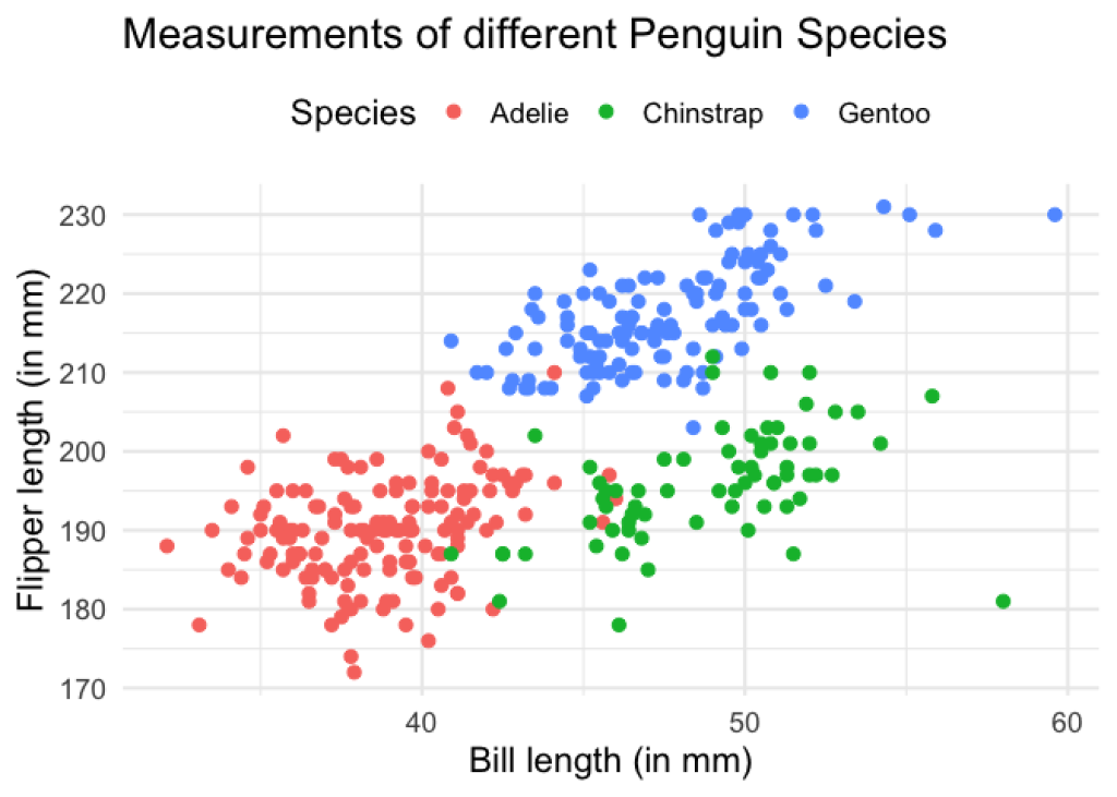
The base plot
First, we need to build the scatter plot from above and then we can add annotations. Here, this means that we combine a ggplot() and a geom_point() layer to get the job done. The underlying data comes from the famous palmerpenguins package.
palmerpenguins::penguins |>
  ggplot(aes(bill_length_mm, flipper_length_mm, col = species)) +
  geom_point(size = 2.5)

So that’s our basic plot. To make things look nicer, we can also add a theme_minimal() to this and increase the base_size in that layer. Also, let us make the axes labels into proper descriptions and let us move the legend to the top.
scatterplot <- palmerpenguins::penguins |>
  ggplot(aes(bill_length_mm, flipper_length_mm, col = species)) +
  geom_point(size = 2.5)+
  labs(
    x = 'Bill length (in mm)',
    y = 'Flipper length (in mm)',
    col = 'Species',
    title = 'Measurements of different Penguin Species'
  ) +
  theme_minimal(base_size = 16) +
  theme(legend.position = 'top')
scatterplot
Our first annotation
Now let’s try to add a text annotation with geom_text() . In this layer, we have to specify the coordinates and the label of the text label. Notice that we can do all of this outside of the aes() call because our annotation is not data dependent.
scatterplot +
  geom_text(
    x = 35,
    y = 217.5,
    label = 'Important penguins',
    fontface = 'bold', # makes text bold
    size = 4.5 # font size
  )
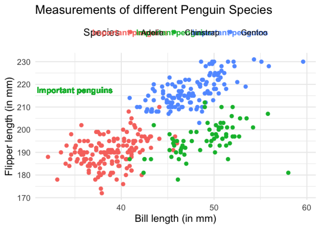
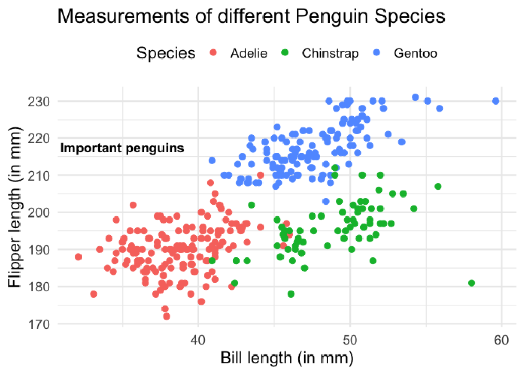
Oh no! The legend got all messed up and the text is colored. That’s a bit annoying. But we can fix that with show.legend = FALSE and color = "black" .
scatterplot +
  geom_text(
    x = 35,
    y = 217.5,
    label = 'Important penguins',
    fontface = 'bold', # makes text bold
    size = 4.5, # font size
    show.legend = FALSE,
    color = 'black'
  )
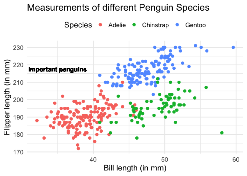
Now, let’s have a look at this chart. Did you notice that the text looks weird? Maybe you don’t notice it right away. So let’s have a look at what the same thing would look like if we use annotate() instead. Once we have done that we can compare the two plots.
So, here’s the same plot using annotate() . In case you’ve never worked with annotate() , I’ll provide an explainer after the code.
scatterplot +
  annotate(
    'text',
    x = 35,
    y = 217.5,
    label = 'Important penguins',
    fontface = 'bold',
    size = 4.5
  )
As you’ve seen, basically annotate() layers need the exact same information as the corresponding geom_*() layer. The only difference is that annotate() never uses aes() and the first thing you must pass to annotate() is the geom you want to use. But despite the similarities, the resulting plot is a little bit different. Somehow, the plot that uses geom_text() instead shows a text label which is a tiny bit blurry. Have a look at what annotate() gives you instead.
Maybe you can already guess what causes this to look different. But if not, don’t worry. I will reveal that secret in a second. For now, let us try to create a rectangle annotation with geom_rect() and annotate() . And then I will reveal what’s going on behind the scenes. Exciting, isn’t it?
Maybe rectangle annotations work better?
Let us start with geom_rect() . What this geom needs (in case you’ve never used it), is the coordinates of the four corners of the rectangle that we want to draw. We specify this with xmin , xmax , ymin , ymax .
And since we want to have a colored rectangle with a border we will also specify a fill color with fill and a border color with col . This means that we also need to set the transparency aesthetic alpha to something lower than 1. Otherwise, we cannot see the points below the rectangle. Now, without further ado, look what happens.
scatterplot +
  geom_text(
    x = 35,
    y = 217.5,
    label = 'Important penguins',
    fontface = 'bold', # makes text bold
    size = 4.5, # font size
    show.legend = FALSE,
    color = 'black'
  ) +
  geom_rect(
    xmin = 40,
    xmax = 47,
    ymin = 210,
    ymax = 225,
    alpha = 0.5,
    fill = 'grey40',
    col = 'black'
  )
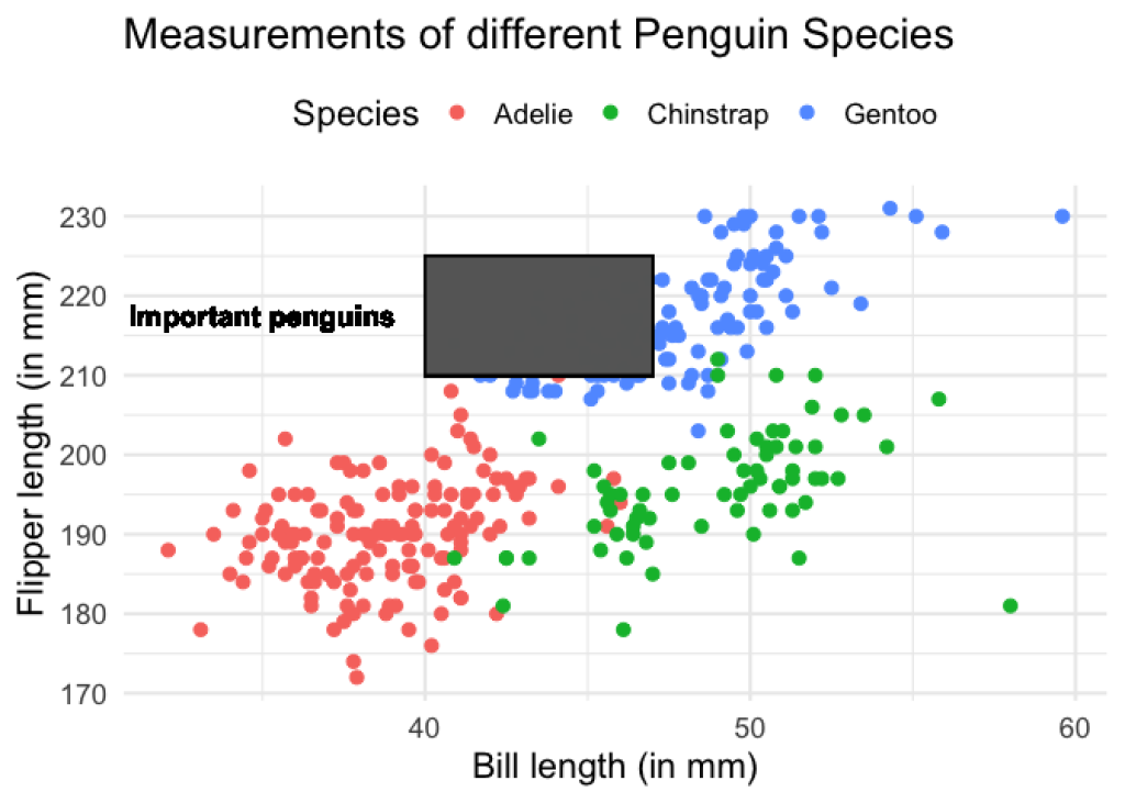
Oh no! We cannot see the points below the rectangle (even though we have lowered alpha ). So maybe go even lower with alpha ?
scatterplot +
  geom_text(
    x = 35,
    y = 217.5,
    label = 'Important penguins',
    fontface = 'bold', # makes text bold
    size = 4.5, # font size
    show.legend = FALSE,
    color = 'black'
  ) +
  geom_rect(
    xmin = 40,
    xmax = 47,
    ymin = 210,
    ymax = 225,
    alpha = 0.1,
    fill = 'grey40',
    col = 'black'
  )
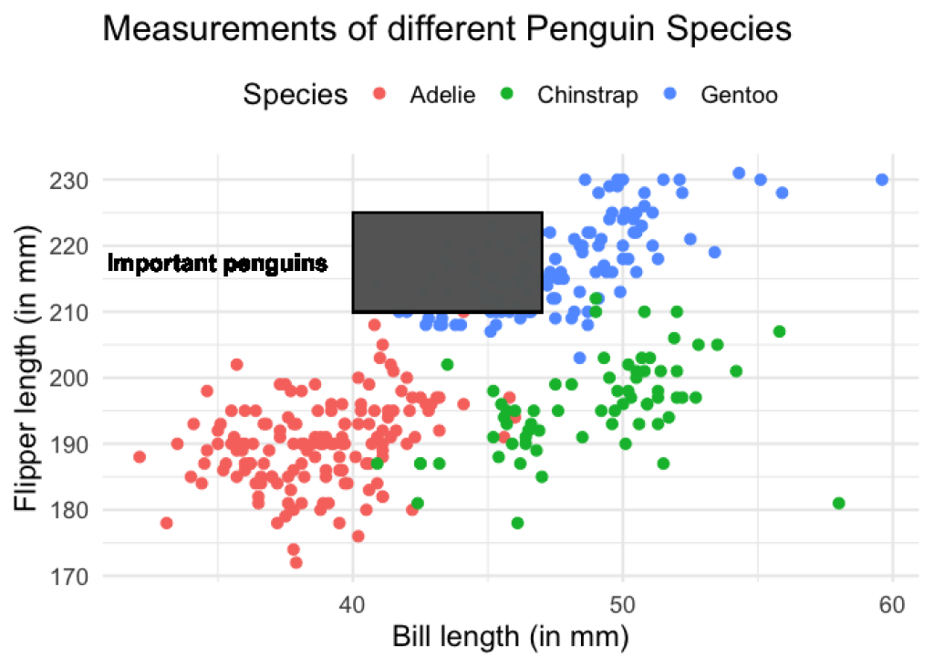
No joy. You will have to lower alpha to ridiculously low amounts like 0.01 in order to even begin to see the points a little bit. Clearly, something is wrong here. Let’s check if annotate() fares better.
scatterplot +
  annotate(
    'text',
    x = 35,
    y = 217.5,
    label = 'Important penguins',
    fontface = 'bold',
    size = 4.5
  ) +
  annotate(
    'rect',
    xmin = 40,
    xmax = 47,
    ymin = 210,
    ymax = 225,
    alpha = 0.5, # This was put back to 0.5
    fill = 'grey40',
    col = 'black'
  )

Nice. This works as expected. So it appears as if we actually do need annotate() layers. That’s why I will (finally) reveal the secret about what is going on here.
When you use an annotate() layer, you will draw the exact amount of rectangles or labels that you’ve specified. In our case, we have always specified exactly one label or coordinates for exactly one rectangle. And annotate() fulfills our wish just like we would expect and that’s why everything looks like it should.
But with geom_*() layers, things are different. Since all geom_*() layers “know” the data that is passed to ggplot() (in this case the penguins data), all geom_*() layers expect the same amount of data. So, even if you specify only a single label, your geom_text() layer will interpret this as one label for every data point. Same thing with geom_rect() .
And then hundreds of labels and rectangles will be plotted above each other. Consequently, your text label looks a little bit weird because you have a lot of labels behind each other that are not always 100% exactly in the same position. Similarly, you can make your rectangle’s transparency very low and this won’t change a thing because there are so many rectangles on top of each other.
So this is why annotate() layers are necessary. They break free from the “I always expect the same amount of data” -paradigm. So now that you understand the difference, let us finish our visualization.
Create an arrow annotation
In general, we can create curved arrows with geom_curve() . But we know better now than to use geom_curve() . Instead, use annotate() with "curve" as its first argument. Then, we need to specify the start and end coordinates of the arrow with x , y , xend and yend . This will give us a curved segment line.
scatterplot +
  annotate(
    'text',
    x = 35,
    y = 217.5,
    label = 'Important penguins',
    fontface = 'bold',
    size = 4.5
  ) +
  annotate(
    'rect',
    xmin = 40,
    xmax = 47,
    ymin = 210,
    ymax = 225,
    alpha = 0.5,
    fill = 'grey40',
    col = 'black'
  ) +
  annotate(
    'curve',
    x = 32.5, # Play around with the coordinates until you're satisfied
    y = 219.5,
    yend = 225,
    xend = 39.75,
    linewidth = 1
  )

Here, we should change the curvature of our curved segment so that it gets flipped. And to make this curved line into an arrow, we need to also set the arrow argument and fill it using the arrow() function. In that function, we can specify how long or how wide the arrowhead is supposed to be.
scatterplot +
  annotate(
    'text',
    x = 35,
    y = 217.5,
    label = 'Important penguins',
    fontface = 'bold',
    size = 4.5
  ) +
  annotate(
    'rect',
    xmin = 40,
    xmax = 47,
    ymin = 210,
    ymax = 225,
    alpha = 0.5,
    fill = 'grey40',
    col = 'black'
  ) +
  annotate(
    'curve',
    x = 32.5, # Play around with the coordinates until you're satisfied
    y = 219.5,
    yend = 225,
    xend = 39.75,
    linewidth = 1,
    curvature = -0.5,
    arrow = arrow(length = unit(0.5, 'cm'))
  )

And with that, we have finished our visualization and we learned what the point of annotate() is. Not bad for one blog post, eh? Now, you can use all of that knowledge to draw your reader’s attention to specific parts of your charts. Have fun with that and see you next time.
Sign up for the newsletter
Get blog posts like this delivered straight to your inbox.

You need to be signed-in to comment on this post. Login.