Use geom_ribbon() to highlight the gap between two lines
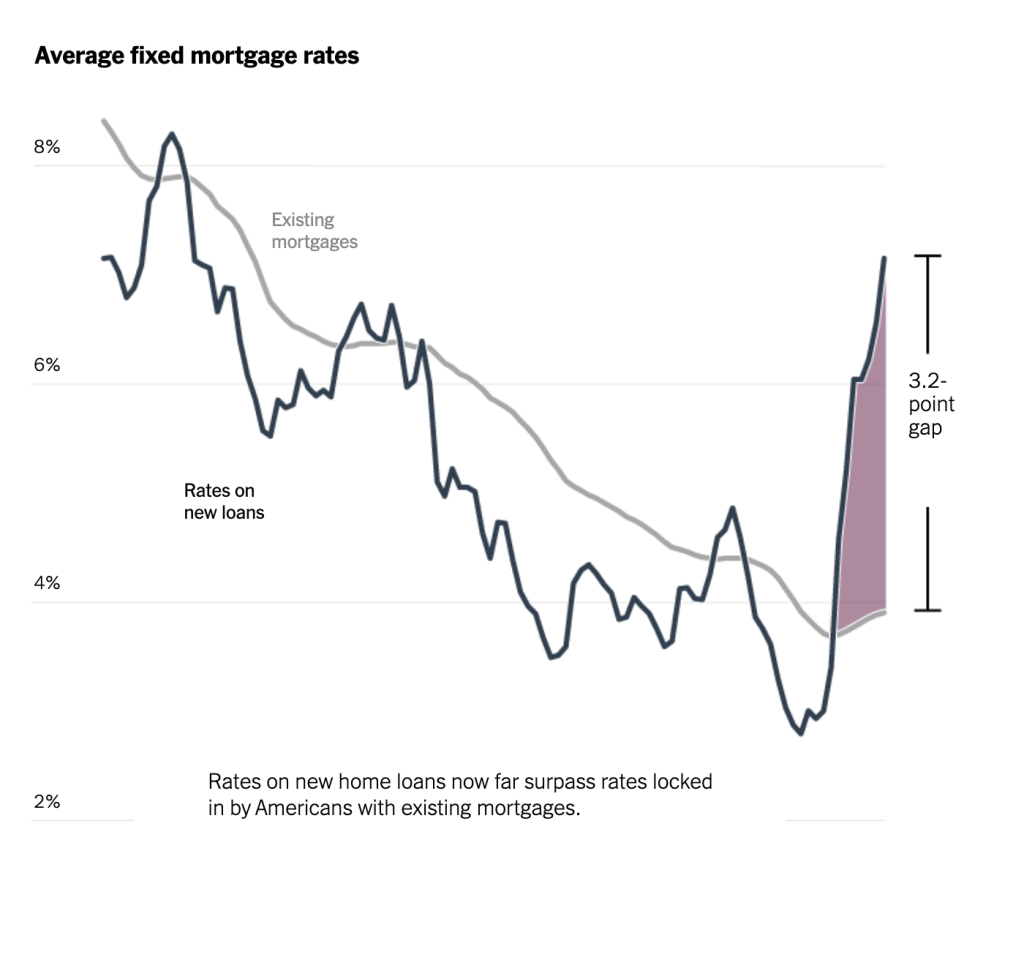
I recently found this really nice graph in the New York Times and I thought it was really effective, particularly the fact that it shows two lines and only shows the spread over a specific period. So how can we replicate this in R, particularly the shading of the gap between existing mortgages and rates on new loans?
In this guide, written with Joseph Barbier, I’ll walk you through the steps of creating a line chart with two lines, where the area between the lines is filled only for a specific portion of the chart. Here’s what we’re going to do:
Load the Necessary Packages
First, we need to load the tidyverse package, which includes ggplot2 for plotting and dplyr for data manipulation. We’ll also be using the gapminder dataset that comes preloaded with the gapminder package. It contains data about life expectancy, GDP per capita, and population for different countries over time. We’ll also load the scales package for nicely formatted values.
library(tidyverse)
library(gapminder)
library(scales)Filter the Data
We’ll focus on two specific countries (e.g., “Australia” and “Japan”) and plot their GDP per capita over time. To do this, we’ll filter the dataset accordingly.
gdp_data <- gapminder |>
  filter(country %in% c("Japan", "Australia")) |>
  filter(year >= 1982) |>
select(year, country, gdpPercap)Now that we’ve filtered the data to include only Australia and Japan after 1982, let’s take a look at it:
gdp_data
#> # A tibble: 12 × 3
#>     year country   gdpPercap
#>    <int> <fct>         <dbl>
#>  1  1982 Australia    19477.
#>  2  1987 Australia    21889.
#>  3  1992 Australia    23425.
#>  4  1997 Australia    26998.
#>  5  2002 Australia    30688.
#>  6  2007 Australia    34435.
#>  7  1982 Japan        19384.
#>  8  1987 Japan        22376.
#>  9  1992 Japan        26825.
#> 10  1997 Japan        28817.
#> 11  2002 Japan        28605.
#> 12 2007 Japan 31656.Create a Basic Line Plot
To begin, we’ll create a basic line chart that shows the GDP per capita for both Australia and Japan over time, using the geom_line() function.
ggplot() +
  geom_line(
    data = gdp_data,
    aes(
      x = year,
      y = gdpPercap,
      color = country
    ),
    size = 1.2
  ) +
  labs(
    title = "GDP Per Capita Comparison: Australia vs Japan",
    subtitle = "Area between the lines is highlighted for the years 2002-2007",
    x = NULL,
    y = "GDP Per Capita",
    caption = "Source: Gapminder"
  ) +
  scale_color_manual(
    values = c(
      "black",
      "grey70"
    )
  ) +
  scale_y_continuous(labels = dollar_format(
    accuracy = 1,
    scale = 1 / 1000,
    suffix = "K"
  )) +
  theme_minimal() +
  theme(
    axis.title = element_blank()
)The result, which I’ll save as gdp_line_chart , shows GDP per capita over time for these two countries.

Highlight the Area Between the Two Lines for a Specific Time Period
We’ll focus on a specific time period to fill the area between the two lines. Let’s say we want to highlight the period between 2000 and . We’ll first filter the data to include only that range of years:
highlight_data <- gdp_data |>
  filter(year > 2000 & year < 2010)

highlight_data
#> # A tibble: 4 × 3
#>    year country   gdpPercap
#>   <int> <fct>         <dbl>
#> 1  2002 Australia    30688.
#> 2  2007 Australia    34435.
#> 3  2002 Japan        28605.
#> 4 2007 Japan 31656.We’ll need to reshape the data so that the GDP per capita for both countries appears in separate columns.
highlight_data_wide <- highlight_data |>
  pivot_wider(names_from = country, values_from = gdpPercap)

highlight_data_wide
#> # A tibble: 2 × 3
#>    year Australia  Japan
#>   <int>     <dbl>  <dbl>
#> 1  2002    30688. 28605.
#> 2 2007 34435. 31656.Create a Filled Area Between the Lines
To fill the area between the lines, we can use geom_ribbon() . This function shades the space between two curves on a graph, making it clear and easy to see the range between them.
In this case, we apply geom_ribbon() to our filtered data ( highlight_data_wide ) as shown above.
gdp_line_chart +
  geom_ribbon(
    data = highlight_data_wide,
    aes(
      x = year,
      ymin = Japan,
      ymax = Australia
    ),
    fill = "#af7d95",
    alpha = 0.8
  )
Annotate the highlighted area
Next, let’s add some annotation to our graph, similar to how it was done in the New York Times. To make our code easier, let’s create variables with the information about the region we want to highlight. For this we need to first calculate the maximum value of both Australia and Japan. We do this using the slice_max() function and then the pull() function to get a single value.
max_australia <- gdp_data |>
  filter(country == "Australia") |>
  slice_max(gdpPercap, n = 1) |>
pull(gdpPercap)We now have a variable, max_australia , that we can use:
max_australia
#> [1] 34435.37We can now do the same thing for Japan:
max_japan <- gdp_data |>
  filter(country == "Japan") |>
  slice_max(gdpPercap, n = 1) |>
pull(gdpPercap)Next, we’ll calculate the difference between Australia and Japan and then create a variable called gap_label that has a nicely formatted value, complete with dollar sign, of the difference variable.
difference <- max_australia - max_japan

gap_label <- str_glue("{scales::dollar(difference, accuracy = 1)}\ngap")Then, we use the annotate() function from ggplot to add both the line showing the gap size and the text annotation of it.
gdp_line_chart +
  geom_ribbon(
    data = highlight_data_wide,
    aes(
      x = year,
      ymin = Japan,
      ymax = Australia
    ),
    fill = "#af7d95",
    alpha = 0.8
  ) +
  annotate(
    geom = "line",
    x = 2007.5,
    y = c(max_australia, max_japan)
  ) +
  annotate(
    geom = "text",
    x = 2008,
    y = max_japan + difference / 2,
    label = gap_label,
    lineheight = 1,
    label.size = 0,
    hjust = 0
  ) +
  scale_x_continuous(
    limits = c(1980, 2010)
)The result (saved as plot_with_annotation for future use) has shading between the values for Australia and Japan and an annotation that explains what is going on in the chart.

Add country labels directly to lines
One additional tweak we could make is to have the labels for Australia and Japan directly on the lines rather than in the legend. The New York Times chart does this, and it’s a nice way to not force the reader to have to look in multiple places. To do this, we can load the geomtextpath package. This package facilitates adding lines on line charts.
library(geomtextpath)Next, we can use the geom_textpath() function to add the country labels. And, since we have the labels on the lines, we can remove the legend altogether.
plot_with_annotation +
  geom_textpath(
    data = gdp_data,
    aes(
      x = year,
      y = gdpPercap,
      color = country,
      label = country
    ),
    vjust = -0.5
  ) +
theme(legend.position = "none")The resulting chart is much easier to comprehend at a glance.

We now have a polished line chart comparing GDP per capita between Australia and Japan. The area between the two lines is filled for the years 2002-2007, making it easy to visually compare their economic performance during that period. And the direct labeling of the lines makes it easy for readers to see what is going on. These techniques are a great way to highlight differences between two variables over a specific range of time, helping the viewer focus on key periods of interest in the data.
Sign up for the newsletter
Get blog posts like this delivered straight to your inbox.


You need to be signed-in to comment on this post. Login.