How to make heatmaps in ggplot
Heatmaps are a common way of representing data. In this blog post, I'll show you how to make your own heatmaps using ggplot. In the process, you'll learn a bit about working with the {sf} package, specifically the st_make_grid() function to make a grid, the st_intersection() function to clip the boundaries of your geography to the grid you create, and st_join() to do spatial joins.
This blog post is adapted from a lesson in the Mapping with R course. If you want to learn to make heatmaps (and much, much more!), check it out.
What is a heatmap?
Before learning to make a heatmap, let's talk about what a heatmap is. Heatmaps may be common, but a single definition of a heatmap is less so. Search for tutorials on making heatmaps in ggplot and you'll get tutorials for using the geom_tile() function to make heatmaps like this:

In this blog post, however, I want to talk about heatmaps that are actually maps. There are a number of types of heatmaps maps (is that a phrase?) you'll see in the wild. This map from the Washington Post, for example, shows total precipitation on the Korean peninsula during a particularly rainy period in 2022.

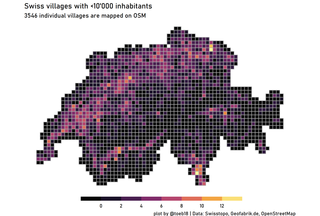
Or this map by Tobias Stadler showing the locations of Swiss villages with populations over 10,000.
What all heatmaps do is take some phenomena and bucket outcomes into some type of grid:
For the measles cases chart, that involves creating one square for each year and state.
For the Korean precipitation map, this means taking readings from rain monitoring stations and grouping them to create the smoothed colors you see on the map.
For Tobias Stadler's Swiss villages map, this means creating a grid of Switzerland, putting villages within one of the grid cells, and then counting the number of villages within each cell.
After creating grids, all three of these visualizations then use color to show the density of some outcome (measles cases, precipitation, number of 10k+ population villages). With this in mind, let's dive into making our own heatmap.
Start our heatmap
We're going to make a heatmap showing the location of improved corners in Portland, Oregon (where I live). These are corners that have a ramp which makes them accessible for folks in wheelchairs, people pushing strollers, etc. I took this photo recently of a corner being fixed up and an already-improved corner in the background for comparison.

Import data
To start our map, we’ll load several packages: the {tidvyerse} for general data wrangling and mapping with ggplot, {sf} for working with geospatial data, and {scales} to make nicely formatted values.
library(tidyverse)
library(sf)
library(scales)Next, we’ll import our data. We begin by importing a geojson file with the location of all corners in Portland.
improved_corners |>
  read_sf(
    "https://raw.githubusercontent.com/rfortherestofus/mapping-with-r-v2/refs/heads/main/data/improved_corners.geojson"
)We can look the improved_corners data frame we’ve created and see that it consists of an id variable ( objectid) , a ramp_style variable (which is either Improved or Unimproved), and a geometry column, which consists of the location of each corner:
#> Simple feature collection with 38492 features and 2 fields
#> Geometry type: POINT
#> Dimension:     XY
#> Bounding box:  xmin: -122.8301 ymin: 45.43282 xmax: -122.4619 ymax: 45.63909
#> Geodetic CRS:  WGS 84
#> # A tibble: 38,492 × 3
#>    objectid ramp_style             geometry
#>       <int> <chr>               <POINT [°]>
#>  1        1 Unimproved  (-122.6607 45.6012)
#>  2        2 Unimproved (-122.6606 45.60167)
#>  3        3 Unimproved (-122.6605 45.60117)
#>  4        4 Unimproved (-122.6604 45.60163)
#>  5        5 Unimproved (-122.6603 45.60056)
#>  6        6 Unimproved (-122.6603 45.60072)
#>  7        7 Unimproved (-122.6602 45.60079)
#>  8        8 Unimproved (-122.6551 45.59177)
#>  9        9 Unimproved (-122.6546 45.59212)
#> 10       10 Unimproved (-122.6538 45.59125)
#> # ℹ 38,482 more rowsWe’ll also import a geojson file that has the boundaries of the city of Portland.
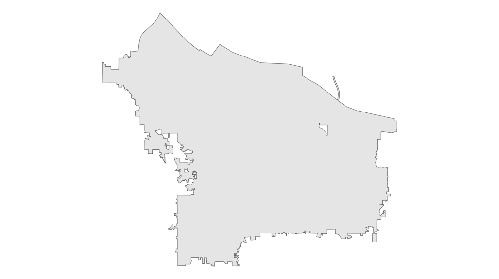
portland_boundaries |>
  read_sf(
    "https://raw.githubusercontent.com/rfortherestofus/mapping-with-r-v2/refs/heads/main/data/portland_boundaries.geojson"
)The easiest way to see what this data looks like is with a quick map, which we can do with ggplot:
portland_boundaries |>
  ggplot() +
  geom_sf() +
theme_void()This code gives us this map:
Create a grid map
Next, we’re going to take our portland_boundaries object and create a grid from it. The st_make_grid() function enables us to do this as follows:
portland_grid |>
  portland_boundaries |>
st_make_grid()We can see what this grid looks like by plotting it:
ggplot() +
  geom_sf(data = portland_boundaries) +
  geom_sf(
    data = portland_grid,
    alpha = 0.5
  ) +
theme_void()This code gives us a grid map overlaid on top of the boundaries of Portland.
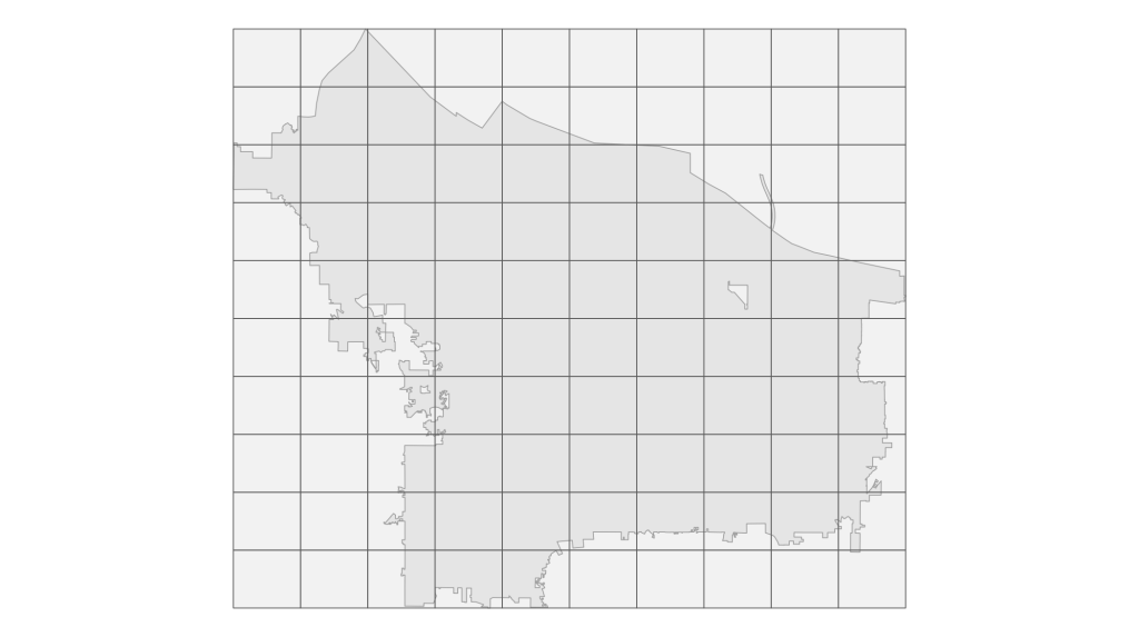
By default, the st_make_grid() creates a 10 by 10 grid. However, to make our heatmap, we’d like to have more cells. So let’s adjust our code to make a 100 by 100 grid:
portland_grid |>
  portland_boundaries |>
st_make_grid(n = c(100, 100))The same code as before makes a map that reflects the more fine-grained cells:
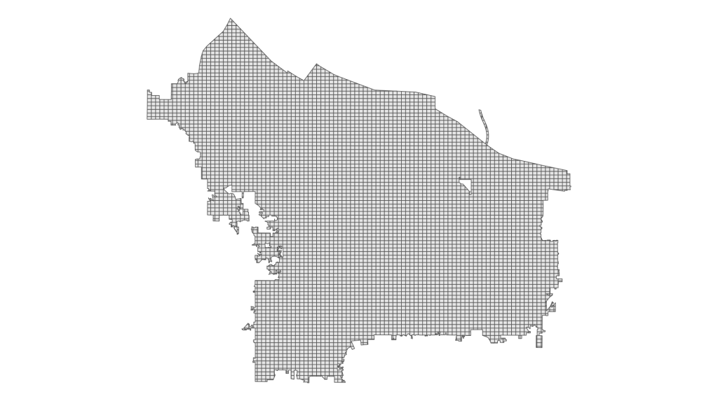
Clip city boundaries to the grid map
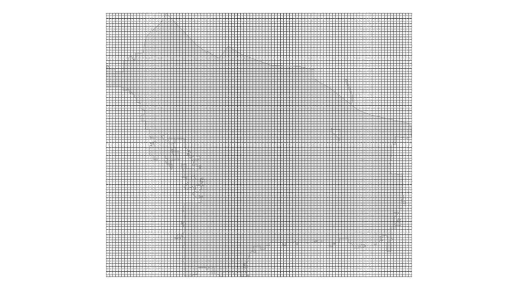
We’ve made a grid, but the grid has many cells outside of the boundaries of Portland. To clip the grid to these boundaries, we can use the st_intersection() function as follows. After st_intersection() , we also run st_make_valid() , which deals with an issue particular to the city of Portland where there is separate city within its . I also create a grid_id variable, which we will use below when joining the data on corners with our grid map.
portland_grid_map |>
  st_intersection(
    portland_boundaries,
    portland_grid
  ) |>
  st_make_valid() |>
  mutate(grid_id = row_number()) |>
select(grid_id)We can now plot the portland_grid_map object:
portland_grid_map |>
  ggplot() +
  geom_sf() +
theme_void()Which gives us this map:
Join our corners data with the grid map
Now that we’ve created a grid map that is clipped to the boundaries of Portland, we need to join our data on corners with it. Doing so will enable us to see where there are higher concentrations of unimproved corners. We join our portland_grid_map and improved_corners objects using the st_join() function:
improved_corners_grid |>
  st_join(
    portland_grid_map,
    improved_corners
)If we look at improved_corners_grid , we can see that it has each corner joined to the grid cell within which it is located.
#> Simple feature collection with 41222 features and 3 fields
#> Geometry type: MULTIPOLYGON
#> Dimension:     XY
#> Bounding box:  xmin: -122.8368 ymin: 45.43254 xmax: -122.472 ymax: 45.65289
#> Geodetic CRS:  WGS 84
#> # A tibble: 41,222 × 4
#>    grid_id                                          geometry objectid ramp_style
#>  *   <int>                                <MULTIPOLYGON [°]>    <int> <chr>
#>  1       1 (((-122.7437 45.43474, -122.7437 45.43446, -122.…       NA <NA>
#>  2       2 (((-122.7419 45.43328, -122.7412 45.43327, -122.…    23683 Unimproved
#>  3       2 (((-122.7419 45.43328, -122.7412 45.43327, -122.…    23684 Unimproved
#>  4       2 (((-122.7419 45.43328, -122.7412 45.43327, -122.…    23685 Unimproved
#>  5       2 (((-122.7419 45.43328, -122.7412 45.43327, -122.…    23686 Unimproved
#>  6       2 (((-122.7419 45.43328, -122.7412 45.43327, -122.…    23687 Unimproved
#>  7       2 (((-122.7419 45.43328, -122.7412 45.43327, -122.…    23688 Unimproved
#>  8       3 (((-122.7383 45.43325, -122.7383 45.43325, -122.…    23692 Unimproved
#>  9       3 (((-122.7383 45.43325, -122.7383 45.43325, -122.…    23696 Unimproved
#> 10       3 (((-122.7383 45.43325, -122.7383 45.43325, -122.…    23697 Unimproved
#> # ℹ 41,212 more rowsFrom there, we need to calculate the percentage of unimproved corners in each grid. We can do this with some basic data wrangling using various {dplyr} functions (see around 7:00 of the video for a full walkthrough of this code). The code below also sees us use st_drop_geometry() to turn geospatial data into a regular data frame before we later turn it back into geospatial data with the st_as_sf() function (we do this in order to speed up our code, which tends to run slowly on geospatial data).
unimproved_corners_grid_pct |>
  improved_corners_grid |>
  st_drop_geometry() |>
  count(grid_id, ramp_style) |>
  complete(grid_id, ramp_style) |>
  group_by(grid_id) |>
  mutate(pct = n / sum(n, na.rm = TRUE)) |>
  ungroup() |>
  select(-n) |>
  pivot_wider(
    id_cols = grid_id,
    names_from = ramp_style,
    values_from = pct
  ) |>
  mutate(
    pct = case_when(
      is.na(Unimproved) & Improved == 1 ~ 0,
      .default = Unimproved
    )
  ) |>
  select(grid_id, pct) |>
  left_join(
    portland_grid_map,
    join_by(grid_id)
  ) |>
st_as_sf()Let’s now look at our unimproved_corners_grid_pct object. As you can see, we now have one row for each grid cell, with a pct variable that shows the percentage of unimproved corners in that cell.
#> Simple feature collection with 5725 features and 2 fields
#> Geometry type: MULTIPOLYGON
#> Dimension:     XY
#> Bounding box:  xmin: -122.8368 ymin: 45.43254 xmax: -122.472 ymax: 45.65289
#> Geodetic CRS:  WGS 84
#> # A tibble: 5,725 × 3
#>    grid_id   pct                                                        geometry
#>      <int> <dbl>                                              <MULTIPOLYGON [°]>
#>  1       1    NA (((-122.7437 45.43474, -122.7437 45.43446, -122.7437 45.43419,…
#>  2       2     1 (((-122.7419 45.43328, -122.7412 45.43327, -122.7411 45.43327,…
#>  3       3     1 (((-122.7383 45.43325, -122.7383 45.43325, -122.7381 45.43325,…
#>  4       4    NA (((-122.7346 45.43322, -122.7334 45.43321, -122.7334 45.43321,…
#>  5       5    NA (((-122.731 45.43435, -122.7309 45.43435, -122.7305 45.43435, …
#>  6       6    NA (((-122.7112 45.43474, -122.7112 45.43469, -122.7103 45.43468,…
#>  7       7    NA (((-122.7047 45.43474, -122.7046 45.43472, -122.7046 45.4347, …
#>  8       8     1 (((-122.7018 45.43404, -122.7011 45.43387, -122.701 45.43384, …
#>  9       9     1 (((-122.6982 45.43255, -122.6981 45.43255, -122.6978 45.43254,…
#> 10      10    NA (((-122.6841 45.43474, -122.6841 45.43471, -122.6841 45.4346, …
#> # ℹ 5,715 more rowsMake the heatmap with ggplot
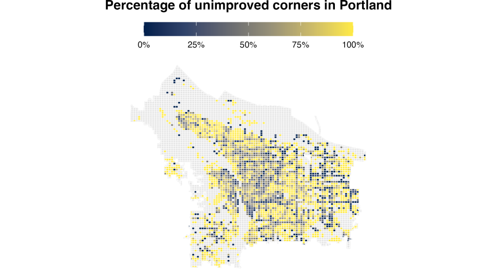
Having created a grid, clipped it to Portland boundaries, joined in our data on improved corners, and calculated the percentage of unimproved corners in each grid cell, we are now ready to create our heatmap. The code below creates the heatmap. For a full walkthrough of the design decisions, check out the video starting at around 10:00.
ggplot() +
  geom_sf(data = portland_boundaries) +
  geom_sf(
    data = unimproved_corners_grid_pct,
    aes(fill = pct),
    color = "white"
  ) +
  labs(fill = NULL, title = "Percentage of unimproved corners in Portland") +
  scale_fill_viridis_c(
    option = "E",
    na.value = "gray90",
    limits = c(0, 1),
    labels = percent_format()
  ) +
  theme_void() +
  theme(
    plot.title = element_text(
      hjust = 0.5,
      face = "bold",
      margin = margin(b = 10, unit = "pt")
    ),
    legend.key.width = unit(1.5, "cm"),
    legend.key.height = unit(0.5, "cm"),
    legend.position = "top"
)The result of this code is a great-looking heatmap that higlights areas of Portland with more unimproved corners.
Summing up
As you’ve seen the process of making a heatmap in ggplot is a bit involved so let’s summarize:
Import data on improved corners and data on the boundaries of Portland
Create a grid map based on the boundaries data
Join data on improved corners with the grid map
Calculate the percentage of unimproved corners in each grid cell
Map the resulting data, with cells with higher percentages of unimproved corners in different colors
Import data on improved corners and data on the boundaries of Portland
Map the resulting data, with cells with higher percentages of unimproved corners in different colors
While I’ve given an example on making a heatmap of unimproved corners in Portland, you can use this process to make heatmaps for any outcome in any location. Good luck making your own heatmaps!
Sign up for the newsletter
Get blog posts like this delivered straight to your inbox.

You need to be signed-in to comment on this post. Login.