

This page is a quick tour of mapping in R: what geospatial data is, then how to make static and interactive maps and do some geospatial analysis. You don’t need to memorize the code, the goal is to know the concepts and the names of the tools, so you can point an AI assistant at the right one.
Geospatial Data
Before you can make a map, you need geospatial data in a form R understands. This section covers what that data is and the main ways to get it into R.
What geospatial data is
Most maps are built from vector data: points, lines, and polygons.
In R, the standard way to represent it is simple features, from the
{sf} package. (When you make maps
with {ggplot2}, geom_sf() uses it under the hood.)
An {sf} object is just a data frame with a special geometry column and
a bit of metadata. Here is the state of Wyoming:
library(sf)
library(tidyverse)

wyoming <- read_sf(
  "https://raw.githubusercontent.com/rfortherestofus/mapping-with-r-v2/refs/heads/main/data/wyoming.geojson"
)

wyoming
Simple feature collection with 1 feature and 1 field
Geometry type: POLYGON
Dimension:     XY
Bounding box:  xmin: -111.0546 ymin: 40.99477 xmax: -104.0522 ymax: 45.00582
Geodetic CRS:  WGS 84
# A tibble: 1 × 2
  NAME                                                                  geometry
  <chr>                                                            <POLYGON [°]>
1 Wyoming ((-106.3212 40.99912, -106.3262 40.99927, -106.3265 40.99927, -106.33…
Two pieces of that metadata are worth knowing:
- Geometry type. The shape of the data:
POINT,LINESTRING, orPOLYGON. Each also has a “multi” version,MULTIPOINT,MULTILINESTRING, andMULTIPOLYGON, for a single row that holds several shapes at once, like a country made of many islands. - Coordinate reference system (CRS). The projection that places the
coordinates on the Earth. Data usually arrives as longitude/latitude
(
WGS 84); you can reproject withst_transform(). There is a lot of depth here, but for most work you just need the CRS to be set and consistent.
The quickest way to see an {sf} object is to plot it with geom_sf():
ggplot() +
  geom_sf(data = wyoming)
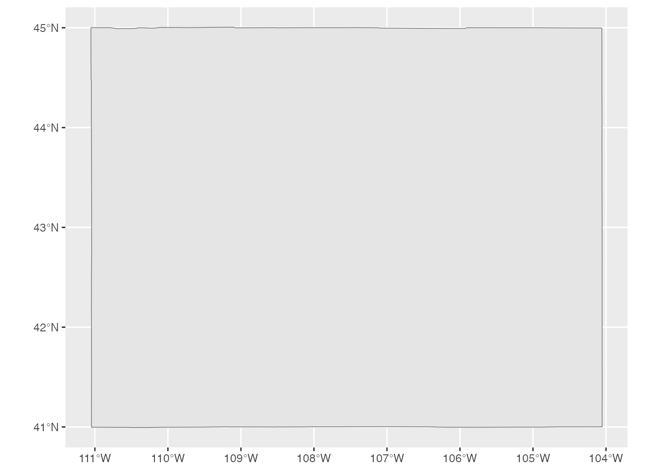
Throughout this section we use geom_sf() just like that: a fast way to
eyeball the data we’ve loaded, not a finished map. Customizing maps is
its own topic, covered in Static Maps below, which is why the maps here
are deliberately plain.
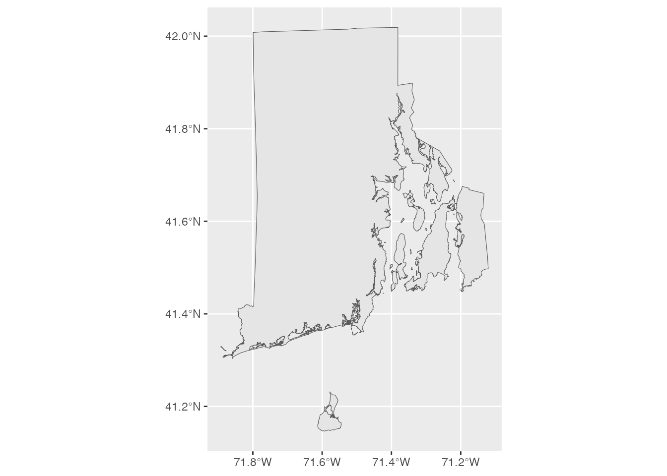
Geometry type depends on the data. Wyoming is a single POLYGON. Rhode
Island, made up of the mainland plus several islands, is a
MULTIPOLYGON:
rhode_island <- read_sf(
  "https://raw.githubusercontent.com/rfortherestofus/mapping-with-r-v2/refs/heads/main/data/rhode-island.geojson"
)

ggplot() +
  geom_sf(data = rhode_island)
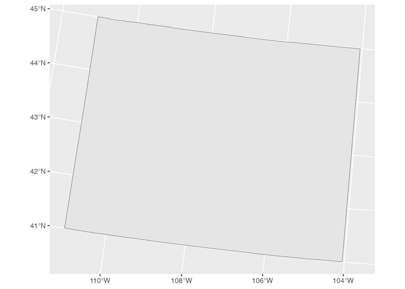
The CRS matters as soon as you combine datasets or want a particular
look. st_transform() reprojects an object; here is Wyoming in a
US-focused projection, tilted slightly compared to the plain
longitude/latitude version above:
wyoming |>
  st_transform(crs = 5070) |>
  ggplot() +
  geom_sf()
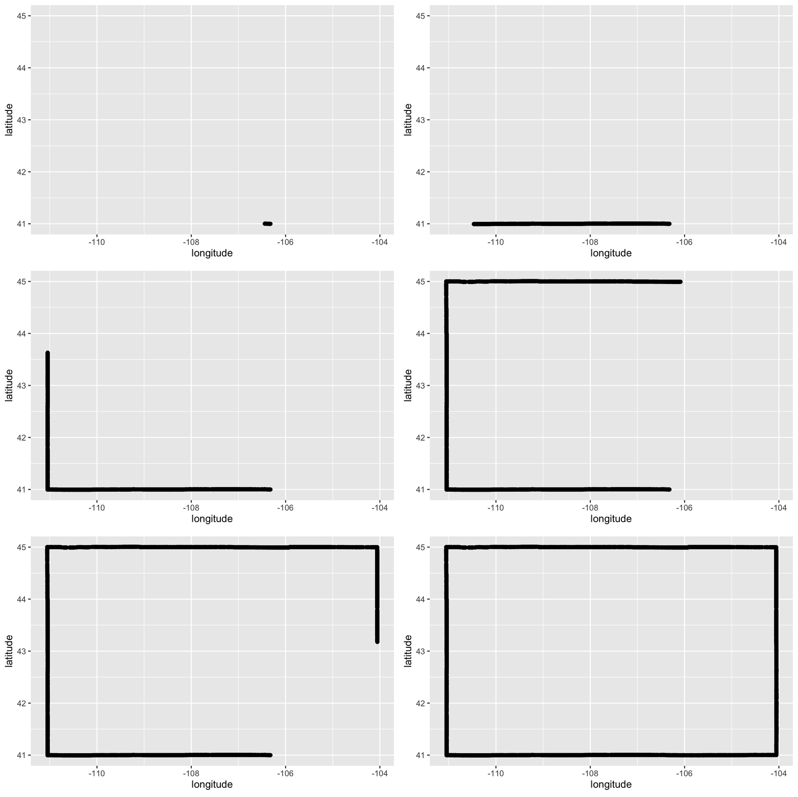
The geometry column is really just an ordered list of coordinate
points. Connect them in order and you trace the shape, which is exactly
what geom_sf() does:
Getting geospatial data into R
There are four routes you will use again and again: reading a file, converting a data frame, pulling from a package, and geocoding addresses.
From a file
read_sf() reads almost any geospatial file. The two you will meet most
are Esri shapefiles and GeoJSON. The one gotcha: a shapefile is
not one file, it is a bundle (.shp, .shx, .dbf, and more) that
must stay together. GeoJSON is a single self-contained file, so it is
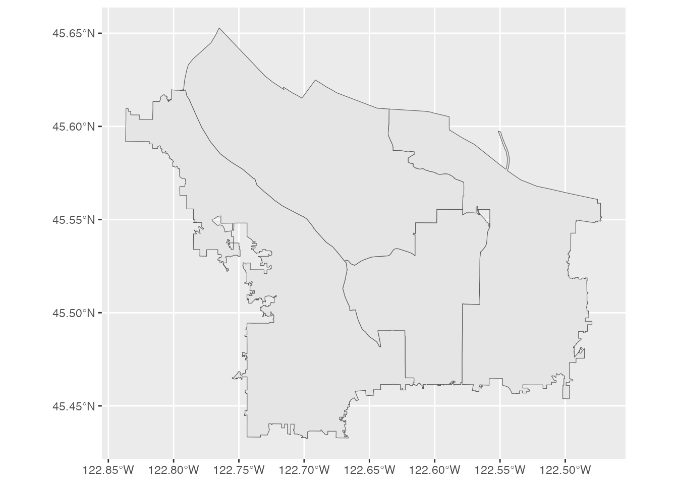
easier to share, and you can even read it straight from a URL. Here are
the four Portland city council districts:
districts <- read_sf(
  "https://raw.githubusercontent.com/rfortherestofus/mapping-with-r-v2/refs/heads/main/data/portland_city_council_districts.geojson"
)

ggplot() +
  geom_sf(data = districts)
From a data frame
Often your data is spatial but arrives as a plain table with
longitude/latitude columns. Turn it into mappable data with
st_as_sf(), telling it which columns hold the coordinates and
which CRS they use (4326 is standard longitude/latitude). Two things
to get right: the column names must be quoted, and you must set
the CRS or nothing will line up on a map.
portland_corners <- read_csv(
  "https://raw.githubusercontent.com/rfortherestofus/mapping-with-r-v2/refs/heads/main/data/portland_corners.csv"
)

portland_corners_sf <- portland_corners |>
  st_as_sf(coords = c("longitude", "latitude"), crs = 4326)
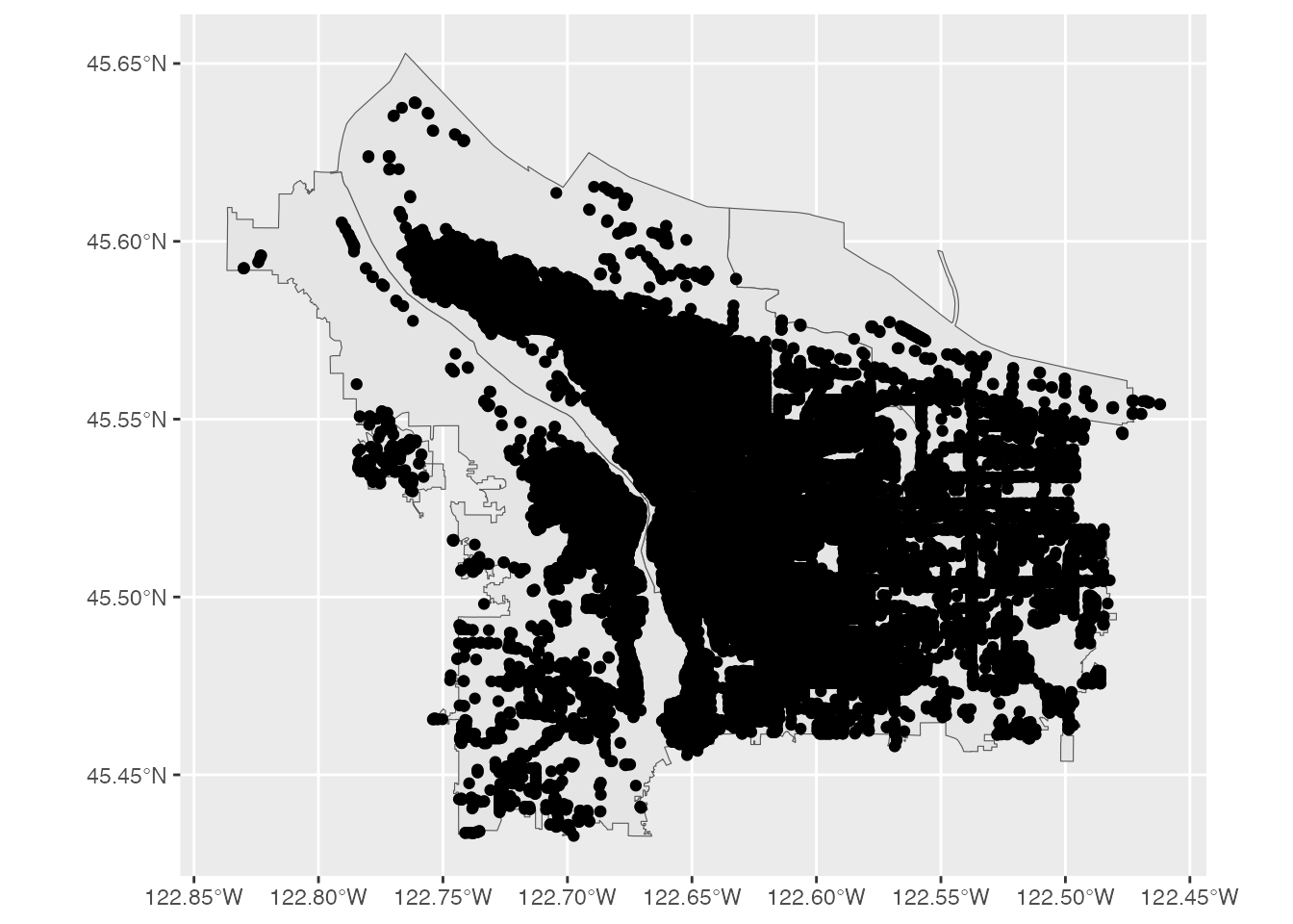
On their own, points floating in space are hard to place. Because we already loaded the council districts above, we can draw them behind the points to give the map some context:
ggplot() +
  geom_sf(data = districts) +
  geom_sf(data = portland_corners_sf)
From a package
For common data you don’t need a file at all, a package will fetch it. A few worth knowing:
Global data with {rnaturalearth}.
{rnaturalearth} pulls
country borders and more from the Natural Earth project.
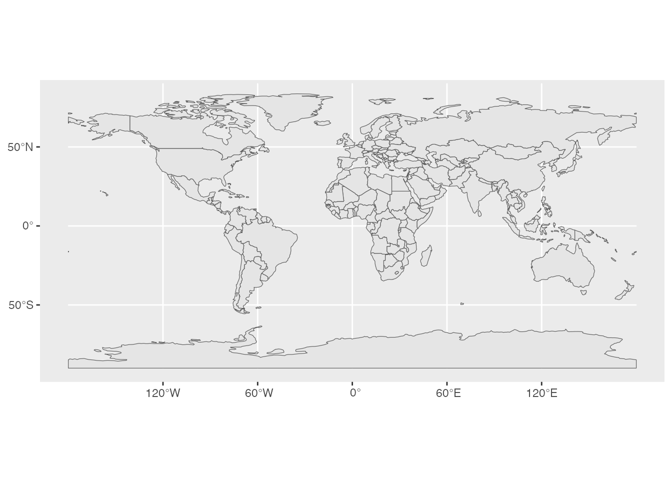
ne_countries() gets them:
library(rnaturalearth)

ne_countries() |>
  ggplot() +
  geom_sf()
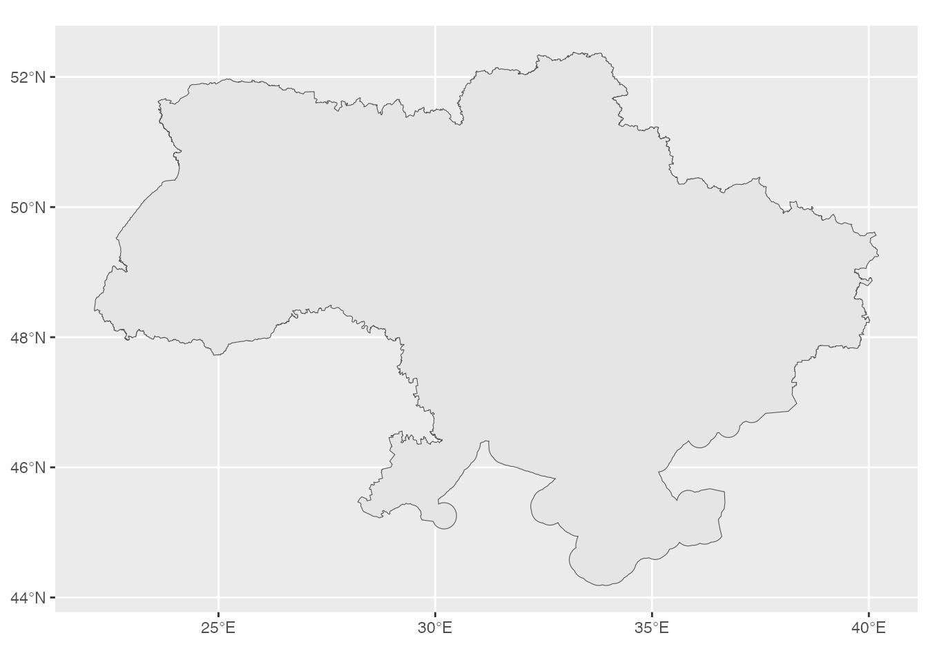
One concept worth carrying with you: boundaries are political, and packages disagree on disputed areas. Natural Earth leaves Crimea out of Ukraine (its de facto policy):
ne_countries(country = "Ukraine") |>
  ggplot() +
  geom_sf()
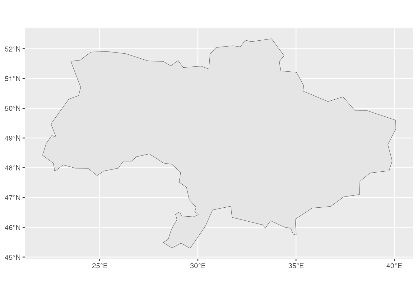
The {rgeoboundaries} package instead uses de jure (legal) borders, so its Ukraine includes Crimea. Plot it and look at the southern coast:
library(rgeoboundaries)

geoboundaries(country = "Ukraine") |>
  ggplot() +
  geom_sf()
US boundaries with {tigris}.
{tigris} (by Kyle Walker)
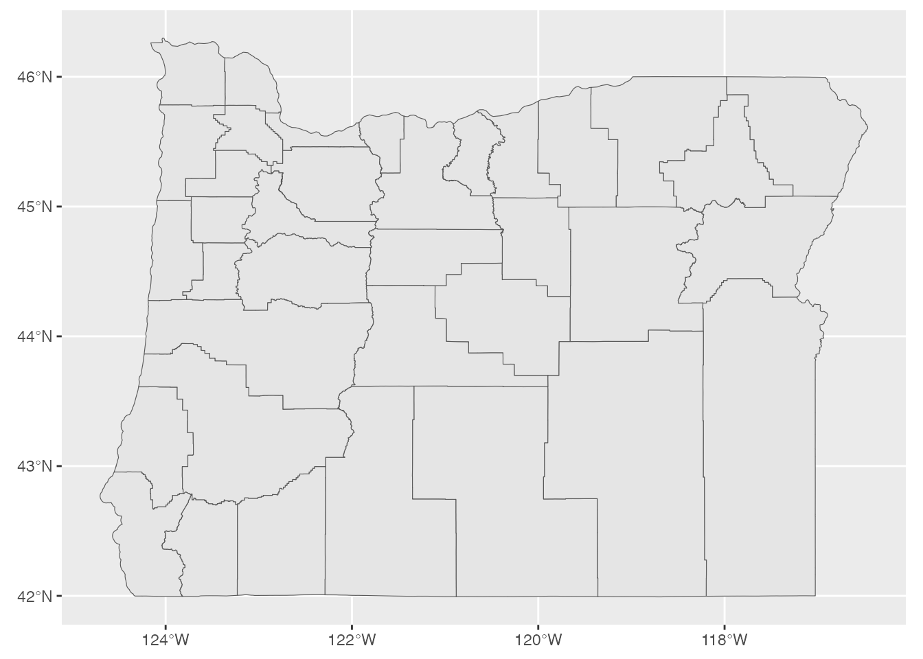
downloads boundary files straight from the US Census Bureau: states,
counties, places, roads, and more. The functions are named for what they
return, like states() and counties():
library(tigris)

counties(state = "OR", progress_bar = FALSE) |>
  ggplot() +
  geom_sf()
Census data with {tidycensus}.
{tidycensus} (also by Kyle
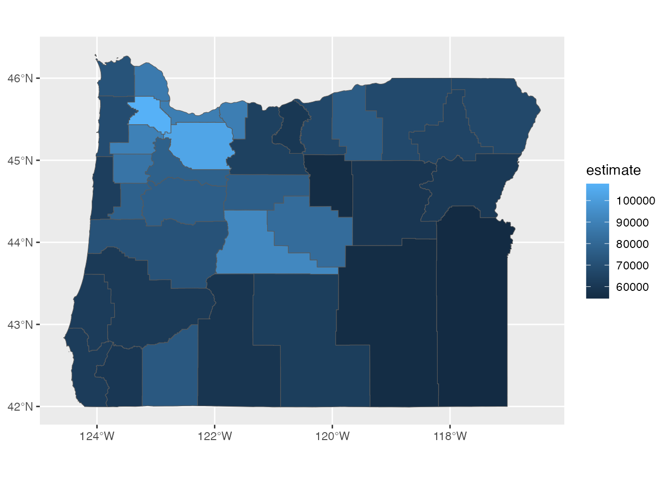
Walker) pulls data from the US Census Bureau, and, crucially, can return
it already joined to geometry. That means you can map a variable
directly, no separate boundary file or join required. It needs a free
Census API key, set once with census_api_key(). Here is median
household income by Oregon county (geometry = TRUE is what attaches
the shapes):
library(tidycensus)

get_acs(
  geography = "county",
  state = "OR",
  variable = "B19013_001",
  geometry = TRUE
) |>
  ggplot() +
  geom_sf(aes(fill = estimate))
By geocoding addresses
If you have addresses instead of coordinates, geocode them: turn
each address into a longitude/latitude with the
{tidygeocoder} package,
then convert to an {sf} object as above. The default service is free
(OpenStreetMap); for better accuracy you can switch services with
method = (for example LocationIQ, which needs a free API key).
library(tidygeocoder)

famous_places_sf <- tribble(
  ~building, ~address,
  "White House", "1600 Pennsylvania Ave NW, Washington, DC",
  "Empire State Building", "350 5th Ave, New York, NY"
) |>
  geocode(address, method = "osm") |>
  st_as_sf(coords = c("long", "lat"), crs = 4326)
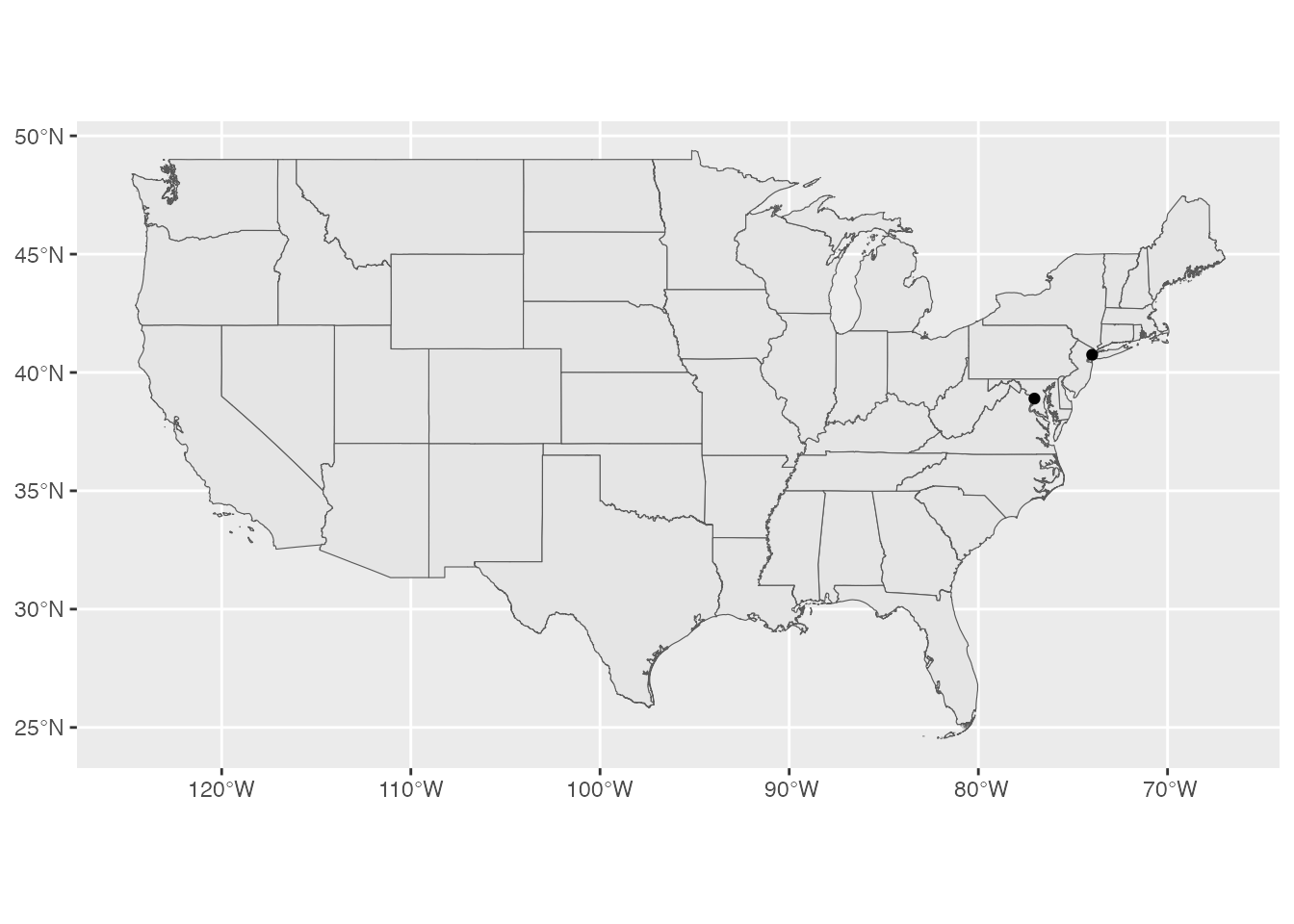
Again, two points on their own are hard to place, so we can pull US state boundaries with {tigris} and draw them behind the geocoded points:
lower_48 <- states(cb = TRUE, progress_bar = FALSE) |>
  filter(!STUSPS %in% c("AK", "HI", "PR", "GU", "VI", "MP", "AS"))

ggplot() +
  geom_sf(data = lower_48) +
  geom_sf(data = famous_places_sf)
Static Maps
A static map is a fixed image. Making one is mostly regular {ggplot2}:
you start with geom_sf() and then map columns to aesthetics and adjust
the styling, exactly as you would any other plot. This section shows the
moves that come up most.
Choropleths
A choropleth shades each region by a value. It is the most common
thematic map, and the whole job is mapping a column to the fill
aesthetic. Here is the percentage of people who speak a language other
than English, by county, from {tidycensus}:
language_at_home <-
  get_acs(
    geography = "county",
    variable = "S1601_C01_003",
    summary_var = "S1601_C01_001",
    geometry = TRUE
  ) |>
  mutate(pct = estimate / summary_est)

language_at_home |>
  shift_geometry() |>
  ggplot() +
  geom_sf(aes(fill = pct))
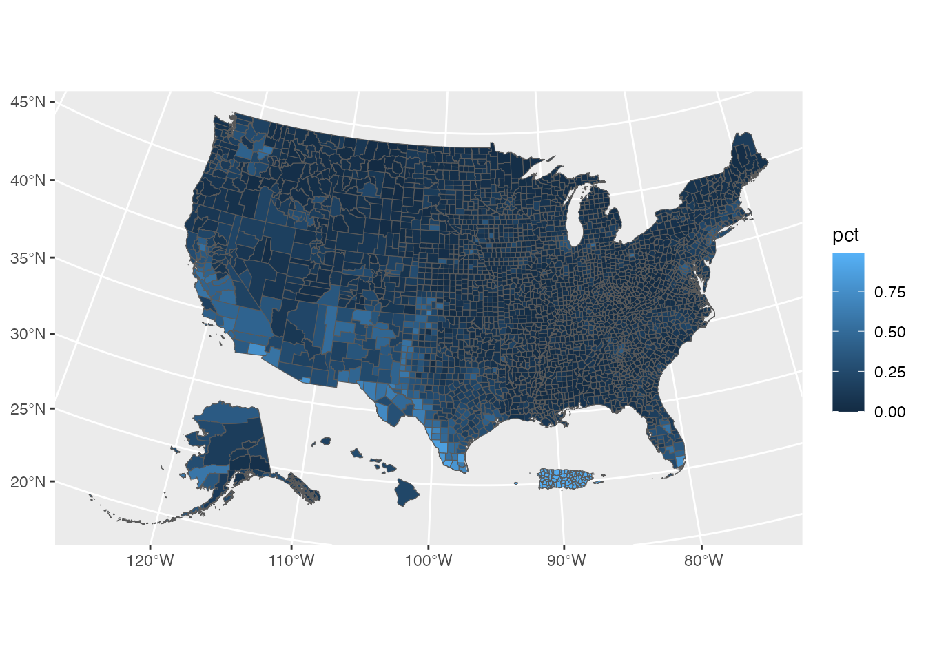
Two things are doing the work: aes(fill = pct) colors each county by
the value, and shift_geometry() (from {tigris}) tucks Alaska, Hawaii,
and Puerto Rico into a compact layout so the whole country fits.
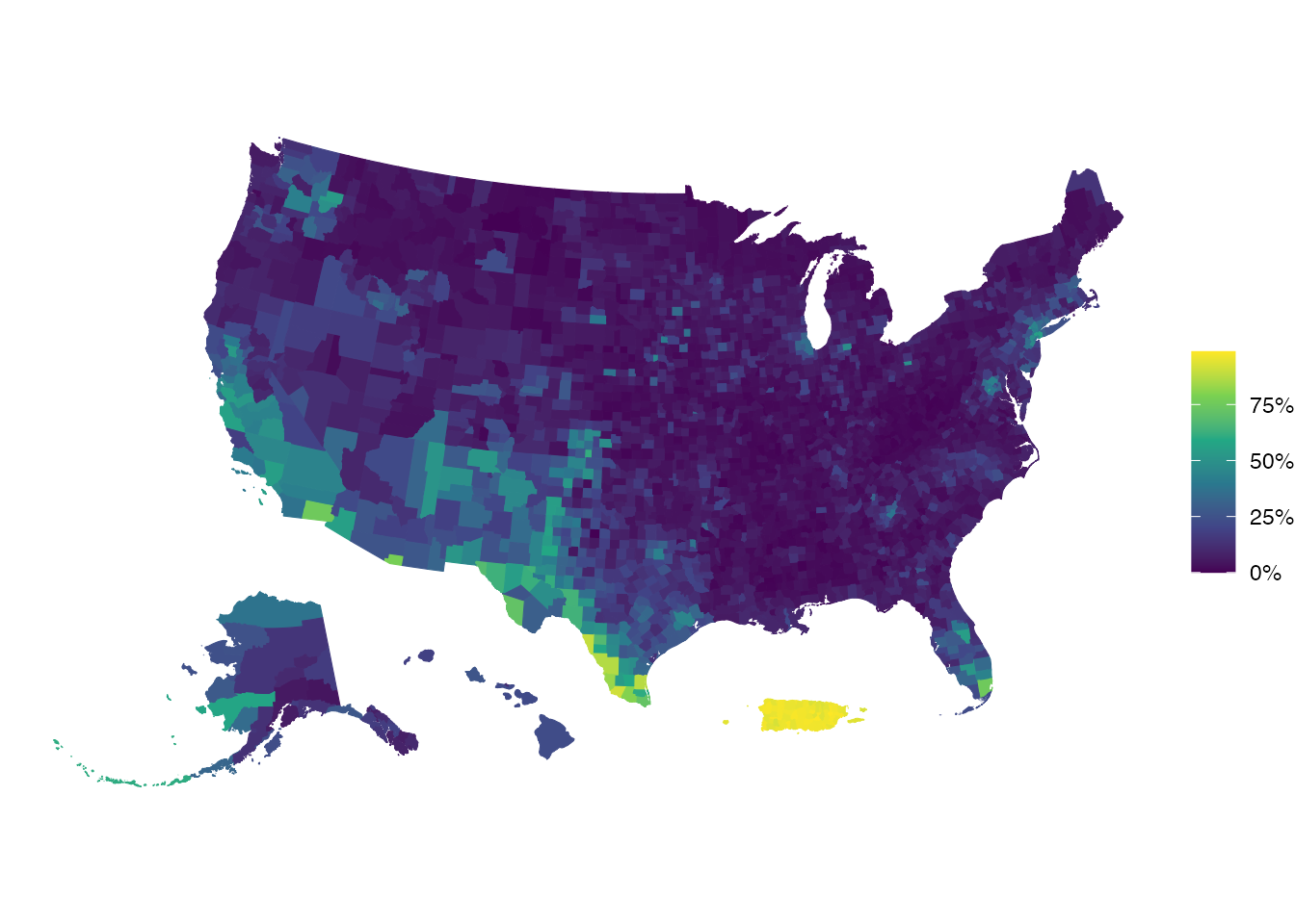
That first version is functional but noisy. A few standard moves clean
it up: scale_fill_viridis_c() for a colorblind-friendly palette,
theme_void() to drop the axes and gridlines, mapping color to the
same value to hide the thin borders between counties, and {scales} to
label the legend as percentages:
library(scales)

language_at_home |>
  shift_geometry() |>
  ggplot() +
  geom_sf(aes(fill = pct, color = pct)) +
  scale_fill_viridis_c(labels = percent_format()) +
  scale_color_viridis_c(labels = percent_format()) +
  labs(fill = NULL, color = NULL) +
  theme_void()
Dot and bubble maps
When your values sit at points rather than regions, size the points
instead of filling areas. A bubble map maps a value to the size
aesthetic, here Oregon places sized by population:
oregon <- states(progress_bar = FALSE) |>
  filter(NAME == "Oregon")

oregon_places <- read_sf(
  "https://raw.githubusercontent.com/rfortherestofus/mapping-with-r-v2/refs/heads/main/data/oregon_places.geojson"
)

ggplot() +
  geom_sf(data = oregon, fill = "transparent") +
  geom_sf(data = oregon_places, aes(size = population), alpha = 0.5) +
  scale_size_continuous(range = c(1, 15)) +
  theme_void()
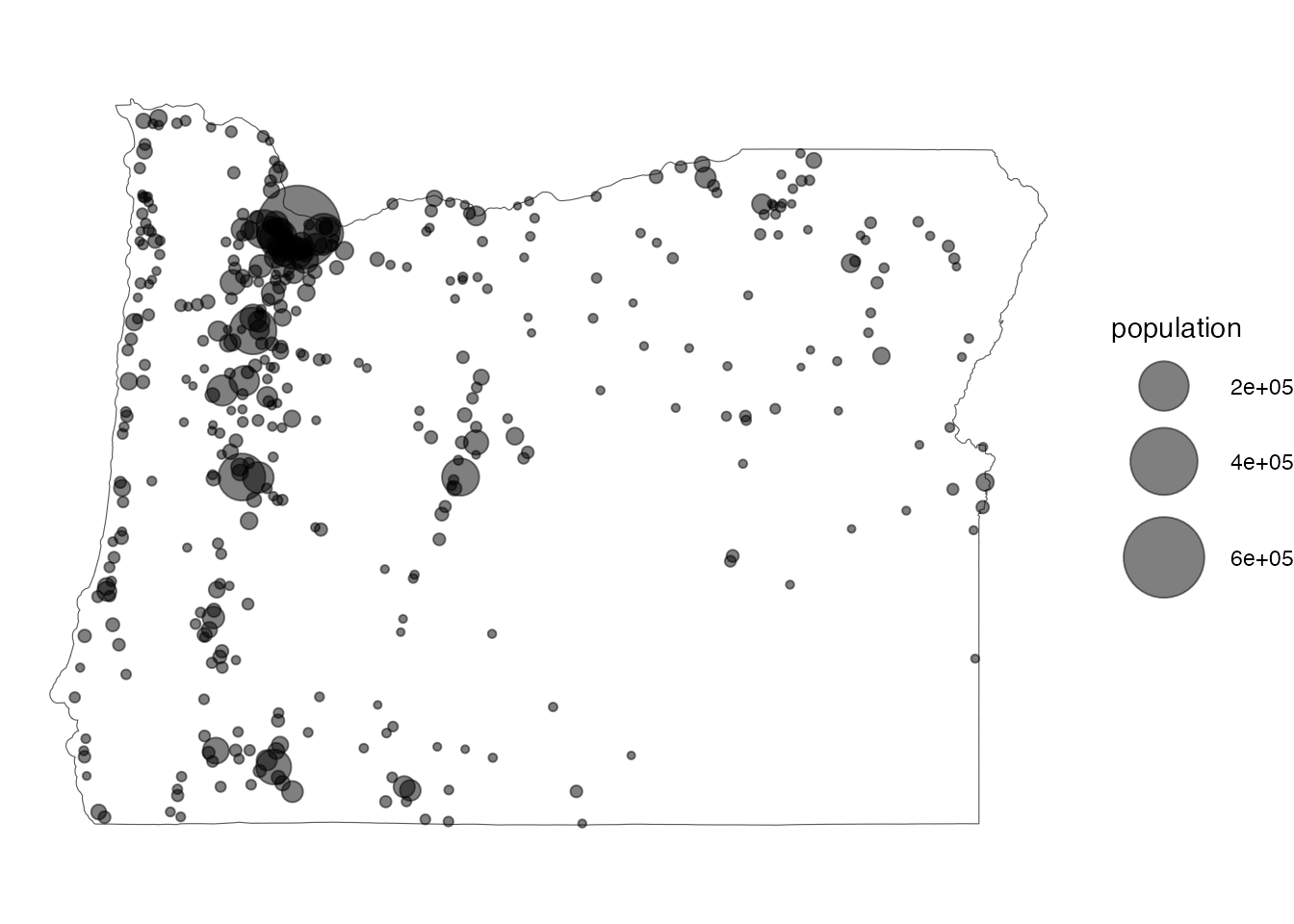
A close cousin is the dot-density map, where each dot stands for a
fixed count and dots are scattered across each region. {tidycensus} has
as_dot_density() to build one.
Choosing a projection
The projection you use changes how the map looks, sometimes
dramatically. st_transform() reprojects your data; here is the world
in the Robinson projection instead of plain longitude/latitude:
ne_countries() |>
  st_transform("ESRI:54030") |>
  ggplot() +
  geom_sf()
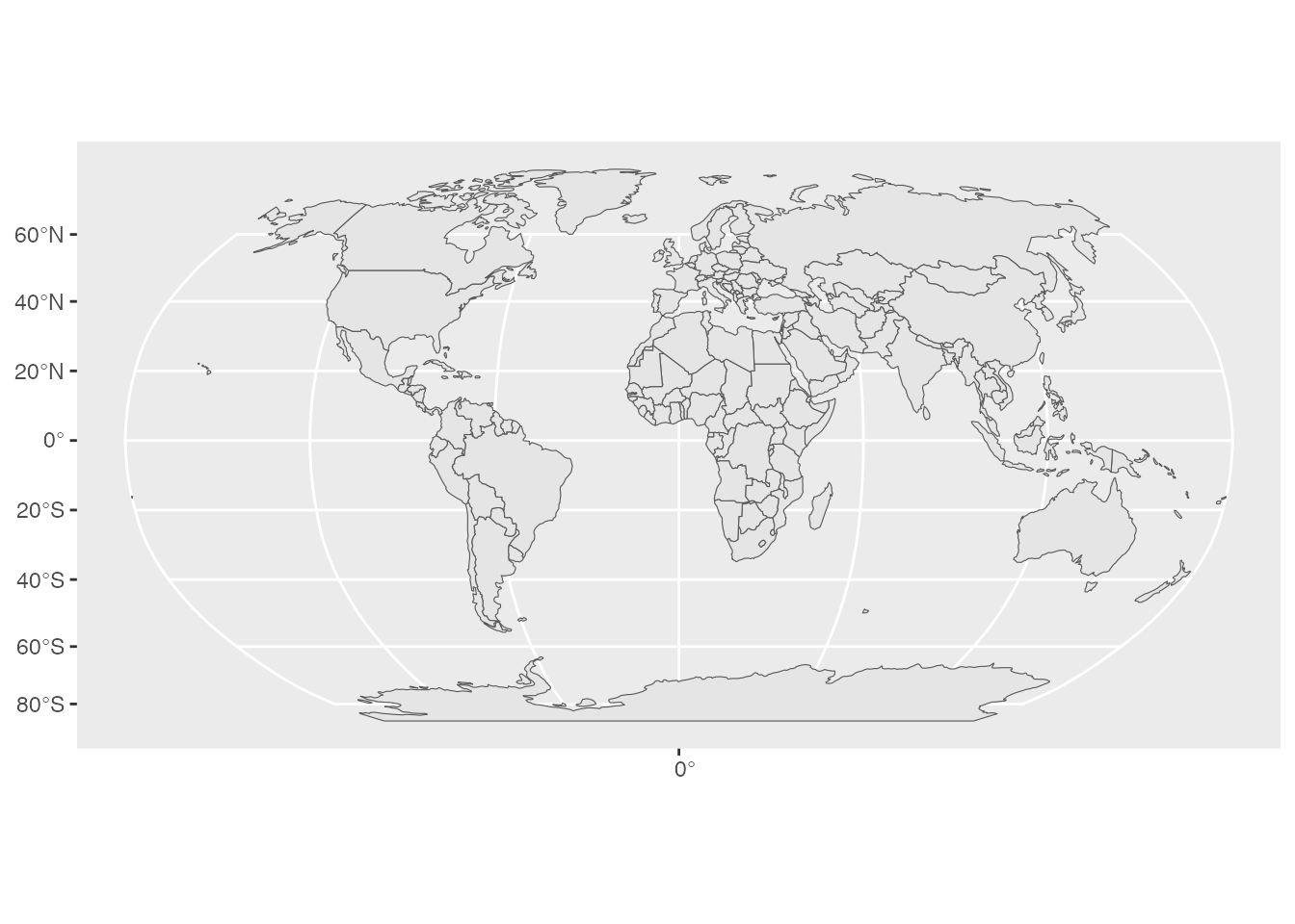
Picking a good projection for a specific region is a small art. The
{crsuggest} package will
suggest one with suggest_top_crs(), and for US maps shift_geometry()
(used above) both reprojects and repositions Alaska and Hawaii.
Adding labels
Text labels come from geom_sf_text(), which places a label at each
feature’s center. Here are Oregon’s counties, labeled:
counties(state = "OR", progress_bar = FALSE) |>
  ggplot() +
  geom_sf() +
  geom_sf_text(aes(label = NAME), size = 2)
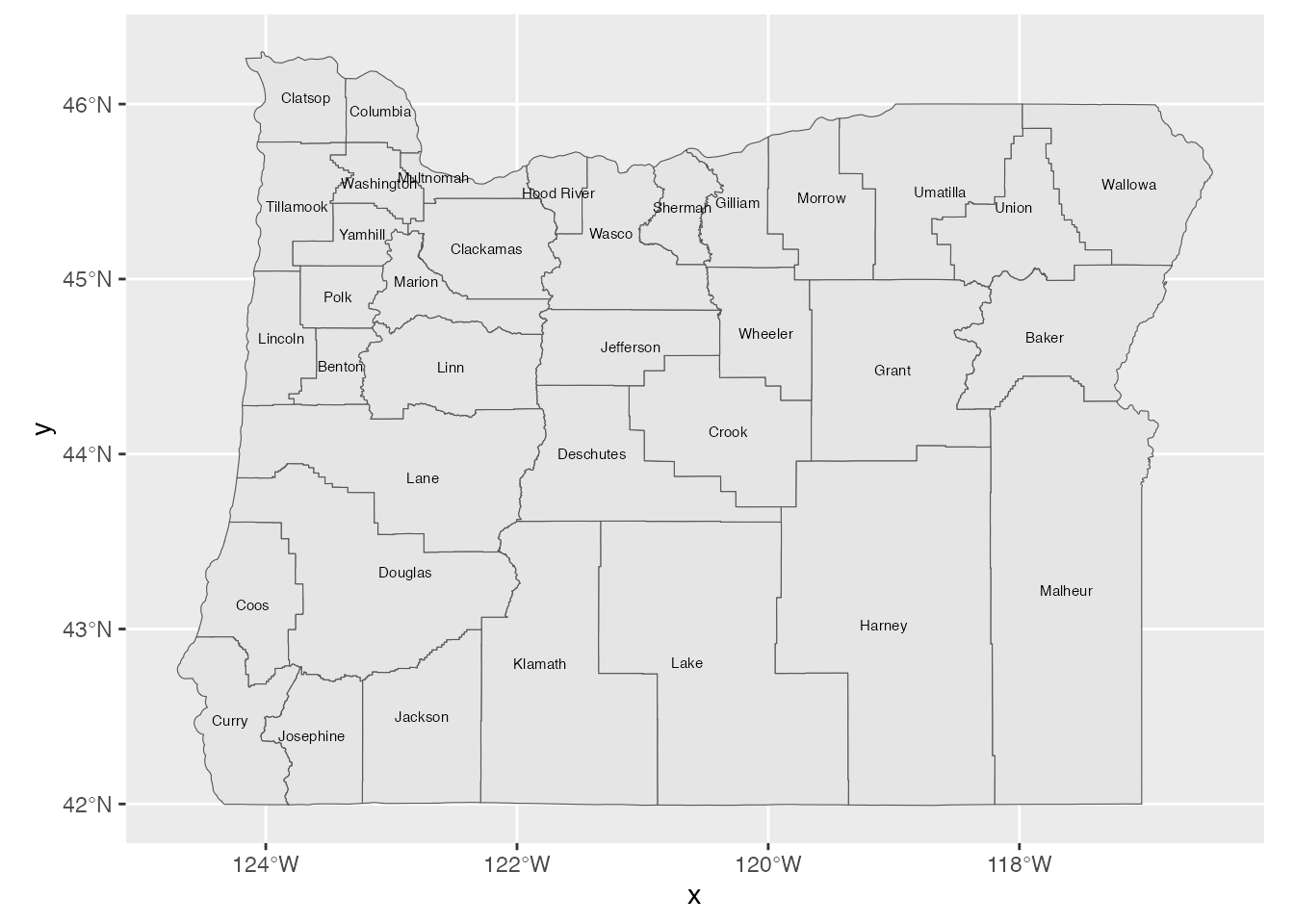
When labels overlap, the {ggrepel}
package nudges them apart with geom_text_repel() (using
stat = "sf_coordinates" for spatial data).
Combining layers
Every map above is built by stacking geom_sf() layers: a region behind
points, boundaries under labels, and so on. That layering, plus
fill = "transparent" and theme_void() to keep the background clean,
is most of what makes a polished static map.
Interactive Maps
An interactive map is one a reader can pan, zoom, and hover or click for
details. Where static maps are {ggplot2}, interactive maps come from a
dedicated package. Historically the most popular has been
{leaflet}, but I find its syntax
less than intuitive, so I reach for
{mapgl} (by Kyle Walker) instead,
which I find much easier to use. It wraps the modern, GPU-accelerated
Mapbox GL and MapLibre GL libraries. maplibre() is free and
needs no account; mapboxgl() uses Mapbox’s styles and needs a free API
token (stored as MAPBOX_PUBLIC_TOKEN).
A basic interactive map
Start with a map and a basemap style. This one you can already drag and zoom:
library(mapgl)

maplibre(style = carto_style("positron"))
Adding your data in layers
Here interactive maps differ from geom_sf(), which draws any geometry.
Like other interactive mapping tools, {mapgl} uses a layer function
chosen by geometry type, which you pipe onto the map:
add_fill_layer() for polygons, add_circle_layer() for points, and
add_line_layer() for lines. Interactive maps expect longitude/latitude
data, so reproject to CRS 4326 first. Here are the Portland council
districts:
districts_4326 <- st_transform(districts, 4326)

maplibre(bounds = districts_4326) |>
  add_fill_layer(
    id = "districts",
    source = districts_4326,
    fill_color = "steelblue",
    fill_opacity = 0.5
  )
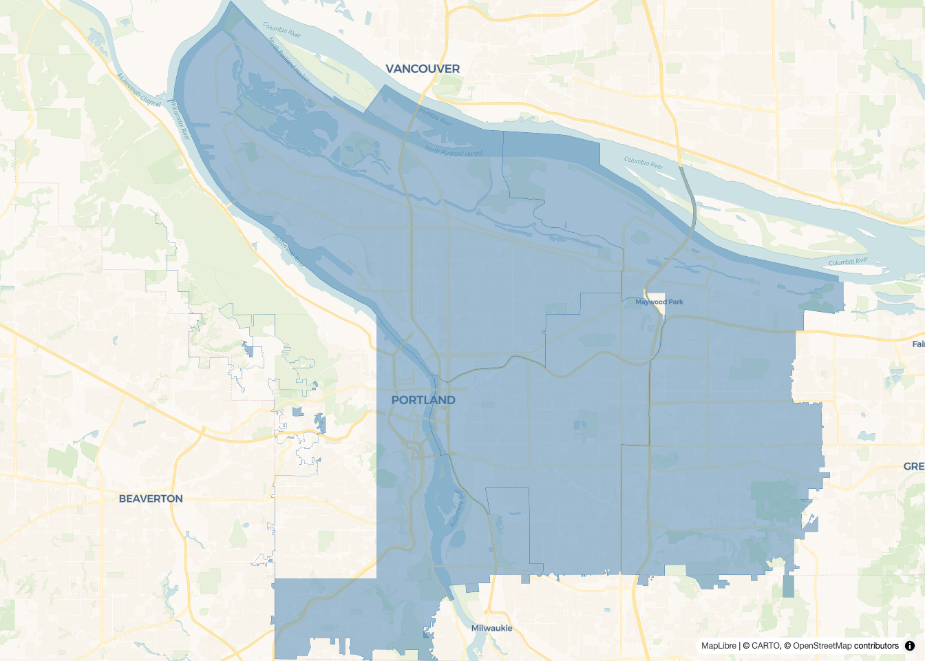
(bounds = zooms the map to fit the data.)
Choropleths
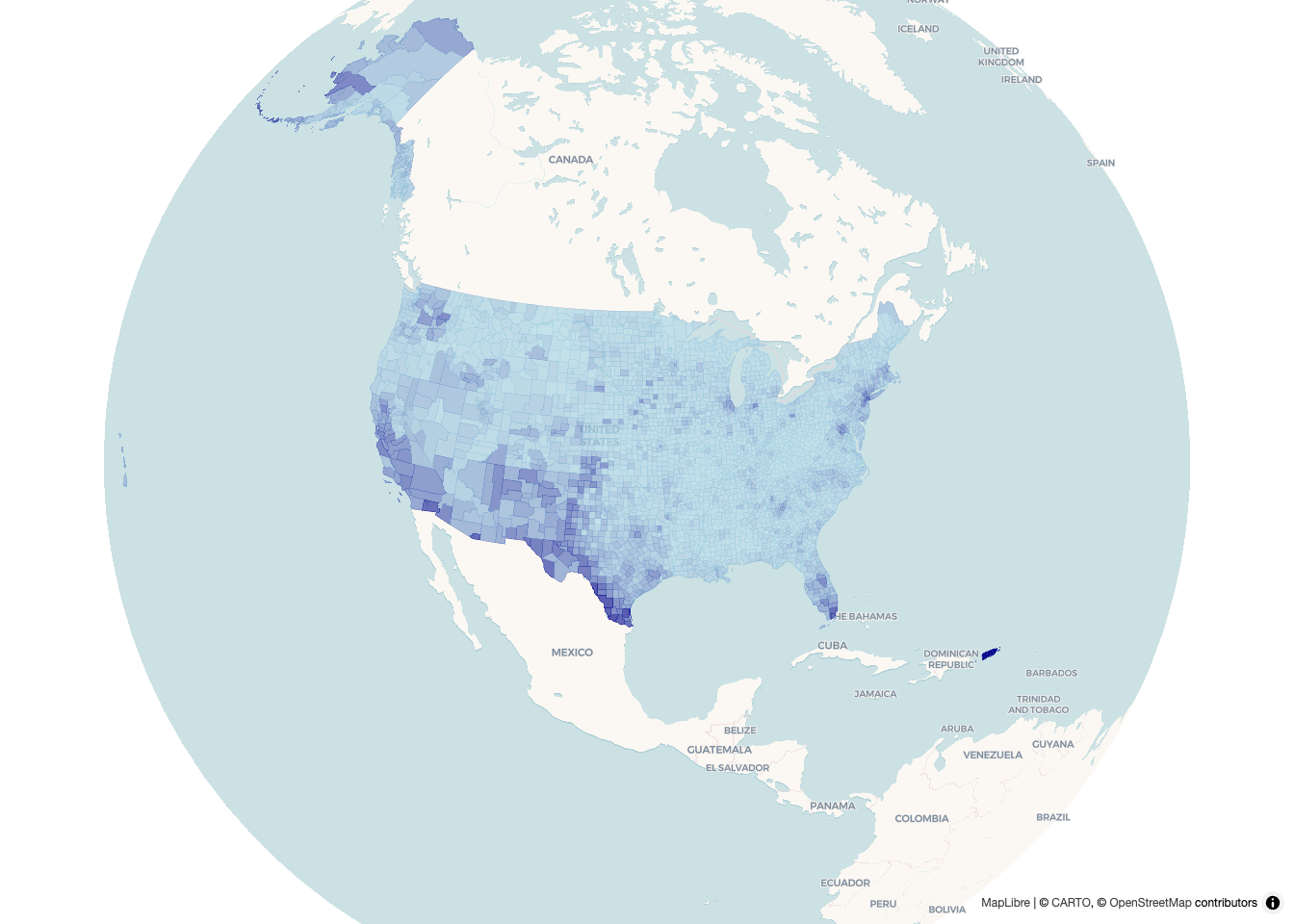
To shade regions by a value, set fill_color to interpolate(), which
maps a column onto a color ramp. Here is the “language other than
English” data from the Static Maps section, now interactive, with a
tooltip that appears on hover:
language_4326 <- st_transform(language_at_home, 4326)

maplibre(center = c(-96, 38), zoom = 3) |>
  add_fill_layer(
    id = "language",
    source = language_4326,
    fill_color = interpolate(
      column = "pct",
      values = c(0, 1),
      stops = c("lightblue", "darkblue"),
      na_color = "lightgrey"
    ),
    fill_opacity = 0.7,
    tooltip = "NAME"
  )
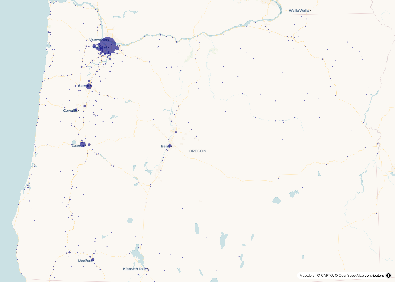
Dot and bubble maps
For point data, use add_circle_layer(). Size the circles by a value
for a bubble map (or color them by a category for a dot map).
Here are Oregon’s places, sized by population:
oregon_places_4326 <- st_transform(oregon_places, 4326)

maplibre(bounds = oregon_places_4326) |>
  add_circle_layer(
    id = "places",
    source = oregon_places_4326,
    circle_color = "navy",
    circle_opacity = 0.6,
    circle_radius = interpolate(
      column = "population",
      values = c(0, 600000),
      stops = c(2, 30)
    ),
    tooltip = "name"
  )
Popups, tooltips, and more
Two ways to attach details to any layer: tooltip = shows on hover
(used above) and popup = shows on click. Pass a column name, or
build a richer HTML string first, {mapgl} renders HTML in both. From
here {mapgl} goes much further than a static map can: animated
fly_to() camera moves, 3D building extrusions, and heatmaps, all
covered in its documentation.