

A table is a data visualization, too. Printing a data frame to the console dumps numbers on the page; a well-designed table guides the reader’s eye to what matters, which is the same job a good chart does. R makes polished tables easy, and I reach for the {gt} package, one of the most popular options and one that follows good design principles by default.
This page walks through the core principles of good table design and how to apply each one with {gt}. The principles, and much of the code, are adapted from Tom Mock’s excellent post “10+ Guidelines for Better Tables in R”.
Creating a Data Frame
You will begin by creating a data frame that you can use to make tables throughout this chapter. First, load the packages you need (the {tidyverse} for general data manipulation functions, {gapminder} for the data you’ll use, {gt} to make the tables, and {gtExtras} to do some table formatting):
library(tidyverse)
library(gapminder)
library(gt)
library(gtExtras)
As you saw earlier, the {gapminder} package provides country-level demographic statistics. To make a data frame for your table, you’ll use just a few countries (the first four, in alphabetical order: Afghanistan, Albania, Algeria, and Angola) and three years (1952, 1972, and 1992). The {gapminder} data has many years, but these will suffice to demonstrate table-making principles. The following code creates a data frame called gdp:
gdp <- gapminder |>
  filter(country %in% c("Afghanistan", "Albania", "Algeria", "Angola")) |>
  select(country, year, gdpPercap) |>
  mutate(country = as.character(country)) |>
  pivot_wider(
    id_cols = country,
    names_from = year,
    values_from = gdpPercap
  ) |>
  select(country, `1952`, `1972`, `1992`) |>
  rename(Country = country)
Here’s what gdp looks like:
gdp
# A tibble: 4 × 4
  Country      `1952`  `1972`  `1992`
  <chr>         <dbl>   <dbl>   <dbl>
1 Afghanistan  779.45  739.98  649.34
2 Albania     1601.1  3313.4  2497.4
3 Algeria     2449.0  4182.7  5023.2
4 Angola      3520.6  5473.3  2627.8
Now that you have some data, you’ll use it to make a table.
Table Design Principles
Unsurprisingly, the principles of good table design are similar to those for data visualization more generally. This section covers six of the most important ones.
Minimize Clutter
You can minimize clutter in your tables by removing unnecessary elements. For example, one common source of table clutter is grid lines, as shown in Table 1.
table_gridlines <- gdp |>
  gt() |>
  tab_style(
    style = cell_borders(
      side = "all",
      color = "black",
      weight = px(1),
      style = "solid"
    ),
    locations = list(
      cells_body(
        everything()
      ),
      cells_column_labels(
        everything()
      )
    )
  ) |>
  opt_table_lines(extent = "none")
table_gridlines
Table 1: A table with grid lines everywhere can be distracting.
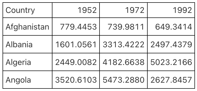
Having grid lines around every single cell in your table is unnecessary and distracts from the goal of communicating clearly. A table with minimal or even no grid lines (Table 2) is a much more effective communication tool.
table_default <- gdp |>
  gt()
table_default
Table 2: A table with only horizontal grid lines is more effective.
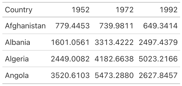
I mentioned that {gt} uses good table design principles by default, and
this is a great example. The second table, with minimal grid lines,
requires just two lines of code—piping the gdp data into the gt()
function, which creates a table:
gdp |>
  gt()
To add grid lines to every part of the example, you’d have to add more
code. Here, the code that follows the gt() function adds grid lines:
gdp |>
  gt() |>
  tab_style(
    style = cell_borders(
      side = "all",
      color = "black",
      weight = px(1),
      style = "solid"
    ),
    locations = list(
      cells_body(
        everything()
      ),
      cells_column_labels(
        everything()
      )
    )
  ) |>
  opt_table_lines(extent = "none")
Since I don’t recommend taking this approach, I won’t walk you through this code. However, if you wanted to remove additional grid lines, you could do so like this:
gdp |>
  gt() |>
  tab_style(
    style = cell_borders(color = "transparent"),
    locations = cells_body()
  )
The tab_style() function uses a two-step approach. First, it
identifies the style to modify (in this case, the borders), then it
specifies where to apply these modifications. Here, tab_style() tells
R to modify the borders using the cell_borders() function, making the
borders transparent, and to apply this transformation to the
cells_body() location (versus, say, the cells_column_labels() for
only the first row).
To see all options, check out the list of helper functions on the {gt} package documentation website at https://gt.rstudio.com/reference/index.html#helper-functions.
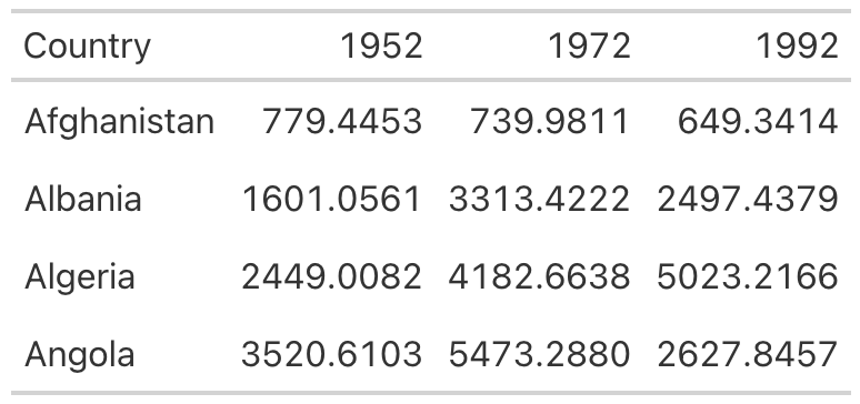
Running this code outputs a table with no grid lines at all in the body (Table 3).
table_clean <- gdp |>
  gt() |>
  tab_style(
    style = cell_borders(color = "transparent"),
    locations = cells_body()
  )
table_clean
Table 3: A clean-looking table with grid lines only on the header row and the bottom
Save this table as an object called table_no_gridlines so that you can
add to it later.
table_no_gridlines <- gdp |>
  gt() |>
  tab_style(
    style = cell_borders(color = "transparent"),
    locations = cells_body()
  )
Differentiate the Header from the Body
While reducing clutter is an important goal, going too far can have negative consequences. A table with no grid lines at all can make it hard to differentiate between the header row and the table body. Consider Table 4, for example.
table_no_grid_lines <- gdp |>
  gt() |>
  opt_table_lines(extent = "none")
table_no_grid_lines
Table 4: An unclear table with all grid lines removed
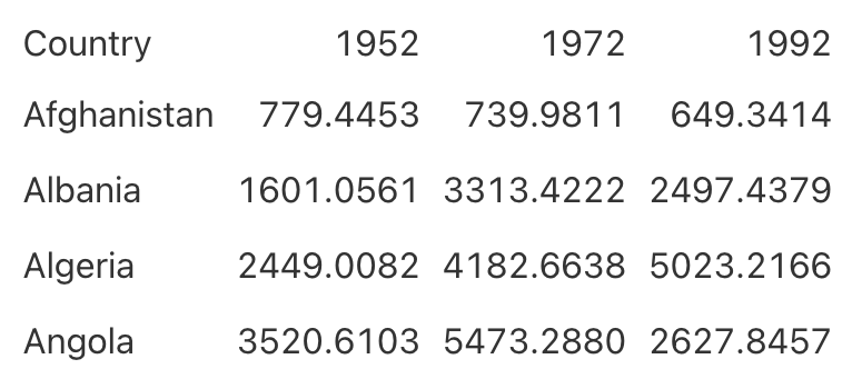
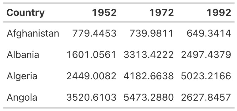
By making the header row bold, you can make it stand out better:
table_no_gridlines |>
  tab_style(
    style = cell_text(weight = "bold"),
    locations = cells_column_labels()
  )
Starting with the table_no_gridlines object, this code applies
formatting with the tab_style() function in two steps. First, it
specifies that it wants to alter the text style by using the
cell_text() function to set the weight to bold. Second, it sets the
location for this transformation to the header row using the
cells_column_labels() function.
Table 5 shows
what the table looks like with its header row bolded.
table <- table_no_gridlines |>
  tab_style(
    style = cell_text(weight = "bold"),
    locations = cells_column_labels()
  )
table
Table 5: Making the header row more obvious using bold
Save this table as table_bold_header in order to add further
formatting.
table_bold_header <- table_no_gridlines |>
  tab_style(
    style = cell_text(weight = "bold"),
    locations = cells_column_labels()
  )
Align Appropriately
A third principle of high-quality table design is appropriate alignment. Specifically, numbers in tables should be right-aligned. Tom Mock explains that left-aligning or center-aligning numbers “impairs the ability to clearly compare numbers and decimal places. Right alignment lets you align decimal places and numbers for easy parsing.”
Let’s look at this principle in action. In Table 6, the 1952 column is left-aligned, the 1972 column is center-aligned, and the 1992 column is right-aligned.
table_mixed_alignment <- table_bold_header |>
  cols_align(
    align = "left",
    columns = 2
  ) |>
  cols_align(
    align = "center",
    columns = 3
  ) |>
  cols_align(
    align = "right",
    columns = 4
  )
table_mixed_alignment
Table 6: Comparing numerical data aligned to the left (1952), center (1972), and right (1992)
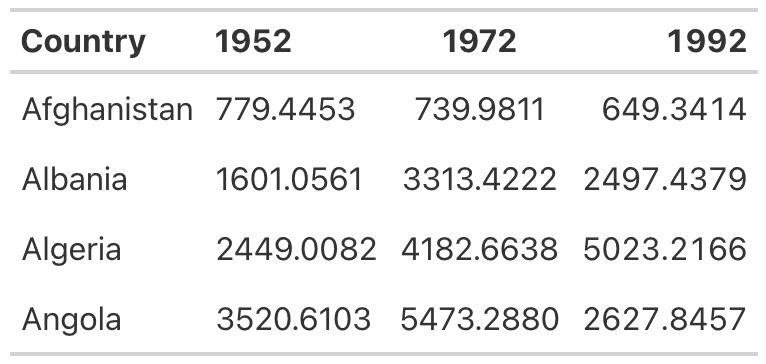
You can see how much easier it is to compare the values in the 1992 column than those in the other two columns. In both the 1952 and 1972 columns, it’s challenging to compare the values because the numbers in the same position (the tens place, for example) aren’t aligned vertically. In the 1992 column, however, the number in the tens place in Afghanistan (4) aligns with the number in the tens place in Albania (9) and all other countries, making it much easier to scan the table.
As with other tables, you actually have to override the defaults to get the {gt} package to misalign the columns, as demonstrated in the following code:
table_bold_header |>
  cols_align(
    align = "left",
    columns = 2
  ) |>
  cols_align(
    align = "center",
    columns = 3
  ) |>
  cols_align(
    align = "right",
    columns = 4
  )
By default, {gt} will right-align numeric values. Don’t change anything, and you’ll be golden.
Right alignment is best practice for numeric columns, but for text
columns, use left alignment. As Jon Schwabish points out in his article
“Ten Guidelines for Better Tables” in the Journal of Benefit-Cost
Analysis, it’s much easier to read longer text cells when they are
left-aligned. To see the benefit of left-aligning text, add a country
with a long name to your table. I’ve added Bosnia and Herzegovina and
saved this as a data frame called gdp_with_bosnia. You’ll see that I’m
using nearly the same code I used previously to create the gdp data
frame:
gdp_with_bosnia <- gapminder |>
  filter(country %in% c("Afghanistan", "Albania", "Algeria", "Angola", "Bosnia and Herzegovina")) |>
  select(country, year, gdpPercap) |>
  mutate(country = as.character(country)) |>
  pivot_wider(
    id_cols = country,
    names_from = year,
    values_from = gdpPercap
  ) |>
  select(country, `1952`, `1972`, `1992`) |>
  rename(Country = country)
Here’s what the gdp_with_bosnia data frame looks like:
gdp_with_bosnia
# A tibble: 5 × 4
  Country                 `1952`  `1972`  `1992`
  <chr>                    <dbl>   <dbl>   <dbl>
1 Afghanistan             779.45  739.98  649.34
2 Albania                1601.1  3313.4  2497.4
3 Algeria                2449.0  4182.7  5023.2
4 Angola                 3520.6  5473.3  2627.8
5 Bosnia and Herzegovina  973.53 2860.2  2546.8
Now take the gdp_with_bosnia data frame and create a table with the
Country column center-aligned. In the table in
Table 7,
it’s hard to scan the country names, and that center-aligned column just
looks a bit weird.
table_center_aligned <- gdp_with_bosnia |>
  gt() |>
  tab_style(
    style = cell_borders(color = "transparent"),
    locations = cells_body()
  ) |>
  tab_style(
    style = cell_text(weight = "bold"),
    locations = cells_column_labels()
  ) |>
  cols_align(
    columns = "Country",
    align = "center"
  )
table_center_aligned
Table 7: Center-aligned text can be hard to read, especially when it includes longer values.
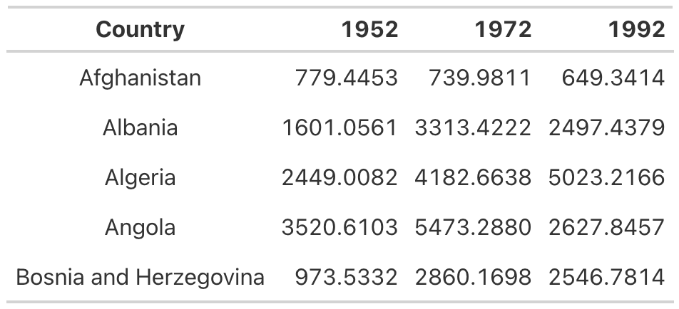
This is another example where you have to change the {gt} defaults to mess things up. In addition to right-aligning numeric columns by default, {gt} left-aligns character columns. As long as you don’t touch anything, you’ll get the alignment you’re looking for.
If you ever do want to override the default alignments, you can use the
cols_align() function. For example, here’s how to make the table with
center-aligned country names:
gdp_with_bosnia |>
  gt() |>
  tab_style(
    style = cell_borders(color = "transparent"),
    locations = cells_body()
  ) |>
  tab_style(
    style = cell_text(weight = "bold"),
    locations = cells_column_labels()
  ) |>
  cols_align(
    columns = "Country",
    align = "center"
  )
The columns argument tells {gt} which columns to align, and the align
argument selects the alignment (left, right, or center).
Use the Correct Level of Precision
In all of the tables you’ve made so far, you’ve used the data exactly as it came to you. The data in the numeric columns, for example, extends to four decimal places—almost certainly too many. Having more decimal places makes a table harder to read, so you should always strike a balance between what Jon Schwabish describes as “necessary precision and a clean, spare table.”
Here’s a good rule of thumb: if adding more decimal places would change some action, keep them; otherwise, take them out. In my experience, people tend to leave too many decimal places in, putting too much importance on a very high degree of accuracy (and, in the process, reducing the legibility of their tables).
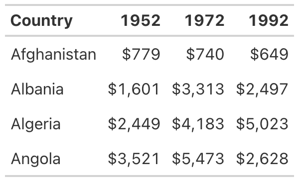
In the GDP table, you can use the fmt_currency() function to format
the numeric values:
table_bold_header |>
  fmt_currency(
    columns = c(`1952`, `1972`, `1992`),
    decimals = 0
  )
The {gt} package has a whole series of functions for formatting values
in tables, all of which start with fmt_. This code applies
fmt_currency() to the 1952, 1972, and 1992 columns, then uses the
decimals argument to tell fmt_currency() to format the values with
zero decimal places. After all, the difference between a GDP of
$779.4453 and $779 is unlikely to lead to different decisions.
This produces values formatted as dollars. The fmt_currency() function automatically adds a thousands-place comma to make the values even easier to read (Table 8).
table_dollar_signs <- table_bold_header |>
  fmt_currency(
    columns = c(`1952`, `1972`, `1992`),
    decimals = 0
  )
table_dollar_signs
Table 8: Rounding dollar amounts to whole numbers and adding dollar signs can simplify data.
Save your table for reuse as table_whole_numbers.
table_whole_numbers <- table_bold_header |>
  fmt_currency(
    columns = c(`1952`, `1972`, `1992`),
    decimals = 0
  )
Use Color Intentionally
So far, our table hasn’t used any color. We’ll add some now to highlight
outlier values. Especially for readers who want to scan your table,
highlighting outliers with color can help significantly. Let’s make the
highest value in the year 1952 a different color. To do this, we again
use the tab_style() function:
table_whole_numbers |>
  tab_style(
    style = cell_text(
      color = "orange",
      weight = "bold"
    ),
    locations = cells_body(
      columns = `1952`,
      rows = `1952` == max(`1952`)
    )
  )
This function uses cell_text() to change the color of the text to
orange and make it bold. Within the cells_body() function, the
locations() function specifies the columns and rows to which the
changes will apply. The columns argument is simply set to the year whose
values are being changed, but setting the rows requires a more
complicated formula. The code rows =1952== max(1952) applies the
text transformation to rows whose value is equal to the maximum value in
that year.
Repeating this code for the 1972 and 1992 columns generates the result shown in Table 9 (which represents the orange values in grayscale for print purposes).
table_highlight_values <- table_whole_numbers |>
  tab_style(
    style = cell_text(
      color = "orange",
      weight = "bold"
    ),
    locations = cells_body(
      columns = `1952`,
      rows = `1952` == max(`1952`)
    )
  ) |>
  tab_style(
    style = cell_text(
      color = "orange",
      weight = "bold"
    ),
    locations = cells_body(
      columns = `1972`,
      rows = `1972` == max(`1972`)
    )
  ) |>
  tab_style(
    style = cell_text(
      color = "orange",
      weight = "bold"
    ),
    locations = cells_body(
      columns = `1992`,
      rows = `1992` == max(`1992`)
    )
  )
table_highlight_values
Table 9: Using color to highlight important values, such as the largest number in each year
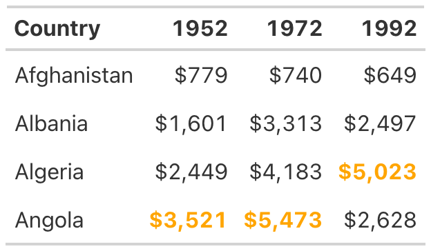
The {gt} package makes it straightforward to add color to highlight outlier values.
table_with_color <- table_whole_numbers |>
  tab_style(
    style = cell_text(
      color = "orange",
      weight = "bold"
    ),
    locations = cells_body(
      columns = `1952`,
      rows = `1952` == max(`1952`)
    )
  ) |>
  tab_style(
    style = cell_text(
      color = "orange",
      weight = "bold"
    ),
    locations = cells_body(
      columns = `1972`,
      rows = `1972` == max(`1972`)
    )
  ) |>
  tab_style(
    style = cell_text(
      color = "orange",
      weight = "bold"
    ),
    locations = cells_body(
      columns = `1992`,
      rows = `1992` == max(`1992`)
    )
  )
Add a Data Visualization Where Appropriate
Adding color to highlight outliers is one way to help guide the reader’s attention. Another way is to incorporate graphs into tables. Tom Mock developed an add-on package for {gt} called {gtExtras} that makes it possible to do just this. For example, say you want to show how the GDP of each country changes over time. To do that, you can add a new column that visualizes this trend using a sparkline (essentially, a simple line chart):
gdp_with_trend <- gdp |>
  group_by(Country) |>
  mutate(Trend = list(c(`1952`, `1972`, `1992`))) |>
  ungroup()
The gt_plt_sparkline() function requires you to provide the values
needed to make the sparkline in a single column. To accomplish this, the
code creates a variable called Trend, using group_by() and
mutate(), to hold a list of the values for each country. For
Afghanistan, for example, Trend would contain 779.4453145,
739.9811058, and 649.3413952. Save this data as an object called
gdp_with_trend.
Now you create your table as before but add the gt_plt_sparkline()
function to the end of the code. Within this function, specify which
column to use to create the sparkline (Trend) as follows:
gdp_with_trend |>
  gt() |>
  tab_style(
    style = cell_borders(color = "transparent"),
    locations = cells_body()
  ) |>
  tab_style(
    style = cell_text(weight = "bold"),
    locations = cells_column_labels()
  ) |>
  fmt_currency(
    columns = c(`1952`, `1972`, `1992`),
    decimals = 0
  ) |>
  tab_style(
    style = cell_text(
      color = "orange",
      weight = "bold"
    ),
    locations = cells_body(
      columns = `1952`,
      rows = `1952` == max(`1952`)
    )
  ) |>
  tab_style(
    style = cell_text(
      color = "orange",
      weight = "bold"
    ),
    locations = cells_body(
      columns = `1972`,
      rows = `1972` == max(`1972`)
    )
  ) |>
  tab_style(
    style = cell_text(
      color = "orange",
      weight = "bold"
    ),
    locations = cells_body(
      columns = `1992`,
      rows = `1992` == max(`1992`)
    )
  ) |>
  gt_plt_sparkline(
    column = Trend,
    label = FALSE,
    palette = c("black", "transparent", "transparent", "transparent", "transparent")
  )
Setting label = FALSE removes text labels that gt_plt_sparkline()
adds by default, then adds a palette argument to make the sparkline
black and all other elements of it transparent. (By default, the
function will make different parts of the sparkline different colors.)
The stripped-down sparkline in
Table 10 allows
the reader to see the trend for each country at a glance.
table_with_sparklines <- gdp_with_trend |>
  gt() |>
  tab_style(
    style = cell_borders(color = "transparent"),
    locations = cells_body()
  ) |>
  tab_style(
    style = cell_text(weight = "bold"),
    locations = cells_column_labels()
  ) |>
  fmt_currency(
    columns = c(`1952`, `1972`, `1992`),
    decimals = 0
  ) |>
  tab_style(
    style = cell_text(
      color = "orange",
      weight = "bold"
    ),
    locations = cells_body(
      columns = `1952`,
      rows = `1952` == max(`1952`)
    )
  ) |>
  tab_style(
    style = cell_text(
      color = "orange",
      weight = "bold"
    ),
    locations = cells_body(
      columns = `1972`,
      rows = `1972` == max(`1972`)
    )
  ) |>
  tab_style(
    style = cell_text(
      color = "orange",
      weight = "bold"
    ),
    locations = cells_body(
      columns = `1992`,
      rows = `1992` == max(`1992`)
    )
  ) |>
  gt_plt_sparkline(
    column = Trend,
    label = FALSE,
    palette = c("black", "transparent", "transparent", "transparent", "transparent")
  )
gt_image(table_with_sparklines, "sparklines")
Table 10: A table with sparklines can show changes in data over time.
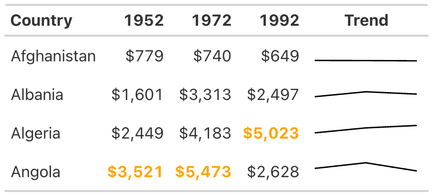
The {gtExtras} package can do much more than merely create sparklines.
Its set of theme functions allows you to make your tables look like
those published by FiveThirtyEight, the New York Times, the
Guardian, and other news outlets.
As an example, try removing the formatting you’ve applied so far and
instead use the gt_theme_538() function to style the table. Then take
a look at tables on the FiveThirtyEight website. You should see
similarities to the one in
Table 11.
table_fivethirtyeight <- gdp |>
  group_by(Country) |>
  mutate(Trend = list(c(`1952`, `1972`, `1992`))) |>
  ungroup() |>
  gt() |>
  tab_style(
    style = cell_text(
      color = "orange",
      weight = "bold"
    ),
    locations = cells_body(
      columns = `1952`,
      rows = `1952` == max(`1952`)
    )
  ) |>
  tab_style(
    style = cell_text(
      color = "orange",
      weight = "bold"
    ),
    locations = cells_body(
      columns = `1972`,
      rows = `1972` == max(`1972`)
    )
  ) |>
  tab_style(
    style = cell_text(
      color = "orange",
      weight = "bold"
    ),
    locations = cells_body(
      columns = `1992`,
      rows = `1992` == max(`1992`)
    )
  ) |>
  fmt_currency(
    columns = c(`1952`, `1972`, `1992`),
    decimals = 0
  ) |>
  gt_plt_sparkline(
    column = Trend,
    label = FALSE,
    palette = c("black", "transparent", "transparent", "transparent", "transparent")
  ) |>
  gt_theme_538()
gt_image(table_fivethirtyeight, "fivethirtyeight")
Table 11: A table redone in the FiveThirtyEight style
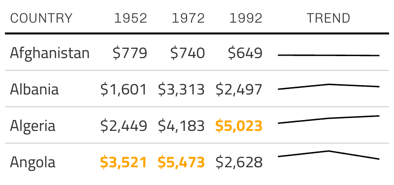
Add-on packages like {gtExtras} are common in the table-making landscape. If you’re working with the {reactable} package to make interactive tables, for example, you can also use the {reactablefmtr} to add interactive sparklines, themes, and more. You’ll learn more about making interactive tables in websites.
Summary
Many of the tweaks you made to your table in this chapter are quite subtle. Changes like removing excess grid lines, bolding header text, right-aligning numeric values, and adjusting the level of precision can often go unnoticed, but if you skip them, your table will be far less effective. The final product isn’t flashy, but it does communicate clearly.
You used the {gt} package to make your high-quality table, and as you’ve repeatedly seen, this package has good defaults built in. Often, you don’t need to change much in your code to make effective tables. But no matter which package you use, it’s essential to treat tables as worthy of just as much thought as other kinds of data visualization.
With Quarto, you can integrate your tables directly into a report, so they render as part of the final document whenever you export it. What’s better than using just a few lines of code to make publication-ready tables?
Additional Resources
-
Thomas Mock, “10+ Guidelines for Better Tables in R,” The MockUp, September 4, 2020, https://themockup.blog/posts/2020-09-04-10-table-rules-in-r/.
-
Albert Rapp, “Creating Beautiful Tables in R with {gt},” November 27, 2022, https://gt.albert-rapp.de.
-
Jon Schwabish, “Ten Guidelines for Better Tables,” Journal of Benefit-Cost Analysis 11, no. 2 (2020), https://doi.org/10.1017/bca.2020.11.