
What’s New in R: November 17, 2025
Welcome to this week’s edition of What’s New in R! This week, we’re featuring a deep dive into mapping Antarctica with R, an analysis of housing affordability in Canada, and a talk on data visualization principles from a New York Times graphics editor. Let’s dive in!
Mapping Antarctica
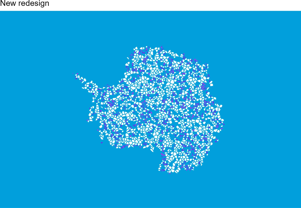
Diego Hernangómez tackles the technical challenges of creating maps that cross the International Date Line and use polar projections in this detailed tutorial. The post walks through fixing geometric artifacts in the GISCO Antarctica shapefile and demonstrates how to create clean orthographic maps centered on the South Pole. Hernangómez showcases several beautiful examples, including recreations of proposed Antarctic flag designs, making this both a practical guide to handling tricky spatial data issues and an inspiring demonstration of what’s possible with {sf} and {ggplot2}.
Age Disparity in Shelter Cost per Room
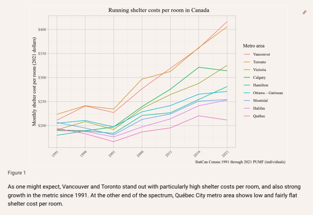
Jens von Bergmann and Nathan Lauster analyze housing affordability in Canada using shelter costs per room as a metric, breaking down the data by age group and region. While focused on Canadian housing data, this post demonstrates excellent techniques for working with public census data, creating informative visualizations, and conducting thorough exploratory analysis. The code shows practical applications of data wrangling, statistical analysis, and creating publication-quality graphics that effectively communicate complex housing trends.
What Makes a Good Data Visualization?
Christine Zhang, Graphics Editor at The New York Times, shares insights on creating effective data visualizations in this talk given to students at Johns Hopkins Bloomberg School of Public Health. While the talk is more general than code-focused and only touches on R occasionally, Zhang’s perspective from one of the world’s leading data journalism teams provides valuable principles for making visualizations that communicate clearly and effectively. It’s a great resource for anyone looking to improve their data visualization skills, regardless of the tools they use.
If you enjoyed this issue of What’s New In R, please share it with a friend! And if they want to get What’s New in R directly in their inbox, they can sign up on the R for the Rest of Us website.
Got any ideas for resources I should feature in future issues of What’s New in R? Leave a comment below!
Sign up for the newsletter
Get blog posts like this delivered straight to your inbox.



You need to be signed-in to comment on this post. Login.