
What’s New in R: August 10, 2026
Welcome to this week's edition of What's New in R! This week, we're featuring a beginner-friendly workshop on reproducible research with R and Quarto, some very well-deserved recognition for the R Core Team, and a clever trick for making your color palettes accessible. Let's dive in!
From Data Analysis to Publication: Reproducible Research with R and Quarto
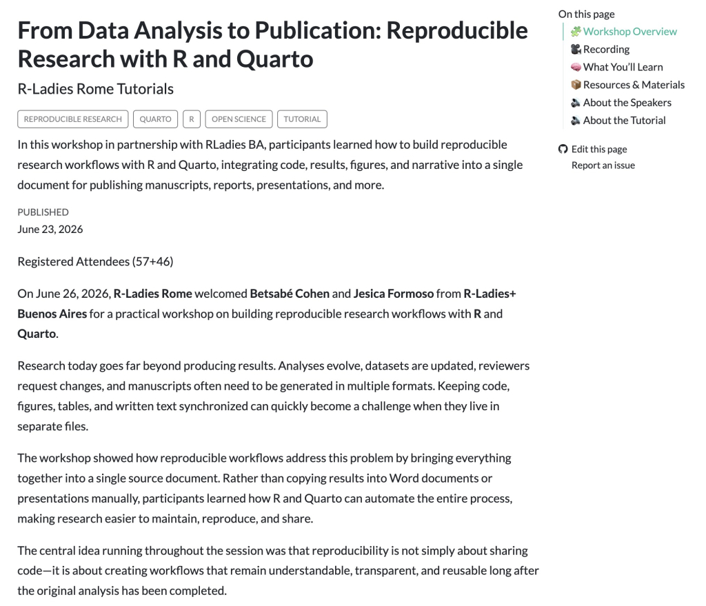
In this R-Ladies+ Rome workshop, Betsabé Cohen and Jesica Formoso walk through how to build a reproducible research workflow by combining R and Quarto, weaving code, results, figures, and narrative into a single document that can render to a manuscript, report, presentation, or website. They cover organizing a project, automating your figures and tables, managing citations, and exporting to Word, PDF, and HTML. I especially like their point that reproducibility isn't just for big research projects; even small analyses benefit from keeping everything synchronized and transparent. It's a great overview to share with someone who doesn't already use R and Quarto and is wondering what all the fuss is about.
The Rousseeuw Prize for Statistics
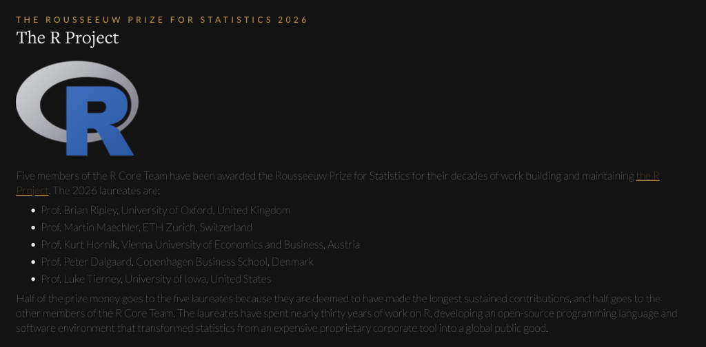
The 2026 Rousseeuw Prize for Statistics, sometimes called the Nobel Prize of statistics, has been awarded to the R Core Team in recognition of decades of work building and maintaining R. The million-dollar prize honors five laureates (Brian Ripley, Martin Maechler, Kurt Hornik, Peter Dalgaard, and Luke Tierney), with a share also going to a wider group of R Project contributors including Thomas Lumley, Simon Urbanek, and Paul Murrell. It's wonderful to see this kind of recognition for the people whose largely volunteer work underpins the entire R ecosystem we all rely on. The prize will be awarded in Leuven on November 4, 2026, and this is a lovely moment for the whole community.
A simple trick for applying accessible colour palettes within dataviz
Cara Thompson tackles a genuinely tricky corner of accessible data visualization: the tension between a colorblind-friendly palette (which needs a good spread from light to dark) and the 3:1 contrast ratio your elements need to stand out against a light background. Her elegant fix is to add a dark contour around points and bars, which visually separates even the lightest colors from the backdrop without sacrificing your palette. She shows how to bake this into a {ggplot2} theme with element_geom() so you're not repeating yourself, and points to helpful tools like {monochromeR} and {colorblindr} along the way. Accessibility in color choices is so important and always a bit confusing, so this is a really practical read.
If you enjoyed this issue of What’s New In R, please share it with a friend! And if they want to get What’s New in R directly in their inbox, they can sign up on the R for the Rest of Us website.
Got any ideas for resources I should feature in future issues of What’s New in R? Leave a comment below!
Sign up for the newsletter
Get blog posts like this delivered straight to your inbox.



You need to be signed-in to comment on this post. Login.