
What’s New in R: September 28, 2026
Welcome to this week's edition of What's New in R! This week, we're featuring a fully open course on quantitative methods that starts with data instead of formulas, an R-Ladies Rome workshop on typesetting with Typst and Quarto, and a package that gives ggplot2 more accessible defaults out of the box. Let's dive in!
Quantitative Methods for International Politics
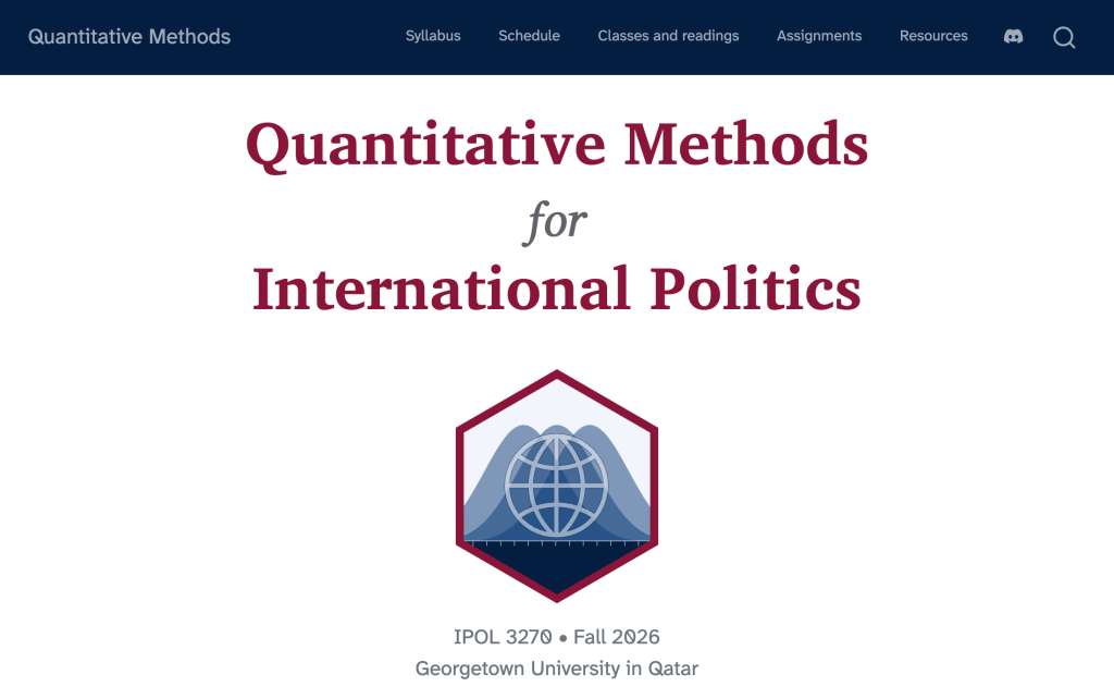
Andrew Heiss has posted the full site for his Fall 2026 course on quantitative methods at Georgetown University in Qatar, and like all of his course sites, it's a fantastic free resource. The course flips the usual stats sequence on its head: as Andrew puts it, you begin with data and learn how to tidy, wrangle, manipulate, and visualize it with code, and only later turn to more classical topics like inference and modeling. Students work in R with the tidyverse and Positron, with Modern Dive as the main textbook. If you teach R or are learning it yourself, the syllabus, schedule, readings, and assignments are all there for you to borrow from.
Typst for Efficient Typesetting
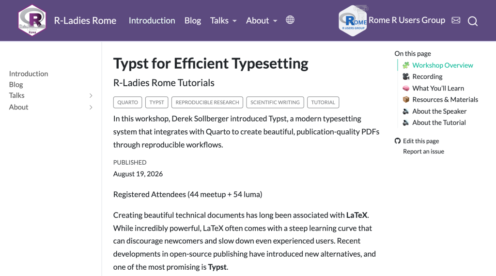
In this R-Ladies Rome workshop, Derek Sollberger introduces Typst, the modern typesetting system that pairs with Quarto to produce beautiful PDFs without the pain of LaTeX. He walks through creating documents, customizing layouts and typography, handling figures and tables, and managing citations and cross-references, all in a reproducible workflow. We've become big fans of Typst at R for the Rest of Us, especially for making accessible PDFs, so it's great to see more people teaching it. The page links to the recording and to Derek's companion blog post, which shows off some fun examples like syllabus templates and tables loaded straight from CSV files.
Guide to the ggplotplus Package
The {ggplotplus} package by Alex Bajcz of the Minnesota Aquatic Invasive Species Research Center gives {ggplot2} an opinionated, accessibility-first set of defaults. The idea is that a basic ggplot() call works, but it often falls short of modern best practices, and fixing that requires knowing which of the many theme(), scale_*(), and geom_*() options to reach for. Functions like theme_plus() and the _plus variants of familiar geoms and scales handle accessible color palettes, better contrast, easier-to-read legends, thoughtful gridlines, and more, while still letting you override anything. This guide is a thorough walkthrough of the package, and it doubles as a nice lesson in accessible chart design.
If you enjoyed this issue of What’s New In R, please share it with a friend! And if they want to get What’s New in R directly in their inbox, they can sign up on the R for the Rest of Us website.
Got any ideas for resources I should feature in future issues of What’s New in R? Leave a comment below!
Sign up for the newsletter
Get blog posts like this delivered straight to your inbox.



You need to be signed-in to comment on this post. Login.