R Handles the Beast and the Beauty
R is the Swiss army knife of data tools. It can handle the work of importing, cleaning, and wrangling data (the beast). And it can also make some of the most attractive graphs you've ever seen (the beauty).
The Beast: Importing Data
One concern that users considering R sometimes have is: how will I work with all of the data I currently have in Excel, SPSS, or some other proprietary format? R handles the beast that is importing data with ease.
There are packages (that is, add-ons designed to do something specific) to handle pretty much any format you can throw at R. Here are some common examples:
CSV files can be read with the read.csv() function built into R. Want more options? Try read_csv() from the readr package.
Excel files can be read with the readxl package.
SPSS, SAS, and Stata files can be read with the haven package.
And R can do even more. It can read directly from PDFs (a lifesaver if you’ve ever, say, received data locked in tables in a PDF), databases, scrape data from the web, and much, much more.
Have 45 minutes to spare? Here’s a video showing all the types of data importing you can do with R.
The Beauty: Publication-Ready Graphs
Many people think of R as the tool-of-choice for hardcore quants. But it is also a tool that dataviz experts are using to make beautiful graphs, maps, and more. Most amazingly, they use R exclusively to make these visualizations (that is, they don't touch them up later in Photoshop, Illustrator, or other graphic design software).
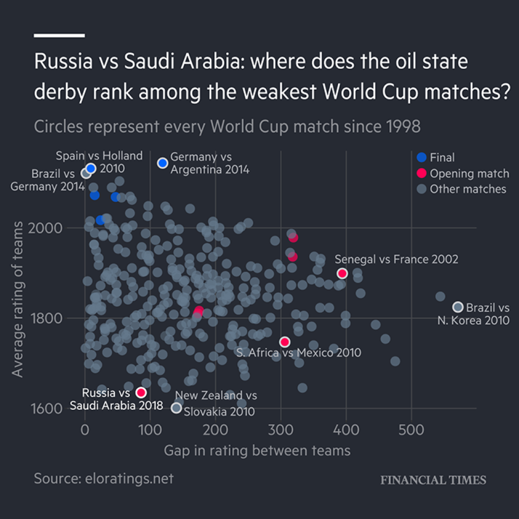
This came to the fore recently when well-known information designer Edward Tufte wrote that graphics made in R are "clunky." R users did not take kindly to his assertion. Several journalists pointed out that their outlets have produced graphs in R for years. For example, this graph on World Cup mismatches, made by the Financial Times, was produced exclusively in R.
R is most definitely capable of producing publication-quality graphics. In fact, if you follow the news, you have likely seen many graphs made in R (the ggplot2 package to be precise).
ggplot2 is so popular that there are many packages that add on to it. One of them, called ggthemes, allows you to use one line of code to make your graphs look just like those in, say, FiveThirtyEight. And do you enjoy irony? There's also a function, theme_tufte(), that lets you make graphs in R made to match the recommendations of, yup, you guessed it, Tufte himself.
Sign up for the newsletter
Get blog posts like this delivered straight to your inbox.

You need to be signed-in to comment on this post. Login.