Making Small Multiples in R
Small multiples are one of the data viz tricks that experienced information designers LOVE.
Ann Emery uses them: “My favorite part of data visualization workshops? The airports. Kidding. Watching jaws drop when folks are introduced to small multiples layouts for the first time. Definitely!”
Stephanie Evergreen writes that “small multiples version[s] make things approximately a billion times easier” to understand.
Andy Kirk describes himself as “fully paid-up member of the small multiples fan club: if I could create small multiples for every dataset I worked with, I would.”
Small multiples are effective because they take a cluttered chart and break it into pieces. Instead of confusing the reader with multiple pieces of data crammed into a single chart, small multiples break out the data, allowing the reader to see pieces of it individually, and compare them to each other.
One of the major benefits for me of learning R over the last few years has been how it handles small multiples. After teaching an R workshop last week, I posted on Twitter about how I loved seeing students amazed at how easy it is to make small multiples in R. John MacKintosh, an NHS data analyst based in Inverness, Scotland, replied that ggplot handles small multiples better than anything.
I don't think anything else implements small multiples as well as ggplot.
— John MacKintosh (@_johnmackintosh) September 12, 2018
So I wanted to share briefly how to use R (and the ggplot package specifically) to make small multiples.
A small multiples example using ggplot
As part of my work for the Ford Family Foundation, I was recently asked to prepare visuals to examine the demographics of applicants over the last few years to the Ford Scholars Program, which provides college scholarships to students in Oregon and Siskiyou County, California. One way the Foundation wanted me to break down the data was by region (there are seven of them: Central Oregon, Eastern Oregon, Metro Portland, North Coast Oregon, Siskiyou County California, Southern Oregon, and the Willamette Valley).
My initial attempt yielded this:
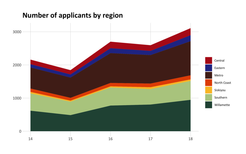
Not bad, and for some purposes it might be totally appropriate. But I had some concerns: it was quite difficult to gauge numbers of applicants for each region and even more difficult to compare across regions.
So, I used the facet_grid function of ggplot and, with literally one line of code, created this:
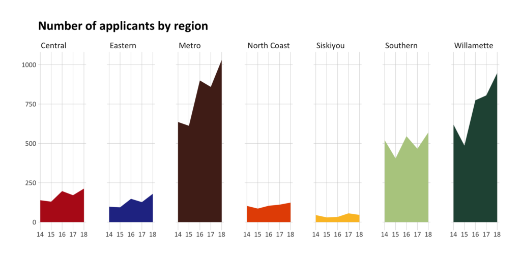
Much better! It's incredibly easy to see numbers of applicants in each region and compare across regions as well. It's also really easy to see the overall trends (big increases in the Metro and Willamette regions!).
How did I do this? Let's take a look at the code.
First, I load my packages and data (I've cleaned and tidied it elsewhere for the sake of simplicity).
# Packages ----------------------------------------------------------------

library(tidyverse)
library(scales)
library(extrafont)
library(hrbrthemes)


# Get data ----------------------------------------------------------------

regions <- read_csv("regions.csv")Next, I define the colors and themes I'll be using later on. I'm using the colors from the Ford Family Foundation palette. And I've adapted the basic theme from the hrbrthemes package to match Ford Family Foundation styling (e.g. using Calibri font).
# Colors ------------------------------------------------------------------

tfff_dark_green <- "#265142"
tfff_light_green <- "#B5CC8E"
tfff_orange <- "#e65100"
tfff_yellow <- "#FBC02D"
tfff_blue <- "#283593"
tfff_red <- "#B71C1C"
tfff_brown <- "#51261C"
tfff_dark_gray <- "#545454"
tfff_medium_gray <- "#a8a8a8"
tfff_light_gray <- "#eeeeee"


# Themes ------------------------------------------------------------------

tfff_theme <- theme_ipsum(base_family = "Calibri",
                          base_size = 10) +
     theme(legend.position = "none",
           axis.title = element_blank(),
           panel.grid.minor.x = element_blank(),
           panel.grid.minor.y = element_blank())


tfff_fill_colors <- scale_fill_manual(values = rev(c(tfff_dark_green,
                                                     tfff_light_green,
                                                     tfff_yellow,
                                                     tfff_orange,
                                                     tfff_brown,
                                                     tfff_blue,
tfff_red)))Now it's time to make my plot. I'm making a fairly basic area plot. By default, ggplot stacks the regions on top of each other.
regions_plot <- ggplot(data = regions,
                       aes(x = year_label,
                           y = n,
                           fill = region)) +
     geom_area() +
     tfff_theme +
     tfff_fill_colors +
     labs(title = "Number of applicants by region",
          fill = "")

regions_plot +
theme(legend.position = "right") Note that I save the result of my plot as an object (regions_plot). The reason I did this is so that I can reuse it. Remember how I said it just takes one line to make small multiples? Here we go!
regions_plot +
     facet_grid(cols = vars(region)) +
theme(axis.title = element_blank())There it is: just add facet_grid(cols = vars(region)) and ggplot turns it into a small multiples plot. Using facet_grid, I’m telling ggplot: use columns (that’s the cols argument) to make small multiples, creating the plots by separating them by region.
(Ok, pedants, there is a second line there, I know. That’s because the hrbrthemes package is adding back the axis titles and I had to get rid of them on the facetted version.)
You can use facet_grid to make as many small multiples as you want. If I had 50 regions, ggplot would make 50 small multiples. Making small multiples in this programmatic way opens up so many possibilities with very minimal extra work to make them come to life.
When I started learning R, there were many times when I felt like it wasn’t worth the effort (learning it is HARD!). But, having persevered, I’m glad to have R in my toolkit. The ability to make small multiples with just a line of code is still as amazing to me as it is to my students seeing it for the first time!
Sign up for the newsletter
Get blog posts like this delivered straight to your inbox.

You need to be signed-in to comment on this post. Login.