Themes to Improve Your ggplot Figures
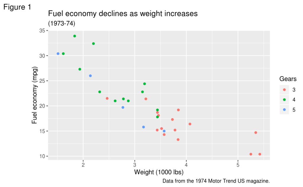
The default look and feel of figures made with ggplot leaves something to be desired. See that default gray background and you know the figure was made in ggplot, just as a 3D pie chart could only mean Excel.
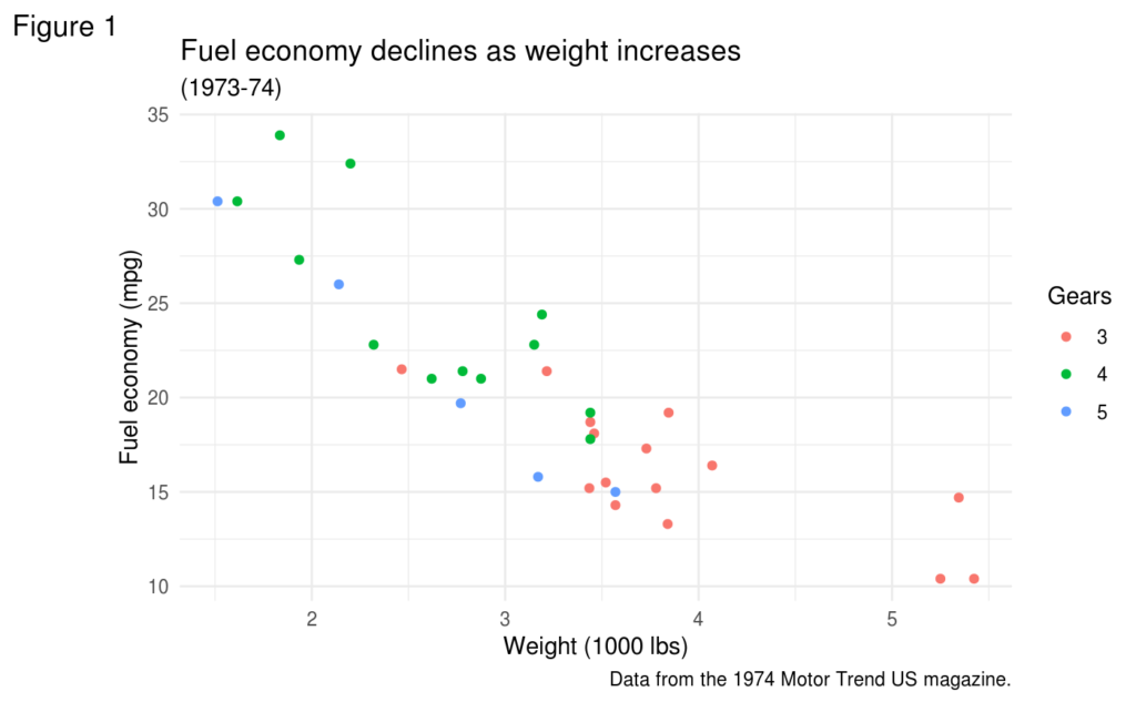
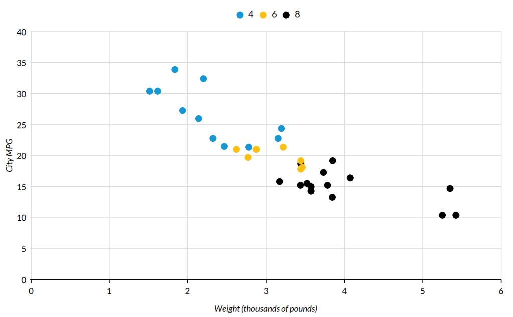
Fortunately, though, changing how your ggplot figures look is incredibly simple. In fact, it's usually just one line of code (and the range of things you can do with one line of code in R never ceases to amaze me). Simply add theme_minimal() to turn the above plot into this:
If you find a theme you like, it's often easier to set the default theme for all of your plots rather than adding the line of code to each plot. David Robinson demonstrates how to do this in one of his #TidyTuesday screencasts.
Themes to Get You Started
The ggplot package has a number of built-in themes, most of which are fairly underwhelming. But the benefit of R being open-source is that users have developed their own themes. Adding them is as simple as installing a package.
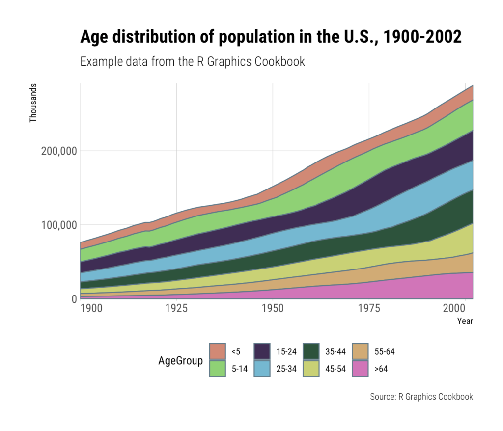
The best place to start if you want a good-looking theme that follows good data visualization practices is Bob Rudis's hrbrthemes package (recommended by Kieran Healy in his book Data Visualization: A Practical Introduction). There are actually several different themes with different fonts. All are great choices.
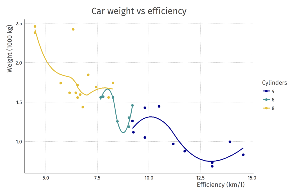
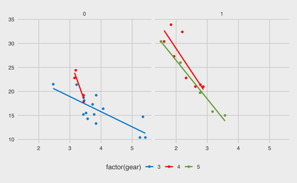
A similar package with a nice theme is firathemefrom Erik-Jan van Kesteren.
Collections of Themes
There are also packages that provide collections of themes. Jeffrey Arnold's ggthemes package, for example, has themes to replicate the look and feel of the Economist and FiveThirtyEight, among others.
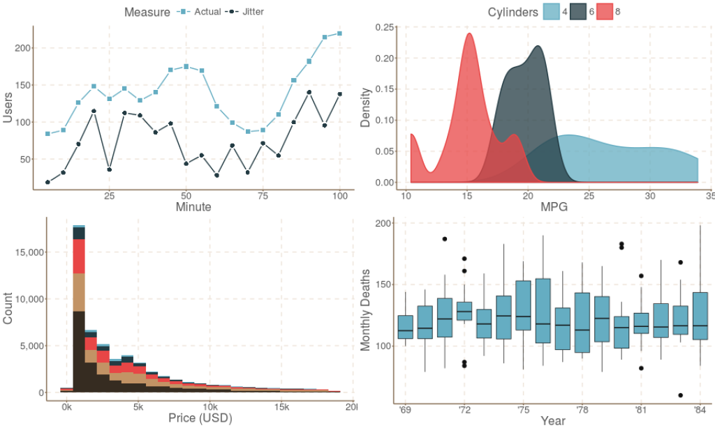
In a similar, Ciarán Tobin has also developed the ggthemr package, which has a collection of themes. The fresh theme is particularly nice looking.
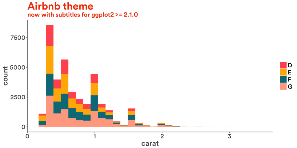
Interested in mirroring the look of your favorite tech company? The ggtech package from Ricardo Bion makes it easy to give your plot, say, an AirBnb look.
Themes Developed for Organizations
More and more organizations are also developing ggplot themes to ensure that their figures have a similar look and feel. It's a much better approach than sending out a style guide and hoping that users follow it (spoiler alert: they don't). And, with more of these packages being developed in the open, you can use their themes for your own work.
The Urban Institute has developed an urbnthemes package to get all users on the same page. They've written about how developing this theme has improved their workflow.
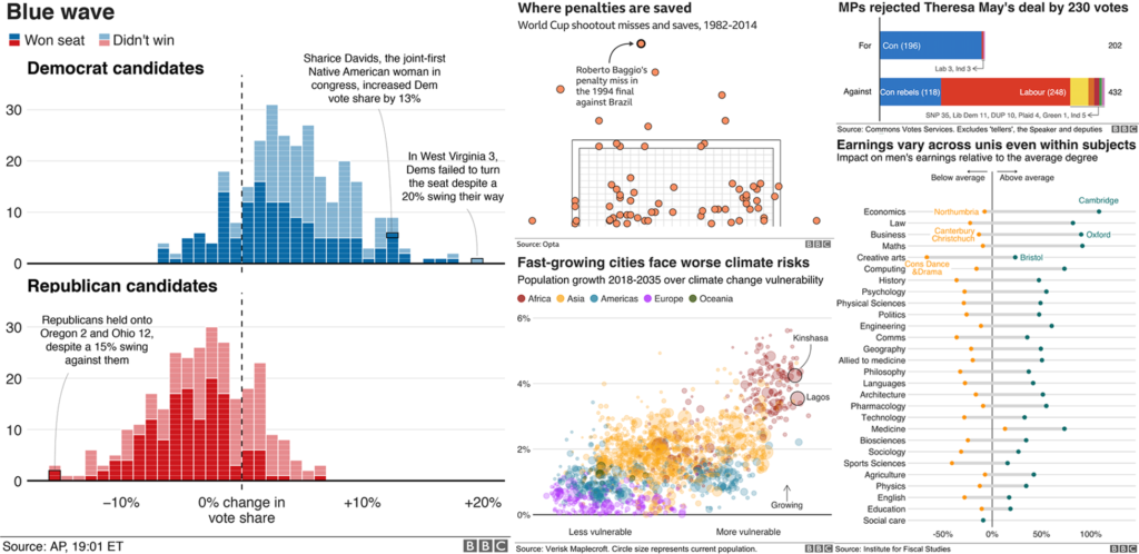
The BBC has done something similar, and, in releasing their bbplot package, has made their theme available to the public.
Fun Themes
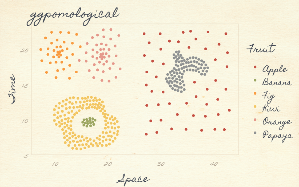
Many of these themes give your figures a serious, professional look. Most of the time, that's great. But sometimes you want a more fun look and feel. Enter Garrick Aden-Buie's ggpomological, which gives your figures a watercolor-type look.
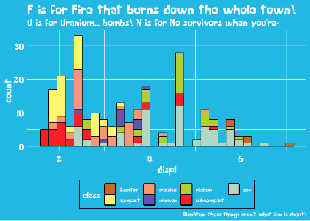
Finally, if you've been looking for a theme that replicates the look and feel of your favorite TV show, Ryo Nakagawara has you covered. With his tvthemes package, you can make plots in the style of Brooklyn Nine-Nine, Rick and Morty, or Sponge Bob (to name just a few).
What themes have I missed? Let me know in the comments!
Sign up for the newsletter
Get blog posts like this delivered straight to your inbox.
You need to be signed-in to comment on this post. Login.