How to Add Color to Titles Using the ggtext Package
If you read experts on data visualization, you'll start to see some common suggestions. One of these is use titles not just to describe your chart, but to explain your findings. Instead of generic titles like "Change in Math Scores, 2017-2018 to 2018-2019," they suggest, try something like, "Most Students Improved Their Math Scores From Last Year to This Year."
In addition to using text in this way, data viz experts also suggest using color to highlight findings. See, for example, this example by Stephanie Evergreen, which uses color to help the reader see the change from pretest to posttest.
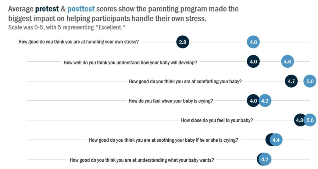
Source: Stephanie Evergeen
Until recently, adding color to titles in ggplot was surprisingly complex. But, with the introduction of the ggtextpackage, it has become much simpler. In this video below, which comes from my soon-to-be-released Going Deeper with R course, you can learn how to add color to your titles to improve their impact.
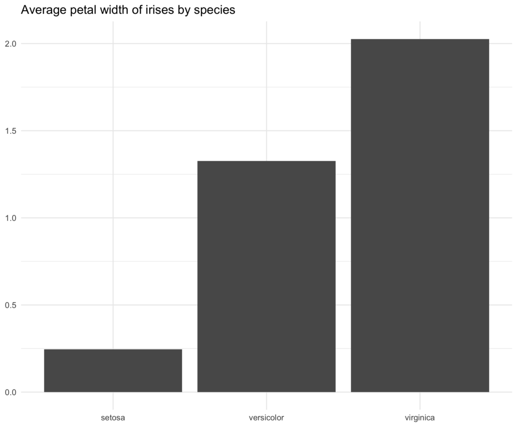
Want to see this difference color makes? Here is a plot made with a generic title (the code used to make it is here).
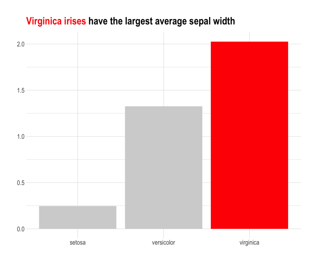
Contrast the plot above with this one, which uses color to help the reader see exactly what the main finding is.
Adding color to titles using ggtext involves two steps:
First, we add HTML to the title argument in thelabs function of ggplot.
Then, we add element_markdown() to the plot.title argument of the theme() function to tell ggplot to display the HTML as HTML, not as raw text.
Here is the code used to make the second plot. Focus in particular on lines 14 and 15. Line 14 uses HTML to add color; line 15 tells ggplot to interpret that text as HTML.
iris %>%
  group_by(Species) %>%
  summarize(mean_petal_width = mean(Petal.Width)) %>%
  ungroup() %>%
  ggplot(aes(Species, mean_petal_width,
             fill = Species)) +
  geom_col(show.legend = FALSE) +
  theme_ipsum() +
  scale_fill_manual(values = c("setosa" = "lightgray",
                               "versicolor" = "lightgray",
                               "virginica" = "red")) +
  labs(x = NULL,
       y = NULL,
       title = "<span style = 'color: red;'>Virginica irises</span> have the largest average sepal width") +
theme(plot.title = element_markdown())This is just one lesson on improving data visualization in my upcoming Going Deeper with R course.
Sign up for the newsletter
Get blog posts like this delivered straight to your inbox.

You need to be signed-in to comment on this post. Login.