How to Make 250+ Plots at the Same Time with R
Learn how I automated the process of making 250+ plots using the walk() function in R.
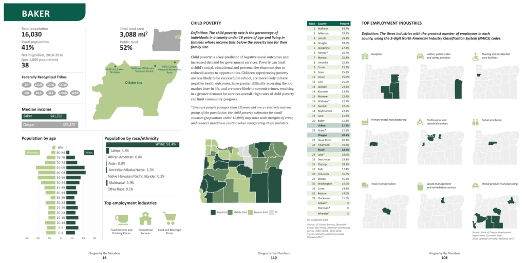
For the past several years, I've worked on a report called Oregon by the Numbers. In this project, I use R to make every single plot in the report: over 250 plots each year.
In the time I've worked on this project, I've become more and more efficient at making these plots. My efficiency comes thanks to the walk() function from the purrr package. This function can be confusing, but if you learn how to use it, you too can make hundreds of plots in just a few lines of code.
As you'll see in the video above, the process is as follows:
Make a function to make one plot
Create a vector with all options for different plots (in my case, that is all of the 36 counties in Oregon)
Use the
walk()function to make one plot for each county
Interested in the code I used in this demo? Here it is!
# Load Packages -----------------------------------------------------------

library(tidyverse)

# Import Data -------------------------------------------------------------

median_income_data <- read_csv("oregon_median_income.csv")

# Make Single Plot --------------------------------------------------------

median_income_data_filtered <- median_income_data %>%
  filter(geography %in% c("Oregon", "Baker")) %>%
  mutate(geography = fct_inorder(geography))

ggplot(data = median_income_data_filtered,
       aes(x = median_income,
           y = geography,
           fill = geography)) +
  geom_col() +
  scale_fill_manual(values = c("#a8a8a8", "#265142")) +
  theme_void() +
  theme(axis.text.y = element_text(),
        legend.position = "none")

ggsave(plot = last_plot(),
       filename = "sample-median-income-plot.png",
       width = 4,
       height = 1,
       bg = "white")

# Make Function -----------------------------------------------------------

median_income_plot <- function(county) {

  median_income_data_filtered <- median_income_data %>%
    filter(geography %in% c("Oregon", county)) %>%
    mutate(geography = fct_inorder(geography))

  ggplot(data = median_income_data_filtered,
         aes(x = median_income,
             y = geography,
             fill = geography)) +
    geom_col() +
    scale_fill_manual(values = c("#a8a8a8", "#265142")) +
    theme_void() +
    theme(axis.text.y = element_text(),
          legend.position = "none")

  ggsave(plot = last_plot(),
         filename = str_glue("median-income-plot-{county}.png"),
         width = 4,
         height = 1,
         bg = "white")

}

median_income_plot(county = "Benton")


# Make Multiple Plots -----------------------------------------------------

walk(c("Baker", "Benton", "Clackamas"), median_income_plot)

oregon_counties <- median_income_data %>%
  filter(geography != "Oregon") %>%
  pull(geography)

oregon_counties

walk(oregon_counties, median_income_plot)Sign up for the newsletter
Get blog posts like this delivered straight to your inbox.

You need to be signed-in to comment on this post. Login.
Fayyaz Ahmad • January 11, 2023
very informative