Spice up your {gt} table with {ggplot}
Have you ever created a table with gt and thought to yourself “Well, maybe just showing the numbers doesn’t cut it? I need to add some visual spice to this table.” If so, then you’re in great company. Because spicing up tables with visuals is one of my favorite tricks. I like to add visual elements like small lines or bars to tables.
Apart from making your table pretty, visuals help to convey an overall impression of the data to your reader. So, let me show you how you can add any chart to your table by combining the powers of gt and ggplot .
A basic table
Basically, we need two ingredients. The first thing is a table that we want to spice up. And then we need ggplots that we can add. Let’s start with the table. Here, we have a basic table summarizing the penguin weights of three different species.
library(tidyverse)
library(gt)
penguin_weights <- palmerpenguins::penguins |>
  summarise(
    min = min(body_mass_g, na.rm = TRUE),
    mean = mean(body_mass_g, na.rm = TRUE),
    max = max(body_mass_g, na.rm = TRUE),
    .by = 'species'
  )

penguin_weights |>
  gt() |>
  tab_spanner(
    label = 'Penguin\'s Weight',
    columns = -species
  ) |>
  cols_label_with(fn = str_to_title) |>
  fmt_number(decimals = 2) |>
  cols_align('left', columns = species)
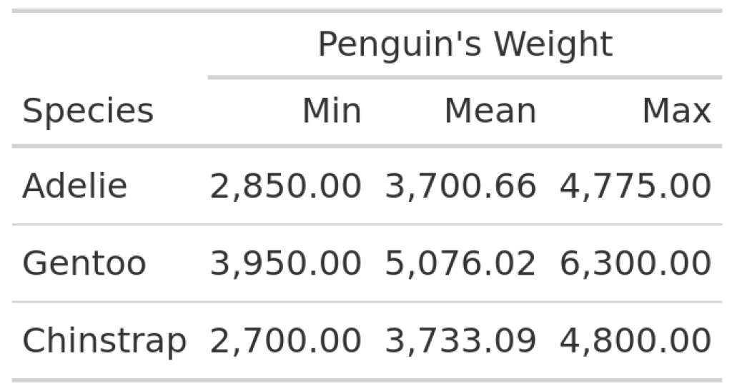
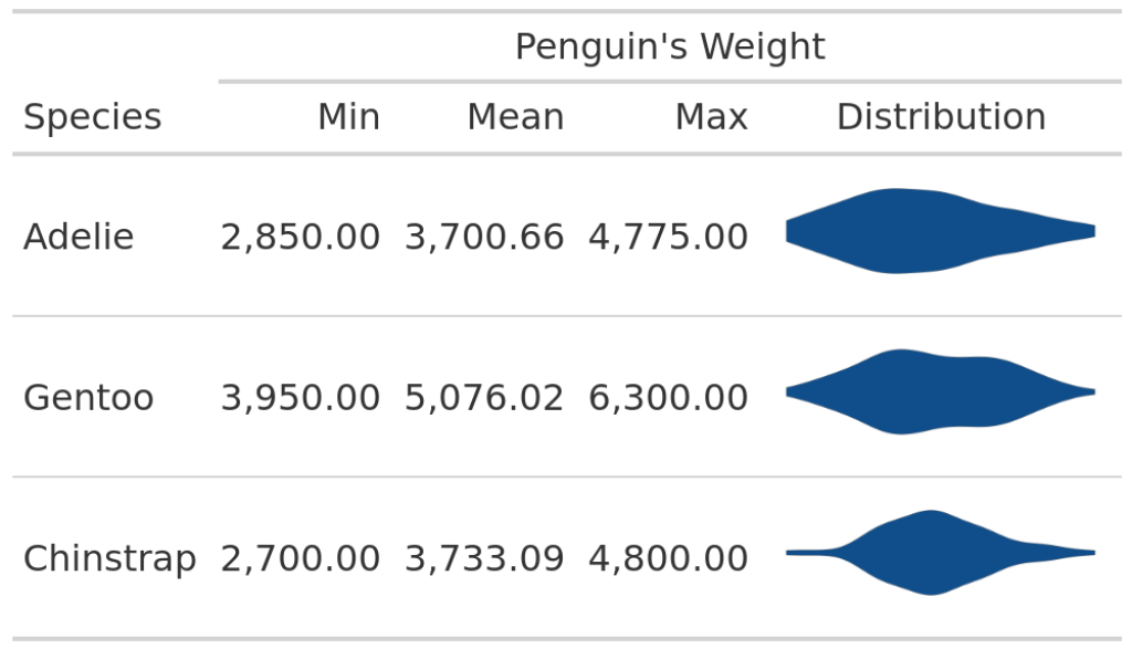
In this table, we can see the minimum, maximum and mean values of the penguin weights for every species. Not the most exciting table, is it? So, we may want to add a nice visual element like a violin plot. Apart from being an eye-catching element, this would also add more information on the distribution of the weights. The resulting table could look something like this:

Spice up your table
To build this, let’s think about how to create the ggplots. Then, we can think about how to add them to the table. So, let us extract the data for one species and save it into a variable. If we can do this for one species, we can do it for all species.
gentoo_data <- palmerpenguins::penguins |>
  filter(species == 'Gentoo')
Then, we can turn this into a violin plot with geom_violin() .
gentoo_data |>
  ggplot(aes(x = body_mass_g, y = species)) +
  geom_violin(fill = 'dodgerblue4')
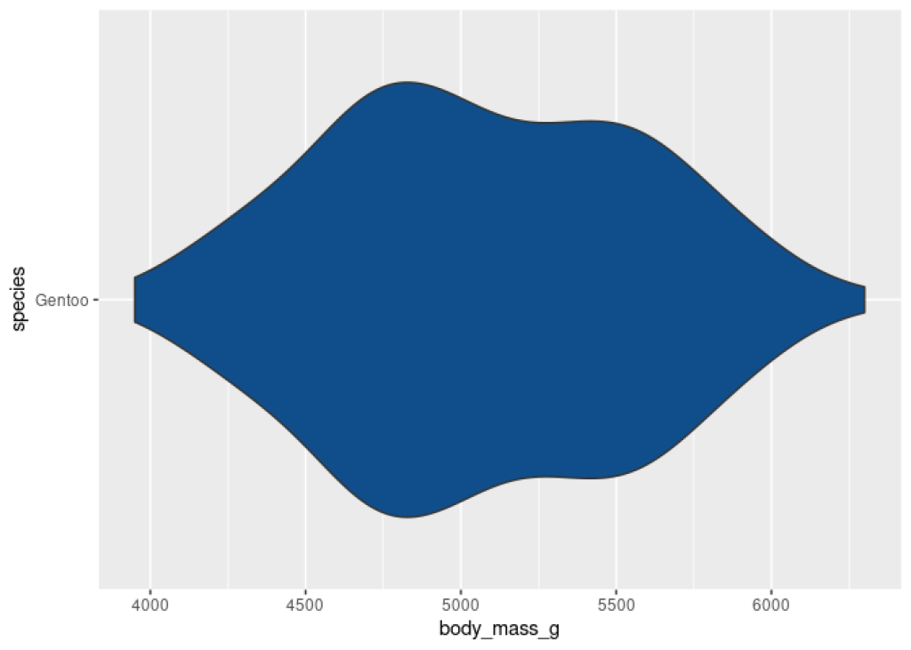
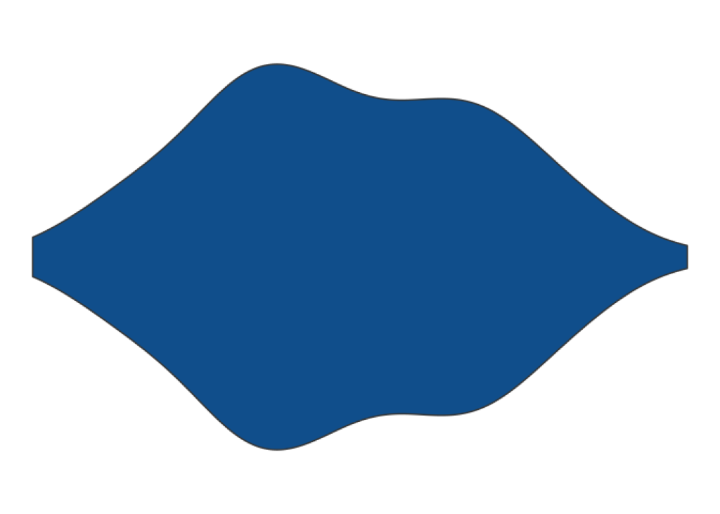
Nice. It’s a pretty violin plot but notice that we have a lot of grid lines and a lot of other stuff that we don’t want to bring into our table. If we would take this image and put it into our table, this will be too much clutter, right?. So let’s remove all of this with theme_void() .
gentoo_data |>
  ggplot(aes(x = body_mass_g, y = species)) +
  geom_violin(fill = 'dodgerblue4') +
  theme_void()
Perfect. Now, let’s wrap this into a function that can repeat this for all species based on the species name. We want to repeat this for every species, remember?
plot_violin_species <- function(my_species) {
  palmerpenguins::penguins |>
    filter(species == my_species) |>
    ggplot(aes(x = body_mass_g, y = species)) +
    geom_violin(fill = 'dodgerblue4') +
    theme_void()
}
Next, we need an additional column in our data set where the plots will live in. At first, this column is only supposed to contain the data that plot_violin_species() needs to generates plots.
penguin_weights |>
  mutate(Distribution = species) |>
  gt() |>
  tab_spanner(
    label = 'Penguin\'s Weight',
    columns = -species
  ) |>
  cols_label_with(fn = str_to_title) |>
  fmt_number(decimals = 2) |>
  cols_align('left', columns = species)
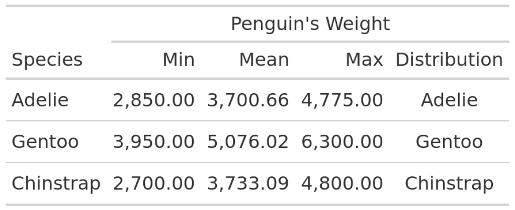
In this table you can see that each row of the Distribution column now contains a species name. Now, we have to instruct gt() to transform the content of the Distribution column to actual images. And the way to do that is to use text_transform() , map() and the ggplot_image() helper function. Take a look at the code that does this and I’ll explain more afterwards.
penguin_weights |>
  mutate(Distribution = species) |>
  gt() |>
  tab_spanner(
    label = 'Penguin\'s Weight',
    columns = -species
  ) |>
  cols_label_with(fn = str_to_title) |>
  fmt_number(decimals = 2) |>
  cols_align('left', columns = species) |>
  text_transform(
    locations = cells_body(columns = 'Distribution'),
    fn = function(column) {
      map(column, plot_violin_species) |>
        ggplot_image(height = px(50), aspect_ratio = 3)
    }
  )
I know that this looks complicated at first but here’s the rundown:
First,
text_transform()needs to know the locations of the cells that we want to transform. This information comes fromcells_body(columns = 'Distribution').Second,
text_transform()needs a function that takes the whole data that is stored in the “Distribution” column and generates images from this.
First, text_transform() needs to know the locations of the cells that we want to transform. This information comes from cells_body(columns = 'Distribution') .
Second, text_transform() needs a function that takes the whole data that is stored in the “Distribution” column and generates images from this.
This latter function that generates images is defined via
function(column) {
  map(column, plot_violin_species) |>
    ggplot_image(height = px(50), aspect_ratio = 3)
}
This does two things:
In the first step
map()appliesplot_violin_species()for every species. This will give us a list of ggplot-objects . This is not whattext_transform()wants. It wants images.Then, the list of ggplot-objects is turned into images with the convenient
ggplot_image()function fromgt.
In the first step map() applies plot_violin_species() for every species. This will give us a list of ggplot-objects . This is not what text_transform() wants. It wants images.
Then, the list of ggplot-objects is turned into images with the convenient ggplot_image() function from gt .
Now that we understand what’s going on with this, let’s see this in action.
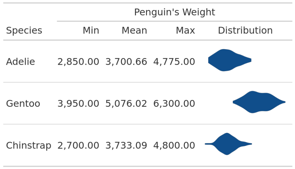
penguin_weights |>
  mutate(Distribution = species) |>
  gt() |>
  tab_spanner(
    label = 'Penguin\'s Weight',
    columns = -species
  ) |>
  cols_label_with(fn = str_to_title) |>
  fmt_number(decimals = 2) |>
  cols_align('left', columns = species) |>
  text_transform(
    locations = cells_body(columns = 'Distribution'),
    fn = function(column) {
      map(column, plot_violin_species) |>
        ggplot_image(height = px(50), aspect_ratio = 3)
    }
  )
Oh no. It looks like the weights are all very similarly distributed. But this is clearly not the case because the numbers tell us otherwise. Also, we have already seen in the first table that the violin plots are not all in the same location.
The reason why our table doesn’t show this is because plot_violin_species() never takes the whole data set into account. Remember? We filter the data to only include data on a specific species data. Hence, the corresponding violin plot is always centered on the x-axis.
Thus, we need to fix our x-axis in plot_violin_species() and set it to the range of the whole data. We do this by computing the full range and then set xlim in coord_cartesian() to that range.
plot_violin_species <- function(my_species) {
  full_range <- palmerpenguins::penguins |>
    pull(body_mass_g) |>
    range(na.rm = TRUE)

  palmerpenguins::penguins |>
    filter(species == my_species) |>
    ggplot(aes(x = body_mass_g, y = species)) +
    geom_violin(fill = 'dodgerblue4') +
    theme_void() +
    coord_cartesian(xlim = full_range)
}
Perfect, now we can rerun our code and our table should look great.
penguin_weights |>
  mutate(Distribution = species) |>
  gt() |>
  tab_spanner(
    label = 'Penguin\'s Weight',
    columns = -species
  ) |>
  cols_label_with(fn = str_to_title) |>
  fmt_number(decimals = 2) |>
  cols_align('left', columns = species) |>
  text_transform(
    locations = cells_body(columns = 'Distribution'),
    fn = function(column) {
      map(column, plot_violin_species) |>
        ggplot_image(height = px(50), aspect_ratio = 3)
    }
  )
Excellent. This looks much better. So, crisis averted: No misleading chart from us today.
Thus, let us end this blog post on this cheerful note. For more information, you may find this {gt} book helpful. See you next time. 👋
Sign up for the newsletter
Get blog posts like this delivered straight to your inbox.

You need to be signed-in to comment on this post. Login.