An introduction to the {gganimate} package
The {gganimate} package is the easiest way to make animated plots in R. If you know how to make plots in ggplot, you can animate them with {gganimate}. Animated plots are a great way to capture attention, especially online where the next shiny object is just a scroll away. If you want to get attention on your data, using animation with a package like {gganimate} is a great option.
In this blog post, I’ll show how to use the {gganimate} package by animating data on refugees. As part of our one percent for people, one percent for the planet giving program , we regularly support the work of the United Nations High Commissioner for Refugees (UNHCR). If you want to learn more about how the UNHCR uses R, please see our interviews with UNHCR statistician Ahmadou Dicko and information management officer Cédric Vidonne.
Import Data
To show how {gganimate} works, let’s use data from UNHCR. Their {refugees} package has data on a number of different datasets related to refugee populations. I’ll use one of these datasets, called population , which has “data on forcibly displaced and stateless persons by year, including refugees, asylum-seekers, internally displaced people (IDPs) and stateless people.”
I begin by loading the {refugees} package:
library(refugees)And then showing the population data:
population
#> # A tibble: 126,402 × 16
#>     year coo_name coo   coo_iso coa_name   coa   coa_iso refugees asylum_seekers
#>    <dbl> <chr>    <chr> <chr>   <chr>      <chr> <chr>      <dbl>          <dbl>
#>  1  1951 Unknown  UKN   UNK     Australia  AUL   AUS       180000              0
#>  2  1951 Unknown  UKN   UNK     Austria    AUS   AUT       282000              0
#>  3  1951 Unknown  UKN   UNK     Belgium    BEL   BEL        55000              0
#>  4  1951 Unknown  UKN   UNK     Canada     CAN   CAN       168511              0
#>  5  1951 Unknown  UKN   UNK     Denmark    DEN   DNK         2000              0
#>  6  1951 Unknown  UKN   UNK     France     FRA   FRA       290000              0
#>  7  1951 Unknown  UKN   UNK     United Ki… GBR   GBR       208000              0
#>  8  1951 Unknown  UKN   UNK     Germany    GFR   DEU       265000              0
#>  9  1951 Unknown  UKN   UNK     Greece     GRE   GRC        18000              0
#> 10  1951 Unknown  UKN   UNK     China, Ho… HKG   HKG        30000              0
#> # ℹ 126,392 more rows
#> # ℹ 7 more variables: returned_refugees <dbl>, idps <dbl>, returned_idps <dbl>,
#> # stateless <dbl>, ooc <dbl>, oip <dbl>, hst <dbl>This dataset has more variables than we need. I’ve done some work to calculate the refugee population from each country as a percentage of its total population in all years since 2000 (you can see the code for that here ). To see the data that I end up with, I’ll load the {tidyverse}:
library(tidyverse)Next, I’ll import the data I’ve created and saved as an RDS file:
refugees_data <-
read_rds("https://github.com/rfortherestofus/blog/raw/refs/heads/main/gganimate/refugees_data.rds")We can take a look at the refugees_data tibble we now have to work with:
refugees_data
#> # A tibble: 5,136 × 3
#>     year country_abbreviation refugees_as_pct
#>    <dbl> <chr>                          <dbl>
#>  1  2018 SYR                            0.344
#>  2  2017 SYR                            0.332
#>  3  2019 SYR                            0.329
#>  4  2020 SYR                            0.323
#>  5  2021 SYR                            0.321
#>  6  2022 SYR                            0.296
#>  7  2016 SYR                            0.291
#>  8  2023 SYR                            0.274
#>  9  2015 SYR                            0.254
#> 10  2017 SSD                            0.229
#> # ℹ 5,126 more rowsI’ve sorted the data to show the single year and country with the highest percentage of refugees as a proportion of the total population. As you can see, Syria (with the country abbreviation SYR) has the top 9 observations, a result of its decade-plus civil war .
Make an Animated Plot
We’re now ready to plot our data. I’ll load a few more packages: {scales} to give me nicely formatted axis text, {hrbrthemes} for its lovely ggplot themes, and {gganimate}.
library(scales)
library(hrbrthemes)
library(gganimate)First, we can make a basic chart from our data. We filter to only show Syria and then make a line chart with geom_line() . We make some aesthetic tweaks: the percent_format() function give us nicely formatted percentages on the y axis and theme_ipsum_inter() makes our plot look good overall.
refugees_data |>
  filter(country_abbreviation == "SYR") |>
  ggplot(
    aes(
      x = year,
      y = refugees_as_pct
    )
  ) +
  geom_line() +
  scale_y_continuous(
    labels = percent_format()
  ) +
  labs(
    x = NULL,
    y = NULL,
    title = "The refugee population in Syria increased\ndramatically as a result of its civil war"
  ) +
  theme_ipsum_inter(base_size = 12) +
  theme(panel.grid.minor = element_blank())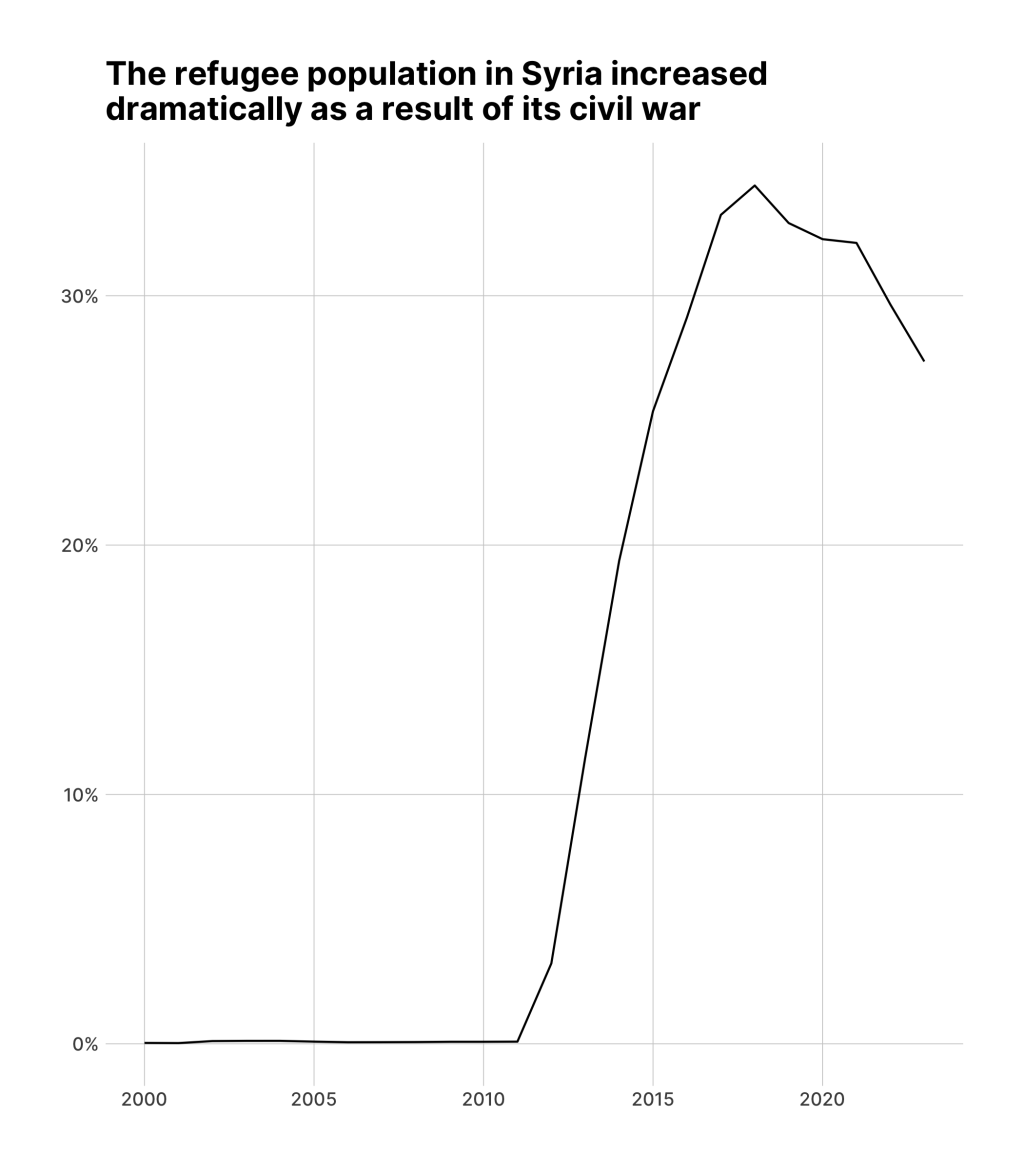
We then save this plot as syria_refugees_plot .
Now, in order to animate the plot, we take the syria_refugees_plot object and add a transition to it. The {gganimate} package has multiple transitions . Which one you use depends on the type of data you are working with as well as how you want to animate it. Here, I’ve used transition_reveal(year) , which tells {gganimate} to sequentially reveal the data, year by year. The result is an animated plot that shows the dramatic rise in the Syrian refugee population starting in 2011.
syria_refugees_plot +
  transition_reveal(year)
Make an Animated Map
The {gganimate} package works with any type of data. You can even use it when making maps. To demonstrate this, I’ll begin by loading the {sf} package.
library(sf)This package gives me access to the read_sf() function, which I use to import geospatial data on all countries.
countries_data <-
read_sf("https://github.com/rfortherestofus/blog/raw/refs/heads/main/gganimate/countries_data.geojson")Taking a look at the countries_data object, we can see it has a country_abbreviation column, as well as continent and subregion .
countries_data
#> Simple feature collection with 172 features and 3 fields
#> Geometry type: MULTIPOLYGON
#> Dimension:     XY
#> Bounding box:  xmin: -180 ymin: -90 xmax: 180 ymax: 83.64513
#> Geodetic CRS:  WGS 84
#> # A tibble: 172 × 4
#>    country_abbreviation continent     subregion                         geometry
#>    <chr>                <chr>         <chr>                   <MULTIPOLYGON [°]>
#>  1 FJI                  Oceania       Melanesia        (((180 -16.06713, 180 -1…
#>  2 TZA                  Africa        Eastern Africa   (((33.90371 -0.95, 34.07…
#>  3 ESH                  Africa        Northern Africa  (((-8.66559 27.65643, -8…
#>  4 CAN                  North America Northern America (((-122.84 49, -122.9742…
#>  5 USA                  North America Northern America (((-122.84 49, -120 49, …
#>  6 KAZ                  Asia          Central Asia     (((87.35997 49.21498, 86…
#>  7 UZB                  Asia          Central Asia     (((55.96819 41.30864, 55…
#>  8 PNG                  Oceania       Melanesia        (((141.0002 -2.600151, 1…
#>  9 IDN                  Asia          South-Eastern A… (((141.0002 -2.600151, 1…
#> 10 ARG                  South America South America    (((-68.63401 -52.63637, …
#> # ℹ 162 more rowsNext, I’m going to join this countries_data object with the refugees_data object we created above. I’ll then filter to only include countries in the subregion Western Asia and rearrange columns with select() .
middle_east_refugees_data <-
  countries_data |>
  left_join(
    refugees_data,
    join_by(country_abbreviation)
  ) |>
  filter(subregion == "Western Asia") |>
select(year, country_abbreviation, refugees_as_pct)This gives me geospatial data on refugees in the Middle East.
middle_east_refugees_data
#> Simple feature collection with 408 features and 3 fields
#> Geometry type: MULTIPOLYGON
#> Dimension:     XY
#> Bounding box:  xmin: 26.04335 ymin: 12.58595 xmax: 59.80806 ymax: 43.5531
#> Geodetic CRS:  WGS 84
#> # A tibble: 408 × 4
#>     year country_abbreviation refugees_as_pct                           geometry
#>    <dbl> <chr>                          <dbl>                 <MULTIPOLYGON [°]>
#>  1  2007 ISR                        0.000214  (((35.71992 32.70919, 35.54567 32…
#>  2  2008 ISR                        0.000203  (((35.71992 32.70919, 35.54567 32…
#>  3  2009 ISR                        0.000173  (((35.71992 32.70919, 35.54567 32…
#>  4  2011 ISR                        0.000170  (((35.71992 32.70919, 35.54567 32…
#>  5  2010 ISR                        0.000169  (((35.71992 32.70919, 35.54567 32…
#>  6  2012 ISR                        0.000168  (((35.71992 32.70919, 35.54567 32…
#>  7  2013 ISR                        0.000127  (((35.71992 32.70919, 35.54567 32…
#>  8  2006 ISR                        0.000124  (((35.71992 32.70919, 35.54567 32…
#>  9  2014 ISR                        0.000118  (((35.71992 32.70919, 35.54567 32…
#> 10  2004 ISR                        0.0000983 (((35.71992 32.70919, 35.54567 32…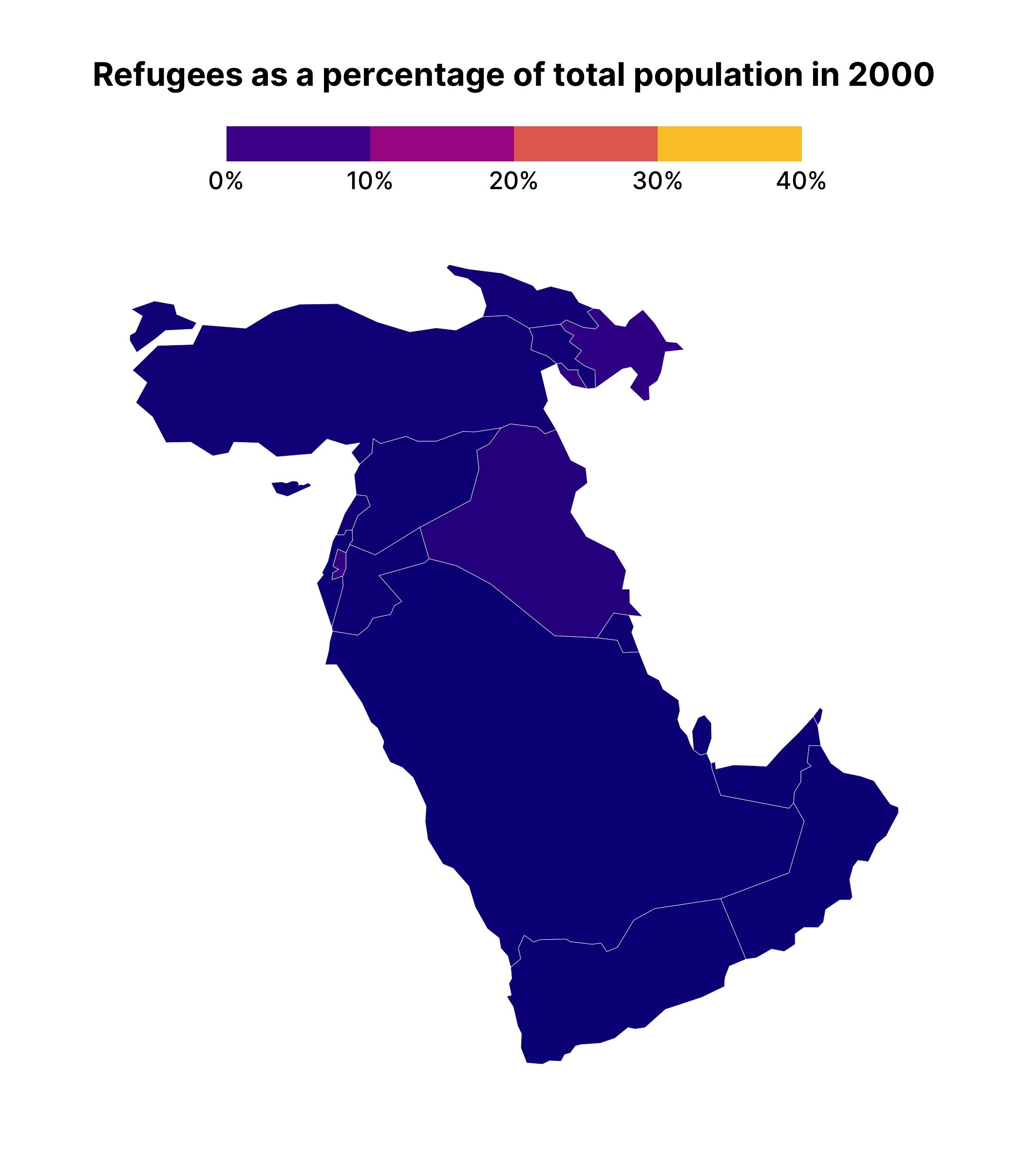
#> # ℹ 398 more rowsI can now use this data to make a map. The geom_sf() function plots my data and I use the fill aesthetic to make the shading of each country different depending on the value in the refugees_as_pct variable.
middle_east_refugees_data |>
  ggplot() +
  geom_sf(
    aes(fill = refugees_as_pct),
    linewidth = 0.1,
    color = "white"
  ) +
  scale_fill_viridis_c(
    labels = percent_format(),
    limits = c(0, .4),
    option = "C",
    guide = guide_colorsteps(show.limits = TRUE)
  ) +
  labs(
    title = "Refugees as a percentage of total population",
    fill = NULL
  ) +
  theme_ipsum_inter(
    grid = FALSE
  ) +
  theme(
    legend.position = "top",
    plot.title = element_text(
      face = "bold",
      hjust = 0.5
    ),
    axis.text.x = element_blank(),
    axis.text.y = element_blank(),
    legend.key.width = unit(2, "cm"),
    legend.text = element_text(
      size = 12
    )
)The result, though, isn’t quite what we expect:
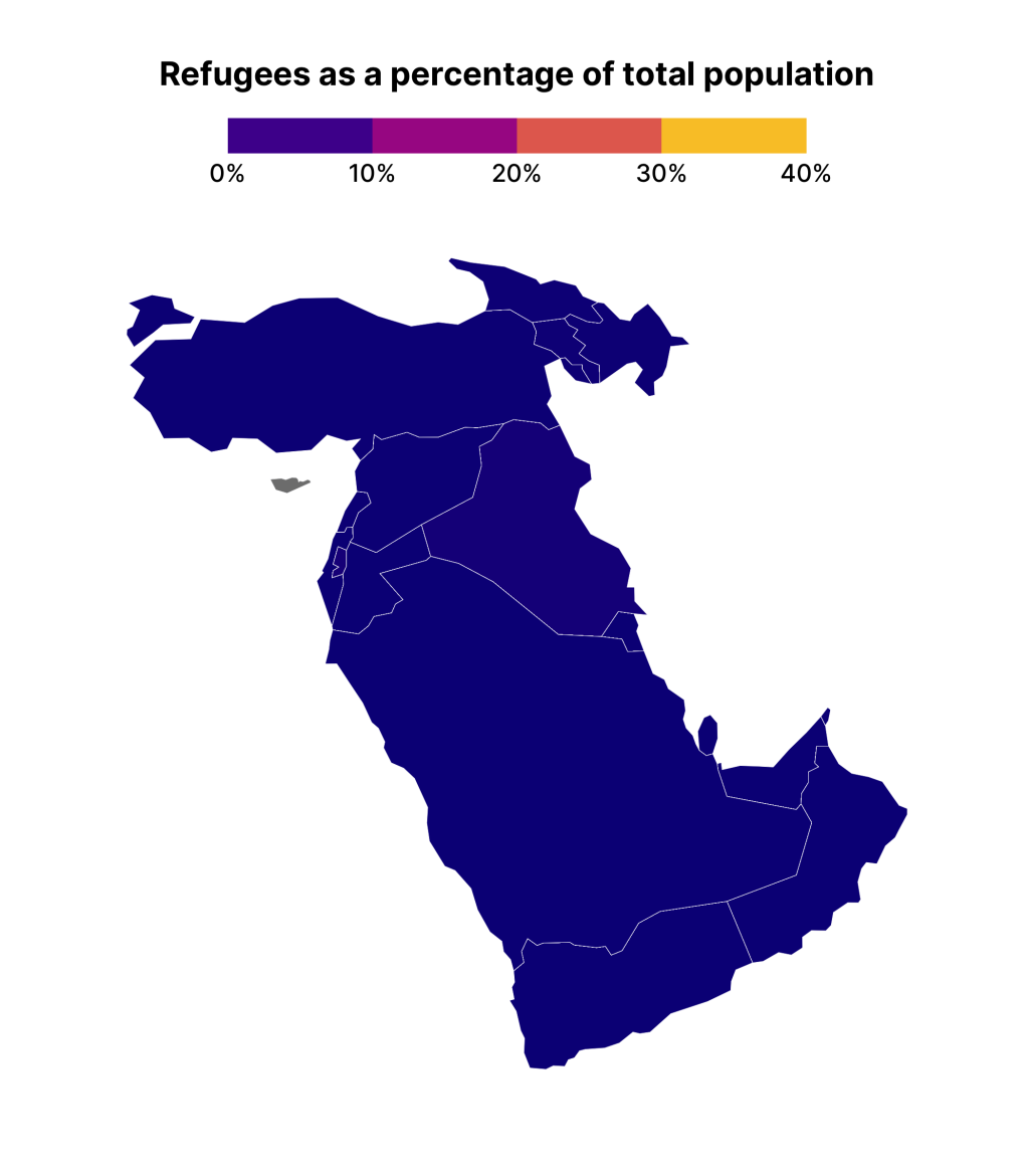
That’s because the data is longitudinal. That is, we have multiple years for each year, meaning earlier years are covering up later ones. To see what is going on, let’s make a small multiples chart. I’ve saved the previous plot as middle_east_refugees_map . If I add a facet_wrap() onto it, I can see the data for each year.
middle_east_refugees_map +
  facet_wrap(vars(year))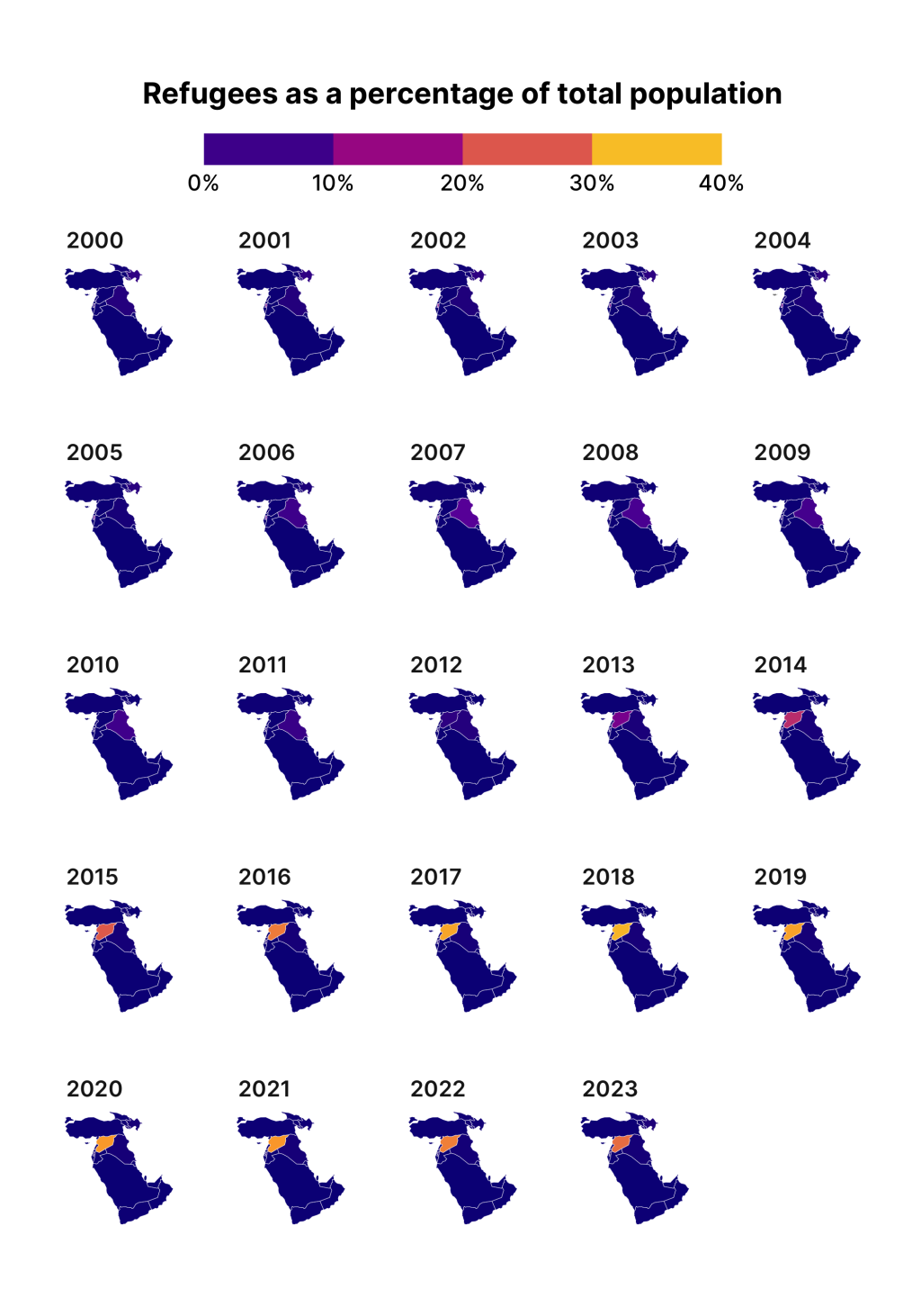
This plot allows us to see how the earlier data from 2000 is covering up later years, making it appear that no countries have refugees.
Making a facetted chart like this is actually quite instructive about how {gganimate} works. Specifically, it takes the variable that you use to animate on, creates one plot for each unique observation of that variable, and then puts each plot together, one after the other, kind of like an old flipbook . If we add transition_manual(year) (this works with our geospatial data) to middle_east_refugees_map , you can see the animated result.
middle_east_refugees_map +
  transition_manual(year)
One difficult thing about the animated map we’ve just made is that we can’t see the year on display as the shading changes. To add this, we can use the {current_frame} syntax provided by {gganimate}, adjusting our title as follows:
middle_east_refugees_map +
  labs(title = "Refugees as a percentage of total population in {current_frame}") +
transition_manual(year)The resulting map will show {current_frame} replaced by the year, meaning your title is animated alongside the map itself.
I’ve only covered the surface here; the {gganimate} package has a lot of additional functions to tweak your animations. Hopefully this introduction to {gganimate} will inspire you to check them out!
Sign up for the newsletter
Get blog posts like this delivered straight to your inbox.

You need to be signed-in to comment on this post. Login.