Use vertical white lines instead of axis lines for cleaner charts
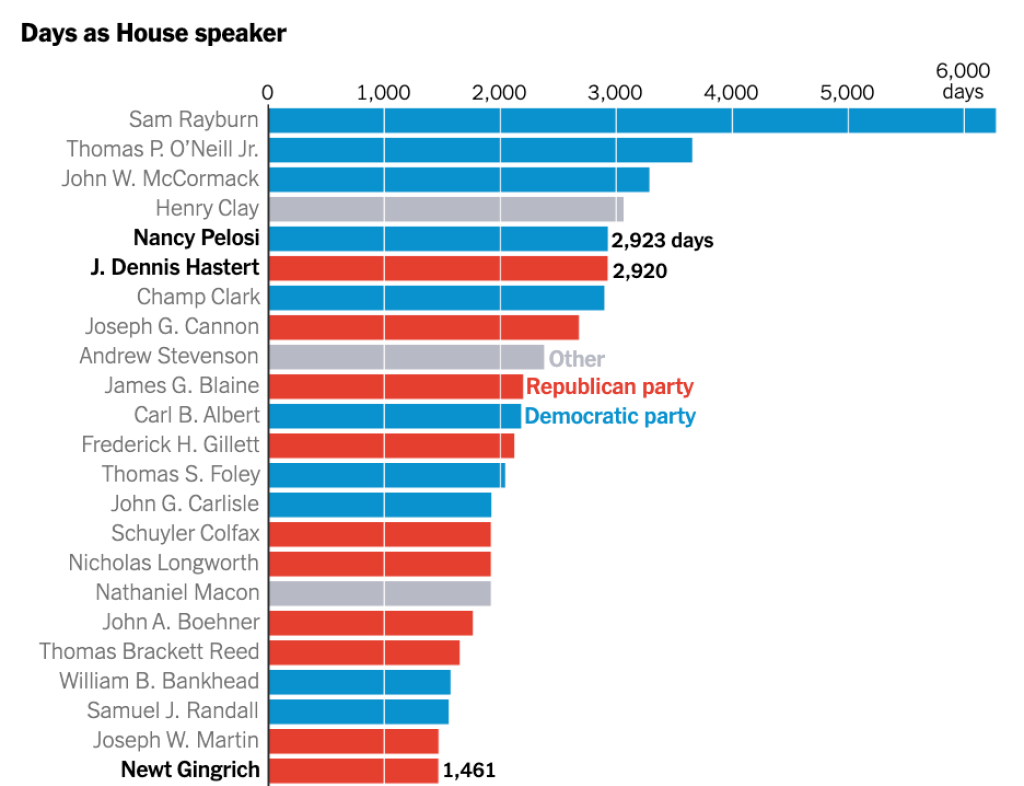
I recently came across a data viz in the New York Times that used a unique approach to adding axis lines. In this chart about the number of days that members of the United States House of Representatives served as speaker, rather than use traditional axis lines, they used white lines that show up on bars but are hidden otherwise.
How can we create a bar chart in ggplot2 without using vertical white lines? This guide will walk you through the steps to create a polished bar plot using gross domestic product data (GDP) from the gapminder package.
Load the Necessary Packages
First, we need to load the tidyverse package, which includes ggplot2 for plotting and dplyr for data manipulation. We’ll also be using the gapminder dataset that comes preloaded with the gapminder package. It contains data about life expectancy, GDP per capita, and population for different countries over time.
library(tidyverse)
library(gapminder)Import Data
We’ll focus on the most recent data in the dataset, which is from 2007, and select the top 10 countries by GDP per capita. We’ll also make the country variable into a factor, reordering it by the gdpPercap variable so that our bar chart will be ordered by GDP per capita.
gdp_data <-
  gapminder |>
  filter(year == 2007) |>
  select(
    country,
    gdpPercap
  ) |>
  mutate(country = fct_reorder(
    country,
    gdpPercap
  )) |>
  arrange(desc(gdpPercap)) |>
slice(1:15)Now, let’s take a look at our filtered dataset:
gdp_data
#> # A tibble: 15 × 2
#>    country          gdpPercap
#>    <fct>                <dbl>
#>  1 Norway              49357.
#>  2 Kuwait              47307.
#>  3 Singapore           47143.
#>  4 United States       42952.
#>  5 Ireland             40676.
#>  6 Hong Kong, China    39725.
#>  7 Switzerland         37506.
#>  8 Netherlands         36798.
#>  9 Canada              36319.
#> 10 Iceland             36181.
#> 11 Austria             36126.
#> 12 Denmark             35278.
#> 13 Australia           34435.
#> 14 Sweden              33860.
#> 15 Belgium 33693.Create a Basic Horizontal Bar Plot
With our data in place, we will now create a basic bar chart to visualize the GDP per capita for each country.
ggplot(
  gdp_data,
  aes(
    x = gdpPercap,
    y = country
  )
) +
  geom_col()
This creates a basic bar chart, but it’s still missing the customization we want, like removing the x-axis and adding vertical white lines.
Remove Default Axis Lines
Next, we’ll remove the x-axis (since the bars are horizontal, this refers to the axis along the bottom). We’ll do this by using theme() and setting panel.grid.major and panel.grid.minor to element_blank() .
ggplot(
  gdp_data,
  aes(
    x = gdpPercap,
    y = country
  )
) +
  geom_col() +
  theme_minimal() +
  theme(
    panel.grid.major = element_blank(),
    panel.grid.minor = element_blank()
  )
Add Custom Axis Lines
To add vertical white lines in place of the x-axis, we’ll use geom_vline() . This function allows us to add vertical lines at specified positions. We’ll place the lines at intervals across the y-axis values to help the viewer estimate the GDP per capita using the seq() function to add lines from 10,000 to 50,000 at increments of 10,000.
ggplot(
  gdp_data,
  aes(
    x = gdpPercap,
    y = country
  )
) +
  geom_col() +
  geom_vline(
    xintercept = seq(
      from = 10000,
      to = 50000,
      by = 10000
    ),
    color = "white"
  ) +
  theme_minimal() +
  theme(
    panel.grid.major = element_blank(),
    panel.grid.minor = element_blank()
  )
Improve Overall Style
Now that we’ve created the plot with our white vertical lines instead of axis lines, we can customize it further to make it look just a bit more polished.
First, let’s add a nicer color to our bars (you might recognize it as the R for the Rest of Us blue):
geom_col(fill = "#6cabdd")To do this, we make some tweaks with the scale_x_continuous() function to reduce the horizontal spacing around the bars and make the y-axis labels to show values in thousands (e.g., $20k instead of 20000) with the dollar_format() function from the scales package.
scale_x_continuous(
  expand = expansion(add = 500),
  labels = scales::dollar_format(scale = 1 / 1000, suffix = "k")
)We also added a title and caption and removed the x and y axis labels (since they are now obvious from the title).
labs(
  x = NULL,
  y = NULL,
  title = "GDP Per Capita (2007)",
  caption = "Source: Gapminder"
)Next, we made a few additional tweaks to the theme. Adding base_family = "Roboto" makes the entire plot use that font and base_size = 14 makes the size of all text elements larger in order to make them more readable.
theme_minimal(
  base_family = "Roboto",
  base_size = 14
)Finally, we added some additional tweaks in the theme() function to style the title and caption:
theme(
  panel.grid.major = element_blank(),
  panel.grid.minor = element_blank(),
  plot.title = element_text(face = "bold"),
  plot.caption = element_text(
    size = 10,
    color = "#7f8c8d",
    hjust = 0,
    margin = margin(t = 15)
  )
)All of these elements combined given us our final code:
ggplot(
  gdp_data,
  aes(
    x = gdpPercap,
    y = country
  )
) +
  geom_col(fill = "#6cabdd") +
  geom_vline(
    xintercept = seq(
      from = 10000,
      to = 50000,
      by = 10000
    ),
    color = "white"
  ) +
  scale_x_continuous(
    expand = expansion(add = 500),
    labels = scales::dollar_format(scale = 1 / 1000, suffix = "k")
  ) +
  labs(
    x = NULL,
    y = NULL,
    title = "GDP Per Capita (2007)",
    caption = "Source: Gapminder"
  ) +
  theme_minimal(
    base_family = "Roboto",
    base_size = 14
  ) +
  theme(
    panel.grid.major = element_blank(),
    panel.grid.minor = element_blank(),
    plot.title = element_text(face = "bold"),
    plot.caption = element_text(
      size = 10,
      color = "#7f8c8d",
      hjust = 0,
      margin = margin(t = 15)
    )
)And the result looks great!

By following these steps, you now have a clean, polished horizontal bar plot that uses vertical white lines as reference points for GDP per capita values. The x-axis has been removed for a cleaner look, but the vertical lines give viewers a guide for interpreting the values. This chart is a useful visualization tool for comparing GDP per capita across countries without the clutter of an x-axis, making the data easy to interpret at a glance.
Sign up for the newsletter
Get blog posts like this delivered straight to your inbox.


You need to be signed-in to comment on this post. Login.