Recreating Financial Times Data Viz of 2024 US Presidential Election
A couple weeks ago, in the wake of the presidential election here in the United States, everyone was looking for explanations for the results. One of the most compelling reasons that Donald Trump won came from John Burn-Murdoch. Burn-Murdoch, a columnist and the chief data reporter at the Financial Times, posted this graph showing that incumbents around the world had fared extremely poorly in 2024.
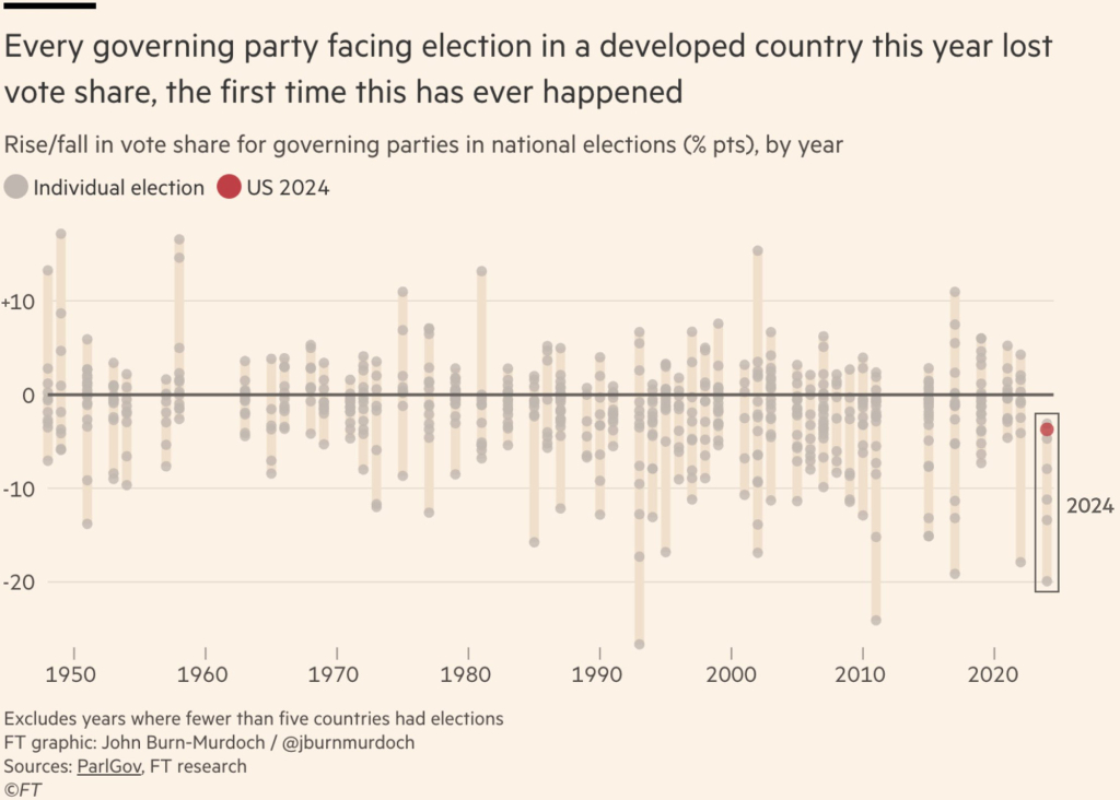
This graph got a ton of attention online not only because the data that underlies it strongly supports the hypothesis that voters this year are looking to dump incumbents. It also got attention because it is just a really well done graph. It is both novel (don’t think I’ve ever seen a chart quite like it) and easy to grasp – a unique combination.
I was so taken by the graph that I wondered whether I could recreate it in ggplot. Many people encouraged me to try it so I’ve decided to go for it.
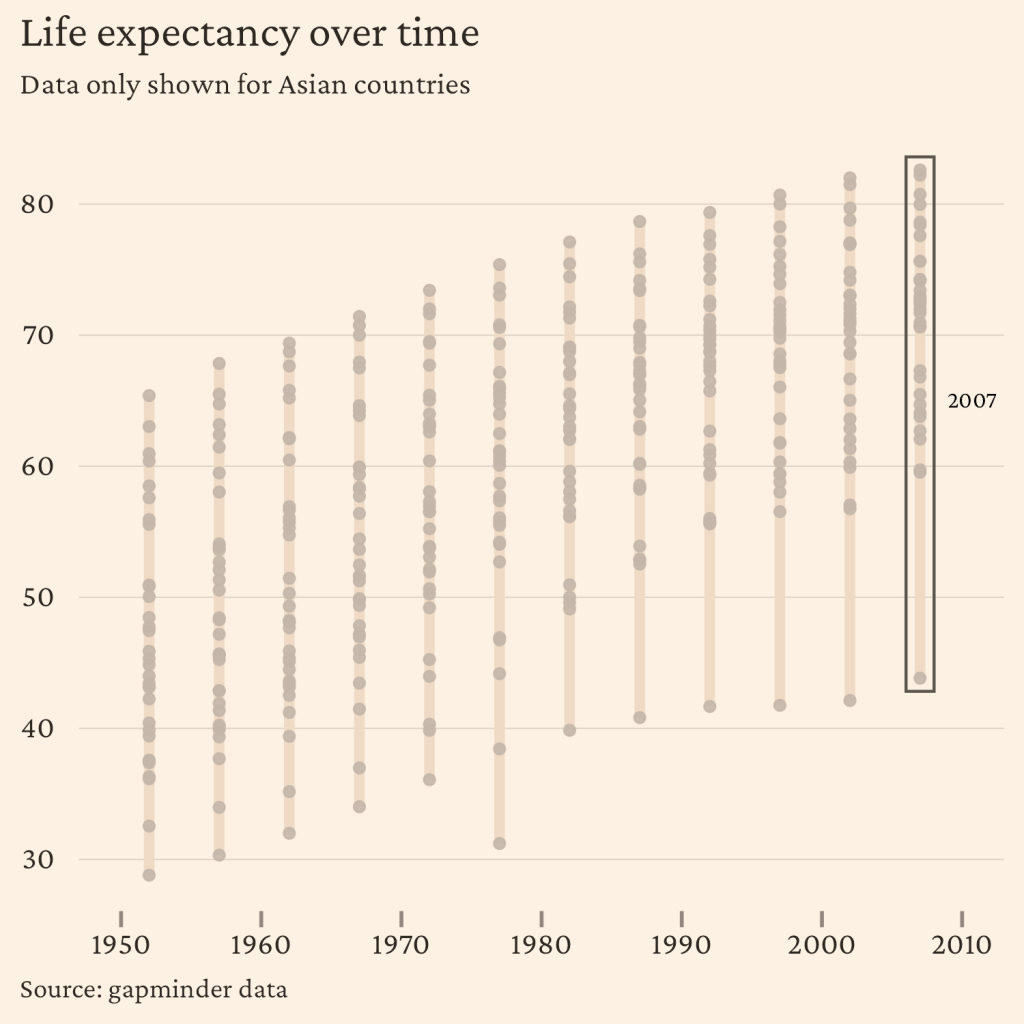
I ended up not creating the exact same chart because I don’t have the exact code that John Burn Murdoch used to wrangle the original source data. So, instead I used gapminder data (from the {gapminder} package) to make a chart that very closely resembles the FT chart, but for a measure like life expectancy. Here's where I ended up:
If you want to see how I made it, here's what I cover in the video:
Creating the basic dot plot structure using
geom_point()Adding connecting segments between min and max values with
geom_segment()Styling the plot to match the Financial Times aesthetic, including custom colors and fonts, grid line adjustments, text alignment and sizing, and adding a highlight rectangle for the most recent year
The code that I developed will work for any measure so if you want to go through the original data and wrangle it into shape to make a plot, you’ll be able to apply my code to do so.
library(tidyverse)
library(gapminder)

life_expectancy <-
  gapminder |>
  filter(continent == "Asia") |>
  select(country, year, lifeExp)

life_expectancy_min_max <-
  life_expectancy |>
  group_by(year) |>
  summarize(
    max_life_expectancy = max(lifeExp),
    min_life_expectancy = min(lifeExp)
  )

life_expectancy_most_recent_year <-
  life_expectancy_min_max |>
  slice_max(
    order_by = year,
    n = 1
  )

text_color <- "#2e2822"

ggplot() +
  geom_segment(
    data = life_expectancy_min_max,
    aes(
      x = year,
      xend = year,
      y = min_life_expectancy,
      yend = max_life_expectancy
    ),
    linewidth = 1.75,
    color = "#efdac5"
  ) +
  geom_point(
    data = life_expectancy,
    aes(
      x = year,
      y = lifeExp
    ),
    color = "#c4b7aa",
    alpha = 0.9
  ) +
  labs(
    title = "Life expectancy over time",
    subtitle = "Data only shown for Asian countries",
    caption = "Source: gapminder data"
  ) +
  theme_minimal(
    base_family = "Crimson Pro",
    base_size = 14
  ) +
  theme(
    text = element_text(color = text_color),
    panel.grid.major = element_line(
      color = "#e1d6c8",
      linewidth = 0.25
    ),
    panel.grid.minor = element_blank(),
    panel.grid.major.x = element_blank(),
    axis.text = element_text(
      color = text_color
    ),
    axis.title = element_blank(),
    axis.ticks.x = element_line(
      color = "#93877f"
    ),
    axis.ticks.length = unit(0.2, "cm"),
    plot.title.position = "plot",
    plot.caption.position = "plot",
    plot.caption = element_text(
      hjust = 0,
      size = 10
    ),
    plot.title = element_text(
      size = 16
    ),
    plot.subtitle = element_text(
      size = 11
    ),
    plot.background = element_rect(
      color = "transparent",
      fill = "#fcf1e3"
    )
  ) +
  scale_x_continuous(
    limits = c(1950, 2010),
    breaks = seq(1950, 2010, 10)
  ) +
  annotate(
    geom = "rect",
    xmin = max(life_expectancy$year) - 1,
    xmax = max(life_expectancy$year) + 1,
    ymin = min(life_expectancy_most_recent_year$min_life_expectancy) - 1,
    ymax = max(life_expectancy_most_recent_year$max_life_expectancy) + 1,
    fill = "transparent",
    color = "#5b564e"
  ) +
  annotate(
    geom = "text",
    label = "2007",
    x = 2010,
    y = 65,
    hjust = 0.3,
    family = "Crimson Pro",
    size = 3
)Sign up for the newsletter
Get blog posts like this delivered straight to your inbox.

You need to be signed-in to comment on this post. Login.