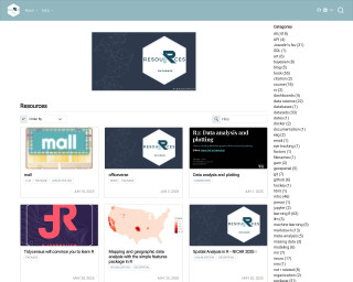
Resources
This carefully curated collection of resources will help you find packages and learning resources to help you on your R journey.

How to use a histogram as a legend in {ggplot2}
Andrew Heiss demonstrates how to create choropleth maps in 'ggplot2' with an integrated histogram as a legend to provide additional context for the data. This approach helps to counter visual bias, such as large areas with similar colors obscuring the true distribution of data. Heiss highlights the issue using unemployment rates across U.S. counties, where larger counties can appear to have a disproportionate impact. To address this, he uses the 'ggplot2' and 'patchwork' packages in R, offering a programmatic solution as opposed to the manual process of using D3, Excel, and Figma outlined in Joey Cherdarchuk's original post.
Go to Resource

Modern Data Visualization with R
Modern Data Visualization with R is a comprehensive guide by Robert Kabacoff on data visualization techniques using the R programming language. This book, available in both online and print versions, emphasizes the use of ggplot2 for creating a variety of charts and plots. Covering topics from importing and cleaning data to customizing and saving graphs, the book includes worked examples and best practices to help readers create publication-ready graphics. The content also introduces interactive graphing tools and offers advice on graph aesthetics such as color choice and signal-to-noise ratio.
Go to Resource
resouRces
This content encompasses a comprehensive list of R-related educational materials, packages, tutorials, and datasets with projected dates ranging up to the year 2025. It includes various titles that focus on learning R programming, data analysis, data visualization, geospatial mapping, and statistical methods. Significant emphasis is placed on resources for learning R, such as introductions to R, books, courses, and video tutorials. Additionally, specific packages for data wrangling, statistical modeling, and visualization are mentioned, indicating the evolution and specialization of R's ecosystem to cater to diverse data science needs.
Go to Resource
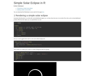
Simple Solar Eclipse in R
The tutorial 'Simple Solar Eclipse in R' by Esther Weidauer explains how to render a simple solar eclipse using R and ggplot2. It begins with generating points on a circle to simulate the moon's disk and then proceeds to add a corona effect, simulating the sun's atmosphere seen during an eclipse. Adjustments are made for a more realistic corona by creating subsets of points, assigning unique identifiers, and layering to produce the final visual effect. RMarkdown for the demo is available for download, encouraging users to try their hand at this elegant astronomical depiction.
Go to Resource

The best R packages for data visualization
The best R packages for data visualization provide a comprehensive suite of tools for creating all types of charts and graphs. Core to R's visualization capabilities is the package ggplot2, which offers a versatile grammar of graphics. Extensions of ggplot2 and other packages expand these functionalities, allowing for interactive charts, improved aesthetics, specialized geospatial analysis, and managing complex data structures like networks. Packages like plotly, rmarkdown, patchwork, and hrbrthemes enhance the user experience and presentation. Additionally, there are packages dedicated to managing colors, creating tables, and supporting specific chart types like word clouds and streamgraphs.
Go to Resource
tvthemes
The tvthemes package is a collection of various ggplot2 themes and color/fill palettes based on popular TV shows.
Go to Resource