How to Make a Diverging Bar Chart in R
Much of the credit for this blog post goes to Thomas Vroylandt. Before we began working together regularly, I made diverging bar charts but never really understood how things worked. Thomas has helped me truly understand how to make these visualizations.
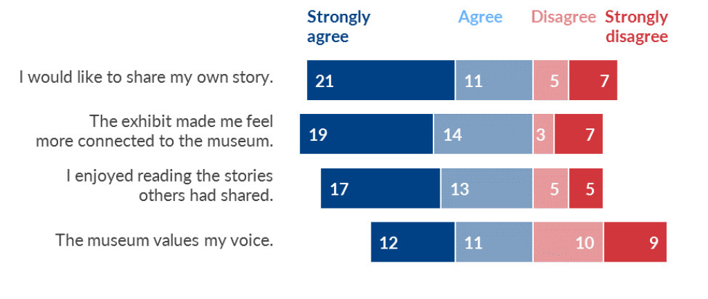
In a previous life, I worked in the world of program evaluation. In this work, I did a lot of surveys. And in these surveys, we often used Likert scales for answer options. For example:
Question: How good is the education at your school? Answers: Very good, good, bad, very bad.
I had learned from data viz experts like Stephanie Evergreen and Ann Emery that data like this is best shown in a diverging bar chart.
At this time, I used Excel for all my visualizations. When I switched to R, I struggled to figure out how to make these charts. It's taken me a few years, but I've finally gotten the hang of making diverging bar charts in ggplot. Here's my attempt to show how to make diverging bar charts.
And here's the code to follow along.
# Load Packages
Let's load the two packages we'll use
```{r}
library(tidyverse)
library(scales)
```
# Generate Data
We'll create some fake data.
```{r}
set.seed(1234)
school_quality <-
tibble(
id = seq(1, 300, 1),
school = rep(c(
"Sabin", "Vernon", "Faubion", "Irvington", "Alameda", "Beverly Cleary"
), 50),
opinion = sample(c("Very bad", "Bad", "Good", "Very Good"), 300, replace = TRUE)
)
school_quality
```
# Default Bar Chart
Let's make a summary of our data.
```{r}
school_quality_summary <- school_quality %>%
group_by(school, opinion) %>%
count(name = "n_answers") %>%
group_by(school) %>%
mutate(percent_answers = n_answers / sum(n_answers)) %>%
ungroup() %>%
mutate(percent_answers_label = percent(percent_answers, accuracy = 1))
school_quality_summary
```
```{r}
school_quality_summary %>%
ggplot(aes(x = school,
y = percent_answers,
fill = opinion)) +
geom_col() +
geom_text(aes(label = percent_answers_label),
position = position_stack(vjust = 0.5),
color = "white",
fontface = "bold") +
coord_flip() +
scale_x_discrete() +
scale_fill_viridis_d() +
labs(title = "How good is the education at your school?",
x = NULL,
fill = NULL) +
theme_minimal() +
theme(axis.text.x = element_blank(),
axis.title.x = element_blank(),
panel.grid = element_blank(),
legend.position = "top")
```
# Basic Diverging Bar Chart
Let's create data that we need to make a basic diverging bar chart.
```{r}
school_quality_summary_diverging <- school_quality_summary %>%
mutate(percent_answers = if_else(opinion %in% c("Very Good", "Good"), percent_answers, -percent_answers)) %>%
mutate(percent_answers_label = percent(percent_answers, accuracy = 1))
school_quality_summary_diverging
```
We can now make a basic diverging bar chart.
```{r}
school_quality_summary_diverging %>%
ggplot(aes(x = school,
y = percent_answers,
fill = opinion)) +
geom_col() +
geom_text(aes(label = percent_answers_label),
position = position_stack(vjust = 0.5),
color = "white",
fontface = "bold") +
coord_flip() +
scale_x_discrete() +
scale_fill_viridis_d() +
labs(title = "How good is the education at your school?",
x = NULL,
fill = NULL) +
theme_minimal() +
theme(axis.text.x = element_blank(),
axis.title.x = element_blank(),
panel.grid = element_blank(),
legend.position = "top")
```
# Positive/Negative Labels
In our previous chart, the labels for very bad and bad were negative. Let's change this!
This will make our labels are positive numbers.
```{r}
school_quality_summary_diverging_good_labels <- school_quality_summary_diverging %>%
mutate(percent_answers_label = abs(percent_answers)) %>%
mutate(percent_answers_label = percent(percent_answers_label, accuracy = 1))
school_quality_summary_diverging_good_labels
```
```{r}
school_quality_summary_diverging_good_labels %>%
ggplot(aes(x = school,
y = percent_answers,
fill = opinion)) +
geom_col() +
geom_text(aes(label = percent_answers_label),
position = position_stack(vjust = 0.5),
color = "white",
fontface = "bold") +
coord_flip() +
scale_x_discrete() +
scale_fill_viridis_d() +
labs(title = "How good is the education at your school?",
x = NULL,
fill = NULL) +
theme_minimal() +
theme(axis.text.x = element_blank(),
axis.title.x = element_blank(),
panel.grid = element_blank(),
legend.position = "top")
```
# Reorder Bars
Our bars are out of order. Let's fix this!
```{r}
school_quality_summary_diverging_right_order <- school_quality_summary_diverging_good_labels %>%
mutate(opinion = fct_relevel(opinion,
"Bad", "Very bad", "Good", "Very Good"),
opinion = fct_rev(opinion))
school_quality_summary_diverging_right_order
```
```{r}
school_quality_summary_diverging_right_order %>%
ggplot(aes(x = school,
y = percent_answers,
fill = opinion)) +
geom_col() +
geom_text(
aes(label = percent_answers_label),
position = position_stack(vjust = 0.5),
color = "white",
fontface = "bold"
) +
coord_flip() +
scale_x_discrete() +
scale_fill_viridis_d() +
labs(title = "How good is the education at your school?",
x = NULL,
fill = NULL) +
theme_minimal() +
theme(axis.text.x = element_blank(),
axis.title.x = element_blank(),
panel.grid = element_blank(),
legend.position = "top")
```
# Make Legend Order Match
The bars are now in the right order, but the legend doesn't match. Let's fix this!
```{r}
school_quality_summary_diverging_right_order %>%
ggplot(aes(x = school,
y = percent_answers,
fill = opinion)) +
geom_col() +
geom_text(aes(label = percent_answers_label),
position = position_stack(vjust = 0.5),
color = "white",
fontface = "bold") +
coord_flip() +
scale_x_discrete() +
scale_fill_viridis_d(breaks = c("Very bad", "Bad", "Good", "Very Good")) +
labs(title = "How good is the education at your school?",
x = NULL,
fill = NULL) +
theme_minimal() +
theme(axis.text.x = element_blank(),
axis.title.x = element_blank(),
panel.grid = element_blank(),
legend.position = "top")
```
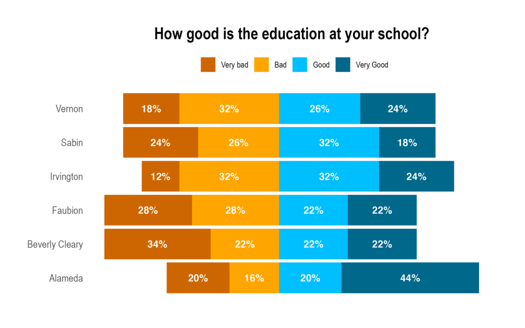
# Improve Colors
Let's use a more appropriate color scale for this data.
```{r}
school_quality_summary_diverging_right_order %>%
ggplot(aes(x = school,
y = percent_answers,
fill = opinion)) +
geom_col() +
geom_text(aes(label = percent_answers_label),
position = position_stack(vjust = 0.5),
color = "white",
fontface = "bold") +
coord_flip() +
scale_x_discrete() +
scale_fill_manual(breaks = c("Very bad", "Bad", "Good", "Very Good"),
values = c(
"Very bad" = "darkorange3",
"Bad" = "orange",
"Good" = "deepskyblue",
"Very Good" = "deepskyblue4"
)) +
labs(title = "How good is the education at your school?",
x = NULL,
fill = NULL) +
theme_minimal() +
theme(axis.text.x = element_blank(),
axis.title.x = element_blank(),
panel.grid = element_blank(),
legend.position = "top")
```
There are a few steps to making a diverging bar chart:
And here's what you end up with:
Make your negative responses have negative values
Adjust your plot labels so that all positive labels show up
Reorder your bars so they’re in the right order
Make the order of your legend match the bars
Use a diverging fill scale that matches the nature of your data
It might sound daunting, but once you get the hang of it, you can easily make diverging bar charts in R!
Sign up for the newsletter
Get blog posts like this delivered straight to your inbox.

You need to be signed-in to comment on this post. Login.
Jorge Aldo Barajas Ochoa • December 1, 2021
Hi David! Thanks! This is extremely useful. I'm struggling to create a diverging bar chart with a survey question that has 5 options instead of 4, mainly on how to handle the neutral answer (nor agree/disagree). Do you have any ideas on how I could build it? I appreciate your help a lot!