How To Make Data Viz That Matches Your Organization's Branding
Here at R for the Rest of Us, we make a lot of reports for clients. And one of the most important things we do in these reports is use the clients' colors throughout.
Picking a color scheme that ties in with a client's brand or that evokes the subject matter behind the data is what allows the plot to contribute to, rather than detract from, the main story the client is seeking to tell.
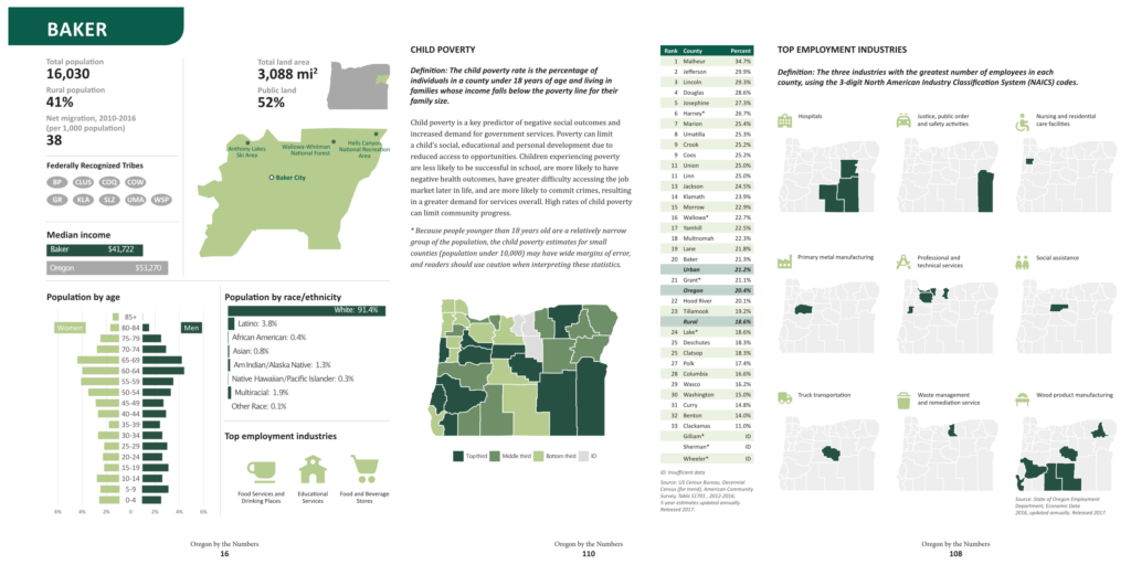
It's what we've done for the last several years working on Oregon by the Numbers. The report uses the greens that the Ford Family Foundation uses in all of their branding.
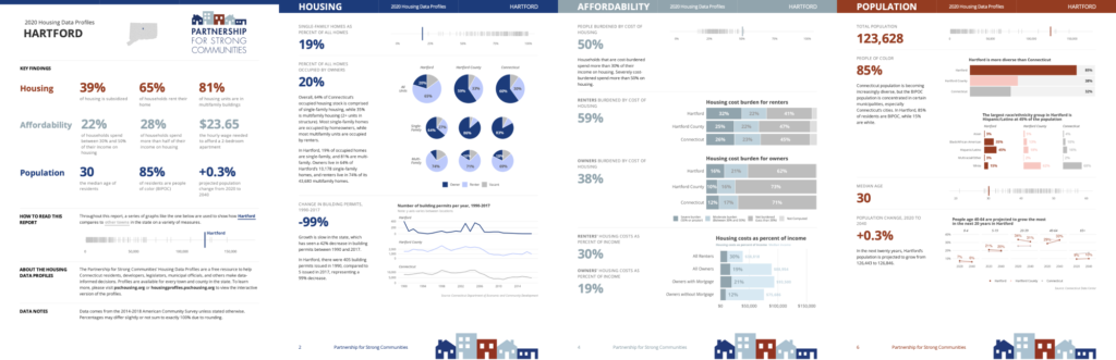
You can see the coherence in the visuals we made using the reds, blues, and teals from the Partnership for Strong Communities.
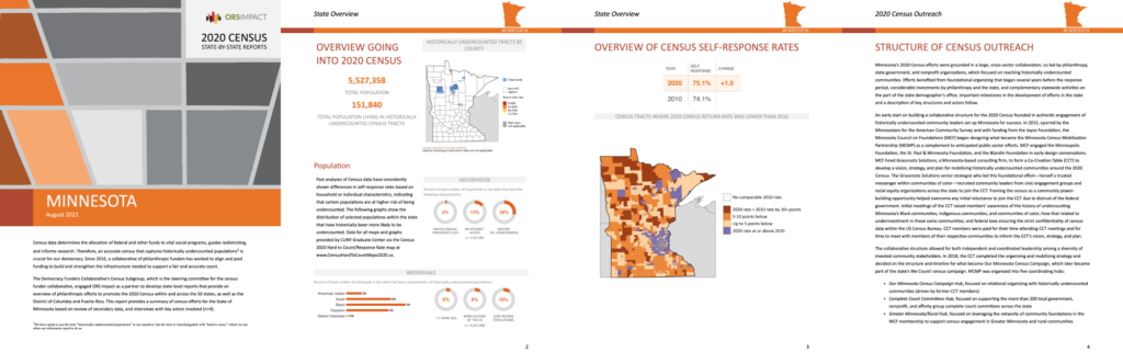
And when ORS Impact and the Democracy Funders Collaborative wanted reports that used shades of orange, we were able to make something that reflected these organizations.
How do we make reports that clearly reflect the branding of the organizations we work with? Here's how.
One of the first things we do when working with a client is ask if they have a branding guide. Something like this. Some of the clients do, but most don't. How, then, do we take what we have and make plots that match the look-and-feel of the organization?
We are working on a project right now with Colibri Consulting that shows how we create coherent visuals even when the organization we're working with does not have a branding guide.
This post explores how we go about choosing an appropriate color scheme and how to create scale_fill/color_discrete/continous() to align all plots with that color scheme.
Step 1: Decide what colors to use
In the case of this project, our client had a logo with two colors.
Jody O’Connor, head of Colibri, was able to give us the hex codes for those colors, which was handy, but there are plenty of online tools to help you pick out the hex colors in an image or even in a website.
One good one is Color Picker Online which does what it says on the tin: it allows you to pick out different colors from an image or a website, and provides you with their hex codes.
So, back to Colibri Consulting. Our two starting colors were:
Deep purple: #530577
Bright green: #43d293
Step 2: See what those colors look like when used for dataviz
There are plenty of datasets around that can be used to create plots to get a feel for the color schemes we’ll be using. The penguins set from {palmerpenguins} is one of my favorites: it contains both continuous data (e.g. flipper lengths) and categorical data (e.g. species), along with some NAs. And, because of the way the flipper and bill lengths group together into clusters, it’s a great way of seeing how the colors highlight the different clusters of points.
Let’s put together a basic plot that we can then apply our color schemes to:
categorical_penguins <-
  palmerpenguins::penguins %>%
  ggplot() +
  geom_point(aes(x = bill_length_mm, y = flipper_length_mm,
                 color = sex, size = body_mass_g),
             show.legend = F) +
  labs(title = "Palmer Penguins",
       subtitle = "Look at them go!",
       x = "Bill length",
       y = "Flipper length") +
  theme_minimal()

categorical_penguins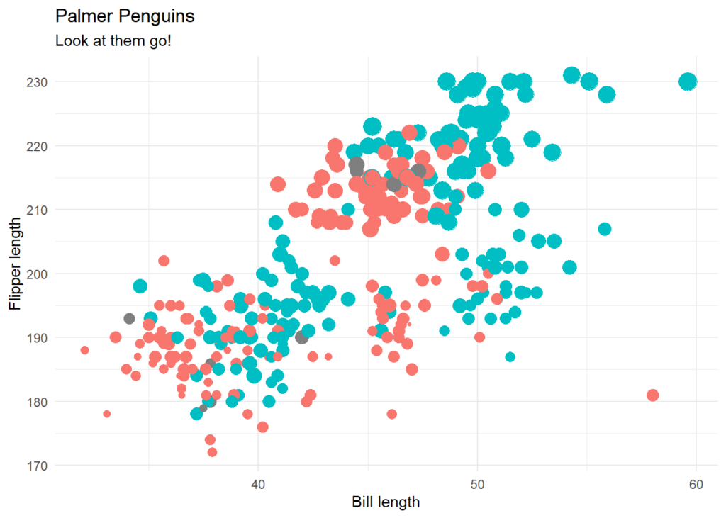
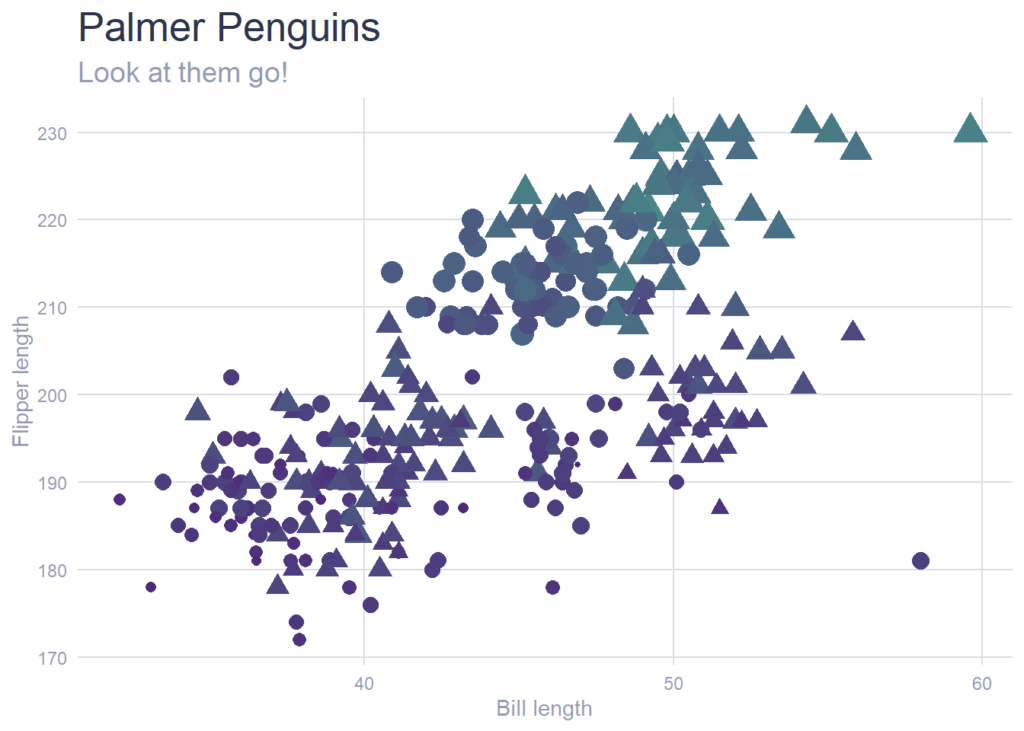
We had an inkling this might happen, but when we created a plot using the colors from the client's logo, the problem became clear: the green "popped" way more than the purple, meaning that whichever group ended up being green in our data viz would be highlighted to the detriment of the purple group.
categorical_penguins +
  scale_color_manual(values = c("#43d293", "#530577"))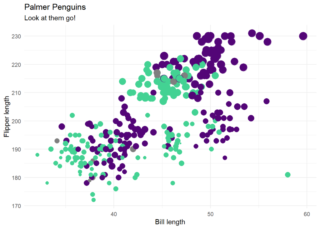
This wasn't the effect we were going for, so some tweaking was required.
The first step was to blend together the two colors, to see if we could get a "muted" green that tied in nicely with the original colors. I created the monochromer package for exactly this purpose:
monochromeR::generate_palette("#530577", modification = "blend",
                              blend_colour = "#43d293",
                              n_colours = 6, view_palette = T)
The last color in this palette is the green with a touch of purple. After some experimenting, it was still a bit too bright, so, in discussion with the client, we decided to go for a purple that was one step towards the green, and green that was one step towards the purple as the two main colors to base the palettes on.
Here's the penguin plot again with those two colors. It looks much more balanced!
categorical_penguins +
  scale_color_manual(values = c("#50257B", "#488888"))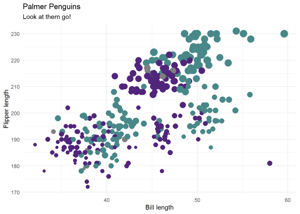
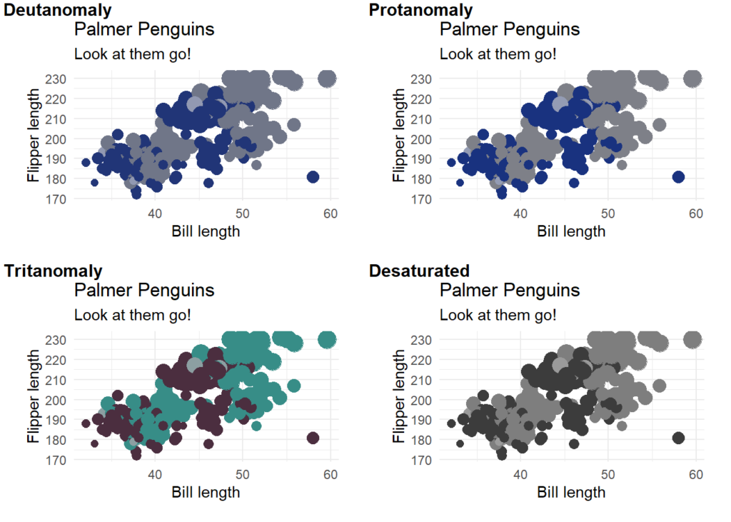
Step 3: Check the colors work for people with different types of color vision
Creating plots that work for as many readers as possible is important. Claire D. McWhite and Claus O. Wilke have made it easy for us #rstats users to check this with colorblindr, a package that simulates how plots look to readers with different color perception deficiencies.
colorblindr::cvd_grid(

  categorical_penguins +
    scale_color_manual(values = c("#50257B", "#488888"))

)
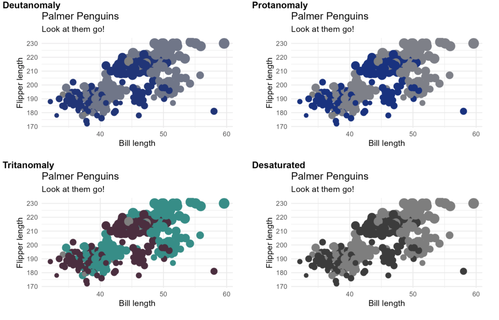
The two main colors seem to come across well, but the NAs were getting lost in all but one of the plots. To rectify that, we created an NA color which was a faded version of the middle color between our two main colors:
middle_col <- c(monochromeR::generate_palette("#50257B",
                                              modification = "blend",
                                              blend_colour = "#488888",
                                              n_colours = 4), "#488888")[3]

NA_col <- monochromeR::generate_palette(middle_col,
                                        modification = "go_both_ways",
                                        n_colours = 5)[2]


categorical_penguins +
  scale_color_manual(values = c("#50257B", "#488888"), na.value = NA_col)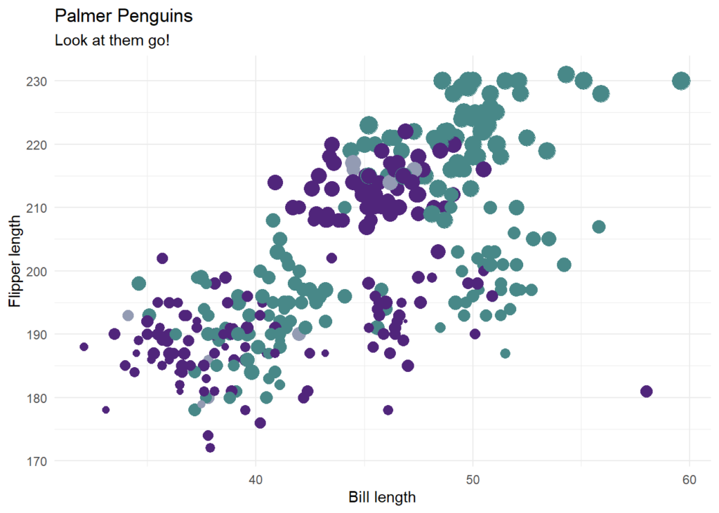
That made the NAs blend more into the background. Let's check it again with colorblindr:
colorblindr::cvd_grid(

  categorical_penguins +
    scale_color_manual(values = c("#50257B", "#488888"), na.value = NA_col)

)
The is a different color to the two main colors in all four of the plots - mission accomplished!
Step 4: Create color/fill scales
In this project, we'll be creating a lot of plots! We have plots some comparing two groups, some requiring more colors, and some using continuous data. We don't want to be adding those colors manually every time! Instead, let's create a few palettes we can call upon. First we need to get our anchors at either end of the palettes. We already have our "Purple-to-Green" anchor colors, but we also needed an all-purple palette and an all-green palette, so we needed a light purple and a light green to fade to:
# Purple extremes
monochromeR::generate_palette("#50257B",
                              modification = "go_lighter",
                              n_colours = 2, view_palette = T)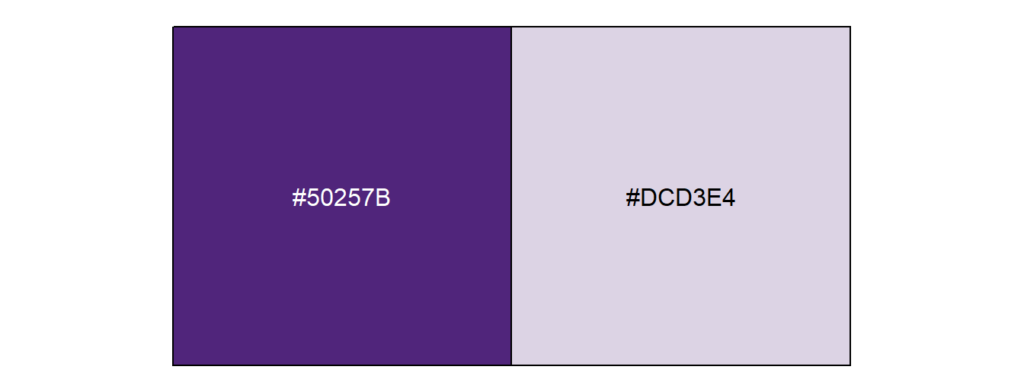
# Green extremes
monochromeR::generate_palette("#488888",
                              modification = "go_lighter",
                              n_colours = 2, view_palette = T)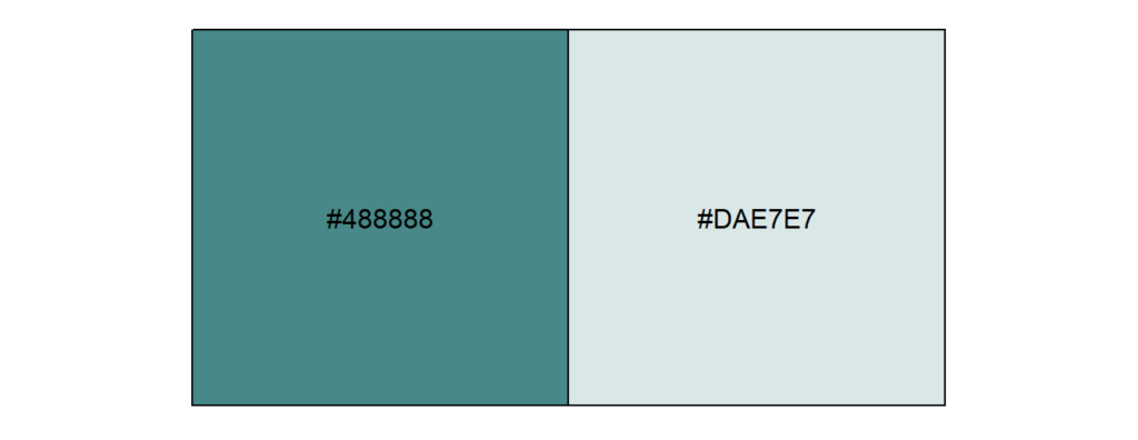
Next, we use those values to create palettes that we call upon within scale_color/fill functions. Note the NA_col applied to na_values from earlier in this post.
colibri_pal <- function(palette = "Main",
                        reverse = FALSE,
                        ...) {

  colibri_palettes <- list(
    "Main" = c("#50257B", "#488888"),
    "Purple" =  c("#50257B", "#DCD3E4"),
    "Green" = c("#488888", "#DAE7E7")
  )

  pal <- colibri_palettes[[palette]]

  if (reverse)
    pal <- rev(pal)

  grDevices::colorRampPalette(pal, ...)

}

# Discrete scales
scale_color_colibri_discrete <-
  function(palette = "Main",
           reverse = FALSE,
           ...) {
    pal <- colibri_pal(palette = palette, reverse = reverse)

    ggplot2::discrete_scale("color", pal,
                            na.value = NA_col,
                            palette = pal, ...)

  }

scale_fill_colibri_discrete <-
  function(palette = "Main",
           reverse = FALSE,
           ...) {
    pal <- colibri_pal(palette = palette, reverse = reverse)

    ggplot2::discrete_scale("color", pal,
                            na.value = NA_col,
                            palette = pal, ...)

  }

# Continuous scales
scale_color_colibri_continuous <-
  function(palette = "Main",
           reverse = FALSE,
           ...) {
    pal <- colibri_pal(palette = palette, reverse = reverse)

    ggplot2::scale_color_gradientn(colors = pal(256),
                                   na.value = NA_col,
                                   ...)

  }

scale_fill_colibri_continuous <-
  function(palette = "Main",
           reverse = FALSE,
           ...) {
    pal <- colibri_pal(palette = palette, reverse = reverse)

    ggplot2::scale_color_gradientn(colors = pal(256),
                                   na.value = NA_col,
                                   ...)

}Step 5: Align the text and grid lines with the color scheme for a more polished look
The final touch is to make the rest of the colors we see in each plot line up nicely with the color scheme: the grid lines and the text. For this, we used the "middle" color again as a basis, creating a "light text" color, a "light text" color (the same as the NAs - the color we want to blend into the background), and a "light text" color.
light_text_col <- NA_col

dark_text_col <- monochromeR::generate_palette(middle_col,
                                               modification = "go_both_ways",
                                               n_colours = 5)[4]

light_col <- monochromeR::generate_palette(middle_col,
                                           modification = "go_both_ways",
n_colours = 5)[1]We can then use these to modify theme_minimal():
categorical_penguins +
  scale_fill_colibri_discrete("Main") +
  theme_minimal() +
  theme(panel.grid.minor = element_blank(),
        panel.grid.major = element_line(color = light_col),
        text = element_text(color = light_text_col),
        plot.subtitle = element_text(size = 14, color = light_text_col),
        axis.ticks = element_blank(),
        axis.text = element_text(color = light_text_col),
        plot.title = element_text(color = dark_text_col, size = 20))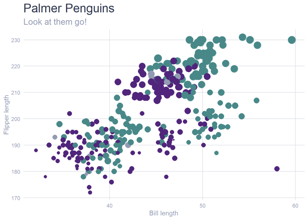
Bringing it all together
Here are some plots with continuous color scales, making use of all the steps above.
continuous_penguins +
  scale_color_colibri_continuous()
continuous_penguins +
  scale_color_colibri_continuous("Green")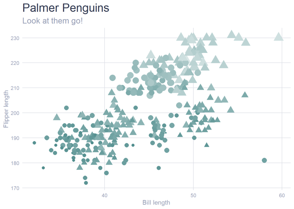
continuous_penguins +
  scale_color_colibri_continuous("Purple", reverse = T)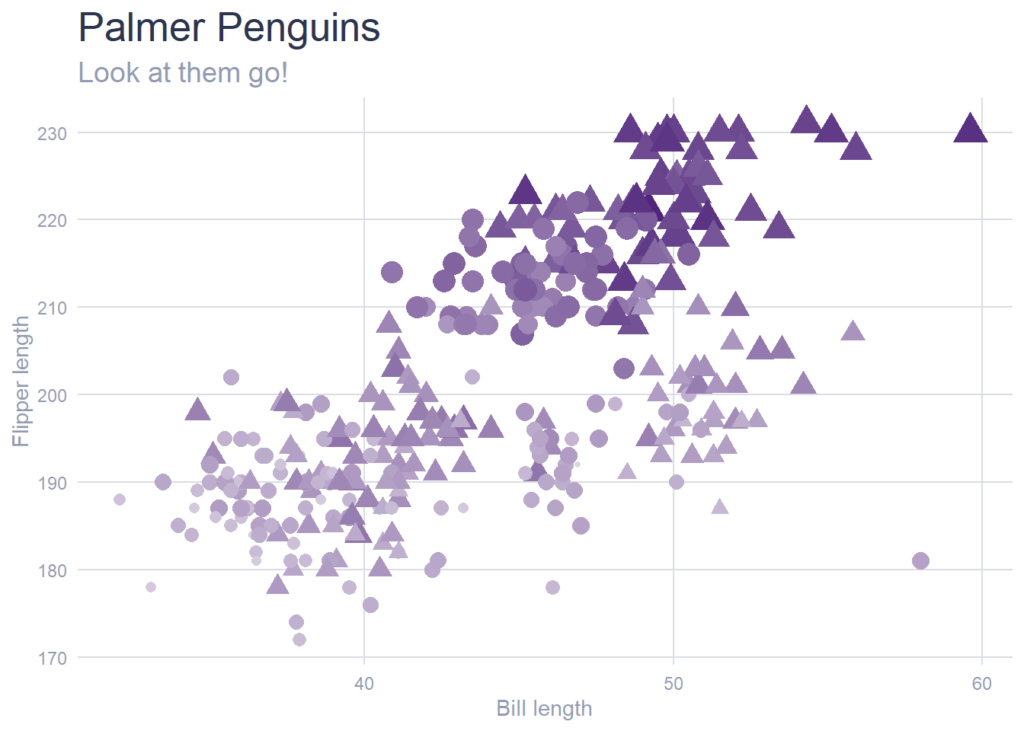
We now have custom color palettes that allow us to make plots throughout the report that will reflect Colibri branding. A little setup in the beginning of a project sets us up for success.
If you need to make reports that reflect your organization's branding, this approach can help you do the same!
Sign up for the newsletter
Get blog posts like this delivered straight to your inbox.

You need to be signed-in to comment on this post. Login.