What’s New in R: April 22, 2024
Welcome to this week’s edition of What’s New in R! This week, we’re featuring a tutorial on wrapping text labels, a comprehensive look at joins, and an analysis of toast (yes, really). Let’s dive in!
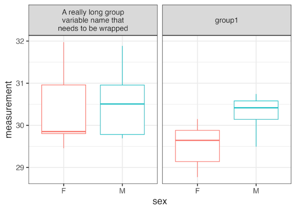
How to wrap long strip labels in facet_wrap
If you’ve ever made a facetted plot in ggplot and found that the title of each plot (fancy name: strip text) is too long and gets cut off, this blog post from the website Data Viz with Python and R is for you! It shows how to use the labeller argument in the facet_wrap() function to wrap your strip text and ensure that it is visible.
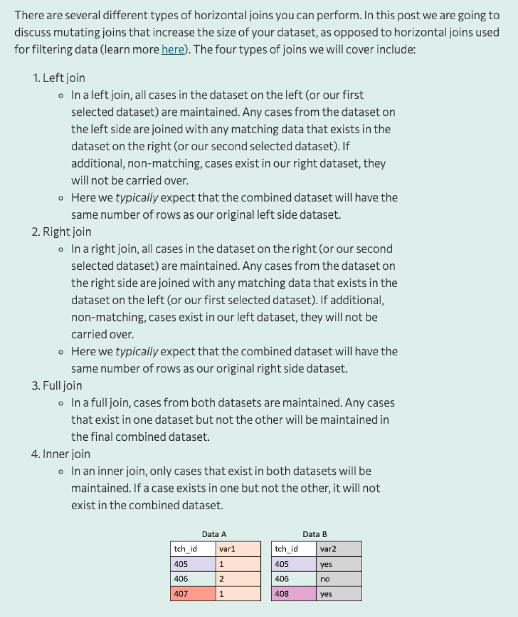
Let’s talk about joins
If you’ve ever wanted an extremely comprehensive tutorial covering the various types of joins you can do with the dplyr package, this blog post by Crystal Lewis is for you! In it, she walks through left joins, right joins, full joins, and inner joins, show how each works. It’s a great resource to bookmark for when you get stuck trying to run own code doing a join!
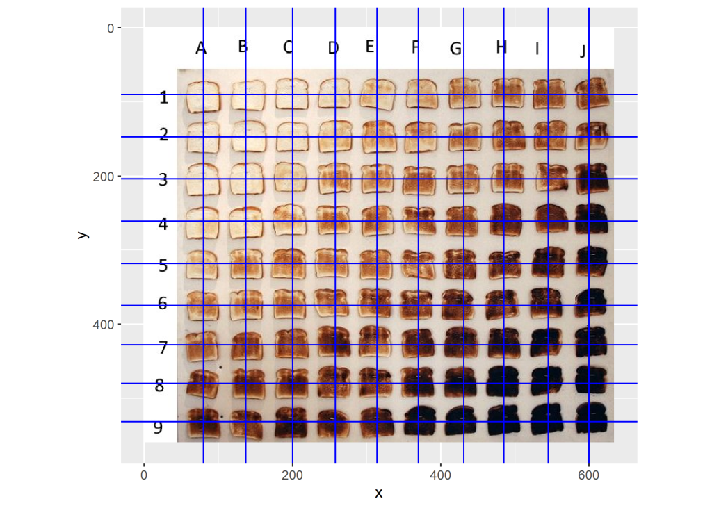
Analyzing toast
File this under: things you didn’t know you’d be interested in but are once you take a look. CJ Holmes saw a viral tweet about the best way to toast a toast and decided to use R to do some analysis. Using the magick package, he imported the image of toast and then analyzed the color of each piece of toast. It’s a cool example of doing something in R that you never would have even thought possible!
If you enjoyed this issue of What’s New In R, please share it with a friend! And if they want to get What’s New in R directly in their inbox, they can sign up on the R for the Rest of Us website.
Got any ideas for resources I should feature in future issues of What’s New in R? Leave a comment below.
Sign up for the newsletter
Get blog posts like this delivered straight to your inbox.


You need to be signed-in to comment on this post. Login.