What’s New in R: May 20, 2024
Welcome to this week’s edition of What’s New in R! This week, we’re featuring an in-progress update to Modern Data Science with R, a tutorial on using flags for facetted plots, and a deep dive into avoiding overplotting. Let’s dive in!
Modern Data Science with R
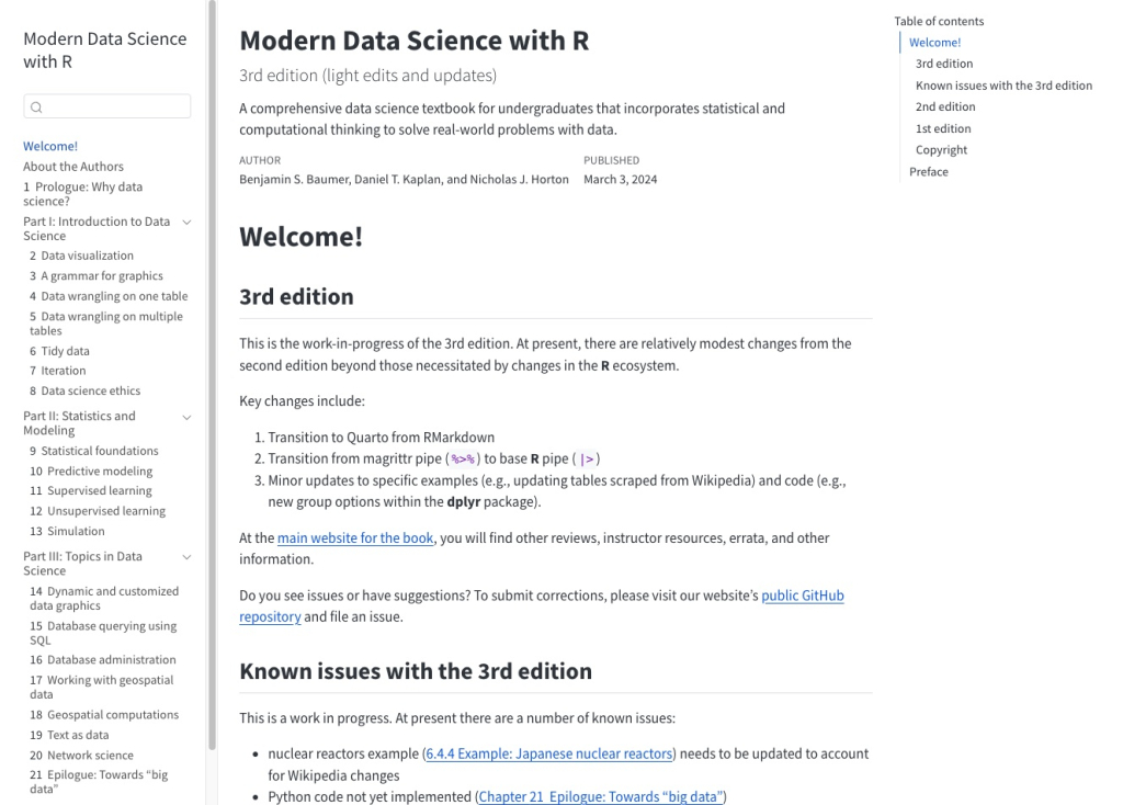
This book, written by Benjamin S. Baumer, Daniel T. Kaplan, and Nicholas J. Horton, bills itself as “a comprehensive data science textbook for undergraduates that incorporates statistical and computational thinking to solve real-world problems with data.” The authors are currently updating the third edition of the book, which has sections on data viz, data wrangling, statistics and modeling, and more. Best of all, it’s free to read online.
Images as facet labels in {ggplot2}
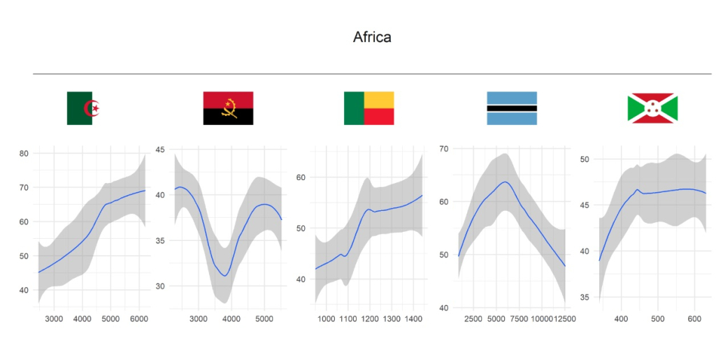
Normally, when you make facetted plots with ggplot, the values of the variable used for facetting show up as the titles of each plot (they’re technically known as the strip titles). But, as with everyhing ggplot, there are ways to tweak the defaults. In this blog post, Umair Durrani shows how to use flags as the title for facetted plots.
How to fill maps with density gradients with R, {ggplot2}, and {sf}
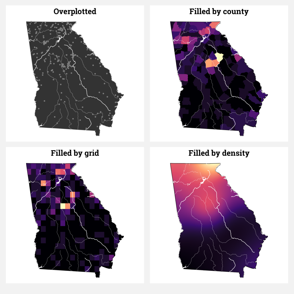
A common problem in data viz is overplotting. This happens when you have a number of points you want to show and they all overlap. This is a particularly common problem with geospatial data. In this blog post, Andrew Heiss goes through various options to deal with the problem using data on campgrounds in the US state of Georgia. The one he lands on (so-called density gradients) is a great way to highlight which areas have a lot of campgrounds without having to show each of them on a map.
If you enjoyed this issue of What’s New In R, please share it with a friend! And if they want to get What’s New in R directly in their inbox, they can sign up on the R for the Rest of Us website.
Got any ideas for resources I should feature in future issues of What’s New in R? Leave a comment below.
Sign up for the newsletter
Get blog posts like this delivered straight to your inbox.
Let us know what you think by adding a comment below.

Sign up for the newsletter
R tips and tricks straight to your inbox.
You’ll also like

What’s New in R: May 13, 2024
May 13, 2024
Welcome to this week’s edition of What’s New in R! This week, we’re featuring a Quarto extension to show when your document was most recently updated, animations of common functions, and a video to show you how to efficiently import hundreds of Excel files to R. Let’s dive in!Add last rendered or modified time to Quarto Say you’re working on an analysis in a Quarto document and you want to add a timestamp to show when it was last updated. How would you do this? You could write some code, of...

R for the Rest of Us Podcast Episode 15: Nicola Rennie
May 15, 2024
In this episode, I talk with Nicola Rennie about making data viz for mobile devices. Nicola is a lecturer in health data science based within the Center for Health Informatics, Computing, and Statistics at Lancaster University in the UK. She recounts her initial encounter with R and how she got deeper into data visualization in R as a means of creative expression. Amidst the plethora of programming languages available, Nicola sheds light on why she chose R specifically for data visualization....
You need to be signed-in to comment on this post. Login.