What’s New in R: May 6, 2024
Welcome to this week’s edition of What’s New in R! This week, we’re featuring not one, not two, but three data viz guides. Let’s dive in!
UK Royal Statistical Society best practices for data visualization guide
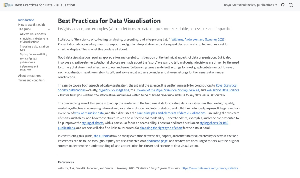
Released in July 2023, the UK Royal Statistical Society guide, Best Practices for Data Visualization, is a great resource to have on hand. Written by Andreas Krause, Nicola Rennie, and Brian Tarran, the guide has general guidance as well as code samples to help you make better data viz.
UNHCR data visualization platform
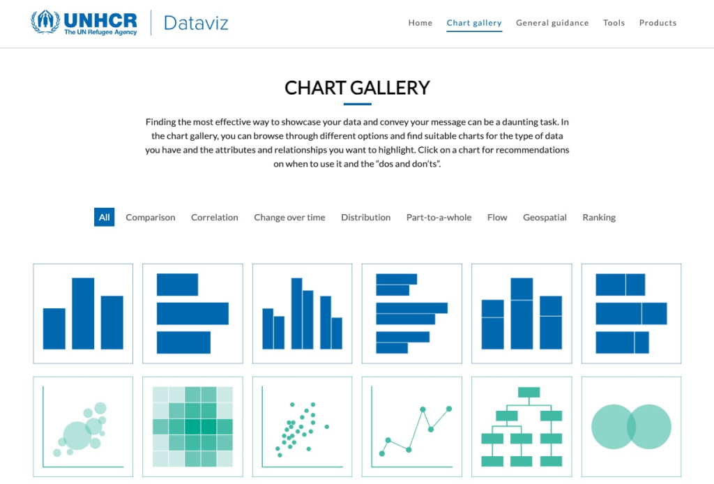
Another great data visualization guide comes from the United Nations High Commissioner for Refugees data team (I spoke with one of their members, Ahmadou Dickou, on the R for the Rest of Us podcast). It’s got general guidance as well as a chart gallery, which allows you to see examples of different types of charts and the code used to make them.
BBC Visual and Data Journalism cookbook for R graphics
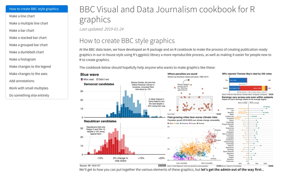
I’m streteching the definition up “what’s new” to the point of breaking here, but, having listed two other data viz guides, I thought I’d continue with a third. Released in 2019, the BBC Visual and Data Journalism cookbook for R graphics is a great guide to making high-quality data viz in R. And, if you’re interested in the story of how this cookbook came to be, check out my conversation with Nassos Stylianou and Clara Guibourg, two of the BBC journalists who brought it to life.
If you enjoyed this issue of What’s New In R, please share it with a friend! And if they want to get What’s New in R directly in their inbox, they can sign up on the R for the Rest of Us website.
Got any ideas for resources I should feature in future issues of What’s New in R? Leave a comment below.
Sign up for the newsletter
Get blog posts like this delivered straight to your inbox.

You need to be signed-in to comment on this post. Login.