How to make polished population pyramids in ggplot: part 2
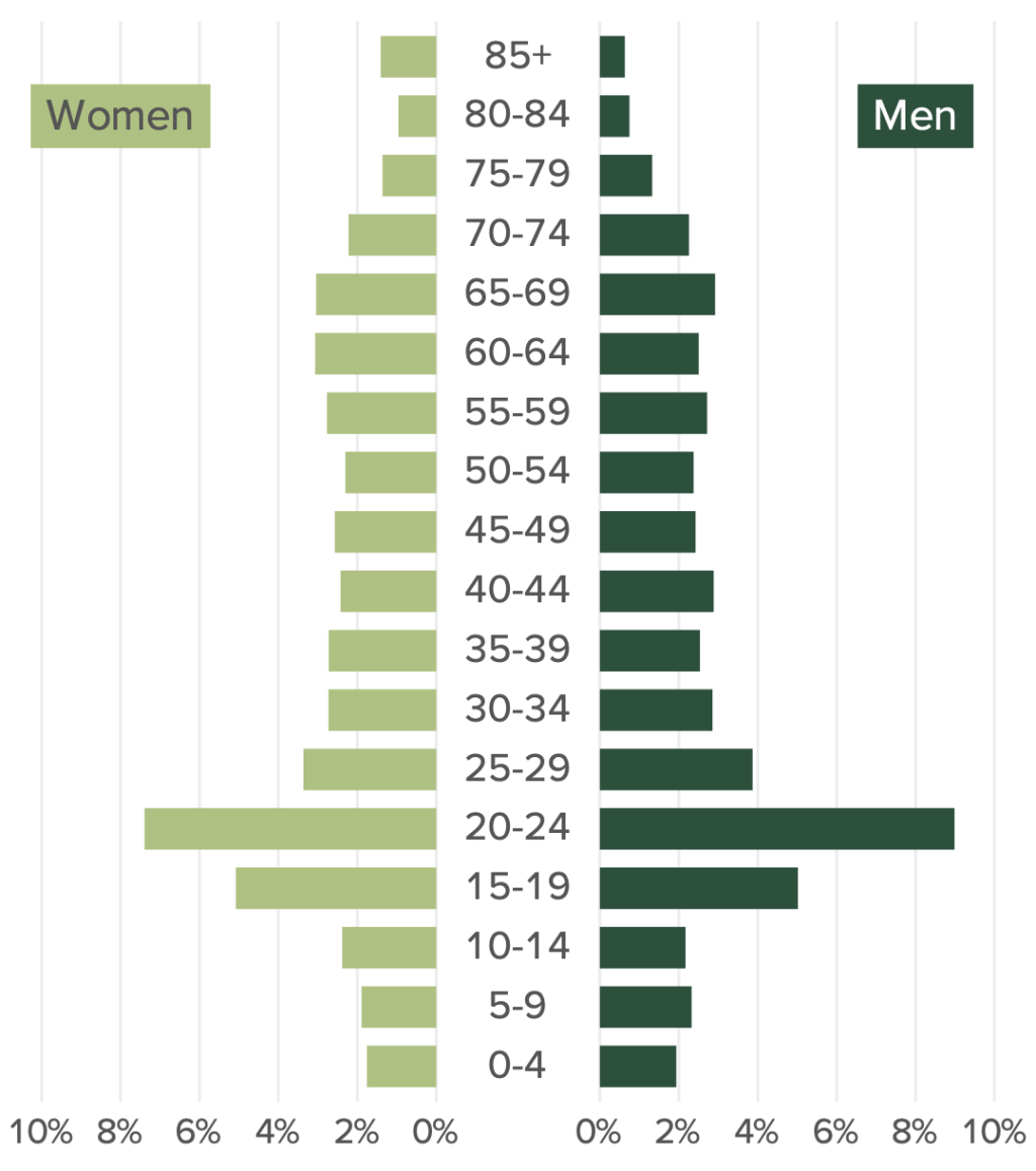
I wrote recently about how I revamped the process of making population pyramids for Oregon by the Numbers, the report I’ve worked on for the last several years. Rather than making one plot, I used the patchwork package to stitch together three parts:
A plot for women on the left
Age labels in the center
A plot for men on the right
The result is a polished version of a population pyramid that I’m quite pleased with.
The blog post I wrote about making this version of the population pyramid saw us make one for Benton county. But this is only one of the 36 counties that make up Oregon. Given that my job is to make 36 population pyramids (alongside a couple hundred other visuals), what I really need is not the code to make one population pyramid, but a function to make all population pyramids.
In this blog post, I detail how to turn code for a single population pyramid into a function to make a population for any county.
Getting started
To do this, I’ll load three packages:
The
tidyversecollection of packages for data wrangling and plotting.scalesto give me nicely formatted values in my plots.patchworkto stitch together my women, men, and age labels plots.
library(tidyverse)
library(scales)
library(patchwork)Next, I’ll import my data. As I showed in part 1, the first step is to make the values in percent variable show up as negative for women so that they appear on the left side while the values for men show up on the right side. Additionally, I make the age variable a factor and use fct_inorder() to ensure the age categories show up in the right order.
oregon_population_pyramid_data <-
  read_csv("https://raw.githubusercontent.com/rfortherestofus/blog/main/population-pyramid-part-1/oregon_population_pyramid_data.csv") |>
  mutate(percent = if_else(gender == "Men", percent, -percent)) |>
mutate(age = fct_inorder(age))Next, I created an age_labels tibble in order to make a plot that just shows the age categories. As we saw in part 1, we can use the patchwork package to combine this with our women and men bar charts to make a population pyramid. I saved this as age_labels_plot so I can use it later on.
age_labels <-
  tibble(
    age = c(
      "0-4",
      "5-9",
      "10-14",
      "15-19",
      "20-24",
      "25-29",
      "30-34",
      "35-39",
      "40-44",
      "45-49",
      "50-54",
      "55-59",
      "60-64",
      "65-69",
      "70-74",
      "75-79",
      "80-84",
      "85+"
    )
  ) |>
  mutate(
    age = fct_inorder(age)
  )

age_labels_plot <-
  age_labels |>
  ggplot(
    aes(
      x = 1,
      y = age,
      label = age
    )
  ) +
  geom_text() +
theme_void()Finally, I’ll add back in the calculation to get the max_percent value (i.e. the maximum bar length for men and women), which we use to create consistent limits in our plots.
max_percent <-
  oregon_population_pyramid_data |>
  filter(county == "Benton") |>
  slice_max(
    order_by = percent,
    n = 1
  ) |>
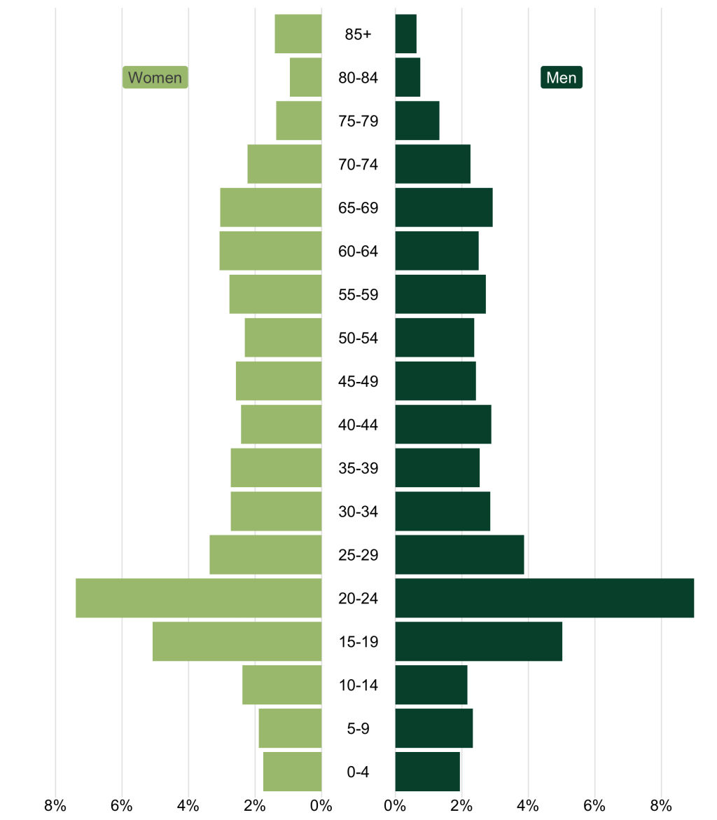
pull(percent)Combining these pieces, I made a population pyramid that combined a plot for women, men, and age labels.
Create a population pyramid function
First, I’m going to take the code I used to make the men plot and make it a function. In part 1, I manually filtered oregon_population_pyramid_data to only include Benton county and men. To start my function, however, I’ll add two arguments: county_to_filter and gender_to_filter.
population_pyramid_single_gender_plot <-
  function(
  county_to_filter,
  gender_to_filter
  ) {
    oregon_population_pyramid_data |>
      filter(county == county_to_filter) |>
      filter(gender == gender_to_filter) |>
      ggplot(aes(
        x = percent,
        y = age
      )) +
      geom_col(fill = "#004f39") +
      annotate(
        geom = "label",
        x = 0.05,
        y = 17,
        label = "Men",
        fill = "#004f39",
        color = "white",
        label.size = 0,
        label.padding = unit(0.3, "lines")
      ) +
      scale_x_continuous(
        labels = function(x) label_percent(accuracy = 1)(abs(x)),
        breaks = breaks_pretty(),
        limits = c(0, max_percent)
      ) +
      theme_void() +
      theme(
        axis.text.x = element_text(),
        panel.grid.major.x = element_line(color = "grey90")
      )
}Now, instead of manually specifying the county and gender, I’ll add them as function arguments.
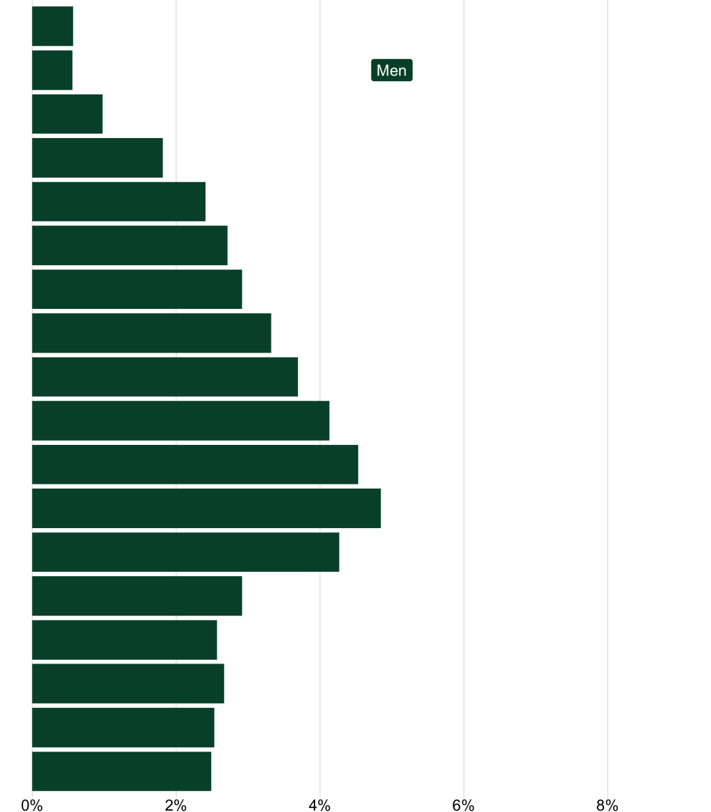
population_pyramid_single_gender_plot(
  county_to_filter = "Benton",
  gender_to_filter = "Men"
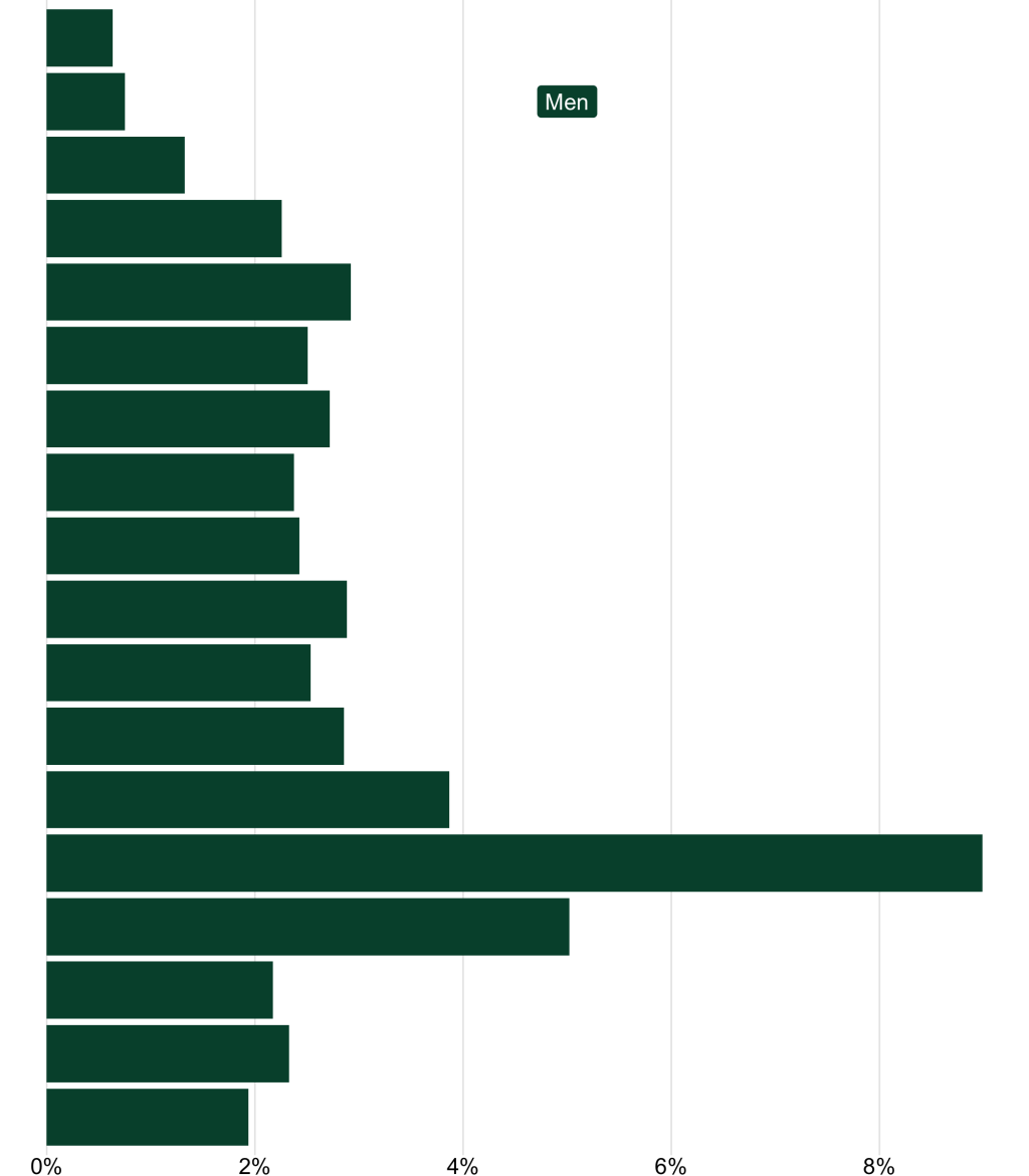
)I can run my code and see that it creates a nice plot for men.
Unfortunately, when I try to run this function for women, it doesn’t work.
Why doesn’t this function work for women? The problem is that the x axis limits go from 0 to max_percent, which is 0.0898708. But, since the values for women are all negative, nothing appears on our chart.
There’s one other issue with our chart x axis limits. When we calculated max_percent we manually specified Benton county. What if we adjust our code to create a plot for Multnomah county as follows?
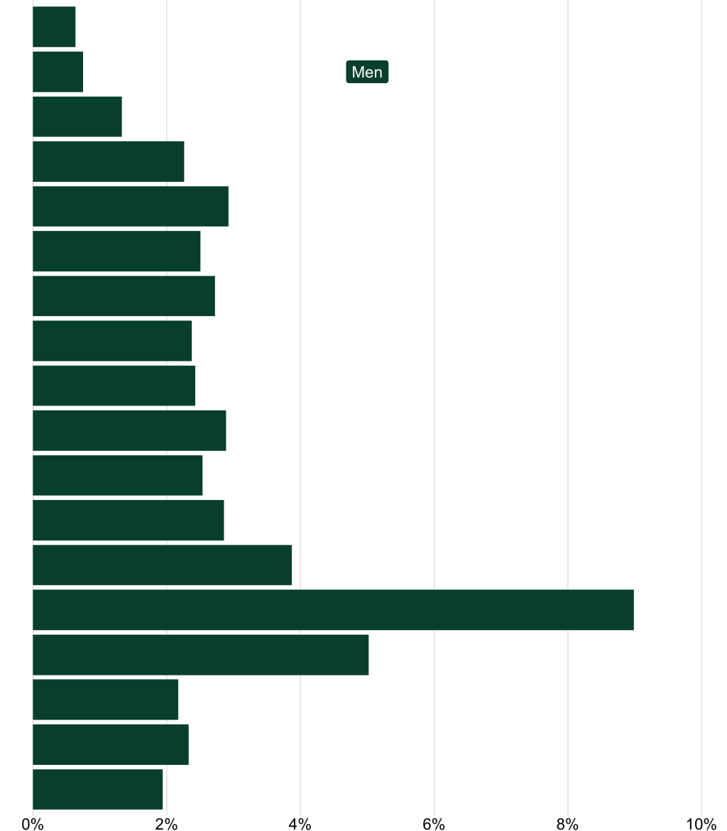
population_pyramid_single_gender_plot(
  county_to_filter = "Multnomah",
  gender_to_filter = "Men"
)Let’s see!
That doesn’t look right. If we try to create a plot for Multnomah county, the x axis limits don’t adapt. That’s why there’s too much space on the right side. Let’s make our x axis limits adapt to the data we’re plotting.
Make our x axis limits dynamic
To do this, we need to move the max_percent calculation inside our function. I’ve done that below, replacing the line that read filter(county == "Benton) with filter(county == county_to_filter) so that max_percent will be calculated for the county being plotted.
In addition, I’ve added a couple if statements to ensure the limits show up correctly for women and men. Within these two if statements, I’ve created an object called x_limits. For men, it goes from 0 to max_percent times 1.1 (I do this just to give it a bit of padding and make sure nothing gets cut off). For women, it goes from -max_percent times 1.1 to 0.
if (gender_to_filter == "Men") {
  x_limits <- c(0, max_percent * 1.1)
}

if (gender_to_filter == "Women") {
  x_limits <- c(-max_percent * 1.1, 0)
}We then use limits = x_limits within scale_x_continuous() to apply our calculated x axis limits. Our function as of now looks like this:
population_pyramid_single_gender_plot <-
  function(
  county_to_filter,
  gender_to_filter
  ) {
    max_percent <-
      oregon_population_pyramid_data |>
      filter(county == county_to_filter) |>
      slice_max(
        order_by = percent,
        n = 1
      ) |>
      pull(percent)

    if (gender_to_filter == "Men") {
      x_limits <- c(0, max_percent * 1.1)
    }

    if (gender_to_filter == "Women") {
      x_limits <- c(-max_percent * 1.1, 0)
    }

    oregon_population_pyramid_data |>
      filter(county == county_to_filter) |>
      filter(gender == gender_to_filter) |>
      ggplot(aes(
        x = percent,
        y = age
      )) +
      geom_col(fill = "#004f39") +
      annotate(
        geom = "label",
        x = 0.05,
        y = 17,
        label = "Men",
        fill = "#004f39",
        color = "white",
        label.size = 0,
        label.padding = unit(0.3, "lines")
      ) +
      scale_x_continuous(
        labels = function(x) label_percent(accuracy = 1)(abs(x)),
        breaks = breaks_pretty(),
        limits = x_limits
      ) +
      theme_void() +
      theme(
        axis.text.x = element_text(),
        panel.grid.major.x = element_line(color = "grey90")
      )
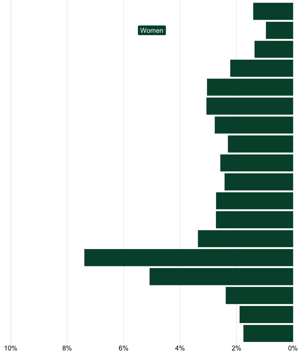
}Now, if we run our code to make the Benton plot for women, the x axis limits look good and, importantly, we can actually see our bars!
However, we can’t see the Women label. Let’s fix that.
Adjust gender label position and text
The reason why we can’t see the Women label is that its x position is hard coded within the annotate() function to 0.05. This works for the Men label, but not for Women, where all values are negative. To remedy this, let’s create a gender_label_x_position variable within our two if statements. If gender_to_filter is Men, then gender_label_x_position is 0.05; if it is Women, gender_label_x_position is -0.05 (I cheated a bit because I know from having worked with my data that the bars will never overlap at this location).
if (gender_to_filter == "Men") {
  x_limits <- c(0, max_percent * 1.1)
  gender_label_x_position <- 0.05
}

if (gender_to_filter == "Women") {
  x_limits <- c(-max_percent * 1.1, 0)
  gender_label_x_position <- -0.05
}Then, we update the annotate() function to specify that the x position should be the value of gender_label_x_position. Additionally, we set the label argument in annotate() to take the value of the gender_to_filter argument so that the label text adapts dynamically.
annotate(
  geom = "label",
  x = gender_label_x_position,
  y = 17,
  label = gender_to_filter,
  fill = "#004f39",
  color = "white",
  label.size = 0,
  label.padding = unit(0.3, "lines")
)population_pyramid_single_gender_plot <-
function(
county_to_filter,
gender_to_filter
) {
max_percent <-
oregon_population_pyramid_data |>
filter(county == county_to_filter) |>
slice_max(
order_by = percent,
n = 1
) |>
pull(percent)
if (gender_to_filter == "Men") {
x_limits <- c(0, max_percent * 1.1)
gender_label_x_position <- 0.05
}
if (gender_to_filter == "Women") {
x_limits <- c(-max_percent * 1.1, 0)
gender_label_x_position <- -0.05
}
oregon_population_pyramid_data |>
filter(county == county_to_filter) |>
filter(gender == gender_to_filter) |>
ggplot(aes(
x = percent,
y = age
)) +
geom_col(fill = "#004f39") +
annotate(
geom = "label",
x = gender_label_x_position,
y = 17,
label = gender_to_filter,
fill = "#004f39",
color = "white",
label.size = 0,
label.padding = unit(0.3, "lines")
) +
scale_x_continuous(
labels = function(x) label_percent(accuracy = 1)(abs(x)),
breaks = breaks_pretty(),
limits = x_limits
) +
theme_void() +
theme(
axis.text.x = element_text(),
panel.grid.major.x = element_line(color = "grey90")
)
}This works for Men:
And for Women:
Use different colors for men and women
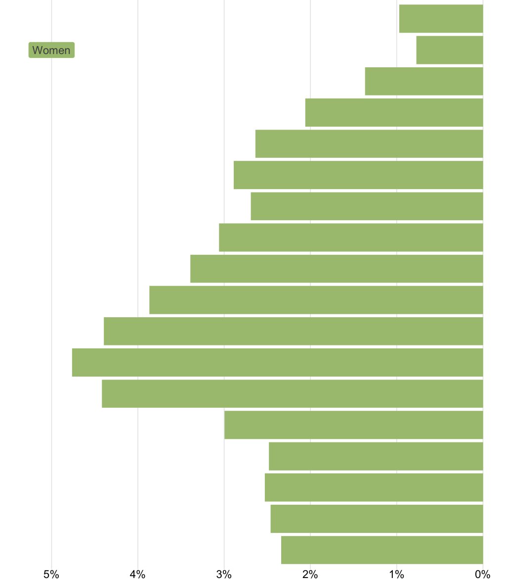
The only remaining issue to deal with at this point is the color of the bars and the gender labels. I want to make women show up in a light green and men in the dark green we’ve seen up to this point. To do this, I follow the same procedure as above, creating a new variable called fill_color in our if statements and then applying it within both geom_col() and the annotate() functions.
population_pyramid_single_gender_plot <-
  function(
  county_to_filter,
  gender_to_filter
  ) {
    max_percent <-
      oregon_population_pyramid_data |>
      filter(county == county_to_filter) |>
      slice_max(
        order_by = percent,
        n = 1
      ) |>
      pull(percent)

    if (gender_to_filter == "Men") {
      x_limits <- c(0, max_percent * 1.1)
      gender_label_x_position <- 0.05
      fill_color <- "#004f39"
      gender_text_color <- "white"
    }

    if (gender_to_filter == "Women") {
      x_limits <- c(-max_percent * 1.1, 0)
      gender_label_x_position <- -0.05
      fill_color <- "#A9C27F"
      gender_text_color <- "grey30"
    }

    oregon_population_pyramid_data |>
      filter(county == county_to_filter) |>
      filter(gender == gender_to_filter) |>
      ggplot(aes(
        x = percent,
        y = age
      )) +
      geom_col(fill = fill_color) +
      annotate(
        geom = "label",
        x = gender_label_x_position,
        y = 17,
        label = gender_to_filter,
        fill = fill_color,
        color = gender_text_color,
        label.size = 0,
        label.padding = unit(0.3, "lines")
      ) +
      scale_x_continuous(
        labels = function(x) label_percent(accuracy = 1)(abs(x)),
        breaks = breaks_pretty(),
        limits = x_limits
      ) +
      coord_cartesian(clip = "off") +
      theme_void() +
      theme(
        axis.text.x = element_text(),
        panel.grid.major.x = element_line(color = "grey90")
      )
}Now, when I make a plot for women in Multnomah county, we can see the light green in action.
Combine everything into a population pyramid
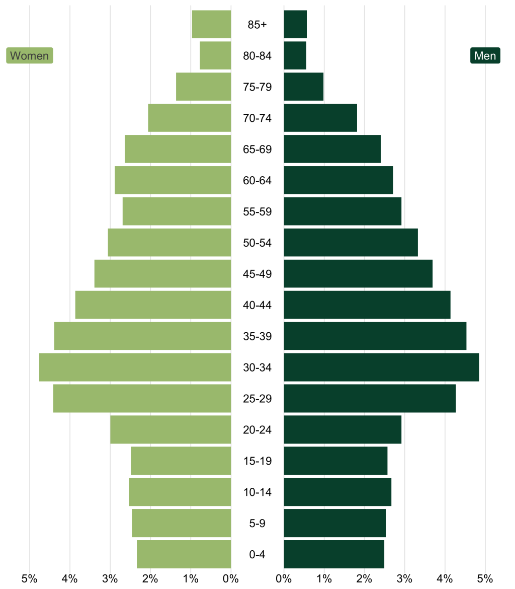
Now that we’ve adjusted our population_pyramid_single_gender_plot() function so that it works for men and women, let’s make a population pyramid! I’ll create a population pyramid for Multnomah county by running the function to create a women_plot object and a men_plot object. I then use the patchwork package to combine these with the age_labels_plot I made above.
women_plot <-
  population_pyramid_single_gender_plot(
    county_to_filter = "Multnomah",
    gender_to_filter = "Women"
  )

men_plot <-
  population_pyramid_single_gender_plot(
    county_to_filter = "Multnomah",
    gender_to_filter = "Men"
  )

women_plot +
  age_labels_plot +
  men_plot +
  plot_layout(
    widths = c(7.5, 1, 7.5)
)Run this code and I’ve got a really nice population pyramid!
To top it off, let’s make a single function to make a population pyramid by just passing the name of a county. I’ll call it population_pyramid_combined_plot(). The function takes just one argument (county_to_filter), which it uses to make a women_plot and a men_plot, which it then combines with the age_labels_plot.
population_pyramid_combined_plot <- function(county_to_filter) {
  women_plot <-
    population_pyramid_single_gender_plot(
      county_to_filter = county_to_filter,
      gender_to_filter = "Women"
    )

  men_plot <-
    population_pyramid_single_gender_plot(
      county_to_filter = county_to_filter,
      gender_to_filter = "Men"
    )

  women_plot +
    age_labels_plot +
    men_plot +
    plot_layout(
      widths = c(7.5, 1, 7.5)
    )
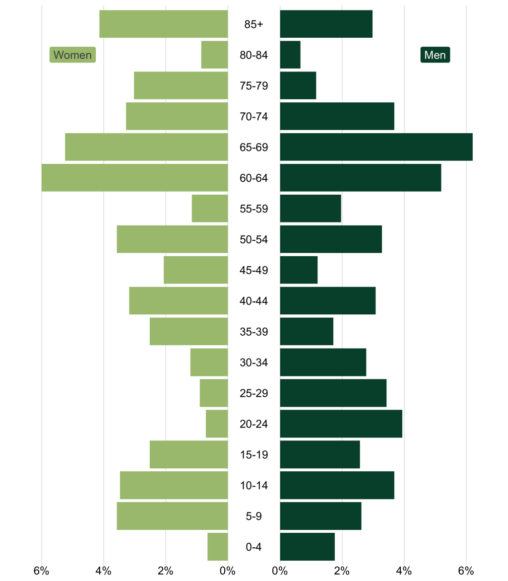
}Now, I can run this code, passing any Oregon county name as my county_to_filter argument. To make a population pyramid for Gilliam county, for example, I just write this:
population_pyramid_combined_plot(county_to_filter = "Gilliam")And I get a nicely formatted population pyramid in return!
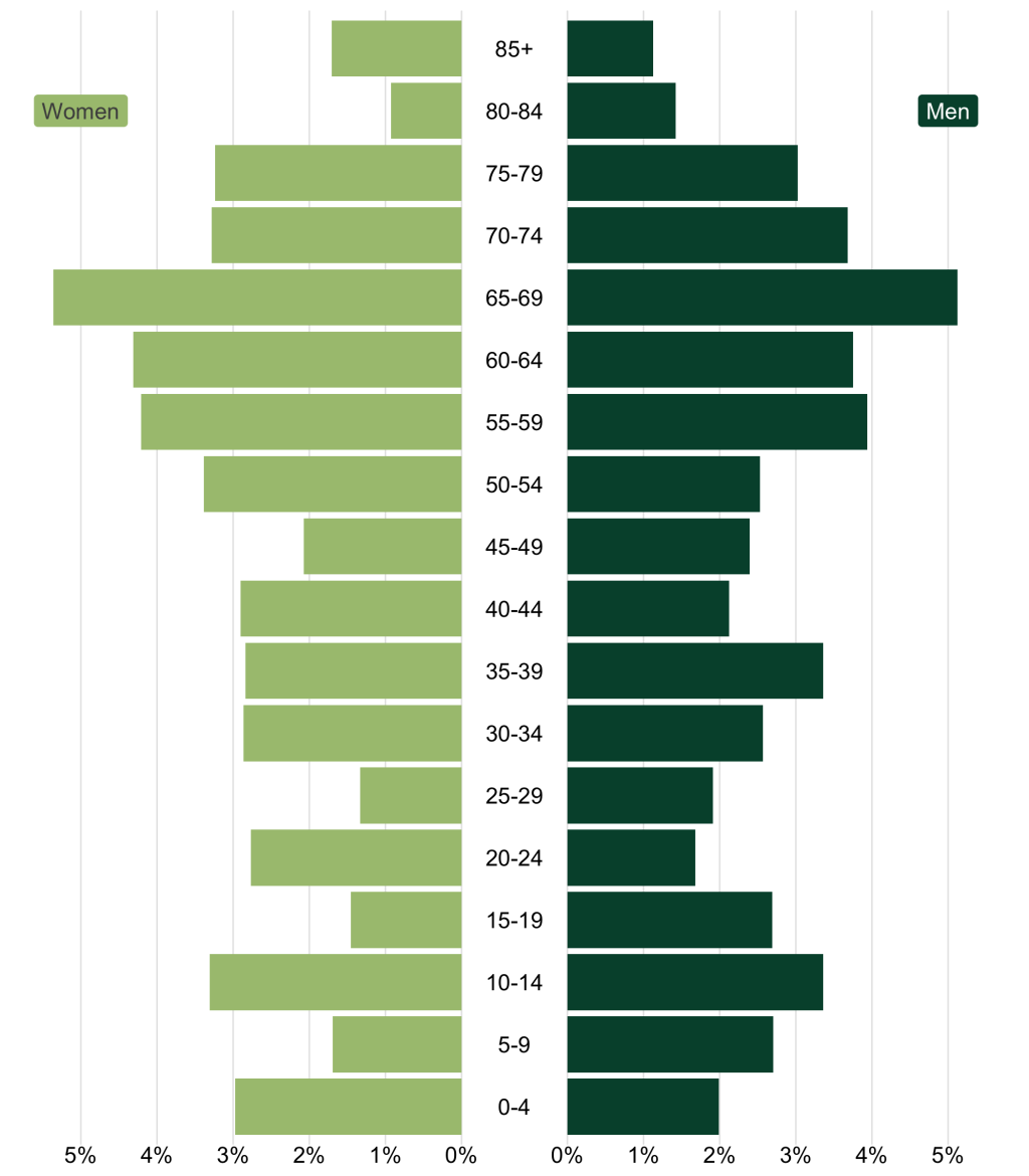
And, just for fun, here’s Wallowa county (one of my favorite places in Oregon!).
I could now run this for any county in Oregon. Don’t believe me? Copy the code and try it for yourself!
Sign up for the newsletter
Get blog posts like this delivered straight to your inbox.

You need to be signed-in to comment on this post. Login.