Data viz tips for parameterized reporting: set consistent axis limits
One of the biggest challenges we face when doing parameterized is how to make plots consistent across multiple reports. We’ve learned (oftentimes the hard way) many tricks for dealing with this problem. One I want to share with you today is making your axis limits consistent when making multiple plots.
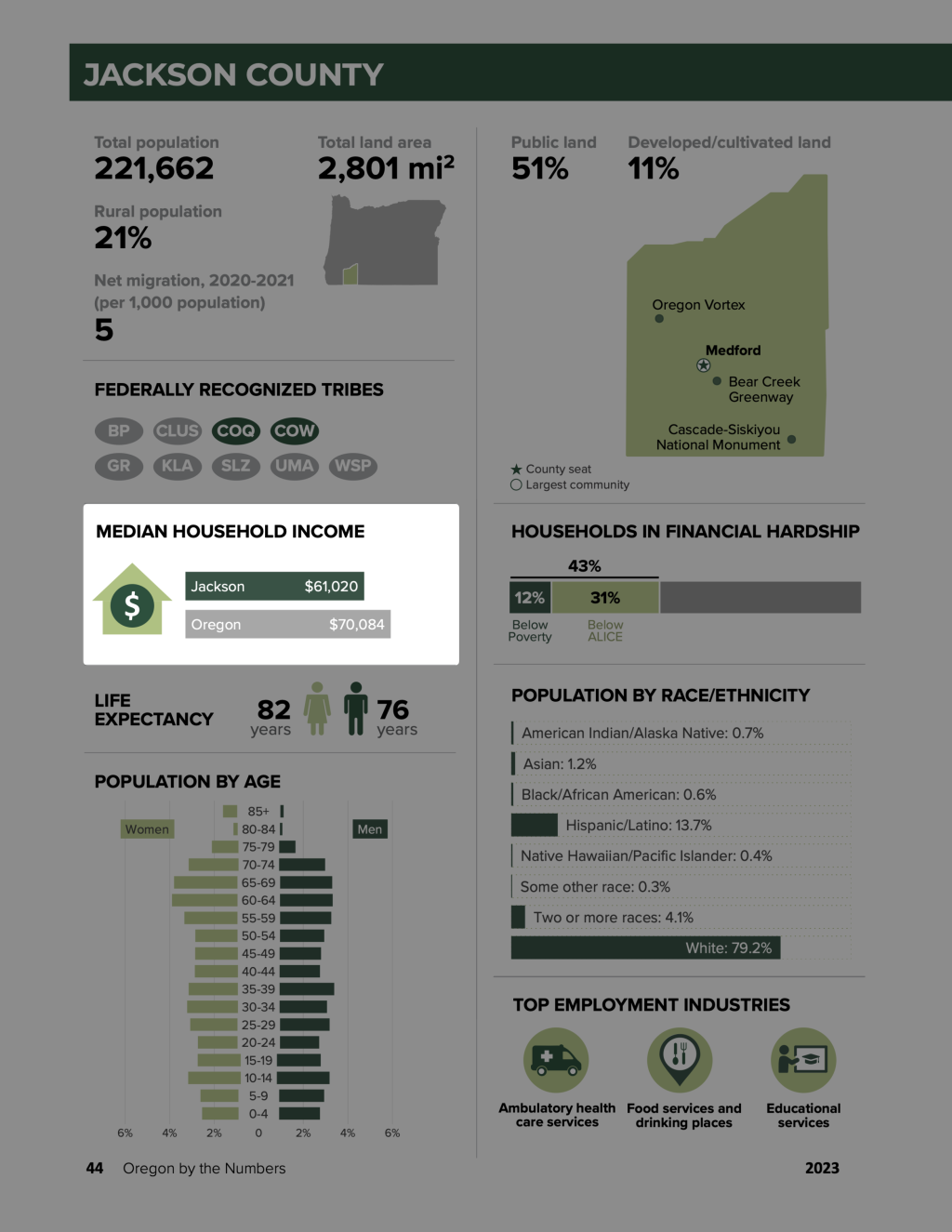
Here’s an example of a plot that shows median income by county for the annual Oregon by the Numbers.
Let me show you a simplified version of the function I created to make these plots. We’ll begin by the tidyverse package for data wrangling and plotting with ggplot2 .
library(tidyverse)Next, we’ll import our data.
median_income <-
read_csv("https://raw.githubusercontent.com/rfortherestofus/blog/main/set-consistent-limits/median_income.csv")You can see the four variables we have in this data frame.
median_income
#> # A tibble: 37 × 3
#>    geography amount amount_formatted
#>    <chr>      <dbl> <chr>
#>  1 Oregon     70084 $70,084
#>  2 Baker      46922 $46,922
#>  3 Benton     68732 $68,732
#>  4 Clackamas  88517 $88,517
#>  5 Clatsop    61846 $61,846
#>  6 Columbia   73909 $73,909
#>  7 Coos       52548 $52,548
#>  8 Crook      64820 $64,820
#>  9 Curry      57553 $57,553
#> 10 Deschutes  74082 $74,082
#> # ℹ 27 more rowsNext, we’ll create a function to a single median income plot. This function has one argument ( county ), which is used to filter the median_income data before plotting it.
median_income_plot <- function(county) {
  median_income |>
    filter(geography %in% c(county, "Oregon")) |>
    mutate(geography = fct(geography, levels = c("Oregon", county))) |>
    ggplot(
      aes(
        x = amount,
        y = geography,
        label = amount_formatted,
        fill = geography
      )
    ) +
    geom_col(show.legend = FALSE) +
    geom_text(
      color = "white",
      hjust = 1.2,
      size = 8
    ) +
    geom_text(
      aes(
        x = 2000,
        label = geography
      ),
      color = "white",
      hjust = 0,
      size = 8
    ) +
    scale_fill_manual(values = c(
      "gray",
      "darkgreen"
    )) +
    theme_void()
}
Now that we have my median_income_plot() function, we can use it to make some plots. Here’s the plot for Jackson county.
median_income_plot("Jackson")
And here’s the plot for Harney county.
median_income_plot("Harney")
Everything looks good so far. But take a look at what happens when we make the same plot for Washington county. Because the median income of Washington county is above that of Oregon, the x axis limits go beyond the limits of the plots for Jackson and Harney counties.
median_income_plot("Washington")
If we were to put plots with different x axis limits in the Oregon by the Numbers report, readers might be confused. If they looked at two plots side by side, for example, they might see that the bar for Oregon for the Harney plot is larger than it is in the Washington plot.
How do we deal with this? The answer is to adjust our median_income_plot() function so that we calculate the maximum median income for all counties and then use to set the x axis limits in our plots. To do this, let’s first create a variable called max_median_income by starting with the median_income data frame, using slice_max() to get the top row by the amount variable, and then using the pull() function to turn this into a single value.
max_median_income <-
  median_income |>
  slice_max(
    order_by = amount,
    n = 1
  ) |>
  pull(amount)
We can now see the value of max_median_income :
max_median_income
#> [1] 92025
Next, what we’ll do is adjust our median_income_plot() function by adding the following code. This will set the x axis limits to go from 0 to the value of max_median_income .
scale_x_continuous(
  limits = c(0, max_median_income)
)
We’ll create a new function called median_income_plot_v2() with this code added at the bottom:
median_income_plot_v2 <- function(county) {
  max_median_income <-
    median_income |>
    slice_max(
      order_by = amount,
      n = 1
    ) |>
    pull(amount)

  median_income |>
    filter(geography %in% c(county, "Oregon")) |>
    mutate(geography = fct(geography, levels = c("Oregon", county))) |>
    ggplot(
      aes(
        x = amount,
        y = geography,
        label = amount_formatted,
        fill = geography
      )
    ) +
    geom_col(show.legend = FALSE) +
    geom_text(
      color = "white",
      hjust = 1.2,
      size = 8
    ) +
    geom_text(
      aes(
        x = 2000,
        label = geography
      ),
      color = "white",
      hjust = 0,
      size = 8
    ) +
    scale_fill_manual(values = c(
      "gray",
      "darkgreen"
    )) +
    theme_void() +
    scale_x_continuous(
      limits = c(0, max_median_income)
    )
}
Now let’s use our function make a plot for Jackson county:
median_income_plot_v2("Jackson")
For Harney county:
median_income_plot_v2("Harney")
And for Washington county:
median_income_plot_v2("Washington")
The size of the Oregon bar is the same throughout and our readers will no longer be confused. By calculating the maximum median income and using that to set our x axis limits, we’ve made our plots consistent across all 36 Oregon counties.
Creating data viz when doing parameterized reporting requires thinking about what plots will look like when you make them many . It’s a bit more upfront work, but the results are worth it!
Sign up for the newsletter
Get blog posts like this delivered straight to your inbox.


You need to be signed-in to comment on this post. Login.