What’s New in R: January 6, 2025
Welcome to this week’s edition of What’s New in R! This week, we’re featuring a tutorial on creating inset maps with ggplot2, a tutorial for recreating some interesting graphs used in baseball analysis, and a guide to using Typst with Quarto. Let’s dive in!
Creating Inset Maps with ggplot2
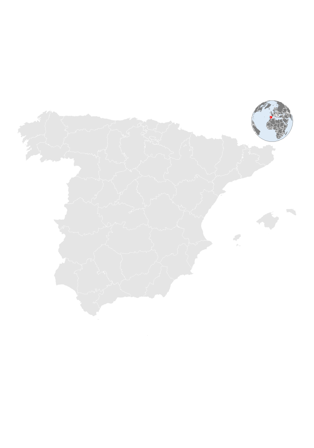
Dominic Royé demonstrates how to create professional-looking inset maps using ggplot2. This detailed tutorial walks through the process of combining multiple maps into a single visualization, with one map serving as an inset to provide additional context. The guide includes practical examples and code snippets that will help you create more informative geographic visualizations.
Constructing a Baseball Savant Graph
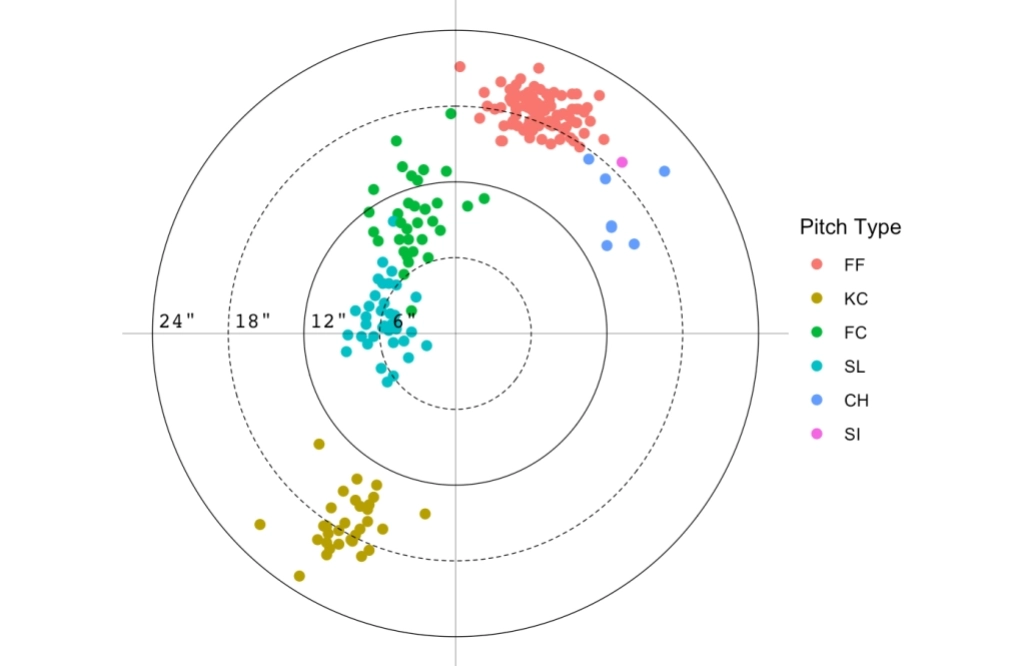
Jim Albert provides a detailed walkthrough of how to recreate so-called Savant Graphs (from the Baseball Savant website) using R. This tutorial shows how to build scatter plots with custom elements like zones and gradients, demonstrating advanced ggplot2 techniques along the way. Even if you don’t care about baseball, you’ll definitely learn something new in this post.
Building a Linkedin data visualisation template with Quarto and Typst
Aaron Schiff presents a guide to using Typst, a modern markup-based typesetting system, with Quarto. This tutorial shows how to set up and use a Quarto template that outputs to Typst, offering an alternative to LaTeX for creating PDF documents. The post includes detailed instructions and examples to help you get started with this powerful combination of tools.
If you enjoyed this issue of What’s New In R, please share it with a friend! And if they want to get What’s New in R directly in their inbox, they can sign up on the R for the Rest of Us website.
Got any ideas for resources I should feature in future issues of What’s New in R? Leave a comment below!
Sign up for the newsletter
Get blog posts like this delivered straight to your inbox.

You need to be signed-in to comment on this post. Login.