What’s New in R: March 10, 2025
Welcome to this week’s edition of What’s New in R! This week, we’re featuring the winners of the Posit Closeread prize, a fantastic tutorial on creating histogram legends in ggplot2, and a package for analyzing wildfire exposure data. Let’s dive in!
Winners of the Closeread Prize – Data-Driven Scrollytelling with Quarto
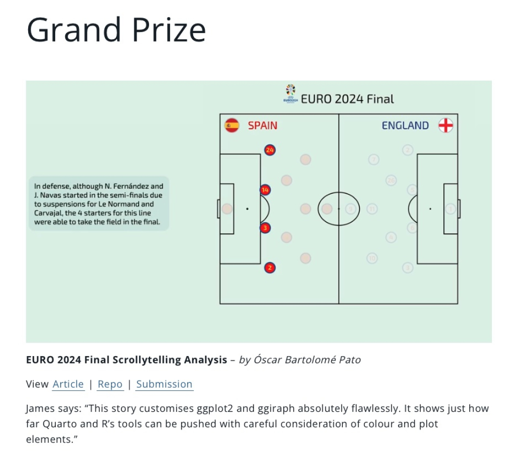
Posit has announced the winners of their Closeread Prize, which challenged developers to create scrollytelling projects (you’ve probably seen them in places like the New York Times) using the new {closeread} package. Check out the blog post to see some great examples of {closeread} in action!
Creating Custom Legends for Histograms in ggplot2
Andrew Heiss is one of the best out there when it comes to making seemingly complex visualization challenges accessible. In this post, he shows how to use a histogram as a legend for a map. This has the advantage of showing not just the colors use for shading on the map, but also the distribution of the values.
fireexposuR: Analyzing Wildfire Exposure Data
The rOpenSci team has put together the new-to-me {fireexposuR} package for analyzing wildfire exposure data. This package provides tools for processing and analyzing wildfire patterns, smoke exposure, and related environmental data. The documentation includes detailed vignettes showing how to work with various types of fire-related datasets and create informative visualizations of wildfire exposure patterns.
If you enjoyed this issue of What’s New In R, please share it with a friend! And if they want to get What’s New in R directly in their inbox, they can sign up on the R for the Rest of Us website.
Got any ideas for resources I should feature in future issues of What’s New in R? Leave a comment below!
Sign up for the newsletter
Get blog posts like this delivered straight to your inbox.

You need to be signed-in to comment on this post. Login.