What’s New in R: April 21, 2025
Welcome to this week’s edition of What’s New in R! This week, we’re featuring a TidyTuesday analysis on racial disparities in reproductive research, a tutorial on using ggplot2 to visualize relationship between life expectancy and health spending, and insights on R packages. Let’s dive in!
TidyTuesday: Racial disparities in reproductive research
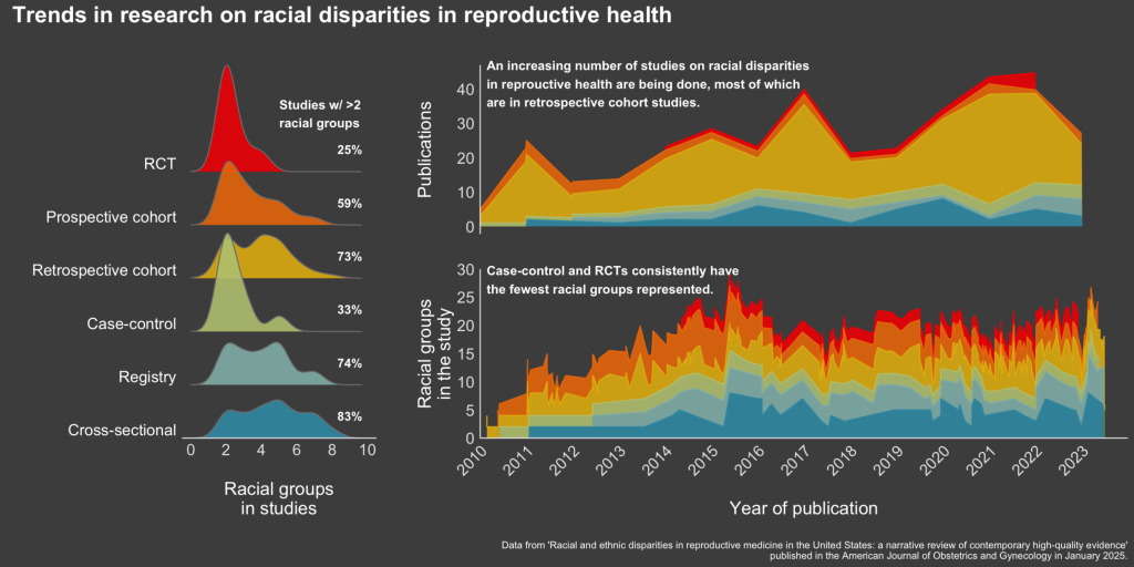
In this insightful post, Jess Graves explores a TidyTuesday dataset, providing a detailed analysis and visualization. This resource is perfect for those looking to improve their data wrangling and visualization skills using real-world datasets. Jess’s approach offers both a learning opportunity and inspiration for your own data projects.
Health Expenditure Tutorial
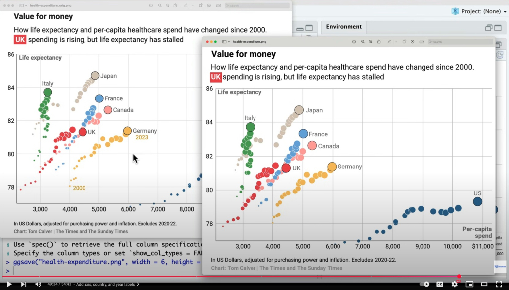
In this tutorial, Pat Schloss explores the relationship between life expectancy and health care spending around the world. This video tutorial focuses on cleaning, analyzing, and visualizing complex datasets, providing practical insights into handling real-world data challenges. It’s great ride-along to help you see how someone analyzes and visualizes a complex dataset.
R packages for chaos control
In this blog post, Javi Rudolph shares her thoughts on the importance and utility of developing your own R packages. The blog post is a speed-run through making your own package, which is not nearly as complicated as you might think! Best of all, having your own package can help to tame the chaos that comes from codebases that spiral out of control.
If you enjoyed this issue of What’s New In R, please share it with a friend! And if they want to get What’s New in R directly in their inbox, they can sign up on the R for the Rest of Us website.
Got any ideas for resources I should feature in future issues of What’s New in R? Leave a comment below!
Sign up for the newsletter
Get blog posts like this delivered straight to your inbox.

You need to be signed-in to comment on this post. Login.