What’s New in R: May 12, 2025
Welcome to this week’s edition of What’s New in R! This week, we’re featuring a guide on getting your Quarto projects out into the world with GitHub Pages, a personal journey into R programming, and a new package for working with colors. Let’s dive in!
Sketchy Waffle Charts in R
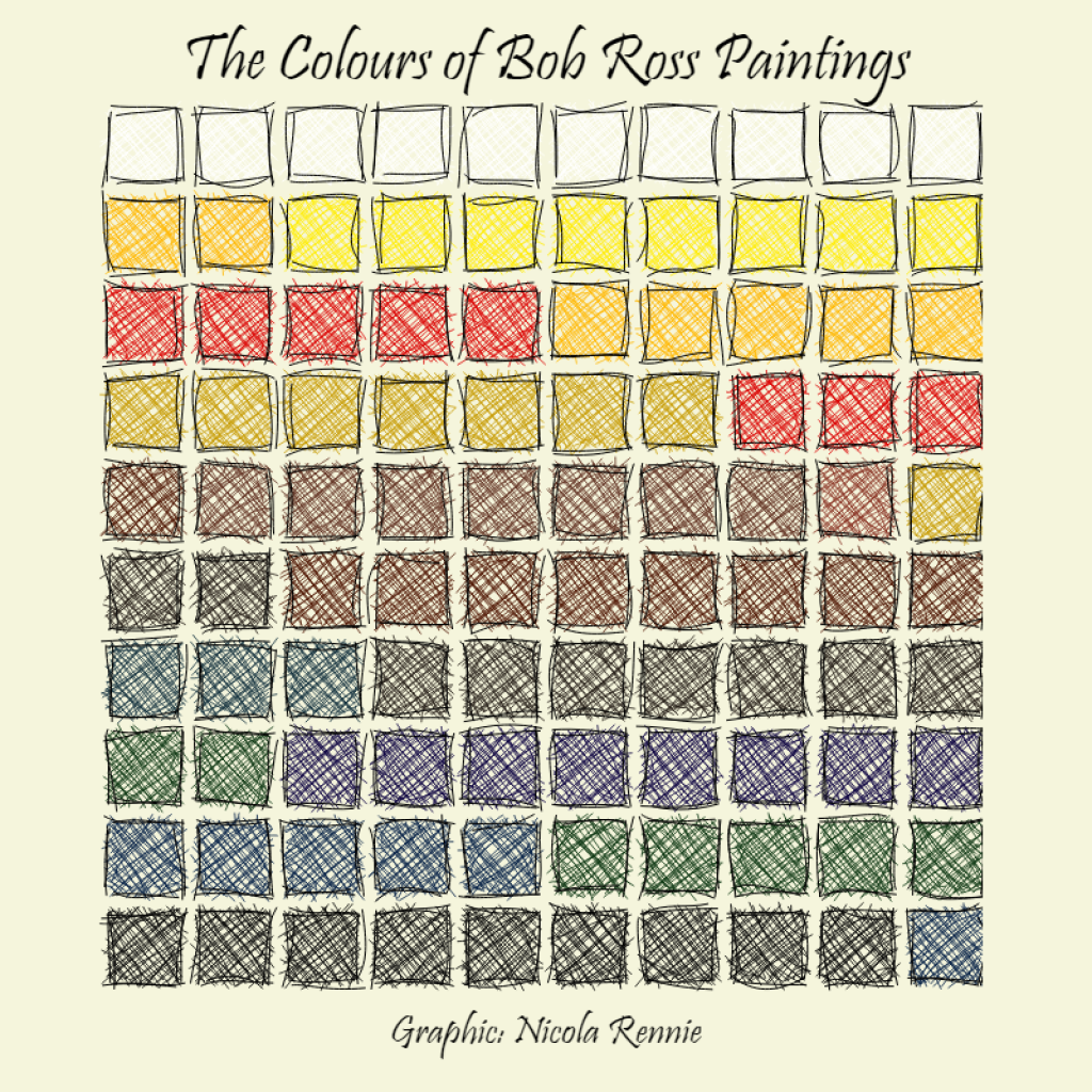
Nicola Rennie has written an intriguing blog post about creating sketchy waffle charts in R. This creative visualization approach adds a hand-drawn aesthetic to traditional waffle charts, making them both engaging and informative. The post provides a step-by-step guide on how to implement this style using R, offering a unique way to present data.
Historydata: Access Historical Datasets
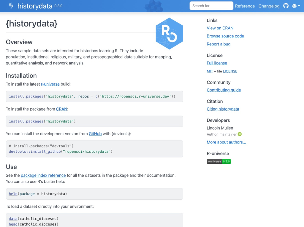
The {historydata} package, maintained by the rOpenSci team, is a treasure trove for historians and data enthusiasts alike. It provides access to a wide array of historical datasets, making it easier to explore and analyze historical trends and patterns. Whether you’re a researcher or just curious about history, this package is a valuable resource for accessing structured historical data.
Importing Data from ZIP Files
A tip so small it fits within a Bluesky post: Andrew Heiss shows that you can import a whole set of CSV files within a zip file. If you’ve ever gotten data in this way, this can be a game changer!
If you enjoyed this issue of What’s New In R, please share it with a friend! And if they want to get What’s New in R directly in their inbox, they can sign up on the R for the Rest of Us website.
Got any ideas for resources I should feature in future issues of What’s New in R? Leave a comment below!
Sign up for the newsletter
Get blog posts like this delivered straight to your inbox.

You need to be signed-in to comment on this post. Login.