What’s New in R: June 16, 2025
Welcome to this week’s edition of What’s New in R! This week, we’re featuring a workshop recording on creating impactful visualizations, a guide to mapping large numbers of Census tracts, and a tutorial on the new use() function in R. Let’s dive in!
More than pretty graphs: Tips, tricks and resources to elevate your dataviz
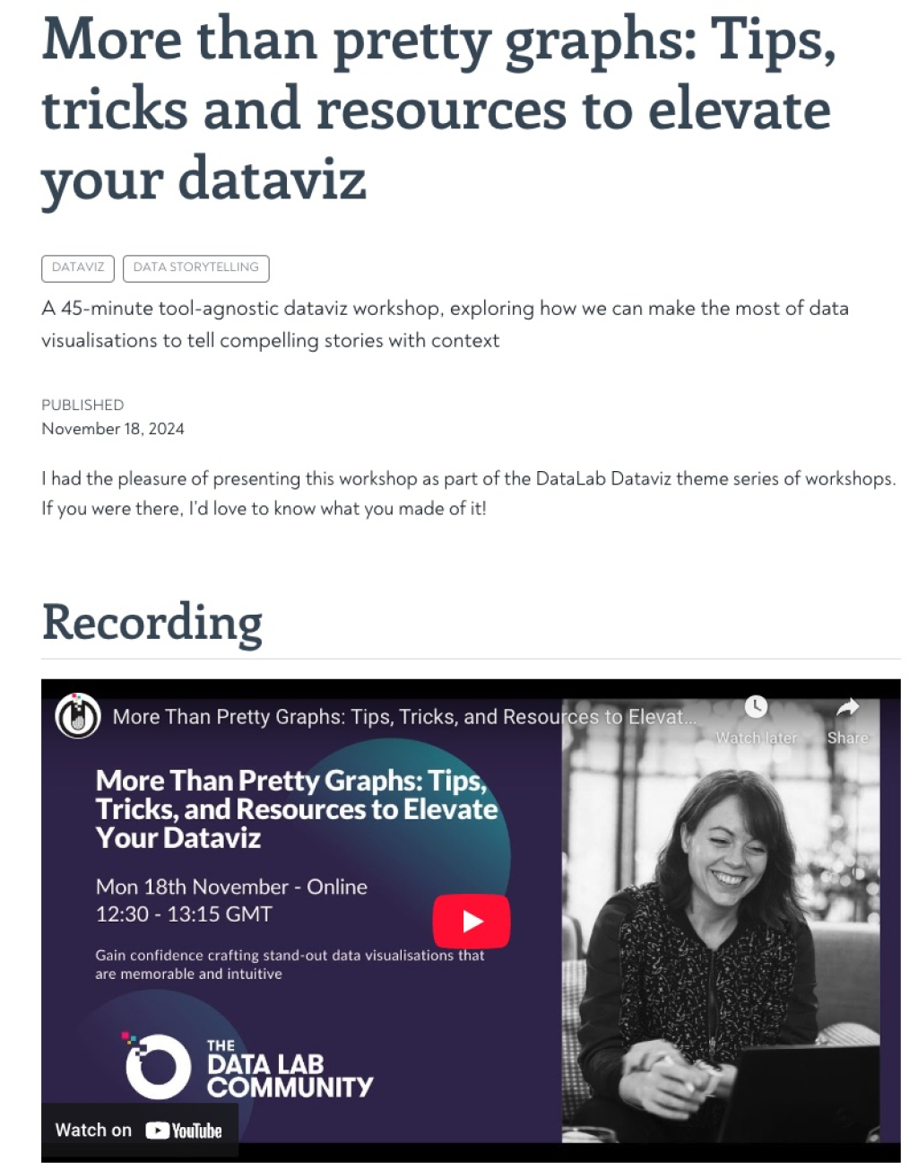
In this workshop from last November, Cara Thompson explores how to create visualizations that are not just aesthetically pleasing but also impactful and informative. The workshop talks about a number of key ideas, including choosing the right data viz type, working with colors, selecting fonts, and more.
National mapping for small areas: visualizing 85,000+ Census tracts with mapgl
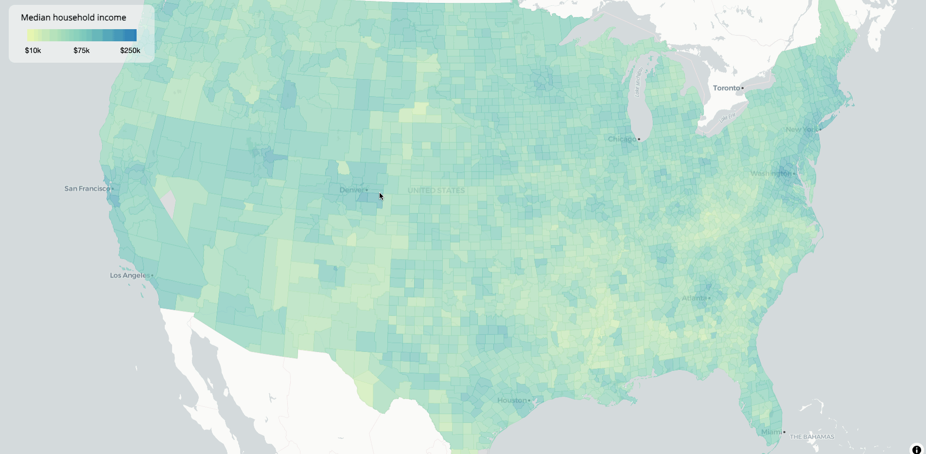
Kyle Walker’s blog post delves into the intricacies of mapping a large number of Census tracts. This comprehensive guide covers the use of the {tigris} and {ggplot2} packages to visualize demographic and geographic data effectively. It’s great tutorial on how to work with large amounts of geospatial data and how to visualize them effectively with the {mapgl} package.
Use use() in R
One of the most notable features of the recent R 4.5 release was the inclusion of the use() function, which allows you to use a single function rather than loading an entire package (think use(mutate) rather than library(dplyr)). In this blog post, Erik Gahner Larsen shows you how it works.
If you enjoyed this issue of What’s New In R, please share it with a friend! And if they want to get What’s New in R directly in their inbox, they can sign up on the R for the Rest of Us website.
Got any ideas for resources I should feature in future issues of What’s New in R? Leave a comment below!
Sign up for the newsletter
Get blog posts like this delivered straight to your inbox.

You need to be signed-in to comment on this post. Login.