Get access to all lessons in this course.
-
Advanced Data Wrangling and Analysis
- Overview
- Importing Data
- Tidy Data
- Reshaping Data
- Dealing with Missing Data
- Changing Variable Types
- Advanced Variable Creation
- Advanced Summarizing
- Binding Data Frames
- Functions
- Merging Data
- Renaming Variables
- Quick Interlude to Reorganize our Code
- Exporting Data
-
Advanced Data Visualization
- Data Visualization Best Practices
- Tidy Data
- Pipe Data Into ggplot
- Reorder Plots to Highlight Findings
- Line Charts
- Use Color to Highlight Findings
- Declutter
- Use the scales Package for Nicely Formatted Values
- Use Direct Labeling
- Use Axis Text Wisely
- Use Titles to Highlight Findings
- Use Color in Titles to Highlight Findings
- Use Annotations to Explain
- Tweak Spacing
- Customize Your Theme
- Customize Your Fonts
- Try New Plot Types
-
Advanced RMarkdown
- Advanced Markdown Text Formatting
- Tables
- Advanced YAML
- Inline R Code
- Making Your Reports Shine: Word Edition
- Making Your Reports Shine: HTML Edition
- Making Your Reports Shine: PDF Edition
- Presentations
- Dashboards
- Other Formats
-
Wrapping Up
- You Did It!
Going Deeper with R (v1)
Pipe Data Into ggplot
This lesson is locked
This lesson is called Pipe Data Into ggplot, part of the Going Deeper with R (v1) course. This lesson is called Pipe Data Into ggplot, part of the Going Deeper with R (v1) course.
If the video is not playing correctly, you can watch it in a new window
Transcript
Click on the transcript to go to that point in the video. Please note that transcripts are auto generated and may contain minor inaccuracies.
Your Turn
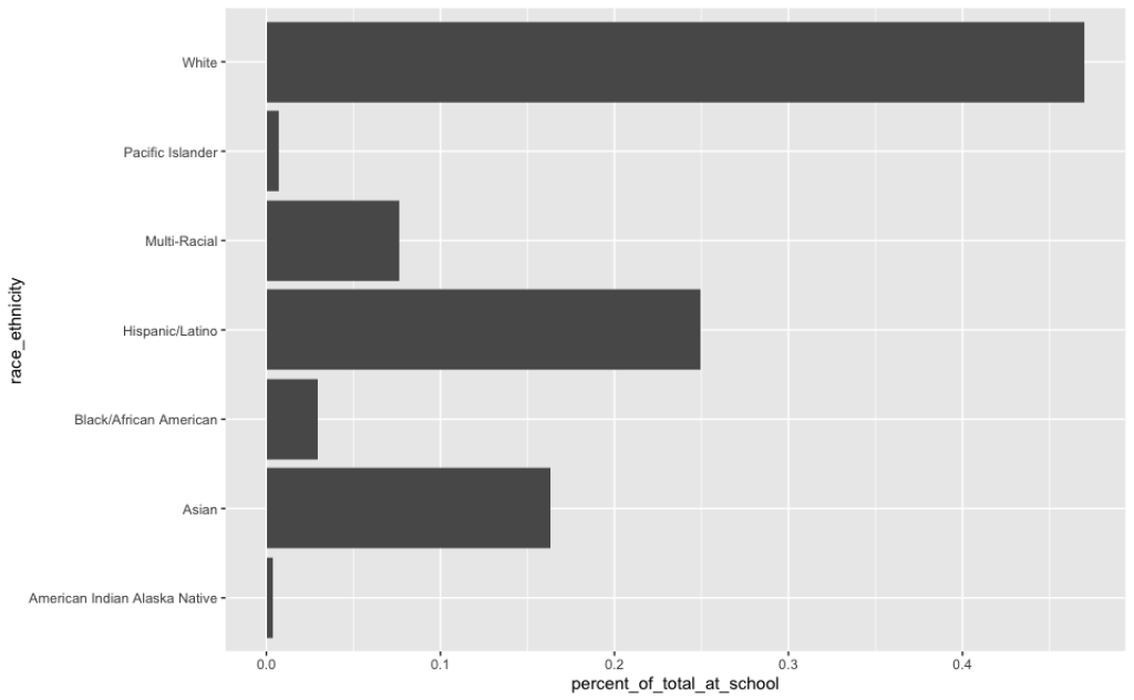
Create a new RMarkdown document
Create a data frame called
enrollment_by_race_ethnicityby reading in your race/ethnicity data from the data wrangling and analysis section using theread_rds()functionPipe your data into a bar chart that shows the breakdown of race/ethnicity among students in Beaverton SD 48J in 2018-2019
Your chart should look like this:
You need to be signed-in to comment on this post. Login.
Allison Brenner
May 7, 2021
I can't seem to load the rds file and I'm not sure why. The data and RMarkdown file are saved in the Oregon Schools project. Here is my code and error message:
Error in gzfile(file, "rb") : cannot open the connection In addition: Warning message: In gzfile(file, "rb") : cannot open compressed file '/data/enrollment_race_ethnicity.rds', probable reason 'No such file or directory'
Atlang Mompe
June 23, 2021
I run this code and get this error message, what am I doing wrong?
Error in filter(., district == "Beaverton SD 48J") : object 'enrollment_by_race_ethnicity' not found
Please advise - I was able to read the rds data and I can see it in the environment pane, but when I use the same code that you shared, I get an error, it says object not found, even though I can see the data on the environment frame.
Mychal Davis
May 19, 2022
Hello,
Which week did we make the RDS file that we are supposed to use for this assignment?
Thank you, Mychal
Amy Germuth
November 15, 2022
Hi -
I get the x-y axis (labeled appropriately) but no data plotted......and no error messages.....
Ruimin Xu
May 30, 2023
Hi David, I got blank chart when running below code... Not sure what is wrong enrollment_by_race_ethinicity %>% filter(year=="2018_2019") %>% filter(district=="Beaverton SD 48J") %>% mutate(percent_of_total_at_school=percentage_of_students) %>%
view()
ggplot(aes(x=percent_of_total_at_school,y=race_ethinicity)) geom_col()