How to create a gauge plot/speedometers in ggplot
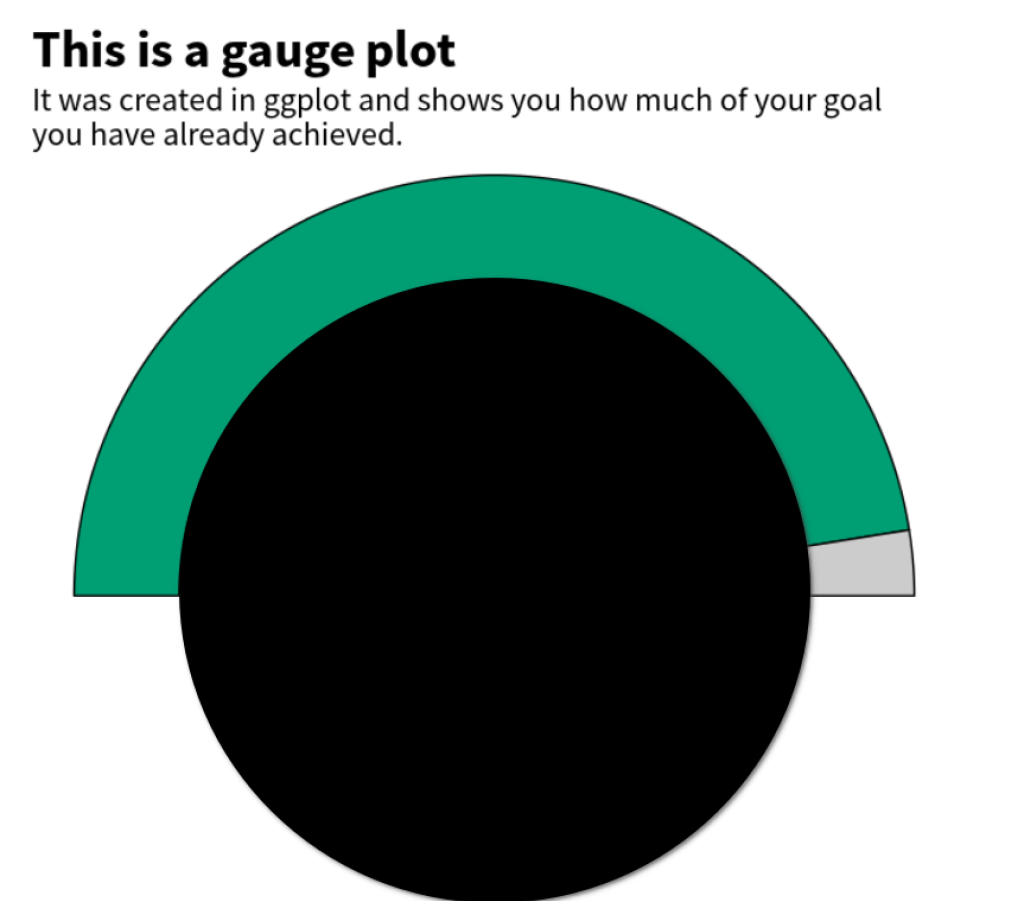
Gauge plots are a nice way to visualize progress or parts-of-a-whole in general. Due to their round shape, they are sometimes also called speedometer plots. Here’s an example chart. It shows you how much of your goal you have already achieved.

Basically, this is a round version of a parts-of-a-whole bar chart. If you want to create one of those, you can check out another one of our blog posts . In this one, we’ll show you how to create the rounded brother. Let’s dive in.
The data
First, we need to calculate a data set to create the chart. Let’s make something up.
library(tidyverse)
percentage_done <- 0.95
tibble(
  part = c("Complete", "Incomplete"),
  percentage = c(percentage_done, 1 - percentage_done)
)
#> # A tibble: 2 × 2
#>   part       percentage
#>   <chr>           <dbl>
#> 1 Complete       0.95
#> 2 Incomplete     0.0500
Most of the heavy lifting of wrapping bars into a round shape will be covered by the ggforce package. It has a function called geom_arc_bar() that does exactly what we need. But it takes a bit of work to get the data into the right shape. Let’s first think through what this function does:
Basically, geom_arc_bar() creates bars that “wrap around a circle”. Sounds complicated, right? Here’s a visualisation of what we mean.
See how the bars are wrapped around the black circle I included? That’s what geom_arc_bar() does. But we also have to tell it the start and end points of each bar. Here’s the same visual again but with red arrows that indicate the start and end points.
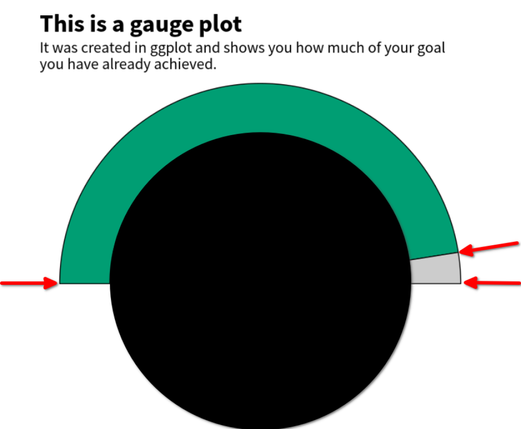
To calculate these start and end points, we actually have to do some math. What we need to know for that is that the start and endpoints are given as angles. Commonly, angles are given in degree so that a circle has 360 degree. But it’s also very common to instead use the unit “radians . In this unit, a circle has $2 \pi$ radians. Consequently, half a circle has $\pi$ radians. So, we can calculate the necessary angles as fractions of $\pi$ by multiplying the percentages with pi.
tibble(
  part = c("Complete", "Incomplete"),
  percentage = c(percentage_done, 1 - percentage_done),
  start = percentage * pi
)
#> # A tibble: 2 × 3
#>   part       percentage start
#>   <chr>           <dbl> <dbl>
#> 1 Complete       0.95   2.98
#> 2 Incomplete     0.0500 0.157
But we want the first bar to start at angle zero. So let’s modify our calculation.
tibble(
  part = c("Complete", "Incomplete"),
  percentage = c(percentage_done, 1 - percentage_done),
  start = lag(percentage, default = 0) * pi
)
#> # A tibble: 2 × 3
#>   part       percentage start
#>   <chr>           <dbl> <dbl>
#> 1 Complete       0.95    0
#> 2 Incomplete     0.0500  2.98
That’s better. Now we have to compute the end angles too. This means that we have to add the start angles to the percentages (multiplied by $\pi$).
fake_dat <- tibble(
  part = c("Complete", "Incomplete"),
  percentage = c(percentage_done, 1 - percentage_done),
  start = lag(percentage, default = 0) * pi,
  end = start + percentage * pi
)
fake_dat
#> # A tibble: 2 × 4
#>   part       percentage start   end
#>   <chr>           <dbl> <dbl> <dbl>
#> 1 Complete       0.95    0     2.98
#> 2 Incomplete     0.0500  2.98  3.14
Creating curved bars
Nice. We have all the data we need. Time to send this to ggplot. Let me just show you the code and then I’ll explain.
library(ggforce)
fake_dat |>
  ggplot() +
  geom_arc_bar(
    aes(
      x0 = 1, # x-center of circle
      y0 = 1, # y-center of circle
      fill = part, # fill color
      start = start, # start angle
      end = end, # end angle
      r0 = 0.75, # inner radius
      r = 1 # outer radius
    )
  ) +
  coord_fixed()
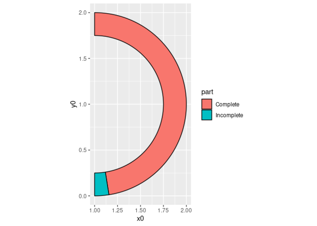
As you can see this code created the curved bar chart. Right now, it’s not oriented correctly but we can turn that really easily in a bit. What’s probably more interesting is to understand what x0 y0 , r0 and r inside of the aes() of geom_arc_bar() do. Thus, let me explain:
The
x0andy0arguments define the center of the circle around which the bars are wrapped.And
r0andrdefine the inner and outer radius of the bars.
The x0 and y0 arguments define the center of the circle around which the bars are wrapped.
And r0 and r define the inner and outer radius of the bars.
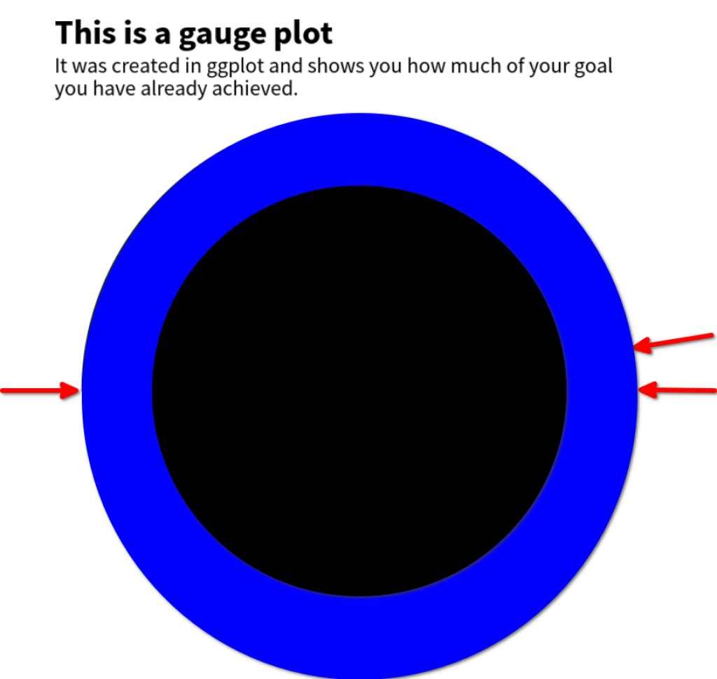
“The inner and outer what?”, I can hear you say. Let me clarify: You see, just like we’ve seen that the bars wrap around a circle, we can also describe the thickness of the bars with a second circle. Basically, the bars are the result of cutting out the smaller circle out of the larger one. Here’s an image of that. The Blue circle has the larger radius r and the black one has the smaller radius r0 . The red arrows indicate our previous start and end points (which I’ve just left in the image for reference).
Finally, coord_equal() makes sure that the x and y axis are scaled equally. This way, the circle doesn’t look like an ellipse and like a circle instead. Now all that’s left to do is to turn the chart so that the bars are oriented correctly. We do that by shifting the start and end angles by a quarter of a full circle ($\pi / 2$).
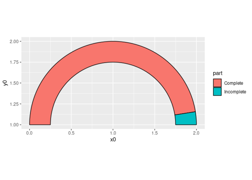
gauge_plot <- fake_dat |>
  ggplot() +
  geom_arc_bar(
    aes(
      x0 = 1,
      y0 = 1,
      fill = part,
      start = start - pi / 2,
      end = end - pi / 2,
      r0 = 0.75,
      r = 1
    )
  ) +
  coord_fixed()
gauge_plot
Add a label
Excellent! We have our speedometer. Time to add descriptive labels to it. We can to that with annotate() and labs() . The annotation will be a little bit too large right now but that will be fixed once we get rid of the legend.
labeled_gauge_plot <- gauge_plot +
  annotate(
    "text",
    x = 1,
    y = 1,
    label = glue::glue("{percentage_done * 100}% complete"),
    size = 16,
    family = "Source Sans Pro",
    fontface = "bold",
    color = "#009E73",
    vjust = 0
  ) +
  labs(
    title = "This is a gauge plot",
    subtitle = "It was created in ggplot and shows you how much of your goal\nyou have already achieved."
  )
labeled_gauge_plot
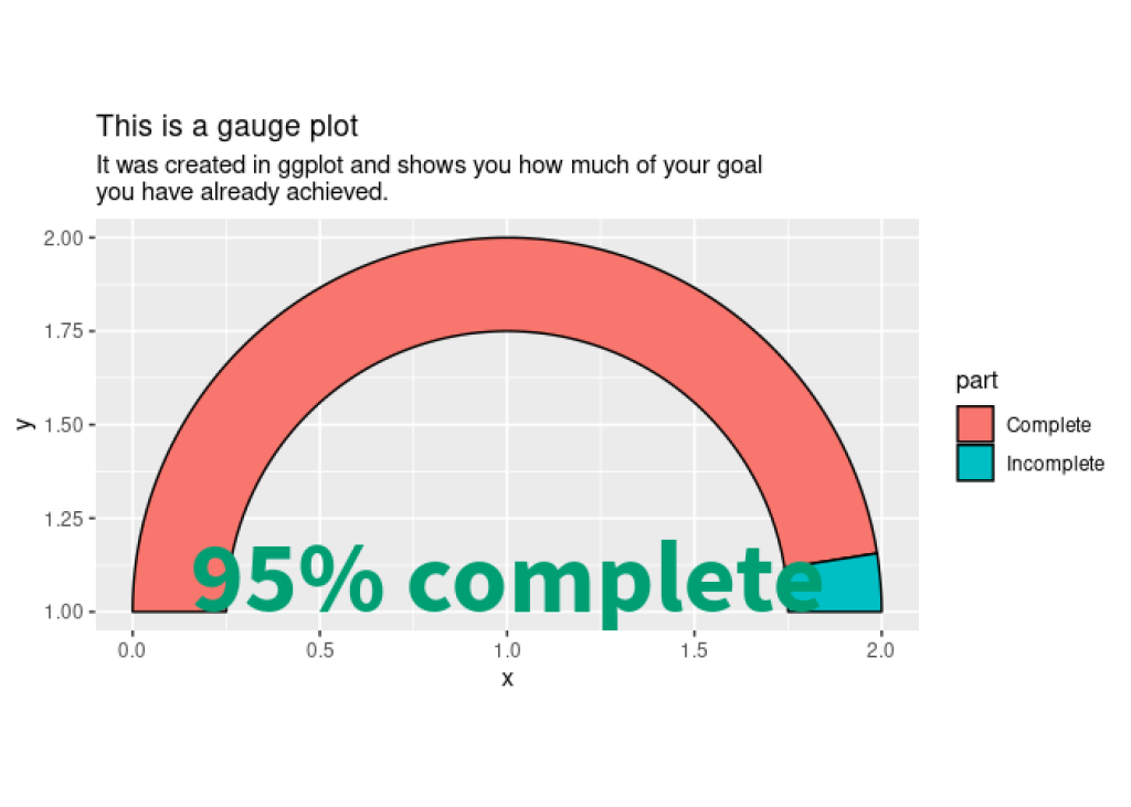
If you’ve never used annotate() before, it’s very similar to using geom_text() . But there’s a subtle difference which makes it perfect for adding one-off labels like we have here. If you want to read up on the difference, you can check out one of our previous blog posts .
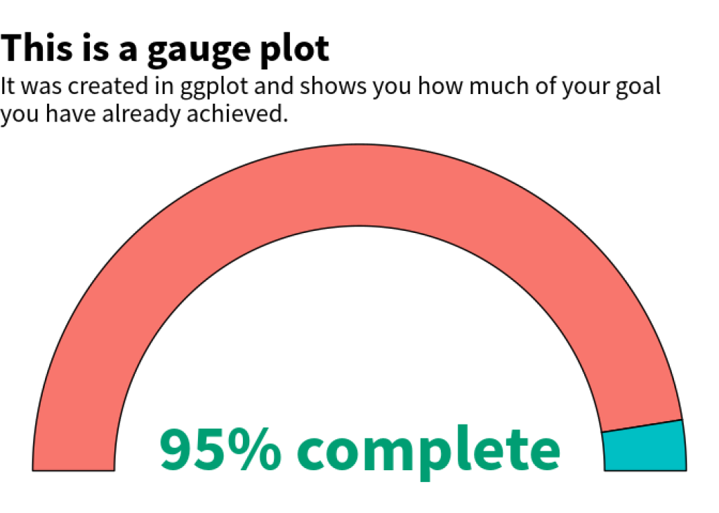
Add some styling
Finally, let’s add some styling to the chart. Here, we just remove all the of the grid lines with theme_void() . Also, we should increase the font sizes as well. That’s why we modify the texts in a theme() call. And while we’re in that layer, we can also remove the legend.
themed_gauge_plot <- labeled_gauge_plot +
  theme_void() +
  theme(
    legend.position = "none",
    plot.title = element_text(
      family = "Source Sans Pro", size = 28, face = "bold"
    ),
    plot.subtitle = element_text(family = "Source Sans Pro", size = 18)
  )
themed_gauge_plot
We’re almost done! All that’s left to do is to change the colors. We do that with scale_fill_manual() .
themed_gauge_plot +
  scale_fill_manual(
    values = c("Complete" = "#009E73", "Incomplete" = "grey80")
  )
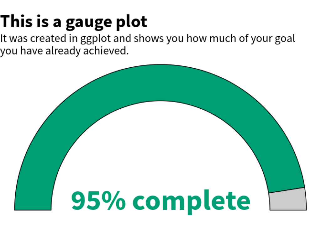
Perfect! This completes our gauge plot 🥳. Hopefully, we managed to explain the math parts of this blog post well enough to make it understandable. If not, feel free to leave us a comment. We’re always happy to hear from you. And with that we have concluded our blog post. Enjoy the rest of your day and see you next time 👋.
Sign up for the newsletter
Get blog posts like this delivered straight to your inbox.

You need to be signed-in to comment on this post. Login.