Making Choropleth Maps with ggplot
This lesson is called Making Choropleth Maps with ggplot, part of the Mapping with R course. This lesson is called Making Choropleth Maps with ggplot, part of the Mapping with R course.
Transcript
Click on the transcript to go to that point in the video. Please note that transcripts are auto generated and may contain minor inaccuracies.
Loading transcript...
View code shown in video
library(tidyverse)
library(tidycensus)
library(janitor)
library(tigris)
library(scales)

speak_language_other_than_english <-
  get_acs(
    geography = "county",
    variable = "S1601_C01_003",
    summary_var = "S1601_C01_001",
    geometry = TRUE
  ) |>
  clean_names() |>
  mutate(pct = estimate / summary_est) |>
  select(name, pct)

speak_language_other_than_english |>
  shift_geometry() |>
  ggplot() +
  geom_sf(aes(fill = pct)) +
  theme_void() +
  scale_fill_viridis_c()

speak_language_other_than_english |>
  shift_geometry() |>
  ggplot() +
  geom_sf(
    aes(
      fill = pct,
      color = pct
    )
  ) +
  theme_void() +
  theme(
    legend.position = "top",
    legend.key.width = unit(2, "cm"),
    legend.key.height = unit(0.5, "cm"),
    plot.title = element_text(
      hjust = 0.5,
      face = "bold",
      size = 16,
      margin = margin(
        b = 0.25,
        unit = "cm"
      )
    )
  ) +
  scale_fill_viridis_c(limits = c(0, 1),
                       labels = percent_format()) +
  scale_color_viridis_c(limits = c(0, 1),
                        labels = percent_format()) +
  labs(
    fill = NULL,
    color = NULL,
    title = "Percentage of People Who Speak a Language\nOther than English in Each County in the United States"
)Your Turn
Improve the map you made in the last lesson on the number of refugees from each country in the world by:
Using a different fill and color scale
Improving the legend by adjusting its width and height
Improving the legend by making nicely formatted values (
scales::comma_format()is your friend)
Learn More
In this lesson, I dealt with state borders by using the color and fill aesthetics. Andrew Heiss has another approach for dealing with this same problem. It's more complicated, but quite interesting!
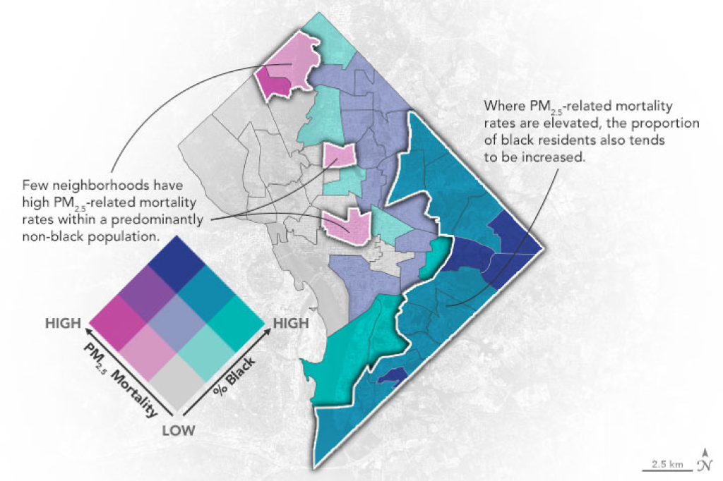
In addition to choropleth maps, another interesting map type is biscale maps. These maps enable you to show the interaction of two different variables. Here's an example from the NASA Earth Observatory.
Course Content
23 Lessons