Making Dot and Bubble Maps with ggplot
This lesson is called Making Dot and Bubble Maps with ggplot, part of the Mapping with R course. This lesson is called Making Dot and Bubble Maps with ggplot, part of the Mapping with R course.
Transcript
Click on the transcript to go to that point in the video. Please note that transcripts are auto generated and may contain minor inaccuracies.
Loading transcript...
View code shown in video
library(tidyverse)
library(tidycensus)
library(tigris)
library(janitor)
library(sf)
library(scales)

oregon <-
  states() |>
  clean_names() |>
  filter(name == "Oregon")

oregon_places <-
  read_sf("https://raw.githubusercontent.com/rfortherestofus/mapping-with-r-v2/refs/heads/main/data/oregon_places.geojson")

oregon_places

options(scipen = 999)

ggplot() +
  geom_sf(data = oregon, fill = "transparent") +
  geom_sf(data = oregon_places) +
  theme_void()

ggplot() +
  geom_sf(data = oregon, fill = "transparent") +
  geom_sf(
    data = oregon_places,
    aes(size = population),
    alpha = 0.5
  ) +
  scale_size_continuous(range = c(1, 15), label = comma_format()) +
  theme_void()

languages_spoken <-
  get_acs(
    geography = "county",
    state = "OR",
    variable = c(
      spanish = "S1601_C01_004",
      other_indo_european = "S1601_C01_008",
      asian_pacific_islander = "S1601_C01_012",
      other = "S1601_C01_016"
    ),
    geometry = TRUE
  ) |>
  clean_names() |>
  select(variable, name, estimate)

languages_spoken

ggplot() +
  geom_sf(data = languages_spoken, aes(fill = estimate)) +
  scale_fill_viridis_c() +
  facet_wrap(vars(variable)) +
  theme_void()

languages_spoken_dots <-
  languages_spoken |>
  filter(name == "Washington County, Oregon") |>
  as_dot_density(
    value = "estimate",
    values_per_dot = 100,
    group = "variable"
  )

languages_spoken_dots

ggplot() +
  geom_sf(data = languages_spoken_dots, aes(color = variable)) +
  geom_sf(
    data = languages_spoken |>
      filter(name == "Washington County, Oregon"),
    fill = "transparent"
  ) +
  theme_void()

ggplot() +
  geom_sf(data = languages_spoken_dots, aes(color = variable)) +
  geom_sf(
    data = languages_spoken |>
      filter(name == "Washington County, Oregon"),
    fill = "transparent"
  ) +
  theme_void() +
facet_wrap(vars(variable))Your Turn
Turn your refguees choropleth map from before into a bubble map
Import data on refugees by country with the following code:
refugees_by_country <-
  read_sf(
    "https://raw.githubusercontent.com/rfortherestofus/mapping-with-r-v2/refs/heads/main/data/refugees.geojson"
)Use this code to import centroids (i.e. one point in the center of each country)
refugees_country_centroids <-
  read_sf(
    "https://raw.githubusercontent.com/rfortherestofus/mapping-with-r-v2/refs/heads/main/data/refugees_country_centroids.geojson"
)Learn More
The example maps I showed in this lesson are below:
Lederhosen in the Amazon: an Austro-German enclave in Peru keeps traditions alive
It’s not just the Gulf of Mexico. Why is so much of America named after foreign countries?
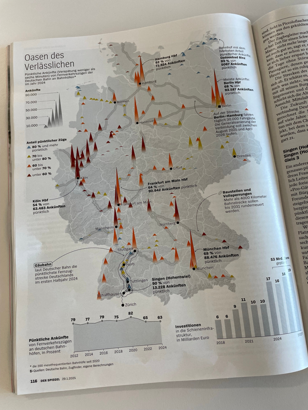
A related type of map is a spike map, which uses height to show some outcome. Here is an example from Der Spiegel showing election outcomes in Germany.
If you want to learn to make spike maps, here is a tutorial.
Course Content
23 Lessons