Learn to use the most powerful tool for working with data.
Even if you've never coded before.

Supporting forward looking organizations


Core Courses
New to R?
From "what's R?" to "I love R" in three self-paced courses.
Start here when you're just starting out.
Sign up for the newsletter
R tips and tricks straight to your inbox.
R in 3 Months
R in 3 Months
Looking for even more? R in 3 Months is a cohort-based program to help you finally learn R.
High-Quality Instruction
With R in 3 Months, you’ll get high-quality instruction that will guide you from R newbie to R expert.
Personalized Feedback
You'll work on your own code every week and get in-depth feedback.
Supportive Community
You'll be on this journey alongside a supportive community that will help you learn and keep you accountable to yourself.
Testimonials
Don't Take it From Us
Our learners say it best.
“This course helped our office and myself grow. David is a great teacher and his videos are very easy to follow along and by letting us use our own data, we are able to see for ourselves where we need to grow and what to accomplish.
“The many hours I've spent in front of my computer crunching this data in R has me wondering why I ever did anything else with my life.
“This is one of the best introduction to R courses that I have taken. It is simple yet very powerful. I have learnt a lot of things in one day which were very confusing to me for the past 2 years. Thank you for opening my eyes and allowing me to see the possibilites that are there in R. I highly recommend this course to anyone starting out in R.
“I thought learning R would be difficult but the introduction was great and has given me hope that I can be good at R. Really loved how the videos were informative and easy to follow along. Thank you.
“Excellent course to know the basics of this great tool (R).
“R for the Rest of Us is such a helpful platform to get started in R or to improve your knowledge and skills in R! The courses are well-structured and paced. Looking forward to continuing my R learning journey!
“This was an easy to follow course.
“A great intro with simple explanations to get someone starting out in R engaged on the topic.
“just started using R. It helped a lot.
“I've been working with R for several years, but looked at this intro just for the heck of it because I keep hearing about R for the Rest of Us. To my shock, I learned a few new very useful tricks. David is a clear and thoughtful teacher. Don't let the short videos or his calm presence trick you into thinking this is too simplistic. It is easy because David is clear. But he's also gently (subtly) telling you some REALLY important stuff. He's laying down an excellent foundation for your future work with R. Don't skip this. Build your good foundation with David's guidance. I'm so glad I finally decided to give R for the Rest of Us a look; now I need to go look at more of it.
Topics Courses
Ready to Up Your R Game?
For when you've got the foundations down and you're ready to learn more.
Consulting
Let Us Handle the R
Our consulting arm, Clarity Data Studio, creates reports, dashboards, websites, and more to help organizations to communicate more effectively with their data.
Blog
Blog
Learn to use the most powerful tool for working with data.
Even if you've never coded before.
How to Get Started Using AI with R
May 27, 2026
There are so many ways to use AI with R now that it's genuinely hard to know where to start. Should you just use ChatGPT in a browser tab? Install something into your code editor? And if so, which one? I made a video walking through the main options, with the pros and cons of each. The simplest approach is the one most people start with. Pop open ChatGPT in a browser and ask it R questions the same way you'd ask anything else. It works, but you end up bouncing back and forth between the...
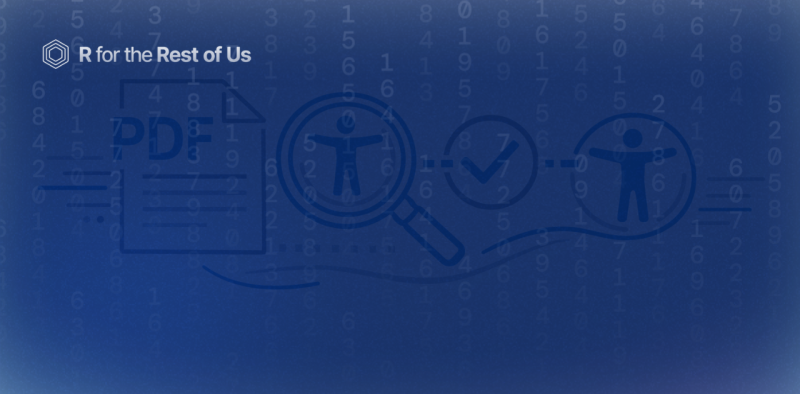
Introducing the {pdfcheck} R package for checking the accessibility of PDFs
February 5, 2026
Are the PDFs you're creating accessible? Can someone using a screen reader navigate them? Is the color contrast sufficient for people who are colorblind? These are questions we've been getting a lot from our consulting clients at Clarity Data Studio. And honestly? When we reviewed our own PDFs, we found there wasn't a really great tool to check accessibility and give us actionable steps to improve. So we decided to build our own. It's called {pdfcheck}, and it's an R package that helps you...

[Livestream Recording] How to Make High-Quality PDFs with Quarto and Typst
November 20, 2025
Last week, we released our massive blog post on making report templates using Quarto and Typst. R for the Rest of Us consultant Joseph Barbier and I did a livestream yesterday where we went over several questions submitted to us on this topic. In the livestream we covered several topics, including: Making complex elements that we used in the state-level immunization reports we recently created for the Johns Hopkins University International Vaccine Access Center. Taking a Typst template and...