 Charlie Hadley
We're often asked by clients to make maps, and oftentimes they ask us to make heatmaps.
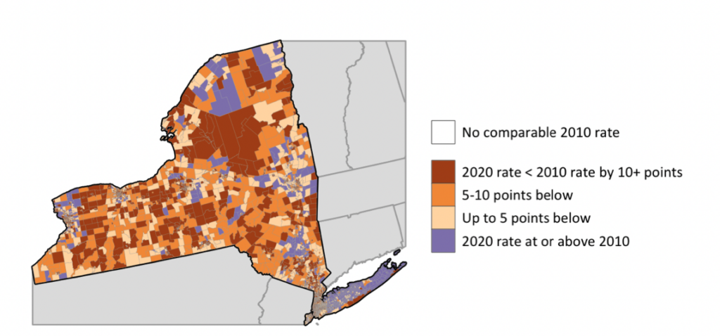
For example, we made heatmaps with {ggplot2} in these reports on 2020 U.S. Census outreach efforts.
And we made interactive heatmaps with the {leaflet} package in this map for the Asian Pacific Islander Council.
Also known as choropleth maps, heatmaps are incredibly useful and easy to understand maps. At their simplest, heatmaps require two things:
Shapefiles for the regions of interest. Your regions might be countries, states or other country subdivisions like census tracts.
A value for each region of interest. This could be a numeric value (like population) or it could be a categorical variable like the most popular streaming service in a state.
I really love mapping with R because it's fairly simple to start off and we can build really beautiful static and interactive maps. Our Mapping with R course will take you through all the steps required to build choropleth. But let me take you through the basic steps so you know what's involved.
Shapefiles and the {sf} package
In the video below I'm going to introduce the {sf} package which is the backbone of most mapping things you'll do with R. I'll use the {tidycensus} package to obtain the population for all US states from the US Census. The great thing about {sf} datasets is can use them inside of a tidyverse workflow to extract just the contiguous United States.
Here's the code that I wrote in the video:
library(tidycensus)
library(tidyverse)

us_state_pop <- get_acs(
  geography = "state",
  year = 2019,
  variables = c("population" = "B01001_001"),
  geometry = TRUE)

us_state_pop %>%
  filter(NAME == "Florida")

non_contiguous_regions <- c("Alaska", "Hawaii", "Rhode Island", "Puerto Rico")

us_contiguous <- us_state_pop %>%
filter(!NAME %in% non_contiguous_regions)If you're working with other regions you'll need to obtain shapefiles and read them into Rusing read_sf() from {sf}, which I cover in the introduction to Mapping with R.
Quickly view data with {mapview}
It's absolutely crucial when working with map data to be able to see your data (the map) - and that's exactly what the {mapview} package is for. It will take any geospatial dataset, whether it's from {sf}, {sp}, {raster}, {stars} and many others and ... just visualise it.
Here's the map made with {mapview}.
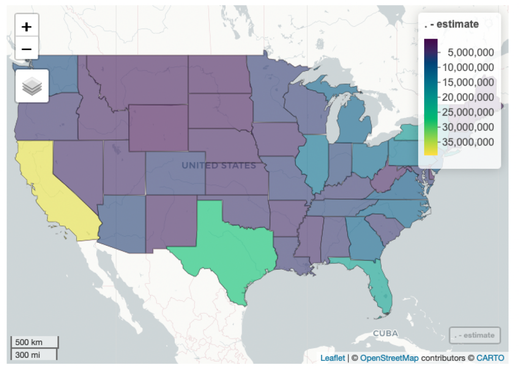
And here's all the code necessary to make this heatmap with {mapview}.
us_contiguous %>%
mapview(zcol = "estimate")This is literally as far as I ever go with {mapview}. It's job is to quickly visualise your map data, and that's it. My next step would be to decide between making a static map with {ggplot2} and an interactive one with {leaflet}.
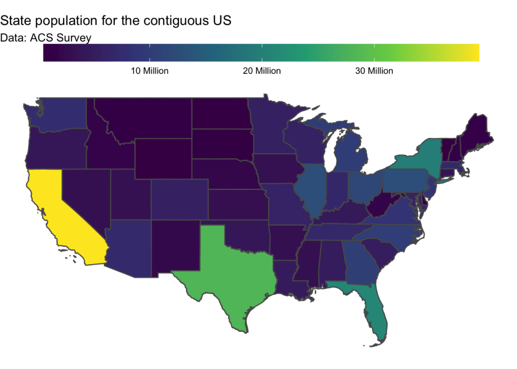
How to make heatmaps with {ggplot2}
The {ggplot2} package is an incredibly powerful data visualisation tool that is able to visualise {sf} datasets. This means that we can create choropleth (and other!) maps using our existing {ggplot2} knowledge. In the video below I'll show how to make this map.
library(tidycensus)
library(tidyverse)
library(scales)

us_state_pop <- get_acs(
  geography = "state",
  year = 2019,
  variables = c("population" = "B01001_001"),
  geometry = TRUE)

non_contiguous_regions <- c("Alaska", "Hawaii", "Rhode Island", "Puerto Rico")

us_contiguous <- us_state_pop %>%
  filter(!NAME %in% non_contiguous_regions)

us_contiguous %>%
  ggplot() +
  geom_sf(aes(fill = estimate)) +
  scale_fill_viridis_c(label = number_format(scale = 1E-6, suffix = " Million"),
                       name = "") +
  labs(title = "State population for the contiguous US",
       subtitle = "Data: ACS Survey") +
  theme_void() +
  theme(legend.position = "top",
legend.key.width = unit(3, "cm"))How to make interactive heatmaps with {leaflet}
{ggplot2} is fine if you're making a map you need to print. But if you're going to publish your map to the web... why not make an interactive heatmap with the {leaflet} package?
It takes a little bit more effort to create a {leaflet} map as I needed to create a user-defined function for the popup, but it's worth it. Interactivity allows your readers to explore and really understand what's shown in the heatmap.
Here's the exact code I showed in the video.
pal_state_pop <- colorNumeric("viridis", us_contiguous$estimate)

label_state <- function(state, pop){
  str_glue("{state} with population of {pop}")
}

us_contiguous %>%
  leaflet() %>%
  addPolygons(weight = 1,
              color = "white",
              fillColor = ~pal_state_pop(estimate),
              fillOpacity = 1,
              popup = ~label_state(NAME, estimate)) %>%
  addLegend(pal = pal_state_pop,
            values = ~estimate,
opacity = 1)Going further with heatmaps
This is just the start of what you can do when making heatmaps in R. You can also use heatmaps in combination with small multiples. Small multiples is an excellent data visualisation technique for comparing how a variable varies across a range of categories. It's particularly powerful when working with heatmaps, as shown in the map below (and associated code) which I built with {ggplot2} and show you how to build in our Mapping with R course.
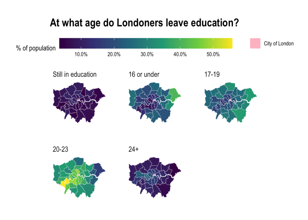
london_sf <- read_sf("data/london_boroughs")

education_data <- read_csv("data/age-when-completed-education.csv")

london_education_sf <- london_sf %>%
  left_join(education_data,
            by = c("lad11nm" = "area")) %>%
  group_by(lad11nm) %>%
  mutate(value = value / sum(value))

# ==== data viz ====


order_age_groups <- c("Still in education",
                      "16 or under",
                      "17-19",
                      "20-23",
                      "24+")


london_education_sf %>%
  mutate(age_group = fct_relevel(age_group, order_age_groups)) %>%
  ggplot() +
  geom_sf(aes(fill = value,
              shape = "City of London"),
          color = "white",
          size = 0.1) +
  scale_fill_viridis_c(na.value = "pink",
                       labels = scales::percent_format(),
                       name = "% of population") +
  facet_wrap(~age_group) +
  guides(shape = guide_legend(override.aes = list(fill = "pink"), order = 2, title = NULL),
         fill = guide_colorbar(order = 1,
                               barwidth = grid::unit(10, "cm"))) +
  labs(title = "At what age do Londoners leave education?") +
  theme_ipsum() +
  theme(panel.grid.major = element_blank(),
        axis.text.x = element_blank(),
        axis.text.y = element_blank(),
legend.position = "top")Ready to make heatmaps with R?
Inspired to start making your own heatmaps with R? Check out Mapping with R. It will teach you to make heatmaps with {mapview}, {ggplot2}, and {leaflet}. Get started today!
You need to be signed-in to comment on this post. Login.