Learn to use the most powerful tool for working with data.
Even if you've never coded before.
New free course: Using AI with R

Supporting forward looking organizations


Core Courses
New to R?
From "what's R?" to "I love R" in three self-paced courses.
Start here when you're just starting out.
Sign up for the newsletter
R tips and tricks straight to your inbox.
R in 3 Months
R in 3 Months
Looking for even more? R in 3 Months is a cohort-based program to help you finally learn R.
High-Quality Instruction
With R in 3 Months, you’ll get high-quality instruction that will guide you from R newbie to R expert.
Personalized Feedback
You'll work on your own code every week and get in-depth feedback.
Supportive Community
You'll be on this journey alongside a supportive community that will help you learn and keep you accountable to yourself.
Testimonials
Don't Take it From Us
Our learners say it best.
“This was a great course for me, just starting to use R and now I got just the introduction I needed to be up and running using R.
“Very easy to work with. loved all the lecture videos. each one making you to want more. The lessons are all easily grasped and understood. Looking forward to the next courses
“I would recommend this course WITHOUT hesitation!! It has helped me so much!! Absolutely encourage signing up for it.
“Good quick overview. I'm likely to take more courses from them in the near future. The mapping course looks very interesting.
“I've used R quite a bit in the past, but until taking this course, I felt like I was navigating a maze with my eyes closed -- running bits and pieces of code and troubleshooting each time I bumped into a wall, but never truly understanding where I'd been or where I was headed. "Getting Started with R" is the map to the maze that I never knew I needed, but now don't know how I'd live without! David clearly explains foundational concepts and makes R so much easier to understand. Whether you're brand-new to R or have been using it for years, I highly recommend this course.
“A great introduction to the fundamentals of R and RStudio.
“Your succinct lessons were the gateway for my fast advancement. By learning the basics from this course, I have already gone down the deep end of conducting inferential statistics, machine learning, and other advanced analyses. I've already impressed my boss with my first HTML report to our VP!
“This is the best R lesson for all beginners. Best Tutor :)
“Before starting R in 3 Months, I had completed several courses on R. However, they all felt generic—focused more on transitioning from learning to simply acing exercise questions, which, in the age of AI, isn't particularly challenging. This course, however, was different. It felt like I was truly in a classroom setting. Even while watching the pre-recorded videos, it struck the perfect balance between self-paced learning and providing the push I needed to stay motivated and engaged. Without a doubt, R in 3 Months is the best course I’ve taken this year.
“I have attended a few R courses, some of which were well taught, but nowhere near as practical as yours. I'll certainly continue subscribing and be considering your future courses.
Topics Courses
Ready to Up Your R Game?
For when you've got the foundations down and you're ready to learn more.
Consulting
Let Us Handle the R
High-quality data visualization, workflow improvements, and custom packages to enable organizations to communicate more effectively and more efficiently.

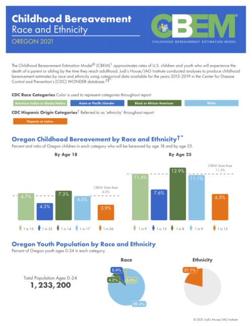
Childhood Bereavement Estimation Model Reports
Judi’s House/JAG Institute, a nonprofit in Colorado, provides support regarding childhood bereavement. In 2018, they created the Childhood Bereavement Estimation Model® (CBEM) to estimate rates of children losing a parent or sibling before adulthood. Annual CBEM reports were produced, but racial and ethnic data breakdowns were lacking until 2021. Partnering with R for the Rest of Us, they generated high-quality, easy-to-understand reports on bereavement disparities by race and ethnicity. These national and state-level reports, created using parameterized reporting and RMarkdown, help advance their vision that no child should be alone in grief.
Immunization Agenda 2030 Reports
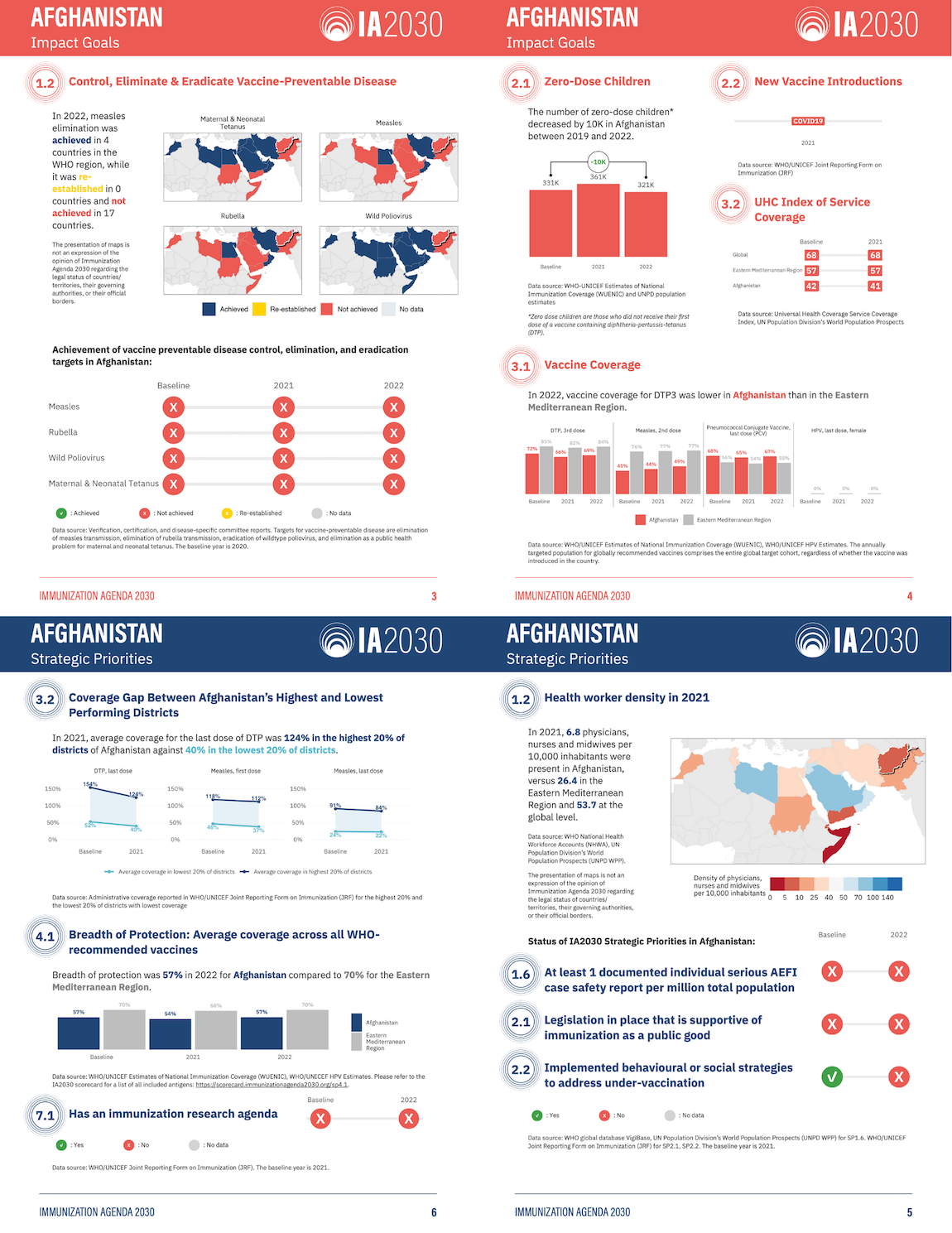
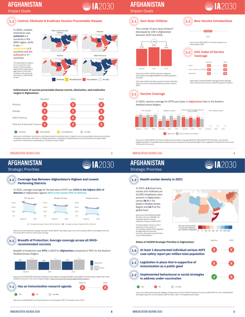
The World Health Organization's Immunization Agenda 2030 (IA2030) aims to improve global vaccine access. To better report progress, the International Vaccine Access Center at Johns Hopkins University partnered with R for the Rest of Us in 2023. They produced 72 user-friendly country-level reports in English and French, using parameterized reporting. These reports highlight individual country progress, use less technical language than previous online scorecards, and are in a printable PDF format for review.
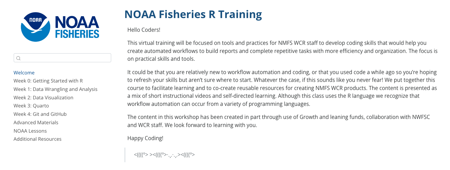
Improving R Training for NOAA Fisheries West Coast Region
NOAA Fisheries West Coast region (NOAA WCR) aims to maintain healthy fish populations along the west coast, with offices in California, Oregon, and Washington. Recently, they have increased their use of R, arranging internal trainings and seeking additional support in 2024 from R for the Rest of Us. They created a 6-week training program focusing on R fundamentals, advanced R topics, and GitHub integration. By the end, NOAA WCR staff efficiently produced technical memoranda and improved their workflows using R and Quarto.

Blog
Blog
Learn to use the most powerful tool for working with data.
Even if you've never coded before.

How to make heatmaps in ggplot
May 1, 2025
Heatmaps are a common way of representing data. In this blog post, I'll show you how to make your own heatmaps using ggplot. In the process, you'll learn a bit about working with the {sf} package, specifically the st_make_grid() function to make a grid, the st_intersection() function to clip the boundaries of your geography to the grid you create, and st_join() to do spatial joins. This blog post is adapted from a lesson in the Mapping with R course . If you want to learn to make heatmaps...

Use shadows in ggplot to highlight findings
April 24, 2025
In our consulting work, we make a lot of the data visualization for parameterized reporting . It’s something I spoke about in my 2024 Cascadia R Conf talk, How to Make a Thousand Plots Look Good: Data Viz Tips for Parameterized Reporting . One example I gave in this talk came from our work with the Johns Hopkins International Vaccine Access Center and the World Health Organization . In this project, we made reports for the Immunization Agenda 2030 project, which tracks the progress countries...

Create your own custom {ggplot2} theme
April 3, 2025
Creating custom themes in {ggplot2} lets you elevate your data visualizations from standard to standout. Whether you’re aiming for a polished, brand-consistent look for your organization or a unique aesthetic that reflects your personal style, a custom theme function makes it easy to apply your design to all figures with a single line of code. In this tutorial, we’ll cover: the essentials of the powerful ggplot2::theme() function, including how to adjust fonts, colors, sizing, and spacing;...