Learn to use the most powerful tool for working with data.
Even if you've never coded before.
New free course: Using AI with R

Supporting forward looking organizations


Core Courses
New to R?
From "what's R?" to "I love R" in three self-paced courses.
Start here when you're just starting out.
Sign up for the newsletter
R tips and tricks straight to your inbox.
R in 3 Months
R in 3 Months
Looking for even more? R in 3 Months is a cohort-based program to help you finally learn R.
High-Quality Instruction
With R in 3 Months, you’ll get high-quality instruction that will guide you from R newbie to R expert.
Personalized Feedback
You'll work on your own code every week and get in-depth feedback.
Supportive Community
You'll be on this journey alongside a supportive community that will help you learn and keep you accountable to yourself.
Testimonials
Don't Take it From Us
Our learners say it best.
“The many hours I've spent in front of my computer crunching this data in R has me wondering why I ever did anything else with my life.
“This course helped our office and myself grow. David is a great teacher and his videos are very easy to follow along and by letting us use our own data, we are able to see for ourselves where we need to grow and what to accomplish.
“Your succinct lessons were the gateway for my fast advancement. By learning the basics from this course, I have already gone down the deep end of conducting inferential statistics, machine learning, and other advanced analyses. I've already impressed my boss with my first HTML report to our VP!
“As I had never used R before, this course helped me learn the basics of R and the different methodologies for data visualization and coming up with errors.
“Very good explanations in an entertaining way, I really enjoyed the course
“I thought learning R would be difficult but the introduction was great and has given me hope that I can be good at R. Really loved how the videos were informative and easy to follow along. Thank you.
“An excellent clear outline of some of the key fundamental processes in R enabling you to import, clean, process, visualise and communicate your data. Great teaching!
“This is one of the best introduction to R courses that I have taken. It is simple yet very powerful. I have learnt a lot of things in one day which were very confusing to me for the past 2 years. Thank you for opening my eyes and allowing me to see the possibilites that are there in R. I highly recommend this course to anyone starting out in R.
“This was so informative! I appreciate all of the help!
“Gone are the days of copy-pasting SPSS output to Excel, and Excel charts to Word, over and over again! Learning R was one of the best professional investments I have ever made, and has been invaluable in streamlining my work UBC Faculty of Medicine and the Justice Institute of British Columbia.
Topics Courses
Ready to Up Your R Game?
For when you've got the foundations down and you're ready to learn more.
Consulting
Let Us Handle the R
High-quality data visualization, workflow improvements, and custom packages to enable organizations to communicate more effectively and more efficiently.

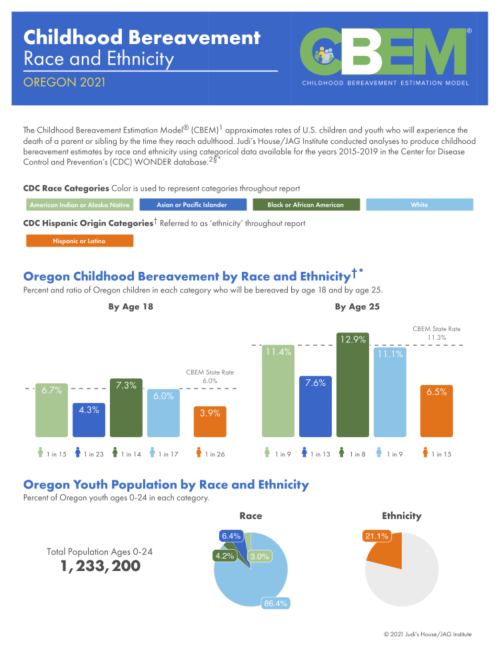
Childhood Bereavement Estimation Model Reports
Judi’s House/JAG Institute, a nonprofit in Colorado, provides support regarding childhood bereavement. In 2018, they created the Childhood Bereavement Estimation Model® (CBEM) to estimate rates of children losing a parent or sibling before adulthood. Annual CBEM reports were produced, but racial and ethnic data breakdowns were lacking until 2021. Partnering with R for the Rest of Us, they generated high-quality, easy-to-understand reports on bereavement disparities by race and ethnicity. These national and state-level reports, created using parameterized reporting and RMarkdown, help advance their vision that no child should be alone in grief.
Immunization Agenda 2030 Reports
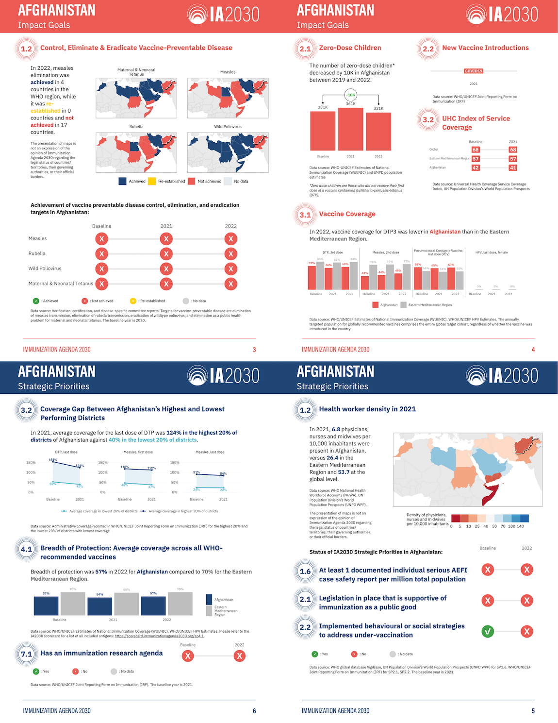
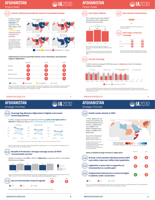
The World Health Organization's Immunization Agenda 2030 (IA2030) aims to improve global vaccine access. To better report progress, the International Vaccine Access Center at Johns Hopkins University partnered with R for the Rest of Us in 2023. They produced 72 user-friendly country-level reports in English and French, using parameterized reporting. These reports highlight individual country progress, use less technical language than previous online scorecards, and are in a printable PDF format for review.
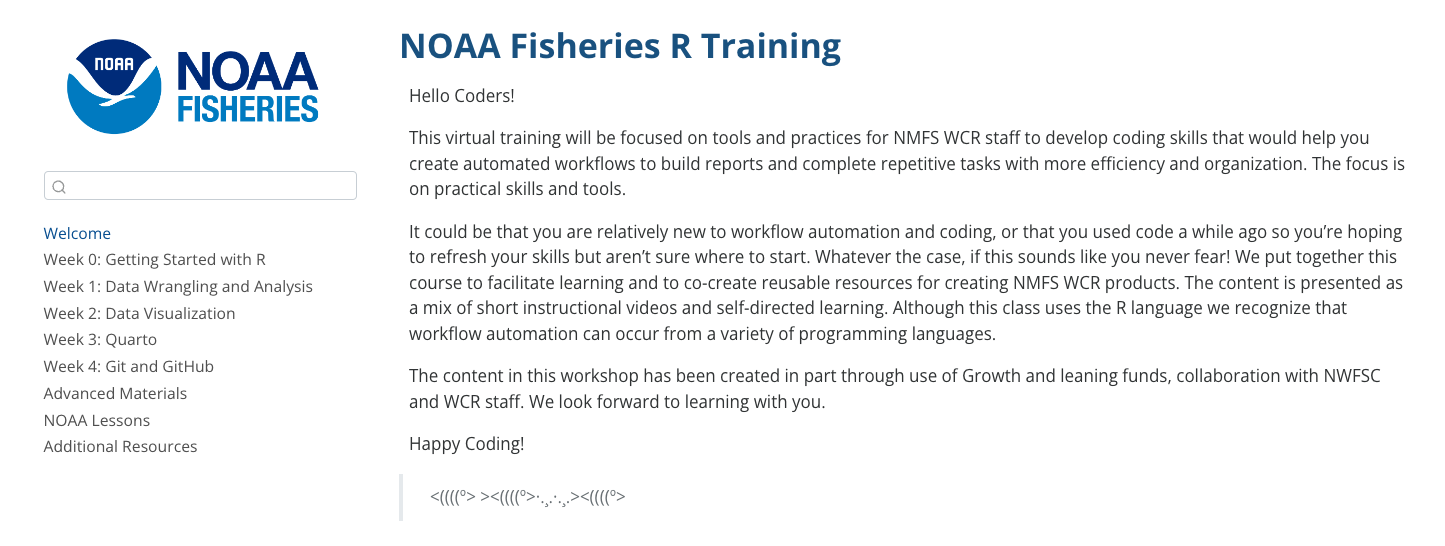
Improving R Training for NOAA Fisheries West Coast Region
NOAA Fisheries West Coast region (NOAA WCR) aims to maintain healthy fish populations along the west coast, with offices in California, Oregon, and Washington. Recently, they have increased their use of R, arranging internal trainings and seeking additional support in 2024 from R for the Rest of Us. They created a 6-week training program focusing on R fundamentals, advanced R topics, and GitHub integration. By the end, NOAA WCR staff efficiently produced technical memoranda and improved their workflows using R and Quarto.

Blog
Blog
Learn to use the most powerful tool for working with data.
Even if you've never coded before.

How to make heatmaps in ggplot
May 1, 2025
Heatmaps are a common way of representing data. In this blog post, I'll show you how to make your own heatmaps using ggplot. In the process, you'll learn a bit about working with the {sf} package, specifically the st_make_grid() function to make a grid, the st_intersection() function to clip the boundaries of your geography to the grid you create, and st_join() to do spatial joins. This blog post is adapted from a lesson in the Mapping with R course . If you want to learn to make heatmaps...

Use shadows in ggplot to highlight findings
April 24, 2025
In our consulting work, we make a lot of the data visualization for parameterized reporting . It’s something I spoke about in my 2024 Cascadia R Conf talk, How to Make a Thousand Plots Look Good: Data Viz Tips for Parameterized Reporting . One example I gave in this talk came from our work with the Johns Hopkins International Vaccine Access Center and the World Health Organization . In this project, we made reports for the Immunization Agenda 2030 project, which tracks the progress countries...

Create your own custom {ggplot2} theme
April 3, 2025
Creating custom themes in {ggplot2} lets you elevate your data visualizations from standard to standout. Whether you’re aiming for a polished, brand-consistent look for your organization or a unique aesthetic that reflects your personal style, a custom theme function makes it easy to apply your design to all figures with a single line of code. In this tutorial, we’ll cover: the essentials of the powerful ggplot2::theme() function, including how to adjust fonts, colors, sizing, and spacing;...