Get access to all lessons in this course.
-
Week 1: Getting Started with R
- Welcome to Getting Started with R
- Install R
- Install RStudio
- Projects
- Files in R
- Packages
- Import Data
- Objects and Functions
- Examine our Data
- Import Our Data Again
- Getting Help
- Wrapping Up
- R in 3 Months Spring 2022 Week 1 Live Session
-
Week 2: Fundamentals of R (RMarkdown)
- Welcome to Fundamentals of R
- RMarkdown Overview
- YAML
- Text
- Code Chunks
- Wrapping Up
- R in 3 Months Spring 2022 Week 2 Project Assignment
- R in 3 Months Spring 2022 Week 2 Office Hours
- R in 3 Months Spring 2022 Week 2 Live Session
-
Week 3: Fundamentals of R (Data Wrangling and Analysis)
- Getting Started
- The Tidyverse
- select
- mutate
- filter
- summarize
- group_by
- count
- arrange
- Create a New Data Frame
- Crosstabs
- Wrapping Up
- R in 3 Months Spring 2022 Week 3 Office Hours
- R in 3 Months Spring 2022 Week 3 Live Session
- R in 3 Months Spring 2022 Week 3 Project Assignment
-
Week 4: Fundamentals of R (Data Visualization)
- An Important Workflow Tip
- The Grammar of Graphics
- Scatterplots
- Histograms
- Bar Charts
- color and fill
- scales
- Text and Labels
- Plot Labels
- Themes
- Facets
- Save Plots
- Wrapping Up
- You Did It!
- R in 3 Months Spring 2022 Week 4 Office Hours
- R in 3 Months Spring 2022 Week 4 Live Session
- R in 3 Months Spring 2022 Week 4 Project Assignment
-
Week 5: Catch-Up Week
- R in 3 Months Spring 2022 Week 5 Office Hours
- R in 3 Months Spring 2022 Week 5 Project Assignment: ASSIGNMENT AMNESTY
-
Week 6: Git + GitHub
- What is Git? What is GitHub?
- Why Should You Learn to Use Git and GitHub?
- Update Everything
- Install Git
- Configure Git
- Create a Local Git Repository
- Commits
- Commit History
- GitHub Repositories
- Connect RStudio and GitHub
- Push an RStudio Project to a GitHub Repository
- Pull a GitHub Repository to an RStudio Project
- Keep RStudio and GitHub in Sync
- R in 3 Months Spring 2022 Week 6 Office Hours
- R in 3 Months Spring 2022 Week 6 Live Session
- R in 3 Months Spring 2022 Week 6 Project Assignment
-
Week 7: Going Deeper with R (Advanced Data Wrangling, Part 1)
- Overview
- Importing Data
- Tidy Data
- Reshaping Data
- Dealing with Missing Data
- Changing Variable Types
- Advanced Variable Creation
- Advanced Summarizing
- Binding Data Frames
- R in 3 Months Spring 2022 Week 7 Office Hours
- R in 3 Months Spring 2022 Week 7 Project Assignment
- R in 3 Months Spring 2022 Week 7 Live Session
-
Week 8: Going Deeper with R (Advanced Data Wrangling, Part 2)
- Functions
- Merging Data
- Renaming Variables
- Quick Interlude to Reorganize our Code
- Exporting Data
- R in 3 Months Spring 2022 Week 8 Office Hours
- R in 3 Months Spring 2022 Week 8 Live Session
- R in 3 Months Spring 2022 Week 8 Project Assignment
-
Week 9: Catch-Up Week
- R in 3 Months Spring 2022 Week 9 Office Hours
- R in 3 Months Spring 2022 Week 9 - Assignment Amnesty
-
Week 10: Going Deeper with R (Advanced Data Visualization, Part 1)
- Data Visualization Best Practices
- Tidy Data
- Pipe Data Into ggplot
- Reorder Plots to Highlight Findings
- Line Charts
- Use Color to Highlight Findings
- Declutter
- Use the scales Package for Nicely Formatted Values
- Use Direct Labeling
- R in 3 Months Spring 2022 Week 10 Office Hours
- R in 3 Months Spring 2022 Week 10 Live Session
- R in 3 Months Spring 2022 Week 10 Project Assignment
-
Week 11: Going Deeper with R (Advanced Data Visualization, Part 2)
- Use Axis Text Wisely
- Use Titles to Highlight Findings
- Use Color in Titles to Highlight Findings
- Use Annotations to Explain
- Tweak Spacing
- Customize Your Theme
- Customize Your Fonts
- Try New Plot Types
- R in 3 Months Spring 2022 Week 11 Live Session
- R in 3 Months Spring 2022 Week 11 Office Hours
- R in 3 Months Spring 2022 Week 11 Project Assignment
-
Week 12: Going Deeper with R (Advanced RMarkdown)
- Advanced Markdown Text Formatting
- Tables
- Advanced YAML
- Inline R Code
- Making Your Reports Shine: Word Edition
- Making Your Reports Shine: HTML Edition
- Making Your Reports Shine: PDF Edition
- Presentations
- Dashboards
- Other Formats
- You Did It!
- R in 3 Months Spring 2022 Week 12 Office Hours
- R in 3 Months Spring 2022 Week 12 Live Session
- R in 3 Months Spring 2022 Week 12 Project Assignment
-
Week 13: Final Assignment
- R in 3 Months Spring 2022 Week 13 Office Hours
- R in 3 Months Spring 2022 Week 13 Live Session
- R in 3 Months Spring 2022 Final Project Assignment
-
WEEK 14: Retrospective
R in 3 Months (Spring 2022)
Wrapping Up
This lesson is locked
This lesson is called Wrapping Up, part of the R in 3 Months (Spring 2022) course. This lesson is called Wrapping Up, part of the R in 3 Months (Spring 2022) course.
Now that you have completed this section of the course, you’re ready to wow your clients with some fantastic data visualizations. If you want to refer back to the examples used in this section, the rendered HTML file is available.
Tidy Tuesday
The best way to improve your data visualization skills in ggplot is, not surprisingly, to practice! Fortunately for you, there is a great community of folks learning R who have banded together to create visualizations each week as part of the Tidy Tuesday project, described as:
A weekly data project aimed at the R ecosystem. An emphasis will be placed on understanding how to summarize and arrange data to make meaningful charts with
ggplot2,tidyr,dplyr, and other tools in thetidyverseecosystem.
Take a look at the #TidyTuesday hashtag on Twitter, where people post visualizations they create each week, often with the code used to produce them.
Looking at Others' Code
If you start looking at other people's ggplot code, you may see some differences from how I wrote code for this course. For example, code that I wrote looks like this:
ggplot(data = sleep_by_gender,
       mapping = aes(x = gender,
                     y = avg_sleep,
                     fill = gender)) +
geom_col()If you look at other people's ggplot code, you'll likely see that they tend to drop many of the arguments. The code below, for example, is identical to the code above, but it drops the data, mapping, x, and y arguments.
ggplot(sleep_by_gender,
       aes(gender,
           avg_sleep,
           fill = gender)) +
geom_col()Because you have to have all of those arguments to make any plot, ggplot is ok if you don't include them. As you write more code, you'll likely drop them in the interest of brevity.
What About Pie Charts?
You may be wondering why I didn’t include pie charts in this course. There are two reasons.
Practically speaking, pie charts are a bit challenging to make in R. They require you to make a stacked bar chart and then use coord_polar to use a polar coordinate system. This is a multi-step process and goes beyond what’s possible in a fundamentals of data visualization in R module.
Conceptually speaking, pie charts are problematic. People often struggle to see the difference between slices, meaning they don’t accomplish their purpose. While there are ways to appropriately use pie charts, they are far more likely to be misused.
Given these two issues, I decided to not teach how to make pie charts in this course. There are plenty of resources available if you want to make pie charts in ggplot so if you’d like to learn how to make them, you now have the background to understand others’ tutorials.
The Data Visualization World is Your Oyster
Now that you have the fundamentals down, you’re ready to dive into the beautiful world of ggplot.
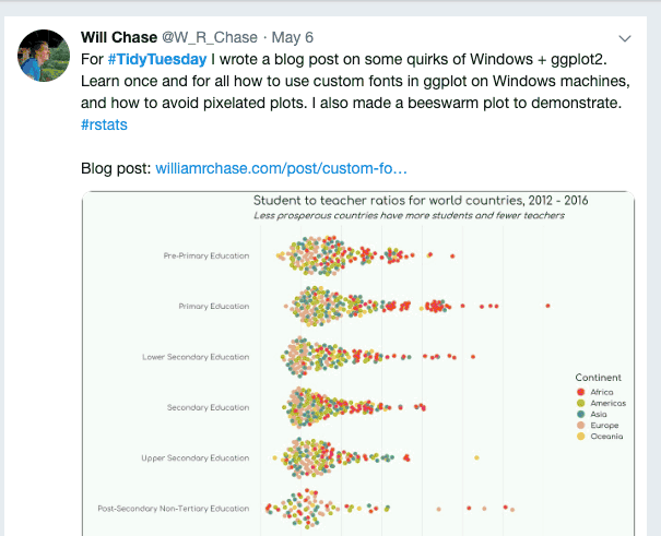
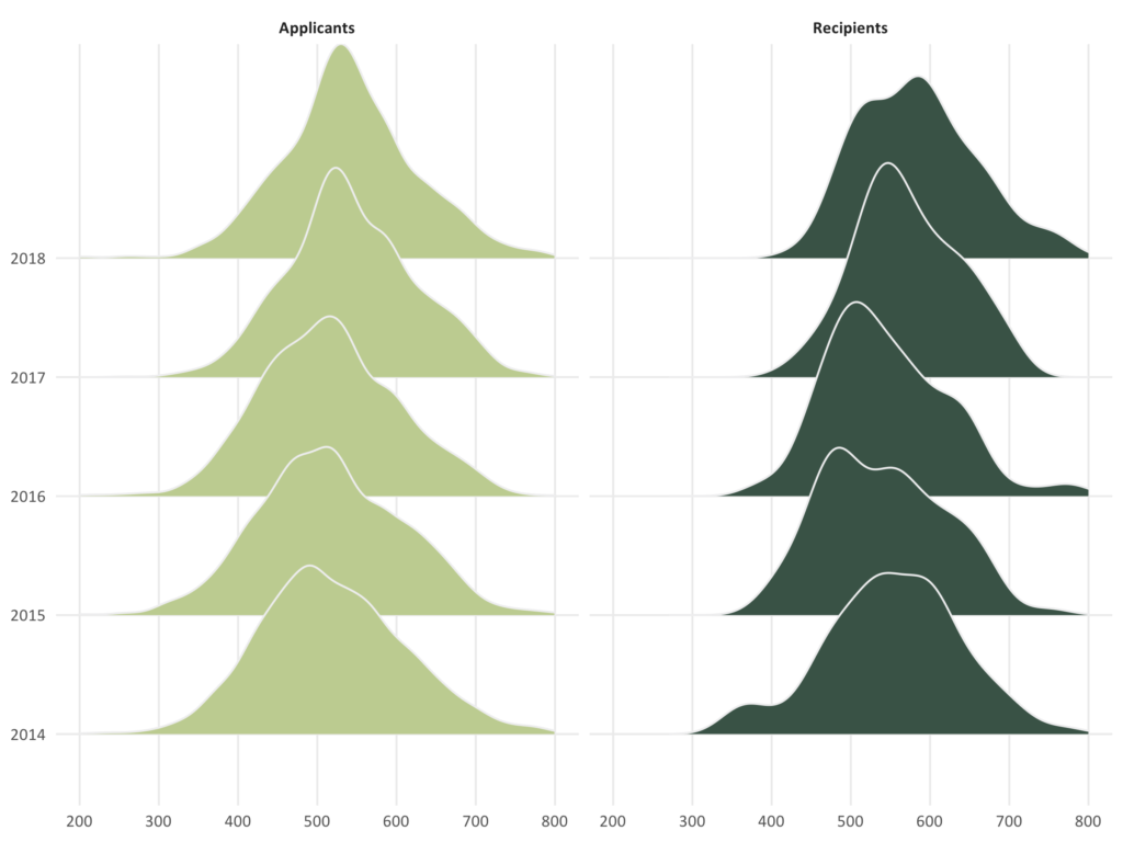
There are many ggplot extensions that enable you to make all sorts of novel visualizations. Here are examples of visualizations produced with a couple of ggplot extensions I particularly like:
ggbeeswarm produces beeswarm plots, “a way of plotting points that would ordinarily overlap so that they fall next to each other instead. In addition to reducing overplotting, it helps visualize the density of the data at each point (similar to a violin plot), while still showing each data point individually.”
ggridges produces ridgeline plots, which are “partially overlapping line plots that create the impression of a mountain range. They can be quite useful for visualizing changes in distributions over time or space.”
And, if you really want to get fancy, check out gganimate, which does what it says on the tin.
You need to be signed-in to comment on this post. Login.