Facets
This lesson is called Facets, part of the Fundamentals of R course. This lesson is called Facets, part of the Fundamentals of R course.
Transcript
Click on the transcript to go to that point in the video. Please note that transcripts are auto generated and may contain minor inaccuracies.
View code shown in video
# Load Packages -----------------------------------------------------------

library(tidyverse)

# Import Data -------------------------------------------------------------

penguins <- read_csv("penguins.csv")

# Facets ------------------------------------------------------------------

# One of the most powerful features of ggplot is facetting.
# You can make small multiples by adding just a line of code.

# The facet_wrap() function will create small multiples.

ggplot(data = penguin_bill_length_by_island_and_sex,
       mapping = aes(x = island,
                     y = mean_bill_length,
                     fill = sex)) +
  geom_col(position = "dodge") +
  labs(title = "Males have longer bills than females",
       subtitle = "But they're all good penguins",
       caption = "Data from the palmerpenguins R package",
       x = NULL,
       y = "Mean Bill Length in Millimeters",
       fill = NULL) +
  theme_economist() +
  facet_wrap(vars(sex))

# You can do something similar with the facet_grid() function.
# With this function, you can specify whether you want the facetting
# on rows or columns.

# This is identical to the facet_wrap() above.

ggplot(data = penguin_bill_length_by_island_and_sex,
       mapping = aes(x = island,
                     y = mean_bill_length,
                     fill = sex)) +
  geom_col(position = "dodge") +
  labs(title = "Males have longer bills than females",
       subtitle = "But they're all good penguins",
       caption = "Data from the palmerpenguins R package",
       x = NULL,
       y = "Mean Bill Length in Millimeters",
       fill = NULL) +
  theme_economist() +
  facet_grid(cols = vars(sex))

# This puts the result in two rows.

ggplot(data = penguin_bill_length_by_island_and_sex,
       mapping = aes(x = island,
                     y = mean_bill_length,
                     fill = sex)) +
  geom_col(position = "dodge") +
  labs(title = "Males have longer bills than females",
       subtitle = "But they're all good penguins",
       caption = "Data from the palmerpenguins R package",
       x = NULL,
       y = "Mean Bill Length in Millimeters",
       fill = NULL) +
  theme_economist() +
  facet_grid(rows = vars(sex))

# We can use facetting for any type of figure.
# Here's our scatterplot from before with a theme and
# facetting by sex added

ggplot(data = penguins,
       mapping = aes(x = bill_length_mm,
                     y = bill_depth_mm)) +
  geom_point() +
  theme_economist() +
  facet_grid(cols = vars(sex))

# You can even use multiple variables with facet_grid().

ggplot(data = penguins,
       mapping = aes(x = bill_length_mm,
                     y = bill_depth_mm)) +
  geom_point() +
  theme_economist() +
  facet_grid(rows = vars(year),
             cols = vars(sex))
Your Turn
# Load Packages -----------------------------------------------------------

library(tidyverse)

# Import Data -------------------------------------------------------------

penguins <- read_csv("penguins.csv")

# Facets ------------------------------------------------------------------

# I've written code to give you a data frame to work with
# Run the code and take a look at the penguin_weight_by_species_and_sex data frame

penguin_weight_by_species_and_sex <- penguins |>
  drop_na(sex) |>
  group_by(species, sex) |>
  summarize(mean_weight = mean(body_mass_g))

# Now see if you can recreate the plot below
# You'll need to adjust the theme, add plot labels, and use facetting.

# YOUR CODE HERE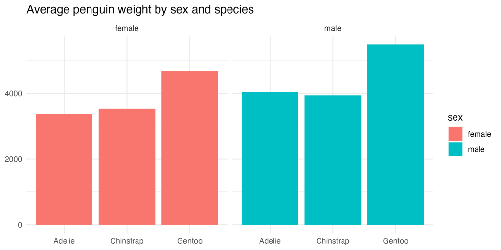
Learn More
Chapter 11 of the R Graphics Cookbook covers facets. Kieran Healy discusses them in Chapter 4 of Data Visualization: A Practical Introduction, as does Claus Wilke in Chapter 21 of Fundamentals of Data Visualization.
I’ve also written an article about the value of small multiples. It includes some code for making them.
Have any questions? Put them below and we will help you out!
Course Content
34 Lessons
1
The Grammar of Graphics
04:39
2
Scatterplots
03:46
3
Histograms
05:47
4
Bar Charts
06:37
5
Setting color and fill Aesthetic Properties
02:39
6
Setting color and fill Scales
05:40
7
Setting x and y Scales
03:09
8
Adding Text to Plots
07:32
9
Plot Labels
03:57
10
Themes
02:19
11
Facets
03:12
12
Save Plots
02:57
13
Bring it All Together (Data Visualization)
06:42
You need to be signed-in to comment on this post. Login.
Pa Thao • October 3, 2023
For the 'Your Turn', I added code:
and realized that it was not an exact match to this plot (plus the solution gave that away)...were there clues in the plot that would have helped me determine that these codes lines were not necessary?
Libby Heeren Coach • October 4, 2023
Hey there! You know, there aren't exact clues to say that it wouldn't be necessary, but once you've used ggplot a bunch, you'll start to notice that it does a lot of things for us. Without us needing to designate limits and breaks, ggplot will make a reasonable guess about what they should be given the data values and data types. For example, in the solution code, ggplot sees that we are using a numeric data type for our y axis, so it already treats it like a continuous variable, and it can see the range of that variable, so it knows where to reasonably set the upper limit of the plot so that it includes the max value, plus a little bit of buffer.
I usually make sure my data types are correct for my plot, and then let ggplot do what it does with my data. If I like the choices it makes, I leave it! If it needs a little bit of help to do what I want, then I'll start specifying limits and breaks :)