Get access to all lessons in this course.
- Welcome to Mapping with R (01_01)
-
Geospatial Data
- Making Maps is Complex (01_02)
- mapview for Quick Maps (01_03)
- sf for Simple Features (01_04)
- Turning Data Frames into sf Objects (01_05)
- Importing Shapefiles (01_06)
- Joining Geospatial Datasets (01_07)
- Disambiguating Country Names (01_08)
- Converting Addresses to Coordinates (01_09)
- U.S.-Specific Datasets (01_10)
- Advice on Finding International Datasets (01_11)
- CRS and Projections: Geographic and Projected CRS (01_12)
- CRS and Projections: How to Choose a CRS (01_13)
- Introducing Raster GIS with raster and stars (01_14)
- Basics of Using the raster Package (01_15)
-
Static Maps
- ggplot2 Essentials (02_01)
- Starting a Map in ggplot2 (02_02)
- Labelling ggplot2 Maps (02_03)
- Compare Locations/Events with Geobubble Charts (02_04)
- Highlight a Region in a Country with ggplot2 (02_05)
- Make a Choropleth Map of Discrete Variables with ggplot2 (02_06)
- Make a Choropleth Map of Continuous Variables with ggplot2 (02_07)
- Faceting Choropleth Maps with ggplot2 (02_08)
- Visualize Raster Data with ggplot2 (02_09)
- Adding Scale Bars and North Arrows with ggplot2 (02_10)
-
Interactive Maps
- What is leaflet? (03_01)
- Starting a Map in leaflet (03_02)
- Necessary HTML for Labelling leaflet Maps (03_03)
- Highlight a Region in a Country with leaflet (03_04)
- Compare Locations/Events with Geobubble Charts in leaflet (03_05)
- Make a Choropleth Map of Discrete Variables with leaflet (03_06)
- Make a Choropleth Map of Continuous Variables with leaflet (03_07)
- Visualize Raster Data with leaflet (03_08)
-
Wrapping Up
- You Did It!
Mapping with R
Make a Choropleth Map of Discrete Variables with leaflet (03_06)
This lesson is locked
This lesson is called Make a Choropleth Map of Discrete Variables with leaflet (03_06), part of the Mapping with R course. This lesson is called Make a Choropleth Map of Discrete Variables with leaflet (03_06), part of the Mapping with R course.
If the video is not playing correctly, you can watch it in a new window
Transcript
Click on the transcript to go to that point in the video. Please note that transcripts are auto generated and may contain minor inaccuracies.
Your Turn
Open project 03_06. Use the your-turn.R script in 03_06 to make this map.
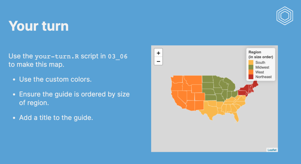
Use the custom colors.
Ensure the guide is ordered by size of region.
Add a title to the guide.
Learn More
It is much easier to work with NA values in {leaflet} maps than with {gglot2}!
In this video I used a slightly different approach to working with factors than in the {ggplot2} video about discrete choropleth. As before, if you want to learn more about factors then I recommend the factors chapter of R for Data Science.
You need to be signed-in to comment on this post. Login.
Jeremy Danz
February 26, 2023
Hi there Charlie; in the "my turn" example, I was expecting that Hulu would end up green, ESPN red, Netflix black ,and Amazon Prime blue. In reality, it looks like Hulu ended up black, ESPN green, Netflix red, and Amazon Prime blue (last one is in line with expectations). I think what's in your video is the same result .. . does this have to do with the arranging in the fct_rev, perhaps linked to some aspect of the unlist function? Seems like a minor point, and it took me a while to realize what I was seeing - sorry if I missed something there, thanks!
Jordan Trachtenberg
May 19, 2023
Hi Charlie, this question is beyond the scope of this video but I was hoping you could steer me in the direction of a helpful resource. Is there a way that you can create an interactive filter on your map to be able to select one or several of the categories? For instance, a button that would allow me to select only the Netflix datapoints? I'm guessing this requires Shiny and more extensive programming but I thought I would ask. The reason I'm asking is because I'm trying to make a map dashboard with various filter variables like company, date, and cost that I would like the user to be able to filter.