Get access to all lessons in this course.
- Welcome to Mapping with R (01_01)
-
Geospatial Data
- Making Maps is Complex (01_02)
- mapview for Quick Maps (01_03)
- sf for Simple Features (01_04)
- Turning Data Frames into sf Objects (01_05)
- Importing Shapefiles (01_06)
- Joining Geospatial Datasets (01_07)
- Disambiguating Country Names (01_08)
- Converting Addresses to Coordinates (01_09)
- U.S.-Specific Datasets (01_10)
- Advice on Finding International Datasets (01_11)
- CRS and Projections: Geographic and Projected CRS (01_12)
- CRS and Projections: How to Choose a CRS (01_13)
- Introducing Raster GIS with raster and stars (01_14)
- Basics of Using the raster Package (01_15)
-
Static Maps
- ggplot2 Essentials (02_01)
- Starting a Map in ggplot2 (02_02)
- Labelling ggplot2 Maps (02_03)
- Compare Locations/Events with Geobubble Charts (02_04)
- Highlight a Region in a Country with ggplot2 (02_05)
- Make a Choropleth Map of Discrete Variables with ggplot2 (02_06)
- Make a Choropleth Map of Continuous Variables with ggplot2 (02_07)
- Faceting Choropleth Maps with ggplot2 (02_08)
- Visualize Raster Data with ggplot2 (02_09)
- Adding Scale Bars and North Arrows with ggplot2 (02_10)
-
Interactive Maps
- What is leaflet? (03_01)
- Starting a Map in leaflet (03_02)
- Necessary HTML for Labelling leaflet Maps (03_03)
- Highlight a Region in a Country with leaflet (03_04)
- Compare Locations/Events with Geobubble Charts in leaflet (03_05)
- Make a Choropleth Map of Discrete Variables with leaflet (03_06)
- Make a Choropleth Map of Continuous Variables with leaflet (03_07)
- Visualize Raster Data with leaflet (03_08)
-
Wrapping Up
- You Did It!
Mapping with R
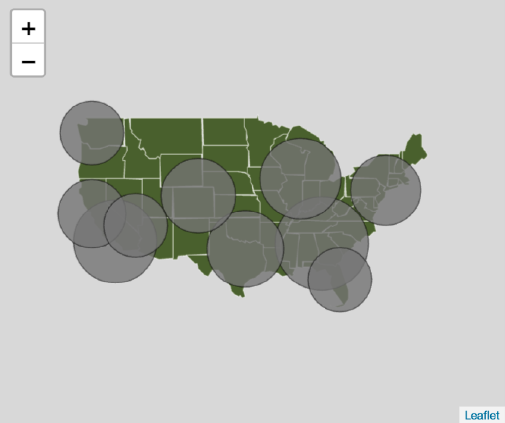
Compare Locations/Events with Geobubble Charts in leaflet (03_05)
This lesson is locked
This lesson is called Compare Locations/Events with Geobubble Charts in leaflet (03_05), part of the Mapping with R course. This lesson is called Compare Locations/Events with Geobubble Charts in leaflet (03_05), part of the Mapping with R course.
If the video is not playing correctly, you can watch it in a new window
Transcript
Click on the transcript to go to that point in the video. Please note that transcripts are auto generated and may contain minor inaccuracies.
Your Turn
Open the 03_05 project.
Use the your-turn.R script in 03_05 to create a geobubble chart of the busiest airports in the US.
Ensure small circles are not overlapped by bigger circles
Give the circles both a fill color and border color
Add a label to each airport
Learn More
In the video I mentioned that the {leaflegend} package provides the ability to add a bubble size legend. The 03_05 folder also includes an example script demonstrating how to use this package.
I’ve purposefully not added the fill legend to this chart as I feel it is confusing using two different aesthetics to communicate the same variable. However, in the 03_06 folder I’ve included a script that shows you how to do this.
You need to be signed-in to comment on this post. Login.