Making Beautiful Tables with R
Add your own ggplot
This lesson is called Add your own ggplot, part of the Making Beautiful Tables with R course. This lesson is called Add your own ggplot, part of the Making Beautiful Tables with R course.
Transcript
Click on the transcript to go to that point in the video. Please note that transcripts are auto generated and may contain minor inaccuracies.
Loading transcript...
Let’s redo our own density plots.
single_species_weights <- penguin_mass$body_masses[[1]]

gg_density_plot <- function(weights) {
  ggplot() +
    stat_density(aes(x = weights), fill = 'dodgerblue4', col = 'grey20') +
    coord_cartesian(xlim = range(penguins$body_mass_g)) +
    theme_void()
}


list_of_ggplots <- map(penguin_mass$body_masses, gg_density_plot)


penguin_mass |>
  flextable() |>
  compose(
    j = 'body_masses',
    value = as_paragraph(
      gg_chunk(
        value = list_of_ggplots,
        width = 3,
        height = 1
      )
    )
)gg_density_box_plot <- function(weights) {
ggplot(mapping = aes(x = weights)) +
stat_density(fill = 'dodgerblue4', col = 'grey20') +
geom_boxplot(width = 0.0005, position = position_nudge(y = -0.0005)) +
coord_cartesian(xlim = range(penguins$body_mass_g)) +
theme_void()
}
list_of_ggplots <- map(penguin_mass$body_masses, gg_density_box_plot)
penguin_mass |>
flextable() |>
compose(
j = 'body_masses',
value = as_paragraph(
gg_chunk(
value = list_of_ggplots,
width = 3,
height = 1
)
)
)Your Turn
Redo the table from the previous exercise but use ggplot to draw the sparklines. This time, also add small dots at beginning and end of each sparkline.
Hint: If you want, you can manually change the width of the sparkline column with width() after autofit() was called.
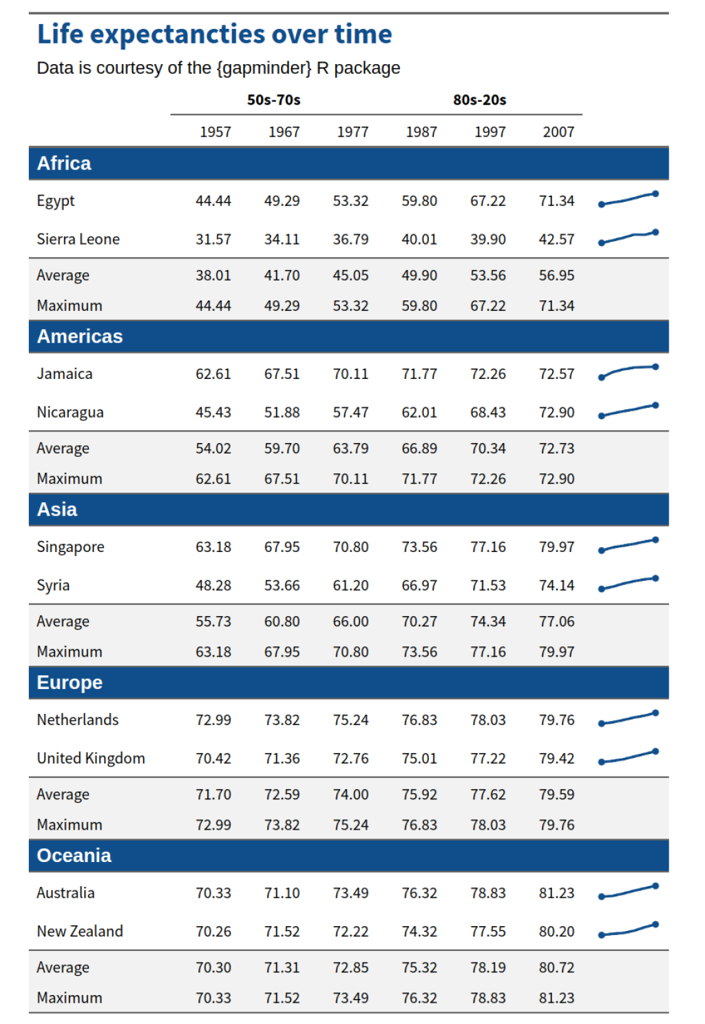
Your table should look like this:
Have any questions? Put them below and we will help you out!
Course Content
16 Lessons
You need to be signed-in to comment on this post. Login.
Majeed Oladokun • August 27, 2024
Hi,
I need help on adding the sparkline as ggplot object. I was able to add the sparklines and the dots as required. However, the dots are being partly cut-off in the cell. Below are excerpts from the code I used.
The code runs but the dots are being chopped off within the table. I attemped to use the commented
# style(j = "trends", pr_c = fp_cell(margin = 5))to check if increasing the cell margin will correct the problem, but to no avail.I am wonderng if you could share the TRICK to correct the problem.
Thank you.
Albert Rapp • August 28, 2024
Hi Majeed,
try making the underlying chart image have more spacing. To do so, you could expand the x- and y-axis spacing by adding
to your ggplot.
Best, Albert